Return to Innocence

Aaaaand that’s about a long enough break from this blog. Let’s get back to it!

This isn’t today’s topic, but I have been feeling disenchanted—or at the very least bored—with drawing lately because I’ve been doing so much of it professionally. This has made my personal time drawing to relax feel tedious and exhausting. You see, even though it’s how I make a living, it’s also something I love to do. The problem is that when you do anything a lot—especially when you have to—it can sometimes feel burdensome. This is a topic I will absolutely write more about soon, but in the meantime I have been trying to rediscover how to rekindle my love for illustrating. These trials have resulted in a lot of fun exercises (all of which I’ll also write about in the near future as well), but none of them were hitting their mark, and neither were previously reliable standards either. It wasn’t until I took things all the way back that I rediscovered my original muse—my childhood dog, Ballington.

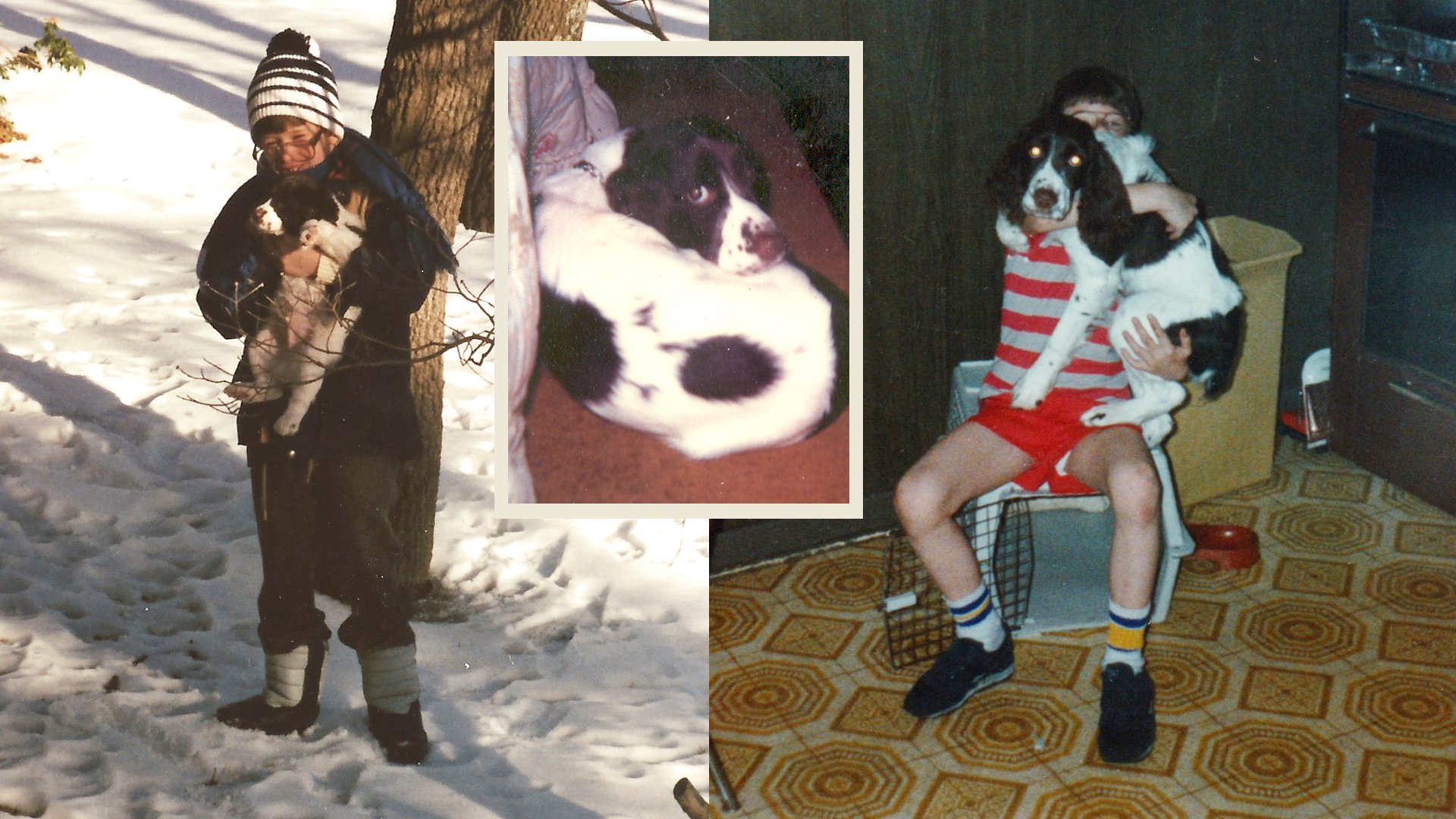
1985–86

First off, it’s very important to me you know how to pronounce his name properly. The first part is not pronounced ball like a spherical object you play sports with. It’s softer and lighter like the touristy Indonesian province, Bali (incidententally also Ballington’s nickname). Ballington was my 7th birthday present from my dad who’s primary directive was to name all our pets after (founder of The Salvation Army) William Booth’s children. We also had a dog, Bramwell and a cat, Evie (short for Evangeline). This entire paragraph is substantially more information than anyone would ever care to know for a blog dedicated to art, illustration, graphic design, and creative thinking, but after my Canadian cousin found too much glee teasing me as a child by calling him “Barflington”, it’s become a bit of an idiosyncrasy of mine to over–inform on this one.

Ballington left and me (circa 1983) with Bramwell & Evie right

My creative pool of illustrators at age seven was understandably shallow, promoting cartoonist Jim Davis way above his station as my artistic gold standard. As a result, everything and everyone I drew looked marginally related to Jon Arbuckle. Jim Davis drew Garfield, so I drew Ballington. If you’re a Simpsons fan, there’s a 13th season episode called “I Am Furious (Yellow)” where a cartoonist comes to Springfield Elementary to promote his comic, “Danger Dog” resulting in every single student creating their own derivative work like Danger Cat, Trouble Dog, and Danger Dude. This is a pretty good analogy for how I was inspired to start drawing my dog after admiring daily Garfield strips.

All my favorites including my grandmother (1989), early art of Ballington (mid to late 80s)

I don’t recall ever thinking that drawing comic strips about my hyper–active English Springer Spaniel—who in reality humped any and everything—would be a career choice, but I loved anthropomorphizing him and would include him in absolutely everything all throughout my childhood and well into my adulthood. As a kid, he would express ideas and thoughts I was too sheepish to say myself. He had adventures with his friends, was a perpetual optimist, and wore every emotion he had on his sleeve. While he never strayed too far from his initial Garfield inspired design, he picked up other influences along the way, embracing madcap and overly cartoonish flare, eventually embodied by the 90s resurgence of the Looney Toons and the collective renaissance of animation from films like Who Framed Roger Rabbit? and Aladdin. Like every single other kid who draws, he was an OC (original character) that only mattered to his creator. His dreams would always surpass his reality and be a mega star to an audience of one. Deep down I knew this and when I would see other illustrator friends embrace and promote their own characters, I completely understood that love and pride they had. No one else knew who they were, what they represented, or why they existed, but they were very special to their creators. I think it’s the equivalent of someone extending the life of a security blanket, teddy bear, or in my case; childhood pet.

Various Ballington drawings from the late 80s–early 90s

Ballington would silently star in many personal projects like comics and flip books, as well as play the lead role in college assignments like my first ever vector drawing and gif animation. Bali would accompany my well wishes in a friend’s birthday card, a doodle made for a high school crush, my signature in a classmate’s yearbook, and even a presentation slide for a meeting at my dad’s work. The cartoon Ballington was indestructible, not just as an over stylized, personal mascot, but as a pet too. My family wasn’t able to keep the real life Ballington, and after a few years by my side, he moved up the block to spend the rest of his life with my grandmother. I still took care of him every day, but by then my love for the unnaturally proportioned, puff–chested, illustrated Ballington outweighed his own real life counterpart. Maybe it was an emotional defense mechanism to let him go, maybe it was the imagination of a suburban white boy who spent too much time day dreaming, or maybe it was the safe space of believing the inked version could never die when the writing was on the wall that my real life childhood pet soon would. Loved ones will always come and go, just like life experiences, but the cartoon creation of a seven–year–old is immortal.

Posters I made that hung on my wall as a child, my grandmother again with Ballington (and Bramwell, late 80s), and comic books I made of Ballington from 1988, 1992, and 1994 respectively

Variations and updates to Ballington between the mid 90s through the early 2010s

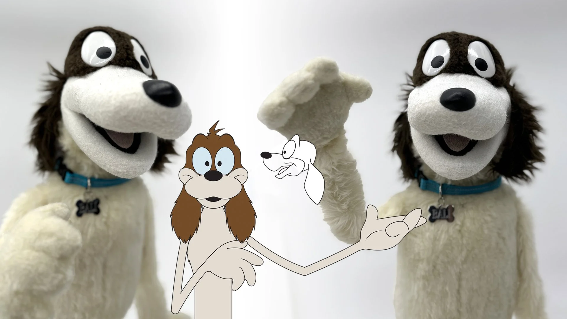
For a short time, my soon–to–be brother–in–law and I started our own production company that enjoyed a modicum of success. While Ballington was not our collective OC, our small sensation in the form of The Bang and Bump Show put me in contact with so many talented people that I was eventually able to commission the very talented builder James Kemp to make a Ballington puppet. I had to update Bali’s initial design for the obvious reason that I didn’t want Jim Davis to sue me, but also because that old style wasn’t conducive to a three dimensional puppet. James kept me in the loop with things like vacu–forming the eyes, shaving the fur for different styles, and dying the fleece. Having that puppet masterfully built and brought into the real world and off the reams of dot matrix computer paper my father brought home for me to draw on was a surreal moment in my life. I felt like I had completed something that I had always wanted to, and now that it was done, I was able to move on. Ballington was no longer confined to just my imagination anymore, so I effectively stopped drawing him.

Ballington puppet by @jameskemppuppets along with my updated illustration

Until recently.

I’ve always been quick to acknowledge that I never developed my own distinctive artistic style, and Ballington was proof positive of that. But I have learned new techniques and attitudes and was randomly doodling a dog this past week—trying to spark some artistic interest as I mentioned at the top—when I noticed he could kind of look like Ballington… if I wanted him to. It was an exceptionally humbling moment that made me think of the 1993 new age song Return to Innocence by Enigma.

Don't be afraid to be weak
Don't be too proud to be strong
Just look into your heart my friend
That will be the return to yourself
The return to innocence

The doodle–dog that inspired this post, Ballington IRL (as an adult mid 90s), my latest Ballington art and he’s still got it!

What a testament to the immortal imagination of a child. I’ve often thought the best way to grow as an artist of any kind is to push past your ability, leave your comfort zone, embrace your flaws and grow from them; but I never once considered that sometimes it’s the complete opposite. Ballington will most likely never have a weekly comic strip, appear as anything other than a background Easter egg in any media, nor will he break out as the star I always saw him as. I don’t say any of that from a defeatist point of view though. I say that because he’s not for that, he’s not for any of you. Ballington is for me. He always has been, and I’m so grateful to realize that he always will.

I’m hoping to keep this blog relatively consistent again, but the best way to know for sure is to follow me on Instagram and Twitter. You should also follow James Kemp on Instagram @jameskemppuppets as well, and if you’d like a brief but deeper dive into his time building Ballington, he blogged a bit about it too starting back in December, 2013 through March, 2014 that you can read in three parts:

Balli the dog for Dave Hulteen
Update on Bali for Dave Hulteen
Bali completion!

2022 Year in review

As 2023 comes upon us, I wanted to reflect on what I’ve learned, accomplished, and celebrated over the year and also what I’m looking forward to!

Personal Projects

The Making of The Great Muppet Mural

While almost everything about ToughPigs pièce de résistance happened in 2021 (including all the work that saw the project to fruition), the documentary premiered on January 29th of 2022 and it was a huge and wonderful experience. Recently I learned that this labor of love did not make it to the final selections it was entered into for a couple independent film festivals, but it still remains one of my own personal Crown Jewels of the year. I will be singing its praises and all those involved for decades to come.

This Blog!

I've been doing a relatively acceptable job maintaining this blog for over a year now, and there are a few posts I'm very proud of. I was also very fortunate to have so many wonderful people contribute as well, so if you haven't already, you should give some of these articles a read and support their contributors as well!

Do You Have to be Creative to be a Graphic Designer?

Seriously, I'‘m super proud of these posts!

Illustrative Stuff

I did not draw much this year at all (outside of commissioned work) but what I did do continued my understanding and development of my craft and the mediums I use to create them. I also did not keep up with my figure drawing classes to the extent I had wanted, but I’m already trying to arrange things for next year so that I don’t slack again.

Some of the illustrations I’m most proud of from 2022

Of everything I drew on my own time, my illustration of Luisa Madrigal in the style of Charles Dana Gibson was my favorite. I have plans for more redraw challenges as well as doing more artist games like I did with Will Carroll and Noah Ginex.

Freelance

For the first real time since my daughter was born, I started taking on serious freelance work again. I took on several more notable clients this time around the sun as well as connected with some old friends. The biggest one of course was getting the opportunity to work with Craig Shemin on his newest book, Sam and Friends: The Story Of Jim Henson’s Television Show.

Being back in demand was wonderful, but in many ways I feel that I jumped the gun and bit off more than I could chew, so…

Biggest Lesson Learned

I willingly and happily put almost all creative endeavors aside when my daughter was born with the understanding that someday when she was older, I’d resume drawing regularly (daily), taking on freelance again, and other passion projects. As she has grown more independent, 2022 seemed like the year to dip my toes back in the water for all of that. Unfortunately, I think I dove in the deep end and over–immersed myself. I’ve always been very good about my time management, but along with everything else, I’m a little rusty here too. 

In general, when you work full time (regardless of what your actual job is), it’s difficult at worst to manage your time properly and seemingly unnecessary at best if you’re good and well paid. The latter is very ambitious, but it’s an easy excuse to turn things down if you just don’t feel like doing them. These are all things I will consider in the coming new year.

New Year’s Resolutions 

Having learned that there will never be enough time to do everything, I am hoping to focus on expanding my tool set a little more in 2023. I would like to become proficient in Adobe After Effects, as well as the 3D modeling program, Blender. Part of this is a continued fascination with video production, but more than a few times in the recent past, I’ve realized the tools that I already know aren’t capable of creating some of the concepts I had hoped to present to clients. Learning new software will accommodate this tremendously.

So here’s looking to 2023 and everything that it has in store for all of us. Thank you so much to every wonderful, talented, and awesome person who has helped me on my journey, contributed to this blog, and taken a moment out of there day to give a blog post a read, an Instagram pic a double–tap, or a retweet on Twitter. See you all in 2023!

A.I. Art: Clarification & Controversy

I wasn’t even planning on writing a blog post this week let alone one on such a topic as art generated by artificial intelligence, but as it is part of my industry and I’ve seen so much outrage from my peers (many who are friends) I thought I’d do a little digging and put something a little more comprehensive together than, “Support artists! Denounce technology!

I’m going to try and keep all of this as brief, simple, and informative as I possibly can, but I’m also going to try and approach this from a (slightly) less biased angle.

What is A.I., and is it Bad?

You don’t have to be relatively well informed to know what AI is. It covers all aspects of our lives from taking care of minor tasks we don’t even think about to the stuff of science fiction nightmares requiring Will Smith to show us that even machines can—and in fact do—love. 

Recently I finished reading Yuval Noah Harari’s Homo Deus: A Brief History of Tomorrow, a follow up to his bestseller Sapiens: A Brief History of Humankind. Harari writes a lot about AI and its benefits. Without going into too much detail and wasting time here, the three big takeaways for now are that:

  • AI is actually a really good thing that can drastically help with all sorts of things to improve life everywhere for everyone 

  • Fundamentally, human life as we continue to understand how it works is not that different from how AI learns, adapts, and grows itself

  • It’s becoming clearer that creative things people believed AI could never reproduce aren’t far off and many areas like classical music are actually surpassing humans in quality, structure, and beauty 

I know most people will not believe any of what I have just written, and that’s completely fine. I would never insist you take my word (or anyone else’s) on anything as gospel at–a–glance. I would strongly encourage you to do your own research though. The point is, however, that whether we like it or not, the world is going to continue to change, it always has, and it’s certainly not going to stop because a few of us don’t like the idea of being replaced by anyone or anything. Automation has been changing how we do our jobs and live our lives for centuries, and the whole process has continued to increase at breakneck speed, especially since the 1980s. In other words, AI is most definitely here to stay, and it’s probably better we figure out how to change with it, rather than stubbornly anchor ourselves against it until the next generation sees us as living fossils who refuse to accept change.

But we’re not here for a lecture on science or philosphy from some Muppet–loving Jersey boy whose blog readership doesn’t extend far past his own family and close friends. So let’s instead talk about AI generated art, specifically the latest fad known as Lensa or “Magic Avatars” because there’s a lot to unpack and it gets complicated. 

Avatar Insanity or High Art?

Remember Bitmojis? I hated Bitmojis when they first debuted. Not because of how well or poorly they’re drawn (depending on your tastes), but because I didn’t come up with the idea first. For those not familiar, Bitmojis aren’t too dissimilar from modern day avatars you create like Meta’s more CGI looking Facebook avatars or Apple’s Memojis. My argument at the time was also that they took away opportunities from artists like myself to create illustrations for profit. On the flip side, they give people who do not possess the skill to draw an opportunity to express themselves creatively quite literally. 

Bitmoji, Facebook, and Memoji avatars of yours truly, and one I drew myself (2017)

The point is that there will always be new technology to engage users and experience something they would otherwise have to commission an artist for. I don’t know a single person that has ever created a digital avatar using some type of technology and then claim that their “artwork” was anything other than a fun opportunity to represent themselves online or even just to “jump on the bandwagon.”

Now I recognize this is a slippery slope that could lead to something more nuanced down the road, but for the time being, let’s all try and remember a social media avatar is not the same as a portrait or caricature that you would give as a gift, hang in your living room, or rock on the side of your 1988 conversion van as you drive to your next gig.

AI Art Stink

The main focus of this article and the commotion that it’s caused is a program called Lensa by Prisma AI. At a glance, Lensa is a pretty standard photo and video app that lets you take and edit media with a variety of different features. It’s most popular of course are the filters that “turn your photos into works of art in the style of famous artists” and transform them “with popular art styles - anime, cartoons, sketches, watercolors...” all by using artificial intelligence. The app is free but offers premium monthly or annual subscriptions. 

Okay, so nothing too new there. I am very far from having my finger on the pulse of any social media platform, but even I’m familiar with these types of things enough to know there are tons of them. I’ve even used some of them before myself, so why is this app getting artists in particular so upset?

The Lensa Learning Problem

Not too long ago (like literally just several months ago) Dall–E 2 debuted to slightly different fanfare. Dall–E 2 is also an AI art generator but it seems it’s absolutely ludicrous creations were more comical than threatening (for the most part). Hence, many people looked at Dall–E’s attempts as technological proof that a computer could never imitate the skill of an experienced artist. Or that optimistically, it’s still a ways off. 

Dall–E (and Lensa) uses Apple’s TrueDepth API which most iPhone users know as the same technology that allows them to unlock their phones just by looking at it. Dall–E 2 learned how to create its images by studying tons of information to create images based on text prompts. This AI learning technique is known as Stable Diffusion. 

This is tricky, but basically when AI uses Stable Diffusion, it’s not just learning to recognize features and characteristics of someone’s art, but essentially manipulating and reproducing elements from that art. So the issue then is that artists are accusing AI of using this learning technique by having Lensa specifically build its creations from existing art without permission from the artists it’s emulating. Now it’s hard to find sources to corroborate some of the allegations I’ve read, but many artists have actively accused Prisma AI of stealing their art specifically, requesting the company stop doing so repeatedly, then Prisma AI allegedly refusing and even cyber bullying them about it. There is compelling evidence to lend credibility to these claims where remnants of the artists signatures from original works are sometimes still visible in the AI generated art. 

Darker Secrets

Okay, maybe I’m coming across a little too unbiased by praising what AI could (or hopefully should) be even though I’ve stated in the past how infuriating and hurtful art theft can be. So let’s look at how one of the more nefarious problems with Lensa isn’t even allegations of art theft, but how it depicts your pictures when they become “art.”

A big problem with AI in general is that it learns its lessons from its creators, and even modern day AI—which is touted as pure—has repeatedly displayed racism, nepotism, and sexism. Lensa has lightened skin tones of people of color, struggled with (re)producing Asian features, and sexualized women and children. Other AI art generators have done similar unwarranted things like taken on macabre tones when “crossbreeding” images that did not previously convey violence. 

I want to be clear: these are not alarmist warnings that AI will rise up and destroy humanity. Artificial intelligence reflects the zeitgeist, which includes everything from cute and fun to morally questionable. In other words, whether it’s an art–stealing bot, a perverted algorithm, or even an altruistic ghost in the machine, it’s all taking its cue from us.

Now What?

So where do we go from here? As artists, we tend to react more emotionally because, you know, suffering is kind of “our thing” (until artificial intelligence corners the market on angst too). But like I mentioned before, technology is going to keep moving forward regardless of how we feel about it and that’s not necessarily a bad thing. A knee jerk reaction is to call out for regulation but that’s way easier said than done for two big reasons. 

While there has been initiative in congress to try and moderate how things like AI continue to develop, bureaucracy—love it or loathe it—purposely moves slowly to make sure it’s covering all its bases properly (and that is an exceptionally gracious and arguably naive platitude). On top of that, it’s an antiquated system that’s literally hundreds of years old. Technology moves ludicrously faster, meaning that by the time well intentioned and thought out legislation finally passes even in the best of circumstances, the applied science behind that technology is usually obsolete, meaning any government progress was all for nothing. 

The second problem is that government officials aren’t exactly young entrepreneurs anymore who even understand the technology they’re hoping to regulate, prioritize, or control. So when you ask older people using an even older system to help answer these questions, you eventually have to consider if the whole process wouldn’t be better served by the AI you want them to regulate in the first place! Understand though that this is not an endorsement to willfully hand the keys over to tech bros like Elon Musk or Sam Bankman–Fried. It’s pretty clear that being rich does not equal being responsible… or smart… or ethical… or competent… or sane. 

So if creative people only know how to get upset over it, and our leaders only know how to politicize it, as usual, it all comes down to you, the user. AI really can do incredible things, but moving forward, it’s up to us to decide how we’ll use it. 

And this is something everyone really needs to learn how to do better. Consider if that neat new AI avatar is worth the likes verses its privacy policy. Yeah, that’s a whole other kettle of fish because one thing practically no one understands is what kind of personal information you allow software developers access to when you agree to terms and services. 

Like almost every app, Lensa uses legalese to ensure you maintain the rights to your photos, but then vaguely explains they have the right to use those photos to independently aid in research, development, and improving new and existing products. 

This is not a dystopian outlook from a conspiracy theorist either. Your personal data is way more important to all of these developers than what kind of review you leave them on the App Store. A great rule of thumb when you download an app is its cost. If the app is free, then you’re the product that’s for sale.

Sources

I did a fair amount of research for this post, so if you’d like to read a bit more in depth on all of this, please check out these articles:

Lensa AI app: What to know about the self portrait generator by Meera Navlakha
Mashable

Understanding the impact of automation on workers, jobs, and wages by Harry J. Holzer
Brookings

Prisma is coming to Android, but there's a way to get it sooner by Stan Schroeder
Mashable

Careful — Lensa is Using Your Photos to Train Their AI by Shanti Escalante-De Mattei
ARTnews

Lensa, the AI portrait app, has soared in popularity. But many artists question the ethics of AI art by Morgan Sung
NBC News

‘Magic Avatar’ App Lensa Generated Nudes From My Childhood Photos by Olivia Snow
Wired

Stable Diffusion
Wikipedia

DALL–E
Wikipedia

If you’d like to track what some artists are saying, a lot of insight on Lensa’s theft I read came from Jon Lam on Instagram. He credited Lauryn Ipsum for the discovery of remnants of artist’s signatures on AI creations. Karla Ortiz is helping lead the fight for artists rights.

Personal Clients

Or Should You Ever Do Freelance for Friends and Family?

I will do a more expansive review for everything at the end of the year, but I wanted to write today about doing freelance work for friends and family. Now the old adage when it comes to working for friends and family is, “don’t.” There’s definitely merit to that but more often than not, I find that to be a pretty rare exception—at least on the basis of difficulty to work with, but I’ll break that down too.

My mom teaching her Sunday school class, early 90s

Truth be told, pretty much all beginner freelance is exclusively for friends and family when you start out. Realistically, no one else is going to hire you! While I certainly didn’t have a solid directional plan when I was younger, I knew that illustration was something that would figure into my adult career if even only tangentially. My mother recognized this and fostered that creativity by being my first and arguably only client for years if not decades. She was responsible for all the youth programs at our church and would ask me to draw giant “pages” for stories she would tell in Sunday school (Christian education geared for kids during or around church time). Now a mother’s admiration and love is hardly good justification for quality, but while she swore up and down my poster size drawings helped keep her kids attention, they were hardly good. However, they did enforce several very important things to me such as deadlines and keeping up with design trends (if only what cartoon characters were popular with a very specific demographic at the time). These “jobs” also helped me refine my ability, so while I’m thrilled no one outside of a very select few have ever seen them, they set things in motion.

This year, I was able to pay those things forward with more than a few friends and family, and I’d like to talk about how those experiences are still really important for experienced professionals and not just those starting out. Typically, you’re not getting a decent payday from friends and family because it will hopefully be important for you to maintain those relationships on a deeper level than just “Jane and Johnny Client,” but that doesn’t mean they can’t still have an impact on you and your career.

Now speaking of only getting hired by friends and family in the beginning, I was really excited to work with an old friend who arguably had one of, if not the most, influence on my career. Even before I started my education, John Lambert was one of the very first adults I ever knew that always treated me like an equal, never ever talking down to me as a child, but also taking a key role guiding and teaching me as well. I was even his ring bearer at his wedding!

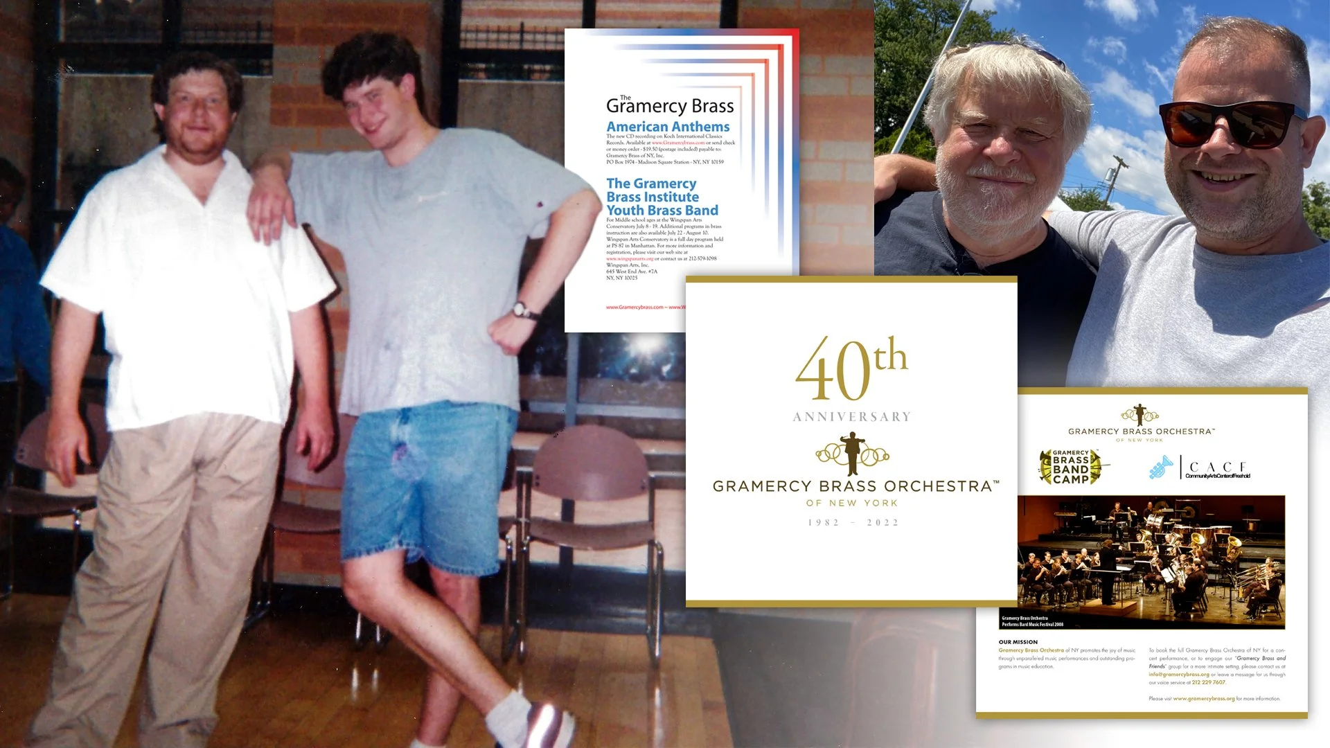
He had started the Gramercy Brass of New York in 1982, so when I was starting to put together my portfolio, it was this prestigious organizational name that I exploited for my resume. John had me help with everything from building sets and stages to giving me the opportunity to create my very first print ad. When I went on an interview, it was almost exclusively the work I did for John that got me in the door. Now John will modestly tell you he was asking me because I was eager to help and only lived a few blocks away, but the reality is that he was the first person to set a standard of quality. I would have to develop multiple concepts, ensure overall print quality, and above all else—strive for something that actually looked somewhat professional. Now none of that early work is good, but it was the catalyst, so I was very excited and honored when he asked me to help with creating the Gramercy Brass’ 40th Anniversary Journal. I can’t say I did anything over the top or groundbreaking, but when you have a relationship that’s about as old as you are, there’s a freedom with candor and understanding that you just can’t manufacture with a client, even if you’ve known them for years. This is primarily because John isn’t just a dear friend, but someone I put on a pedestal for helping me get started.

Left to right: John & I at a Gramercy Brass Orchestra concert in August, 1997. The very bad—but also my very first—print ad for the orchestra’s newest album at the time, American Anthems (2001). The cover and a single page for the GBO’s 40th Anniversary Journal. And finally, two significantly older but wiser men still happy to work together.

One could argue that this could easily be seen as an obligation rather than a job, but neither of us saw it that way and I was so happy to get to work with him like this again. In so many ways, it felt like it was 1997 all over again, and I loved it.

The next project and “client” I want to mention is Lucas Ross. Now I’ve talked about Lucas and how great a guy he is ad nauseam in the past, and it’s possible because of all that adulation he reached out to me to help him with his newest live album, There Will Be Banjo. Again, taking on this job could be seen as the logical “thanks” for all the work Lucas did as the host for my documentary from earlier in the year, The Making of The Great Muppet Mural (which you should totally watch today!). But Lucas and I had that spark of a moment multiple times during the documentary where we really just enjoyed working and talking together. While my intentions were to do so much more for Lucas, he was gracious enough to take what he could get from me with several illustrations he then assembled together himself, but Lucas was also a great client as well as a friend with how we continued to communicate.

Lucas with the Oklahoma Opry and the album cover to the live album

You see, when your day job, freelance, and hobby are all the same thing—in my case, drawing—there’s a nuanced way of going about such a thing with equal respect and attention to all three. Lucas has somewhat of a similar understanding with his music, and so I not only felt comfortable being more open with him about everything from technique to personal concerns, but also letting him use and manipulate my illustrations however he wanted. Lucas was also the key person in helping me understand how I need to better manage and even understand my time (something I’ll most likely write about in the coming weeks or months), and I had no compunctions telling him this. My inside joke is that these things will help me to best work with (just) Lucas again soon, but my reality is Lucas really helped me understand myself better in that way, and I can guarantee that’s never something I would have recognized with “just another client.” (Thanks again for that, man!)

The last instance is a combination of working with both a childhood, lifelong friend and my dad. Now both of these men have known me not just longer than everyone else, but better than everyone too. Plus, both of them needed my talents with a much quicker turnaround (although to be fair, with my dad, it was my fault as I kept putting it off). I grew up with (now Major) Myron Smith as one of my closest best friends. As tiny children, we would play basketball and music together—both for fun and competitively—to which Myron would always always best me. As teenagers, we would go to the beach and the ice rink weekly where we would skate and talk to girls—I was only slightly more adept at these over Myron, so I’ll take my trophy on this one. Technically, what my dad asked was just an update on something I had already done in the past, but as I’ve mentioned numerous times as well, my dad is a big deal to me, so it goes without saying he didn’t have to twist my arm (just remind me constantly!).

So if John and Lucas were varying levels of circles, Myron and dad are on the inner most ones. There are cons to working with people that know you that well for that long, but there’s also a freedom to it as well. You can experiment and try out techniques you wouldn’t with other clients because those close friends and family sure aren’t going to take their business elsewhere. You will also find rationalizing your own choices easier as well, because like them, you’re locked into those relationships too.

left to right: Myron an I in the mid 90s, all grown up (June, 2022), and my dad and I at an art show displaying his work (May, 2010)

In the end, all of these “jobs” secure a more fundamental appeal, and that’s getting the chance to reconnect with them. Do you ever say yes or no right away when friends or family commission you? What type of layering does it add to old relationships? How likely are you to work with or for an old friend or close family member? I’d love to hear your thoughts here, Instagram, or Twitter!

My Story with Sam and Friends, Part III

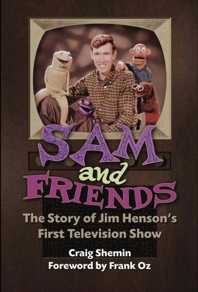
I was hired by Craig Shemin to work on promotional materials for his new book, Sam and Friends – The Story of Jim Henson’s First Television Show. Then he brought me on to fine tune the book’s cover. This week I’ll be talking about how it all ended up!

Right off the bat I need to be honest and tell you this post is rather self–serving as I will be gushing about how I got to be involved with some of the promotional events for the book, but I promise I’ll keep the arrogance level low… low–ish. Somewhat modest for sure. You know what? It will have nice pictures if you want to skip reading, deal?

Heading to the Museum of the Moving Image with my family, Sept. 24, 2022

I’ve written about my fan experiences and how the Museum of the Moving Image is kind of a mecca for Muppet fans, so when Craig asked if I would sign the Sam for President posters I created next to him at the book launch on Jim Henson’s birthday, I was ecstatic. For starters, being on the other side of the table was huge. Getting to have moments like meeting Bob McGrath, or chatting with other fans I only knew through Instagram or Twitter @’s was so much fun. I was also grateful to have my wife, daughter, sisters, and my parents all there as well.

Top left: Craig Shemin, bottom left: Stephanie D'Abruzzo, Heather Henson, top right: with Craig and Ryan Dillon, and meeting Bob McGrath

Top left to right: ToughPigs’ Shane Keating and Matthew Soberman, @gollygeemel and the beautiful Dr. Teeth key chain she gave me. Bottom Left to Right:Richard Gomez and the Snerf he built and gave me, Will Carroll, and finally Joe Hennes and Peter Savieri.

Two weeks later, I got to attend New York Comic Con and be on a panel with Craig, Muppet performer Ryan Dillon, and Henson Company Archivist Susie Tofte. Getting to chat with fans, fellow artists, and friends again tops finding any merchandise or rare treasure. It was a real blast and something I will never forget!

Please follow me on Instagram and Twitter and you should also totally buy Sam and Friends – The Story of Jim Henson’s First Television Show at Bear Manor Media in soft and hard cover.

My Story with Sam and Friends, Part II

I was fortunate enough to be hired by Craig Shemin to create promotional materials for his new book, Sam and Friends The Story of Jim Henson’s First Television Show. I wrote about it in–depth last week, so please check that out first.

While the work was very exciting and fun, it really was a distant secondary project to the book as the pieces were intended to be handed out at events like the launch at The Museum of the Moving Image in Queens. Other than that though, I wasn’t expecting any public connection to the book online, and that was fine because just getting to be a small part of Jim’s legacy by distant proxy was satisfying enough for me. However, that all changed a few months later when in July, Craig floated the idea that he would need me to polish up the book’s cover now as well.

On a book like Sam and Friends, there are a checklist of items that have to be met for legal purposes. Craig had created a mock up of the cover understanding it would need to be punched up later, but its main purpose was to get clearance from all the legal sides of The Jim Henson and Walt Disney Companies. However when he approached me about this new addition, there were several things I needed to be brought up to speed on.

The first was obvious, the mock up Craig had created was approved, so I wouldn’t be creating any new concepts. The job was to create a more refined version. Period. The second was a huge surprise to me: there was no high resolution graphic of the Sam and Friends title! This was one of those “seeing behind the curtain” scenarios where I had just assumed the assets were tucked away somewhere in the archives. Now I was responsible for creating that high resolution asset and beyond everything I had done, this felt the most significant to me. I had created something of this asset partially when I designed the campaign poster of Sam that was one of the original promotional items, but now I would fine tune it—purple swirls and all—for future use of the book and whatever else the Jim Henson Legacy saw fit for as well. The third was a later surprise, and that was that Craig’s mock up had been shown and announced back in early 2021 and now I was being announced as the cover artist! My 15 minutes had officially started.

Several color and effect variations of the title

The last thing was something a little more nuanced. The television set used to frame the photograph of Jim, Sam, Kermit, Yorick, and Harry was art Jim Henson himself had created for the show. Unlike the set design style illustrations I had created for the promotional items, or even the Sam and Friends title card, Craig felt the television set art needed to remain Jim’s and therefore would stay intact as is. As a fan, I wholeheartedly agreed. As a graphic designer, this was a massive problem.

NOTE: While this is the actual art of the original TV set, the colored photo of Jim is Photoshopped into the image.

If you’ve ever looked at a digital picture on your phone and just zoomed in as far as you possibly can, eventually you’ll start to see distortion to the image. This is because a digital image is made up of hundreds if not thousands of individual pixels. When you print a digital image, there has to be so many of those pixels crammed into one square inch so that it looks good whereas the numbers of pixels per inch (PPI or DPI–dots per inch) on a screen can be considerably fewer. If an image is too small and you then blow it up/enlarge it, those pixels will be more visible in a ruddy way that will look really bad. It’s a good rule of thumb to enlarge such an image only 130% at most. Anything beyond that will start to show the physical dimensions are of a much lower quality.

Craig had super high resolution scans of almost everything, but for this television set alone to be increased just for the book cover (never mind any promotional uses that would require it even larger), it would need to be blown up 10 times larger which means it would look terrible in print. I suggested letting me recreate the art so that we could avoid every conceivable problem I could think of, but Craig was understandably hesitant. Fortunately, he also trusted me (especially because I told him we could trash it if he wasn’t happy with it), and I digitally painted everything down to the tiniest detail including the speaker and its screen. I also allowed for a humongous bleed area so that the wood grain of the set could easily wrap around the hard cover’s extended borders. Not only was Craig pleased with the result, but now that I had organized every single part into its own unique layer in Photoshop, we could tweak everything for alignment as well as the additional promotional pieces that would come to be, like a standing retractable banner. If that wasn’t helpful enough, my new painting was 200% larger than the necessary size of the cover.

Craig’s mock–up, my illustrated design update, and the Photoshop layers

Fortunately, the scans for the back cover were of a high enough quality that I didn’t need to mess with them too much. Again, having all the high resolution scans from the show weren’t just easier to work with, but very cool to have something I could really look at and enjoy months before the book was published.

The old adage, “You can’t judge a book by its cover” is always a thorn in a graphic designer’s side because creating book covers is literally our job. Craig was the perfect client to work for. He was very clear in his directions yet open to my suggestions. I wasn’t just providing him with my ability to create stuff for him but my years of experience as well. I don’t know how much any of those things played into his generous offers to have me join him when he signed copies of his book in Queens or be on the panel at New York Comic Con, but I was about to experience a whirlwind of notoriety and respect and it was super exciting.

The lined area for the dials now extends to the TV frame and the speaker mesh was painstakingly drawn with precision in Adobe Illustrator. The frame was digitally painted with a dry brush texture, the set itself was overlaid with a wood grain texture while the knobs have a felt texture over top.

Tune in next Friday when I share the last and most personal part of this story! Follow me on Instagram and Twitter and thanks for stopping by!

My Story with Sam and Friends, Part I

I’ve been waiting to really break down a huge and wonderful experience I had and today is the day I finally (start to) talk about the work I did for Sam and Friends: The Story of Jim Henson’s First Television Show. There’s a lot to cover so let’s start with some basics. As I have written about numerous times, I’m a huge fan of Jim Henson and all his creative works. Jim has always been my leading creative influence starting when I was a toddler all the way through to today. When Jim was a kid himself, he was fascinated with television and broke onto the scene with a black and white puppet series in 1955 on WRC–TV in Washington, DC. Craig Shemin—who I’ll also talk a whole lot more about in a bit—took on the huge task of writing a book about this particular introductory foray into Jim’s career, and would eventually bring me on to this fantastic adventure. But let’s slow it down now and get into more detail.

Images from the MuppetWiki

Every true Muppet fan knows who Craig Shemin is, but to the lay person, he’s a massive contributor to preserving the memory and legacy of Jim Henson. At his core, Craig is a writer who has written for television shows like The Wubbulous World of Dr. Seuss, Telling Stories with Tomie dePaola, Donna's Day, and Dog City. He's also written short stories, video game scripts, press interviews & appearances, text for licensed products, concert scripts, and liner notes. He's also hosted live events, screenings, & panels and prepared additional video content for such things. He has a ton of other credits like director, curator, and consultant as well as his current title of president of The Jim Henson Legacy. To say he is incredibly talented is putting it mildly, but he's also genuinely a wonderful person.

Sam and Friends saw the birth of a lot of what would be in store for Jim Henson's future including the unique and newly innovated techniques in puppetry for what would become the Muppets as we know them today. Chief amongst those Muppets would be Kermit the Frog who was only vaguely amphibian at the time. Jim Henson's complete creative collective would be splintered after his untimely death in 1990 with Kermit and his friends from The Muppet Show eventually being purchased by The Walt Disney Company, Sesame Street transitioning full ownership to Sesame Workshop, and things like Fraggle Rock, Labyrinth, and The Dark Crystal remaining with the Henson Company. Sam and Friends would become known as a "frozen property" essentially meaning that nothing new can be developed with the characters. I'll expand on that later, but ultimately this is a long and convoluted way of saying that if you really want to know more about Sam and Friends, then you should absolutely buy the book.

So now we come to late April of this year when Craig reached out to me asking if I'd be interested in creating promotional materials for the book. There were a few things I was really excited about for this, but the main draw was that I was being hired to create printed materials that would look like Jim Henson had created them himself. This was huge and I was stoked and honored. Initially I had to create four pieces: a bookplate that Craig could sign at publicity events, a campaign poster that was inspired by a 1960 sketch where Sam ran for president, a sticker, and a bookmark.

Professor Madcliffe's Bookmark

Of all of these, the bookmark was the most ambitious. Professor Madcliffe's Manual Marking Machine for Books would be completely illustrated save for the character himself whom I meticulously but lovingly masked from a 1959 photograph. This was where I set some guidelines for myself from here on out. Because I was drawing every other element aside from the professor, I wanted this particular piece to look like it was actual set design that would have been painted on wood or cardboard much like Jim had done for the actual show. As a result, the pieces that would be further set deeper in the background would be out of focus slightly on camera, so layering everything in Photoshop not only allowed me to move everything freely and easier, but the depth of field was changed as well. A subtle film grain was also added.

I need to quickly add something here that I neglected to before. While Craig was the gatekeeper on what I did, everything had to then be approved by The Jim Henson Company. For the most part that meant just making sure nothing from the show was being used without proper permission from the lawyers, but it also had to meet merit as to how it looked comparatively to what Jim was doing back in the late 50s and early 60s. I've talked about how a committee can complicate this process sometimes but also how scrutinous it can be. Higher–ups tend to need very good visual representation, so early on I was advised to have more fully fleshed out illustrations as opposed to sketches. Again, I've walked down this road thousands of times, so this wasn't a huge ask. Some of the notes that came back though made me tighten up where I found my creative direction.

All the props I created for the bookmark including the rejected ones!

For example, while I used a fantastic (and now out of print) book called Imagination Illustrated by Head Archivist for The Jim Henson Company, Karen Falk for reference, I quickly realized there wasn't quite enough material to re–create Jim's aesthetic without directly plagiarizing it. I found most of my design inspiration from the classic Rocky and Bullwinkle Show. The mid century style was fun to create and a style I've enjoyed emulating for quite some time now.

Imagination Illustrated by Karen Falk and screenshots I took from Rocky & Bullwinkle

One of the notes that came back that I appreciated was the push to stray away from things like mechanical gloved hands and wooden signs as they were too reminiscent of the Looney Tunes, whereas Jim used more ornate and flowing designs as opposed to Warner Bros. more industrial style props. I did try and hide a few Easter eggs though. Here they are:

  • Professor Madcliffe's "Mirth–Meter" was changed from "Smiles per Second" to "Smiles per Page"

  • The wooden board is taken from a sketch where Chicken Liver plays a sheriff from the old west

  • A Wilkins Coffee cup (a main commercial entity who sponsored a lot of Jim's work) is obscured just enough to the left of Professor Madcliffe

  • The television EKG monitor, tape reals, machine with bulbs on it, and the odd phone looking device are all illustrations of things found from various Madcliffe sketches

  • The pickle jar is a reference to the campaign sketch from the Sam for President poster where the character Moldy Hay discovers there's no surplus of pickles

  • The red phone is my own tribute to the Muppet Newsman from The Muppet Show

  • The intricate round mirror on the back is a recreation of the frame used for their sponsor Esskay Meats

However, the best Easter eggs are the ones Craig created when I requested to label the dials, knobs, switches, and screens (much like Jim did on the show). Almost all of them are obscured, but he wrote so many great ones and then wrote more!

Paper Thickness
Ink Opacity
Avg. Read Speed (WPM)
Page Turn Count
Between the Lines Content
Font Definition
Binding Integrity
Indexing Index
Recycled paper content
Subtext Comprehension
Page Density
Chapter Adapter
Margin Marginalization
Hinge Protector
Colophonograph
Gutter Guard
Comprehension Override
Pulp Friction
Kerning Kompensation
Print Offset Offset
Paper Strength
Appendix Inflammation
Little to Big Word Ratio

Sam for President

The campaign poster seemed like it should be more straightforward and easy, but other campaign posters of the time were relatively bland. In 1960, the notable comparison was that of Kennedy and Nixon. To a modern audience though, it was important that Sam's poster looked nothing like favoring one political party over the other. I had varying degrees of making the poster look aged 60+ years, but the main goal was to reproduce (at least in aesthetic) how it would have looked printed from a 1950s press so I leaned heavily on exploiting its color halftone look.

I didn't realize it at the time, but just creating the "Sam for President" text (to match the Sam and Friends title card) would play a huge role later when I would design the cover, but I'll get more into that next week.

ToughPigs.com editor–in–chief and co–owner Joe Hennes and designer/illustrator extraordinaire Jamie Carroll (who frequently consults on classic Muppet character design for toy companies) became integral to me for notes and critiques. I relied heavily on their input to make sure everything I created here on out looked and felt authentic. When I say none of this stuff was created in a bubble, I genuinely mean it.

Sticker & Bookplate

The last two promotional pieces were the sticker and bookplate. As I mentioned before, Karen Falk's Imagination Illustrated was very helpful, particularly for these two pieces, especially because they really relied heavily on Jim's fanciful and fun, yet intricate border designs. Craig was insistent on having my art credit listed on all of these things primarily so no one thought Jim actually created them. This was one of the most appealing things for me because not only did I share legit credit with my hero, but a few people missed it and thought they actually were drawn by Jim.

Aside from a few non–specific looking creatures that may or may not evoke certain classic characters from all the Muppets, the only true Easter egg was my daughter's (and coincidentally, Craig's grandmother's) name in the first draft of the sticker's border that ultimately was removed.

Ironically, none of this is what I would be known for once the book's official release date was announced and I was then credited as the cover artist! But that's another story for part 2! Tune in next week when I discuss getting the honor to be a much bigger part of the history for Sam and Friends! In the meantime, follow me on Instagram and Twitter and you should also buy the book at Bear Manor Media in soft and hard cover.

Part 2

Part 3

My Blogs One Year Anniversary

Just a little more than a year ago, I had read that search engines (Google in particular), love when a website is active and will move that site way up when it comes to searches. At that time, my name would link to either my Instagram or a few ToughPigs articles, but my website didn’t even list. It was at that moment I wondered why I was paying so much money for a site that was—at best—a resume placeholder that literally no one could see. I set out to be more proactive which was a job in and of itself. A year later however and I’m so proud and pleased with how this world of analytics and recognition have come along.

The best part is how keeping this blog up has helped me improve my ability to network. For starters, I learned a lot of valuable lessons on how to connect with others, and a lot of those lessons came through trial and error. In the long run though, it gave me opportunities to reconnect with old friends, introduce a lot of how I operate to new ones, and feature the work and ideas of a lot of super talented people. I’d like to take today to show off some of my favorite things that have happened on here over the last year.

So Much Talent!

Getting to interact with so many talented people has been the most fun by far. I won’t go into lengthy details, but simply present this cast of wonderful human beings who were kind enough to be a part of my journey.

Mike Barreiro

Danny Beckwith

Doug Berry

Nick Bondra

Mike Boon

Jonathan Brangwynne

Jamie Carroll

Will Carroll

Maria Chamra

Thank you again to all of these amazing humans! GO CHECK THEM OUT!!!

Some Freelance I’ve Done

Aside from just having another place to spotlight my work, I’ve enjoyed sharing my process with freelance I’ve done for clients like Matt Vogel or the work I’ve done for my full-time job at The Salvation Army. And of course, I’ll always take the opportunity to show off everything that was done for ToughPigs The Great Muppet Mural.

Personal Lessons

Writing a blog has also been cathartic. I’ve been able to share things that’s I’ve always felt very strongly about and wanted to tell. Coping with passive–aggressive clients and defining myself as an illustrator were two things in particular I’ve wanted to talk about for ages.

Real things people have actually said to me

One of the more exciting aspects for me was having my point of view completely refocused like when I asked if it was even necessary to be creative in order to be a good graphic designer or if being pigeonholed into drawing Muppets was a bad thing.

I’ve also really enjoyed looking at my career through a more personal lens in regards to how much my daughter continues to inspire me, the work that I do, and how that easily spreads across my professional and family life and how rewarding it all is.

Randomness

My blog has also provided me with so many creative challenges and new ways to try things I’ve always wanted to do. I’m itching to do more artist games like I did with Will Carroll and Noah Ginex (more of these are on the way too!). I had a blast trying to find every instance of Kermit I’ve ever drawn. I also dug deep to try my hand at redrawing my old illustrations too! All of these things were creative exercises that helped me learn and grow in so many wonderful ways.

My Favorites

For me, my favorite articles deal with talking about my family and being silly. Of everything I’ve written however, my post about Stock Image Sites is the one I’m most proud of. If you want to support me and this foray into writing, I would love if you read it. I’m super proud of that one.

If you’ve been a reader for even one article, from the bottom of my heart, thank you. I have so many more posts I can’t wait to share with you! Please follow me on Instagram and Twitter and check back here on Fridays for more creative thinking!

Thanks, Jim

How you define yourself is such a personal thing and yet it’s something you also want to put on blast. “This is what I like, this is what interests me, this is who I am.” Only, how difficult is it to categorize all those complexities into just one thing? Father, artist, husband, illustrator, son, writer, brother, designer, friend, gamer, CIS gender male, cheese–based snack enthusiast… I’m all of these things but none of them exclusively. This is a real hot button topic that can also both interest and infuriate people and yet all of us across every spectrum of life consider these things and consider them consequential.

Let’s play a game though for just a brief second and pretend you absolutely have to boil all those things down so that you can at the very least point in a general direction to who you identify as and so you can write a manageable blog post. That’s why today I want to briefly highlight my personal admiration for Jim Henson. Good God, I mean I’ve indirectly and directly credited his influence on my life so many times that I don’t even know which past post would even suffice to make that point. Tomorrow however—Saturday, September 24, 2022—would have been his 86th birthday. Side note: Can someone please tell me if referring to someone’s upcoming birthday in the past tense due to their death is grammatically correct? Maybe strike “writer” from my previous list of defining monikers.

Illustrations © DaveHulteenDesign.com

Creatively, Jim is my ultimate true north. His sensibilities and ethos have all strongly influenced my own. When I was younger, I’d say, “If Jim started a religion, I’d convert.” A tongue–in–cheek joke even I wasn’t sure was true or not. But even that way of thinking was inspired by him.

Illustrations © DaveHulteenDesign.com

The reality though is that I can’t even express those thoughts into a cohesive post. Not because I lack the ability to convert those feelings to text, but because I honestly don’t even know where I would start. I know someone who can though, and I’ll turn it over to them in just a second. First I want to share how I’ll be celebrating that upcoming 86th birthday.

Illustrations © DaveHulteenDesign.com

I’ve teased about it, I’ve shared snippets on social media, but I’ve yet to actually talk about the work I’ve done for Craig Shemin on his newest book, Sam and Friends: The Story of Jim Henson’s First Book. Part of this is because my involvement has evolved over the last few months, part of it is because it’s super gauche to discuss a project before it’s completed, and part of it is because this particular story isn’t quite complete yet. For the purposes of this post however, I’ll be at the Museum of the Moving Image with Craig and lots of other fans for the book’s release. Having been given that chance to be a part of this book has pulled my admiration full circle, and I’d like to believe that if Jim were still here and gearing up for this 86th party, he’d know my name—maybe even speak it out loud—and my Lord, what a euphoric, dopamine–inducing daydream that is!

It’s most likely moot at this point, but not being able to fully layout my thoughts on how to express what Jim did for me, all I can really do—and for the record—is say, “Thank you, Jim. Thank you for inspiring so many of us. You absolutely made this world a much much better place, and we are all so grateful that you did.

Illustration © DaveHulteenDesign.com

Now while this post is an opportunity to share my thoughts and art that pays tribute to Jim, I have to turn it over to Julia Gaskill (I was going to label her a poet but as I mentioned before, we’re all so many different things and putting just one label on her would be a huge crime). Awhile back, she created an exceptional video entitled An Open Letter from Kermit the Frog to Jim Henson that just floored me. She said everything I wished I could in this post only so much better than I could have ever hoped to, and so, I’m extactic to give her the final word on this.

For more of Julia’s work, you absolutely must follow her on Instagram and Twitter @geekgirlgrownup. Also, if you haven’t ordered it yet, pick up Craig’s new book about Sam and Friends in either soft or hardcover and learn a little bit more about the guy who inspired so much for so many.

The Pros of Pigeonholing Popular Puppet Pencilers

What the hell is up with that title?!” Yes, well it caught me off guard too and I’m the author. As has happened to me in the past however, I had an idea for a blog post that (in my mind) was very cut and dry. Then I reached out to a ton of very talented people who I was willing to bet paper money on would feel the same way I did, only to readjust my own thinking that was clearly just a pessimistic attitude. So if you don’t feel like reading this whole post, here’s the big spoiler: Muppet fan artists are the greatest human beings to ever walk the planet. Too bold? Okay, then read on.

If you know me or have read practically any post from this blog, you know I’m a big fan of Jim Henson. You’ll also know I draw a lot of Muppets, like a whole lot. So much so that there is a notable and huge difference in the amount of attention an illustration of Kermit the Frog gets over something like, say an illustration of a hotdog. Definitely not a good comparison but it’s really moot at this point. People love when I draw the Muppets, and care minimally when I draw anything else. Creatively it can feel stifling and push to create something absurd. That’s not just an opportunity to post a link to an old post, I’ve covered this purposely when I asked aloud “Why Did I Draw That?” and it inadvertently answers this question, I’d love if you checked it out.

So the hard line in the sand here is that while I do in fact love drawing the creative efforts of everyone involved with various Henson and Muppet adjacent projects, I have often felt obligated or at the very least pigeonholed into drawing them more than I normally would or even should. The basic retaliatory emotion that follows feeling pigeonholed is righteous indignation because the creative person in question feels like they can contribute more to the zeitgeist than what they are already expected to. Sure I appreciate the love and attention from that piece I did of Miss Piggy, but wouldn’t you guys also like to see this fun zombie kid? Or maybe these historical figures? Not so much? Ouch! My ego!

So with my personal gripes neatly arranged in a manila folder, I reached out to a bunch of other artists expecting to hear back nothing but, “Yeah! I feel that way as well!” only to feel the full ethos of Jim Henson personified that only true Muppet fans could deliver. I asked, “Do you ever feel pigeonholed to draw Muppets?” and here’s what these amazing people told me in response.

Toffe

I never feel pressured to only draw Muppets, it just happened to be the thing I want to draw most! But while it’s disheartening to see a personal art post flop in the Instagram algorithm, I always remember that 100–500 of my followers like this too! So I continue to draw and post whatever I want because someone out there likes everything I post. So I always keep that in mind.

Justin Piatt

If I post anything that's not Muppet related, it generally doesn't do well at all. That can include my own puppets. If I post anything with Uzzy, my main character, it gets zip. Other puppets do well, especially if I post a lot of pictures, but Muppet replicas and Muppet art seem to be the only things that really take off.

I'll give you an example—my last two posted drawings. One was the Muppets, one was [a commissioned] piece I did for the Girl Scouts. The Muppet drawing has 394 likes (and counting). The Girl Scout one, filled with cute little big eyed animals, has 55.

It does make me feel more obligated to draw Muppets. At the same time, I hate the impression that it gives. That I'm obsessed and that's all I think about. Because I have a lot of people who know me personally that follow me, and I don't want that to be all they know me for.

Danny Beckwith

I often feel that Muppet-based or inspired work is something that seems to get attention more often than not. If I fall down the chasing "likes" rabbit-hole/mindset, I will often come back to Muppets. But I don't really chase likes and have to remind myself that when I make Muppet art, it's sometimes for me. Perhaps I'll share it (I always do, lol) for others to enjoy. But I've recently realized that making art with Muppets should never be a chore or a contest. I only now do it when I have true inspiration or feel that the Muppets being including in my art matches my values but also the values of those characters and the theme of the piece.

Kenny Durkin

…If anyone tries to refer to me as strictly a “Muppet artist” I ignore it. When I post artwork I tend to rotate them. So I’ll post a Muppet thing and follow it up with something more caricature related, then I’ll do a Father of the Brood or something like that. I also do that to remind people that I’m not a one trick pony.

The time I did get pigeonholed was when I was doing Duck Dynasty stuff. I gained a lot of followers who thought that "redneck" artwork was all I did. I had to "break the cycle" by posting goofy monsters, or aliens, or Muppets probably, just to show them what ELSE I can do.

Noah Ginex

Noah has been doing a Drawing A Day primarily featuring the Muppets.

Yes. that's... what this whole year has been. There's at least two whole universes of original characters I have that I never draw any more. Not to mention an entire universe of other fandoms I'm into. I basically don't do any other art now, except commission work. In fact, several of the drawings this year have been birthday presents for people that I've only done because I needed t–shirt designs and stuff

I only pour “Drawing a Day” into the spaces around my normal life, so I'm often doing them quickly late at night. So really the thing that they're using up is sleep… or this morning… ha ha ha right now!

But to answer the question of do I mind, no I love it. My t–shirt sales have jumped a bunch too. The real trouble, honestly, is ideas. With rare exception I'm always fighting the clock on thinking of a new thing to do. That doesn’t make me seem like more of a crazy person than I know I already come off as, drawing the same frog and bear and pig every day.

Jonathan Brangwynne

I’m pretty self-conscious of how much fan art I do vs. original stuff. I think most online artists feel pressured into doing fan art so they can be seen, and it is pretty frustrating. I do maintain that any original work that you create is part of your identity, and whether you think it’s good or bad, you should still keep at it and try to mix it up. Ultimately, you’re doing it for yourself, if no one else, and you’ll be able to show more range in your art and have a diverse portfolio.

Nick Bondra

I kinda got pigeonholed on other subject matter I did years ago but I think that’s subsided now. It does kinda’ sting when I draw something more of my own creation instead of fan art and don’t get much response. Heck, people mostly react to my Gobo Fraggle photo poser pics. 

So, I do know where you’re coming from. I guess it just depends on how you feel about it. I’d only do it if it’s still fun for you. 

Dan Romens

It's my general lack of frequency that tends to cause the disproportion, as it pulls me out of the algorithm. At least that's my theory. In other feeds or accounts, when I was more frequent, I felt like I got more engagement on my random or original work.

In terms of the Muppets specifically, for as long as I remember, the Henson characters have always been my go–to subjects in moments of art block. They are familiar and drawing them or original characters inspired by them comes easy. So I don't mind in that regard. I also love the Muppet fan art community.

I think where pigeonholing comes into play may have more to do with fan art in general. Regardless of the platform, fan art has always gotten the most engagement, which makes total sense, but can also feel limiting or like I need to pander to some niche audience in order to be seen or acknowledged. Draw a great cartoon dog? Nothing. Draw a cartoon dog dressed as Doctor Who or some such thing, gang busters. Again, it makes sense, but c'mon guys.

Quentin Tracy

As an artist, I have never felt tied to the Muppets. I’m a big fan of them, and they have inspired me many times, but they’re only one of many inspirations of mine. On a more broad scale, I feel like fan art in general guarantees me a good reception from my fans. That fact has left me a little discouraged to work on original ideas of mine, in fear that I may pour my heart and soul into something not many other people will think much about or care for.

Mike Boon

I can put a bunch of work into a new design and get some likes/comments. But then I post an old Muppet one and it's about three times as popular with a faster response. I don't take it personally though—I know that the main reason most people even found me in the first place was because of one Muppet piece or another. It's a badge of honor to be part of this community. Plus, it is an extremely welcoming group to be part of.

I haven't spent enough time in the Muppet realm to really feel pigeonholed though. There are still some ideas kicking around that I would like to explore. But I do want to try to spread them out. Plus I like to think that if something appeals to a Muppet fan like me, it would appeal to other Muppet fans out there. It doesn't always pan out, but it's worth a shot. Ultimately, I do this just because I enjoy it. And if others enjoy it as well, it is just a welcome bonus.

Kevin Williams

I’ve never been one to really let myself feel pressured to do anything I didn’t want to. Nowadays I do leave sketches and napkin doodles’ around of Muley (my original character) with a Muppet or Peanuts character for attention. Even so, I’m surprised when someone finds my photos of napkin doodles online and says, “Woah, that was you? I took these home” or “I pinned them up in the kitchen of the restaurant.” It feels good. Though I wonder: would they have just kept Muley, or was his sketch kept because Oscar was on the napkin next to him? Looking back to when I would set up at conventions and festivals, I think one thing which hurt me was the decision to NOT draw or sell any other characters other than Muley the Mule and Friends. People asked if I would draw Peanuts, Muppets, Disney – anything other than Muley, but I would instead offer to draw Muley or his pals in those costumes. I felt it was important to my own self promotion to push my characters, not those which already had budget and promotion. Yet, I would see people flocking to booths where artists were selling their art of Batman and Scooby-Doo, Bugs Bunny and The Little Mermaid, and I would think, “Those aren’t even the actual artists or the real art. Why are they going there?” Stubbornly, I stuck only to my Mule. Many years now I’ve been out of the convention circuit. I look back and finally realized that people were buying those prints and visiting those artists because they enjoy the “retro memory” of the joy they felt watching or reading those characters, buying into familiarity rather than new, creator-owned properties. Looking back since I’ve been out of conventions the decision to stay away from other characters may have been a mistake. I could have used non–Muley characters to draw attention to my booth and thus more to Muley. If I could go back in time and do it all again I would add these other characters simply for the ‘draw.’ (Get it?)

Will Carroll

Often times it feels like all people wanna see from me and other artists is just one thing, over and over again. The most likes I usually get is my Muppet stuff, everything else gets very few likes as well. I draw what I wish and never think of the audience in mind.

Richard Gomez

I feel like this is an issue that follows all artists who gain popularity with a fan base. Usually I’m able to piggyback off of the Muppet wave with work that’s just Muppet inspired and more of the sort of thing that comes directly from my head…

But all my portraits of real people that aren’t connected to the Muppets almost always bomb. Sometimes, I don’t mind it. I know a lot of people are going to see my Muppet stuff, and only my close friends are going to see the sort of thing I make when I’m not thinking about the Muppets, and I like the intimacy that comes with that because virality is a little scary.

Final Thoughts

So to put a cap on all of this, there are three key things to remember here:

  1. A fan artist is not solely defined by their fandom but being recognized specifically as one is not the worst thing in the world. For starters, the Muppets are a fantastic fandom to be associated with. Heck, it’s even landed me and so many others good freelance work!

  2. If there’s a complaint, it’s that trying to come up with new ideas can be trying, but then again; what is a true artist without a challenge?

  3. Finally, if you really dig what someone does and you found them through your shared fandom, be a pal and subvert the algorithms expectations by seeking out their other work and double–tapping that screen!

Just like you should with all the incredible artists who contributed today! Man, what a treat to get so many fantastic and talented people to not only share their thoughts but some excellent art too! I can’t stress enough how great these artists are, I respect each of them so much. Please be sure to check all of them out and again, thanks so much to:

Toffe

Justin Piatt

Danny Beckwith

Kenny Durkin

Noah Ginex

Jonathan Brangwynne

Nick Bondra

Dan Romens

Quentin Tracy

Mike Boon

Kevin Williams

Will Carroll

Richard Gomez

And please follow me on Instagram and Twitter and check back here on Fridays for more Muppet and non–Muppet stuff!

Incompatible Clients

Today I want to write about something that may sound like it’s just complaining about people, but that’s 100% not the case. Well, maybe 80% not the case, but I’ll elaborate more as we go along. As the title suggests, this is about incompatibility. Like every other relationship, there are just some instances where two parties aren’t meant for each other. This is a very hard pill to swallow when it comes to a client and server/service relationship because of one key difference: an agreement based on work for pay.

Okay, maybe 70% not the case in regards to complaining.

This isn’t prevalent in any other relationship, but when it comes to a client and server/service based relationship, it’s foundational. The issue is that from every other angle, it resembles so many aspects of traditional relationships. Whether it’s familial, friendship, coworker, romantic, online, or even temporary; a client and server/service relationship hits a lot of the same bullet points. At the core, its strongest relational bond is that of collaboration. When you work with someone closely on anything, you can’t help but learn more about who they are and what makes them tick. You may find you really like each other too, but nothing is getting accomplished. The client doesn’t seem to like any of the server/service’s (Good grief, I’m just going to call the server/service a “designer” from here on out) concepts, the designer doesn’t seem to be understanding the client’s requests or critiques, and before you know it; there’s a general consensus that everyone is just wasting each other’s time.

In my experience, there are two four key reasons for these failings. This is going to seem very biased, but usually the problem is the client (Crap, maybe we’re at 60% not the case that this is just complaining). This isn’t a character flaw, but let’s dive deeper.

1. The Client Doesn’t Actually Know What They Want

Shots fired! Of course it’s their fault! How could it ever be that of the perfect designer (or illustrator… man, I’m already confounding the language again—we’re really flying by the seat of our pants here!). Okay, hear me out: a client traditionally hires a creative person to accomplish something they cannot. It could be because the client doesn’t have the tools or talents to do so or because they don’t know what they should even be going for. A healthy relationship then builds from collaboration to create something. Sometimes that lack of knowledge or understanding can be too much of a hurdle and the client realizes they may need to do a lot more soul searching to figure out what it is they need.

Now this is rare, as I’ve stated in the past, many times the client legitimately trusts the person they have hired. It can become clear and possibly even a little overwhelming at just how much thought (should) goes into things like personal branding or creating something that is attached so closely to the client.

2. The Client Is Too Passionate About Their Idea

I considered making this a subcategory of the first reason, but I have personal experience that’s unique. I was commissioned by an absolutely lovely human being who had a very clear vision for what they wanted. There was a lot of passion behind this project; real honest–to–goodness love that wasn’t just important to the direction, but the overall feel as well. If I were obtuse, I’d just brush it off as emotional baggage as the project was very much a tribute to people who are no longer alive. The truth was that this client had a lot invested in the project and had a difficult time disconnecting some of those emotions from the people they were now celebrating.

Maybe you can’t be too passionate about anything and the subtitle for this section is a little callous (I swear this post is 58% not about complaining about people). The point is that the world will continue to move on—even from the worst of tragedies—and that’s always going to be a lot harder for some people over others. This particular client really is a wonderful person, and we parted ways amicably. Just as I ended the last reason, when this happens, the client may need to do a lot more soul searching to figure out what it is they need, and it may not be something a creative person can fix.

3. The Client Is Insane

54% not the case that this post is complaining about people. Of course, while every human being has horror stories in regards to dealing with anyone, I have been very fortunate that I’ve never had a truly bad client. However, my friend and fellow creative Scott Modrzynski has. Here is his story.

There was a sobriety house in Los Angeles that I got in contact with through a mutual. The owner was looking for a logo, and I was more than happy to help. I don't remember what we settled on, price-wise, but it was inexpensive because 

A) I'm terrible-to-me at pricing, and
B) I have the additional guilt of charging people money for doing the lord's work. 

The initial concept, as it was conveyed to me, was vague, so I came up with something based on the operation's initials. The owner thought my usage of negative space to create letter forms was cool, but not his style. No problem. He sent me some examples of something he liked. It was sleek, classy, and minimalist. I mocked up some examples, and they weren't working for him. He liked Viking runes. I came up with something gruffer, that had a Nordic tilt to it. He thought it was great, but was hoping for something with a SoCal vibe. Throughout all our email exchanges, and occasional phone calls, there was a lot of flowery, bullshit language from his end that made no sense, and completely divergent ideas that seemed utterly incongruous to our previous contact. At that point, I realized what a piece of shit designer I am, because I don't know how to make a minimalist, Viking-inspired, SoCal logo that dives into the beating heart my own soul. I gave it a final go, and he said he'd get back to me after the weekend. That was at least five years ago. 

It was my first experience with a nightmare client, and made me appreciate my day job, since I wasn't really in a position where I needed to chase down these side gigs for any reason other than making some extra coin.

4. The Designer is Overly Ambitious

Every so often during a total solar eclipse while a volcano is erupting on your birthday as you and your ambidextrous twin sibling ride a two–headed Laquita porpoise on your way to pick up a winning lottery ticket in the Namib desert; a creative person will bite off more than they can chew. It’s easy for an inexperienced designer to insist everything they do needs to go in the portfolio and will go out of their way to convince the client that because of their creative experience (however extensive or limited it may be), they simply know best. That is to say it’s possible if not improbable that it’s the designers inability to communicate or properly deliver what’s been discussed and promised.

Such instances require a federal judge to prove such a rarity in which most cases prove it was actually the client who was wrong.

Okay, this post is officially drawing a line in the sand insisting that it is 52% not the case that it is complaining about people.

Yes, But What Should You Do?

Okay, let’s talk practically about solving these problems. Patience is key. Word of mouth about incompatibility is going to spread faster than any good work that you do, so remember the client is paying you and not everything has to go in the portfolio! Bad design is everywhere and the real shock is that good designers continually add to that because some clients just don’t care about the golden ratio, proper kerning, that a caricature is meant to exaggerate certain features, or that what you offer is actually a niche service that can’t be obtained at Target or created by AI (yet). Sometimes the best way through is to accept all directions regardless of how counter–intuitive they actually are to good taste, get paid, and forget about them; making sure to make a mental note to always be on vacation should they return for repeat business. Most importantly, separate your personal feelings from your work. I know I sound like a broken record, but not every piece has to go in the portfolio or on social media. Keep your emotions out of your responses and if you are feeling particularly revved up, make sure to burn off those heavy feels before contacting a client. I have seriously over–soured one or two bad business relationships because I didn’t walk off some anger and frustrations first.

Inevitably, there may come a tipping point where it’s clear that a particular relationship just isn’t going to work. Be honest with your client. It’s always good to know a bunch of other creatives in your field that you can recommend in place of yourself. Obviously make sure you give your buddies a heads up first, but having alternatives and providing other solutions really helps you out here. I always strive to never say, “no” to a client. That doesn’t mean I roll over and let someone take advantage of things, but saying, “You know what we can do…” shows you respect their opinion and that you’re listening as well. Solve the problem before acknowledging there actually is one.

If money has already been exchanged, there are a number of variables that could determine if anything is returned or still owed, so there’s no definitive answer you’ll find here. However, Scott’s nightmare is reason enough to consider applying the formula of deciding how much of a loss you may be willing to take just to bail. There may be zero chance of salvaging the relationship, but see what you can endure to make sure your reputation doesn’t take much shrapnel.

Don’t write off the client’s frustration either. They may not be able to communicate their ideas well at all, and as a non–creative person that can be difficult. It bears repeating to make sure your head is out of the fire when responding so that if there is a strong hate–hate relationship; you’re not the hothead. Openly admit you’re not the right fit for the job and that you don’t want to waste the client’s time, even if they’ve wasted yours. Remember, you want out of this, so take it on the chin and never look back. If the client is a real problem, make sure you warn all your creative peers on the down low.

If all else fails, start a blog and write about how you’re totally not complaining about people and vent your problems there!

A big thanks to Scott Modrzynski for taking the time to share his insights today! The dude is a very talented artist and designer who I’ve had the privilege of working with on three different collaborative projects together.

Just some of Scott’s incredible work!

Check him out on Instagram and Twitter, and also take a peak at some of his really cool stuff like this Batman Typography or his Cereal Freaks. You can also follow me on Instagram and Twitter and come back here on Fridays for more creative thinking!

I [still] Know What You Meme!

There’s nothing like laughing your life away with a batch of memes that may or may not hit just a little too close to home. So with that being said, here are some memes!

Not quite what you expect with figure drawing

This more accurate than anyone wants to admit

This one is legit my favorite.

Follow me on Instagram and Twitter and tune in to this blog on (most) Fridays for more fun!

Starry Eyed & Tongue Tied

Last Friday I ended a 25 week streak posting my blog and while the world did not end because I didn’t post, I was bummed out. The problem is I am over my head with freelance and full–time work and some of what I’m working on is super cool and very loosely and indirectly related to this post and I cannot wait to share it with you!

Anyhoo, starting in the early aughts, I began attending comic cons regularly. Before I go any further, if you have never been to a comic con, you absolutely need to go. It doesn’t matter if you’re 8 or 88 and it also doesn’t matter if it’s a humongous convention like SDCC or a tiny one in the basement of a VFW hall. Of course, comic cons back in the first part of the 21st century were slightly different than they are now. For starters, they really were all about comics. Today they tend to be more of a “pop culture convention,“ but they are still a blast.

Wizard World Philadelphia. May 30, 2003

Over 20 years ago, they were also primarily populated with mostly male attendees. When my girlfriend (now wife) would accompany me and our friends, there would be somewhat of an awed hush for a moment when she would first walk on the convention floor. This was more of an initial reaction to her sex over her radiant beauty, but times slowly changed and soon conventions became a much more homogeneous experience. Now that we are married, she will often mention she no longer does comic conventions because she “served her time.

Anyway, in 2006, I dragged her along yet again to Wizard World Philly with my primary goal of meeting comic artist Skottie Young. He is a well renowned artist today, and while he was certainly hot back then, he was arguably still an up-and-coming creator. This can be proved by the fact that he had his own table with no line of swarming fans or even an assistant! It was just Skottie hanging out and drawing alone all day and excited to talk to anyone. 

At the time, he was working on a run of Venom, continuing Marvel’s unconventional trend at the time of showcasing more cartoonish and exaggerated styles on Spider–Man titles along with other artists like Humberto Ramos. I was a super fan, constantly visiting his site to see all his sketches and drawings of any and everything. He wasn’t just an incredible artist, but a super cool guy as well who seemed to have similar pop-culture interests as myself. Not a surprise considering he’s barely 2 months younger than me!

Checking our convention guide, I located where Skottie’s table was and we made a B line so I could ask him to sign my Venom comic and maybe even take a picture with him. As I mentioned, he was alone and just drawing away. When we approached, he lit up like a Christmas tree with excitement. What a fantastic guy! I was so pumped and excited to gush over how great he was. I opened my mouth to greet him and introduce myself only to discover I had completely forgotten the English language. 

Skottie’s table was our very first stop at the con and the one and only thing I truly wanted to do and now that we were finally here I was so star struck that I literally couldn’t speak. I was like Ralphie Parker meeting Santa Claus at Higbee’s in A Christmas Story. I stood with a dumb, open–mouthed smile for a ludicrously long time that made Skottie and my wife shift awkwardly as they waited for me to do absolutely anything. Finally my wife stepped in to save me with a prompting and encouraging, “Hello.” Yes! Hello! What a novel way to start a conversation! I will try saying that, and so I blurted out much too loudly and abruptly, “HELLO!” “Hey! How’s it going!” Skottie replied with renewed energy and a warm friendly smile. I resumed my blank admiring mannequin face as if I was a Make–A–Wish patient who no doubt suffered severe injuries from his love of drinking gasoline straight from the pump. My wife—now staring at me incredulously—saved my bacon again with another encouraging prompt. “He really likes your art.” she said sweetly as I stepped over her last word obnoxiously, “I REALLY LIKE YOUR ART!” 

For the next few minutes, this was pretty much how we communicated. My wife patiently told Skottie what I admired about him and his work and then I would loudly repeat her words in the first person. It was like a bizarre avant–garde ventriloquist act where I was the dummy, my wife the puppeteer, and Skottie as the beleaguered volunteer pulled randomly from the audience. What a complete and total $#!t show. Somehow I managed to get my comic signed and a picture as well. Skottie was polite, patient, enthusiastic, and so kind. He was exactly the type of person I anticipated him to be and I blew it. 

Me still in complete disbelief that is indeed Skottie Young. June 2, 2006

As soon as we were out of earshot from Skottie, my wife turned to me shocked and somewhat exasperated. “What in the world was that?!” she asked. I had returned to earth at that moment as well and was equally stunned. “I have no idea!” I admitted. It was at that exact moment that I had a very serious problem on my hands and I needed to rectify it immediately. My main concern at the time was the realization of just how much this could hinder my own illustrative career. Thanks to sites like ToughPigs and the exposure I was getting from such a niche fandom, I was sure it was only a matter of time before I would have the opportunity to meet actual Muppet performers and maybe even work for them. At my core I knew it was vital they saw me as a peer and not just a fan. Of course if I couldn’t chat up a fellow artist just because he was successful, how would I speak to someone who was partly responsible for molding my childhood, affecting my overall trajectory as a creative person? 

It turned out it was even worse than I imagined as not long after that, I bumped into a family friend—yes, a family friend—whom I greatly admired. Now I had never met him prior, but I had seen pictures and heard recordings of him (he was a very talented musician) so imagine my horror when I got tongue–tied chatting with him as well!

I took the “Face Your Fears” approach by attending every book signing I could find, hung outside every service entrance after a concert, waited in autograph lines at conventions, and attended any speaking engagements featuring celebrities that interested me; all in the hopes I could act like a normal human being around anyone with a modicum of fame so that one day I wouldn’t completely lose my mind if I met someone really famous.

Weird Al Yankovic (2/2/2011), Jesse Ventura (4/7/2011), and Gary “Baba Booey” Dell'Abate (11/9/2010)

I very quickly realized “fame” wasn’t the crux to my star struck nature, it was admiration. If I somehow found myself face to face with someone like Hugh Jackman—something that actually happened —I was excited but maintained my composure easily. However, if I met the likes of Trace Beaulieu, Lorraine Cink, Doc Hammer, Louise Gold, or Stanley Lau, I’d start to choke up. Interacting with them at events did become easier and was also very safe. I was able to see them as actual people and before you knew it, I could at least fake acting casual. When I finally met those lofty Muppet people, at the very least I wasn’t a hot mess. 

MST3k’s Trace Beaulieu (11/27/2010), Marvel’s Lorraine Cink (7/24/2016), and Doc Hammer (4/19/2008) co–creator of The Venture Bros.

I still get very excited when I meet someone I admire—famous or not—and on the inside I’m fan freaking out. If I ever meet Lois Van Baarle or Frank Oz or Jamie Hewlett I think my heart would still explode. At the very least, my wife knows I can control my basic bodily functions without her by my side the entire time. 

Skottie Young, if you’re reading this, thank you so much for being so pleasant and patient and inspiring. Not just to draw better but to get my act together and focus. It changed my career. You really are the GOAT!

I’m not posting much now on Instagram and Twitter but follow me anyway so when I clear my slate you’ll see what I’ve been up to! And come back here every Friday for more creative thinking!

The Redraw Challenge: Part II

Last week I talked a lot about growing as an artist, leveling up, getting more familiar with that growth, and recognizing when you’ve just exceeded your own expectations. None of that was possible without this week’s post which was truly an insightful exercise and the whole purpose of this two part series! When I tell you both last week’s and this week’s post almost didn’t happen, it’s not for dramatic effect. I thought I really had hit my apex and I experienced a level of frustration I couldn’t even comprehend! But we’ll get to all that. First, we need to travel back in time again. Not just to last week, but to 2009.

The iconic Alan Moore & Dave Gibbon’s comic, actress Malin Akerman as Silk Spectre II, and the 2009 Zack Snyder film

Watchmen is consistently one of the highest regarded comics of all times, and in 2009, Zack Snyder finally produced a film adaptation that has been recognized as being (in some cases too) faithful to the original source material. I’m not going to waste a lot of time on discussing whether or not it’s a good film as it’s a polarizing movie amongst fans. When I heard the announcement that it was being made however, I set out to read the comic for the first time. I therefore went into the theater with a very fresh understanding of the story and I was very thrilled with the flick. The casting in my opinion was perfect, especially with Jeffrey Dean Morgan as The Comedian, but the redesigned look of Silk Spectre II’s costume starring Malin Akerman was inspired. I had Watchmen fever and over the next couple of years, it served as a great inspiration when it came to drawing.

Of course I drew the Muppets as characters from the Watchmen! Originally featured on ToughPigs, December 2009 and Silk Spectre II, vector illustration 2014

Okay, so just to drive the point home again from last week; I found Silk Spectre II—a strong female comic hero—to be a muse and was also in the process of really honing my abilities with Adobe Illustrator, so in 2010 I had a leveling up moment by “inking” my sketches in Illustrator and then coloring them in Photoshop. This eliminated all digital debris that would be a causal problem from scanning. And hence I created what was at that time, a moment I recognized as a true level up point. I am beyond shocked now just how proud of this new drawing of Laurie Jupiter I was. Ladies and gentlemen, I am embarrassed to present to you the whole basis for this and last week’s post. Behold!

Thank you, BarbbarossaFrigyes for having the courage to say what everyone else was thinking

A second attempt in 2016

Looking back, I’m really struggling to understand exactly why I thought this was so great, but I totally did. I was still a few years away from taking those aforementioned figure drawing classes and I distinctly remember thinking how pleased I was that I didn’t use a model; backwards thinking at the time to compensate for a complete lack of understanding. I don’t need to break down how exceptionally off model she actually is here and the brush I used for the hair doesn’t even attempt to conform to the style I was going for. Still, I flaunted this piece everywhere and even used it in my portfolio! I wasn’t a young kid drawing this either! This is coming after I was thirty so I had no good reason to be so proud other than the line work. I have thought a lot about this piece ever since with an evolving curiosity in regards to everything I just mentioned and I have absolutely no good answer.

I wanted to justify my pride but eventually I couldn’t deny the best way to do that would be to redraw it. I even took a quick stab at it in 2016. This was a lot better but even my adoration of the movie was starting to wear thin. Then I started this blog and the concept immediately went into my ideas folder. “I’m a competent illustrator who’s miles beyond those days. This will be easy!” I thought. God I was so wrong. I ended up redrawing it THREE times and was completely unsatisfied thinking I hadn’t grown and maybe that doe–eyed Silk Spectre really was the best I could do.

First official attempt, 2022

Notice anything different between this first attempt and the original? Yeah, me neither! Initially I was trying to literally recreate the original with more realistic arms and newer color techniques but that was it. This wasn’t an exercise to show growth, this was modern day plagiarism from my initial drawing 12 years ago!

Second official attempt

I realized I was being too literal with my reinterpretation. I just needed to relax and approach it from a figure drawing perspective. After sleeping on it, I had my wife pose and I quickly roughed out a sketch. I wanted to keep the hair big but not like a large bob as I had done previously. The second result isn’t a bad drawing but it ain’t a good one either. What was I getting so wrong?

Third attempt

This time I took a whole week off from trying and got out of my head. I went full body on the pose and went to town hard on the coloring. I finally had an illustration that I liked but with zero soul. I was devastated. I purposely wanted to prove to myself and anyone else who read this blog that I could redraw this stupid old illustration that nobody asked for but had been living rent free in my head for 12 years. I packed up everything related to this post and moved it to the sad “Abandoned Ideas” folder on my hard drive and walked away.

Often when you work on any project—especially one you take a close personal interest in and for an extended amount of time—you get tunnel vision. You can’t see your own mistakes and you lock yourself up in a windowless room of self doubt. The reality was I was trying to not just redraw an old idea, but specifically an old idea that I felt very differently about back in 2010. The Watchmen may have remained relevant with new comics and the HBO series, but Silk Spectre II—specifically as played by Malin Akerman—was a fanboy muse from a time before everything in my current life: the pandemic, political polarization, where I lived, who I worked for, what I watched, who I associated with, what interested me, how I draw, and my daughter! Of course, I’ve talked about my daughter a lot in the past, and she proved to be an even better muse than Laurie Jupiter ever was.

A Luisa doll, a doodle I left in my daughter’s lunchbox one day, and the cool kid herself

As I’ve mentioned repeatedly before, I can draw Luisa from Disney’s Encanto from memory. Why? Because that’s all my five–year–old ever asks me to do. She’s a huge fangirl and I love how excited she gets with anything Luisa related. Plus I really like Encanto and Luisa too, but when you draw a character so often, you really want to branch out and try something different every once in a while. So when my daughter got an actual Luisa figure, I could now use it for reference. One of my favorite artists is Charles Dana Gibson, and prints of his famous Gibson Girls adorn my home and work offices, and I (as seen in the previous attempts at Silk Spectre II) love drawing people in profile. And that is when it finally hit me. I wasn’t just missing the challenge of redrawing my old illustration, I was missing the whole point.

Now it may seem like I’m asking you (and myself) to make a huge leap here to quantify drawing a Disney character in place of a Zack Snyder re–imagined Dave Gibbons character from a very adult comic. The focal point of the subject though is fundamentally the same: a strong female super hero, specifically one with great design, well thought out character traits, and a wonderful arc that helps define and evolve their world view. Then take into consideration that part of my pride in the original drawing was also surrounded by honing a new technique. In the case of Silk Spectre, it was comfortably merging Adobe creative suite products to achieve a look I had only dreamed of up until that point. With my new inspiration focused on Luisa, it’s marrying the fundamentals I learned from figure drawing and fully embracing Procreate & the Apple Pencil. To cap off the epiphany, I was determined to take the fun and cartoonish design of an animated character and change the style to pay homage to the style of Charles Dana Gibson. In short, I was going to take all that I learned and loved and play with it in a new playground with the intentions of achieving something I had never tried before.

Luisa Madrigal (voiced by Jessica Darrow), some of Gibson’s famous Gibson Girls in profile, and my sketch of my newly inspired redraw challenge subject. If you are wondering, I sketched her nude to properly achieve weight displacement and to make sure her muscle structure and limbs were accurate in length and size.

As soon as I finished my sketch (which oddly enough I did in Photoshop), I knew I was finally on the right track. I was excited, I was pleased, and I was in it for the long haul. I wasn’t going to bust this out in a day or two, I was going to immerse myself in it and take all the time in the world to achieve my goal. I’ve been amazed with Procreate and the Apple Pencil’s intuitiveness, but I also wanted to limit myself with brushes so I stayed almost exclusively with it’s ink technical pen (a halftone brush on her skirt was the only exception). Each strand of hair would be drawn as opposed to using a hair brush (not a hair brush in the traditional sense but a digital brush used to simulate human hair). I shaded using the same technical pen brush as well, painstakingly keeping all my line art clean and crisp. I also wanted to avoid my own personal bad habit of spending lots of time on the subjects face and then rushing through the rest. This meant shading and properly recognizing folds in the clothing as well. I wanted to honor Gibson’s style and that meant a lot of time staying zoomed in tight and making sure it all worked up close as well as from a distance.

In the spirit of Charles Dana Gibson (and because of all the intricate line work), I originally intended to keep it black and white, but my daughter insisted it needed color. I digitally painted it with the understanding I would pull the colors way back and the final piece made me feel even more accomplished than Silk Spectre II did so long ago. My faith in myself and this entire blog entry was thus restored. The final illustration took just over 9 hours to complete (not including all the other nonsense I wasted trying to draw Ms. Jupiter).

Man, what a fun experience! I have a huge collection of my old art I’d love to tackle and redraw, but I think I’ll put it on the shelf for now. Please follow me on Instagram and Twitter and come back here every Friday for more creative thinking experiments, interviews, and stories.

The Redraw Challenge: Part I

I am super excited about today and next week’s post because it is all about progress and rediscovery! If you’re truly passionate about anything, you’ll notice growth in your endeavors. Experience and patience develops all skills, hence the old axiom, “Practice makes perfect” or more to the point in today’s post, “Practice makes progress.” I can very clearly remember many specific moments all throughout my life where I would draw something that made me feel like I just leveled up. I don’t just mean I drew something a certain way and was proud; I remember where I was, what I was drawing, and very clearly understanding I had just crossed a new threshold. It’s always exciting but more than anything, it’s rewarding.

Now every time I’ve experienced leveling up (can you tell I’m also a gamer?!)—particularly when I was younger—I believed I had just hit the apex of my ability. In my mind, I had reached my full potential and I was elated. As time passed, I began to understand I was comprehending things I hadn’t fully previously and in looking back, those breakthrough drawings I felt were the best of the best I had ever done and would ever do, in reality kind of sucked… like a lot. What’s also become a revelation is how those specific illustrations—however good or bad they actually were or still are—only now mark any level progression to me. Those moments are very important because they push you to do better, even when you believe that’s your best. They don’t end an era of creating a certain way, they mark the start of learning new techniques and styles. And the absolute best part? They don’t stop when you’re young! You keep leveling up well into adulthood! There are few things in this world that can bring that kind of joy as you age, but furthering your talents is totally one of them! I’ve said it before and I’ll say it again, an old dog really can learn new tricks!

Now reevaluating those pinnacle moments is nothing new; redrawing old artworks can be seen all over social media and other artistic platforms, so I’m not doing anything groundbreaking here. However, today I’d like to look at a few instances where I hit some personal milestones only to go back and figure out what made them so special. This is part one of my Redraw Challenge!

Okay… let’s make this super awkward and embarrassing. As a cisgender male, I have been intrigued with drawing the female form since I was a child. One of my earliest leveling up experiences was drawing ladies as inspired by comics artist Mark Badger, specifically his work on Marvel Comics Excalibur. Even more specifically the mutant Meggan Puceanu. I got really into comics starting with Excalibur Volume 1, #37 and would redraw the panels from it. I stuck tight with Excalibur and gravitated towards Alan Davis’ work on it as well. My versions were much cartoon–ier but they helped me understand some basic structure and lead to an aforementioned level up. Side note: I am actively hoping for an Excalibur movie or Disney + series in the MCU. Come on Mr. Feige! Make it happen!

Excalibur #37: the first comic book I ever bought, Meggan (and other art) by Alan Davis. Meggan & Kurt Wagner (AKA Nightcrawler from the X–Men) had a very flirtatious relationship and I wanted them together more than her main squeeze Brian Braddock (AKA Captain Britain)

One of my biggest moments came when I started taking figure drawing (or life drawing) classes. Even at my first class, I began to understand what I needed to do, and a few months later it all clicked. I had one of the best sessions ever and I noted it was a level up experience and I was thrilled, even though I popped a tire on the drive home from the studio, I was still on cloud nine.

A flat tire right after one of the best classes I ever had. February 19, 2014

Before all that though, in 2006, I was hired to illustrate my first book. Man, what a thrill to be able to say you’re a published illustrator! I had just settled in on a technique to marry my traditional line art drawings with digital coloring and effects that eliminated most residual imperfections/digital debris after scanning. I was ready and I was excited. I worked very close with the author and editors and even the printer to make sure everything I did was exactly how we all envisioned it. I was very proud when it came out, but it didn’t take long at all before I leveled up further, and soon my pride of being associated with an ISBN number felt embarrassing.

Just a couple years later and my techniques had changed again. The figure drawing classes pushed my abilities further along, so my book now felt dated and subpar at best. Eight years and even more classes later, I decided to at least take a second shot at the cover. The cover was something I wasn’t happy with originally anyway, so it felt like a good exercise. Applying what I had learned as well as using new tools like Daz 3D to create a virtual model for reference, I upgraded my original art. Although only a brief yet serendipitous moment, at that time the author had been contemplating a second printing of the book, and my art director excitedly showed him my new and unsolicited art which he liked. The new cover never got the full green light and the book stayed out of print. I would imagine the idea to re–do all the interior illustrations came up as well and possibly added to the decision not to do a separate printing. Regardless, here we are another 8 years later and I’m still not only proud of my redrawn cover, but content with it as well.

A 3D poser model was my reference for the new pose

The original 2006 cover and my 2014 redesign

Not all redrawing is a calculated exercise. Many artists will sketch a rough draft with the intentions of completely redrawing it some other time. The sketch merely acts as a note or reminder to draw it properly later. Anyway, I had seen a picture of an Instagram model posing and taking a mirror selfie and really liked the pose. I did a quick sketch and saved the photo for reference so I could do a better render some other day which I totally did and—as I already mentioned the process—the second illustration came out much better. What I didn’t do however was finalize the drawing immediately after I did the second sketch. I left it alone for awhile and then picked it up again several weeks later. The problem was I used the original sketch! Even as I was inking and coloring, I was wondering why I thought this illustration was worth completing. It wasn’t until I finished it that I found my second attempt. I basically redrew this twice and for no good reason.

The original photo that inspired plus the first quick sketch, and the better second sketch, 2020

Finals up close. Even the phone is done better!

None of these particular creative forays were the inspiration for this post though. The real deal and nightmare that made me want to write and try this exercise will post next week and man was it a journey! Follow me on Instagram and Twitter and please, please, please tune in next week for a real redraw challenge in part 2!

Too Many Cooks in the Kitchen

Whether it’s freelance or work from my day job, I usually work for one client per job or with a very small team. This allows for good collaboration but without causing too many unnecessary problems. A couple weeks ago I wrote in depth about how unnecessary opinions from other peoples can influence a client, especially when they’re not even directly involved with the project to begin with. 

Occasionally I will work on a project that has to go before a committee for final approval. Where I work, they are known as “the cabinet.“ The cabinet is a substantive collection of management that needs to review larger projects that will have a national or even international audience. Fortunately, by the time a project goes before them, they aren’t necessarily making changes or suggesting frivolous design choices, but rather ticking off all the boxes to make sure the project is ready for final approval. Things like making sure there is proper representation, a clear message, that there’s no misinterpretation, and that it includes all necessary information. Of course there have been a couple nightmare situations in the past, but for the most part, the cabinet exists as a good eye for checks and balances.

The Cabinet” sounds like an NBC crime drama series, right?

Joe Hennes and Cookie Monster

As I love to do, I reached out to some creative professionals to see if anyone had any unique stories when it came to dealing with a situation where there were just too many cooks in the kitchen as the old axiom goes. Writer extraordinaire, co–owner & editor of ToughPigs, and my dear friend, Joe Hennes responded with the penultimate and quite literal interpretive telling of having too many cooks in the kitchen. Here’s his fantastic story:

I have very rarely been a project-based "work for hire" type. For most of the projects I've been involved with, I've either created it for my own needs or been a part of a larger, corporate production company. For the latter, it can be very difficult—and yet, very easy—to get a creative project off the ground. Confusing!

There's an unspoken rule on the business side of production that creative choices should be left to the creatives, especially if we're paying them money for their talents. Sure, there are internal think tanks and approval processes, but it's surprisingly difficult to scratch that creative itch when those responsibilities are handed off to the artists. On the flip side, being on the other side of the table means that you have a better idea of what's possible and what's not, what the company really wants, and how to cut every cost before an idea gets too big.

Back in 2014, I was working in an administrative role at Sesame Workshop, and constantly trying to find ways to be a part of creative projects. A truly bizarre viral video hit the internet that year - "Too Many Cooks", an 11-minute long spoof of sitcom opening sequences that originally aired on Adult Swim. And as all viral videos do, it was the hottest thing for a few days.

Part of my (unofficial) role at Sesame Workshop was to try and brainstorm fun content for grownup fans like myself. Very few of my pitches came to fruition (the most notable being "Big Birdman" - a spoof of the Oscar-winning film "Birdman", starring Caroll Spinney), but when "Too Many Cooks" hit our radars, it seemed like it'd be a HUGE opportunity to develop a "Too Many Cookies" spoof starring Cookie Monster. I mean, the joke was right there in the name!!

Joe with Big Bird & Oscar the Grouch performer Caroll Spinney

This is where that "business side of creative" stuff comes into play. What's the pecking order for getting something like this approved and made? As always, money comes first. Since this would be aimed toward adults, that meant it would be released on social media, so that division of the Marketing Department would be paying for it. I pitched the idea to the head of the social media group, and he agreed that we should do it. But he also recognized that there's no predicting how long things can be viral, so we had to act FAST.

Literally running down the hallway, we went to the Production Department, as they'd be the ones actually putting the video together. The Executive Producer wasn't in her office, but since time was of the essence, one colleague volunteered to start pulling videos of Cookie Monster and editing them together. Once this thing was approved, at least the work would have already started.

Our next stop was with Curriculum & Research, as all things at Sesame Workshop need to be approved through them. It took some convincing (there was literally nothing educational about what we wanted to make), but since there was nothing harmful, and the video would be aimed primarily toward adults, they reluctantly gave us the go-ahead.

Looping back around to Production, the Executive Producer was still absent. We couldn't do anything without her approval, and the clock was ticking. By the end of the day, we couldn't get in touch with her and the social media director made the call to cancel the project. Understandably, if we couldn't get it all approved and created by the end of the day, there was no guarantee that this little video would still be relevant 24 hours later.

Feeling a little dejected, I went home that evening and realized that there was no reason I couldn't keep moving forward with the project on a smaller level. I wouldn't have the resources of a big production company, but that's never stopped me before. I quickly wrote lyrics for a spoof of the "Too Many Cooks" song and recorded myself playing it on the ukulele while my wife Sarah sang. I ripped some videos of Cookie Monster off of YouTube and edited a short video together. (In case you were wondering, I figured out that the original "Too Many Cooks" video featured the "Full House" font.)

In the end, we were right - the video needed to go up at that exact time to benefit from the viral buzz. "Too Many Cookies" currently has over 74k views, almost all of which came in those first few days. Naturally, those numbers would probably be in the millions if Sesame had created it, but I got to keep all that attention for myself. Sure, I didn't make any money off of it, and it didn't do much to help increase my clout at work, but it just goes to show that when the kitchen truly has too many cooks, it just takes one absent sous chef to bring the whole thing crashing down.

For what it's worth, the next day the missing Executive Producer said that she absolutely would've greenlit the project. Oh well!!

Me, my daughter, and Joe, January 29, 2022

What a blast! Joe busts his hump over at ToughPigs, so I am very grateful he took the time to retell his experience here. Make sure you are following ToughPigs everywhere: on Facebook, Instagram, Twitter, and YouTube! If you like, you can also me on Twitter and Instagram and check back every Friday to this blog!

5 Useful [and Fun] Tips & Tricks for Adobe Illustrator

A lot of blogs offer helpful content as opposed to just opinions and stories from an illustrator, so I guess this is my foray into creating some useful tips. I’ve talked about my love for Adobe Illustrator in the past, as well as recognizing it’s a program that tends to scare off a lot of people. While I manage around it relatively comfortably, there are more than a few things I forget how to do. There’s also a few things that I think are small but helpful that I don’t always take advantage of. So in a lot of ways, this post is just as helpful for me as it may be for others and this way I won’t have to go searching for these specific tips scattered across the internet but rather all together here in one place. Let’s go!

Regular/Normal 5 Pointed Star Shape

This seems like a dumb one, but this is one of the most useful tips for me in particular. Illustrator has a very useful shape tool for creating things like a rectangle, ellipse, polygon, and star. The default star shape looks more like something you’d see taped up on a bulletin board in a school classroom rather than the type of star you would see on a flag. The tool creates a star shape based on an outer and inner radius as well as selecting how many points it should have. The default star shape has five points but uses the two different radiuses of a ratio of the second radius being approximately half the size of the first. This results in a bloated looking star where the points aren’t perfectly aligned between its points.

John B. Hall went ahead and did the math to figure out that a normal looking star would have an outer radius of 100 points with an inner radius of 38.2 points. He has also since noted that creating a normal star shape can be done simply by holding down the option (Mac) or alt (Windows) key and clicking and dragging, creating the star from its center point out. Make sure to hold the Shift key as you drag to keep the star perfectly straight and upright!

Make Anything A Guide

Guides are crucial for all Adobe products. They allow you to set boundaries, margins, or just helpful markers for consistency. You can also turn anything with a stroke into a guide as well! While Illustrator has several useful tools for perspective, sometimes you just need a placeholder of sorts to figure out perspective, or maybe a unique shape to help you avoid placing artwork where text or an image will be placed in a different program like InDesign. Simply use the selection tool (black arrow) in Illustrator to pick the shape or line/stroke you want to make a guide and hit Command (Mac) or Control (Windows) and then 5! It won’t work on text, but if you expand text into a shape, that will work too!

You can also have everything snap to your guides by hitting Command (Mac) U or Control (Windows) U to turn Smart Guides on and off

Creating a Long Shadow

There are more complex ways to do this with varying styles, but this is the quickest and easiest way. First, take your object and copy and then paste it either directly behind the original object or create a new layer below it. Change the fill color on the copied object to black (or whatever color you want). With your copied object selected, from the drop down menu select Effect > Distort & Transform > Transform.

In the new pop–up dialog box, you only want to concern yourself with the Move sliders and the Copies input box. You can play around with the Horizontal & Vertical sliders all you want, but keep the numeric values low. I find that between 0.2 pt and 0.5 pt keep the shadow tight (more on that in a second). For copies, enter any number you want understanding the higher the copies, the longer the shadow. Check the Preview box to see your progress. After you click OK, zoom in to see how jagged your shadow actually is. For the most part, you won’t see the copies when viewing your illustration from a reasonable distance.

If it’s too spaced out to your liking, open the Appearance window while having your newly created shadow object selected, and click the Transform property you just applied. This will reopen the Transform Effect options allowing you to go back and tweak your numbers.

Check for Clipping Masks

Oftentimes I’ll get artwork from another designer or stock image site and want to separate pieces that seem to be grouped together. However, after trying several times, the individual elements won’t release or there is no longer anything grouped. Usually that means a Clipping Mask is involved. From the drop down menus go to Object > Clipping Mask > Release. Now your individual objects should be free!

Expand Fonts

Fonts are finicky. For the most part, you’ll live your life day to day with no problems, but a year or so later they can seem temperamental due to Adobe updating, the font licensing change or expire, or any number of things. If your Illustrator file uses text of any kind, make a separate layer and paste all your text there. Then on your main art layer, expand the text. Now you have two copies: One that you can edit down the line (or even just check which font is being used so you can compensate for further designing), and one that maintains the original look you’ve worked on that won’t change years from now.

“Live text” as indicated by the path it rests on and the start and end points for alignment

“Expanded text” as indicated by the anchor points and empty stroke lines

I once lost a logo because I lost the font and had to recreate it from scratch. Having a backup layer that you may or may not be able to edit in the future can save time and headaches.

“Live text” that is missing the proper font, hence the odd substitution, poor kerning, and pink highlight

I realize these tips and tricks are unconventional and unique at best, so if there are any other things you’d like me to cover or tricks and tips you yourselves have discovered, comment below or contact me through my about page! Follow me on Instagram and Twitter and check back here next Friday for more creative thinking posts!

Opinion = Influence

Several years ago I learned a very valuable lesson about how an innocuous and common gesture all creatives deal with, can dramatically change an entire concept. Now that that weighty and boring introductory sentence is out of the way, let me tell you a story.

I was creating concepts for a client who is very talented, smart, and respected. She held a significant position in management where I work and had impeccable taste, especially when it came to design. She was genuinely invested in the work I was helping her to produce and we worked very well together. I was really proud of the final concept I had done for her which I have to admit was a truly collaborative effort. I was excited for it to go into final production when on my way out of her office she uttered a very common phrase I hear many clients say, “I just want to show it to a few people first to get their opinion.

Sure, no problem. All designers have heard this and usually it results in either a few changes or the client deciding they’re not interested in others opinions and just moving forward. This time things hit a little differently though. For starters, my client had a real eye for what she wanted and worked very hard with me to attain that aesthetic. She was also a trend setter herself who exuded class, grace, and style. The only reason she even needed me was because she didn’t have access to Adobe Creative Suite. We created something perfect for her needs. Naturally I assumed this was a courtesy she was extending to her colleagues and little, if anything, would change.

A few days later, she came back to me with a long list of notes; things her peers suggested and boy was it a tedious list. What bothered me was her commitment to making these changes, not because she believed in any of them, but out of professional courtesy to her coworkers. None of these changes made any logical sense (change the font color to a slightly darker blue, move this text box a quarter inch up, make the logo 5% smaller, etc.) That’s when I recognized the big problem: A smart and successful person asked someone their opinion and they then felt obligated to give one. As I mentioned before, this particular client was a very prominent person and everyone felt special when they got to interact with her. The changes they suggested reflect that as they were inconsequential and insignificant. Having been able to work so closely with her though, I definitely understood the excitement those people felt at the chance to be a part of her project. “She wants my opinion?! Wow! I must be important!”

Don’t get me wrong, it can be hard to get a proper perspective on something you’re working on, especially if it’s your pet project or you’ve been working on it for an extended period of time and have tunnel vision. Another set of eyes can be crucial. What needs to be considered is the validity of those changes and opinions. Do they bring about substantive change or does someone just like hearing themselves talk? Since this interaction, I always reflect on that when a fellow designer or illustrator asks my opinion. First and foremost, I consider what I would have done and how in line with their concept that idea fits. Then I consider their past works and how those align with their current concept. Then I take my own feelings, tastes, and methods into account and decide how and if they align with this concept. It’s a long thought out way to actually consider if

  1. I have strong feelings about anything related to the concept one way or another

  2. If I have any past experience with the design aesthetic, client, designer, or subject matter and how it might affect my opinion on it

  3. And if any immediate changes I would personally make would have any purposeful impact on the other designers concept or is simply my own personal tastes vs. what I know of theirs

9 out of 10 times I come to the conclusion that my own opinions are simply reflective of my own taste and don’t necessarily impact the message or overall aesthetic of the concept. In other words, my opinion might just be a suggestion for a whole new concept rather than changes to what’s already been done. So despite being quite fond of my own voice, I have to objectively say I have no opinion and that it looks fine. Of course different associates will get different responses depending on how well I know them, but I think that when it comes to getting feedback, it’s important those being asked be honest with themselves as well as the client and recognize that sometimes not having an opinion is just as valid as having one.

TL;DR Just because someone asks you what you think does not mean you have to create a whole new set of values so you sound important.

This can most likely be extended to all areas of life, but the bottom line is this: if you commission someone to do work for you and you really like it, trust your gut. Now if you really don’t know and want honest feedback, trust your designer. You didn’t hire them just for their access to design software.

As always, I would love if you follow me on Instagram and Twitter, and please check back here for creative thinking ideas!

A Gonzo Father's Day Gift

For the first nine years of my life, it was just my dad and I. As a child, he was a superhero to me. As a teenager, we certainly had our ups and downs and I can’t say I was his biggest fan. As an adult (and especially now as a father myself), he is again a superhero to me. The ultimate superhero. 

I very vividly remember going to something of a book fair when I was in kindergarten and getting him the first gift I ever bought; a coffee mug with “Dad“ repeated over and over which he still has today.

I mentioned before that my dad is largely responsible for my love of the Muppets. Being the two swinging bachelors that we were back in the early 80s, we would have dinner together in our tiny guestroom where our television set was and watch The Muppet Show or Fraggle Rock. We would laugh and look back and forth at each other—him on the couch and me nestled in our green and blue shag carpet—musing over a gag or song (Quick parenting pro tip: actually watch TV with your kids. Don’t go on your phone or whatever. Bond over your child’s interests in that program. I know it’s hard, I struggle too sometimes. A lot of kids shows today are actually pretty good though!).

My dad and I in the ball pit at Sesame Place in Pennsylvania, circa the early 1980s

I would often draw pictures of the Muppets for my dad including the above, nifty picture of Gonzo which is the focal point of the story I am sharing today. I had found this crude drawing a while back and thought it was so funny how I’ve essentially been drawing these characters my whole life. I knew I wanted to do something else—something new—with this fading illustration on dot matrix printer paper, but I wasn’t exactly sure what. 

A few illustrations of the famous weirdo a few years after the original drawing I had done for my dad

Not too long after, I was lucky enough to be invited to the set of the 2015 sitcom, The Muppets. What an absolutely amazing day in my life, but the real opportunity was to use this old illustration to my advantage. Like most dads with their kids, my father is very proud of me, and the opportunities I’ve had to work for the Muppets have been a super fun subject for us to focus on. I decided I was going to give this drawing I did of Gonzo for my dad back to him, only this time with an upgrade. So on the day I went to the set in Burbank, I tucked my old art away until I could show it to the muse who inspired it.

On set talking to Dave Goelz (and Peter Linz hidden behind me). John Kennedy looks on from the side. February 4, 2016

I had briefly met Dave Goelz before, and I was very grateful he remembered me. Goelz has been The Great Gonzo’s performer since 1976 and he is incredibly kind and gracious. Getting to hang out with him and the rest of the crew is easily one of the greatest moments of my life and I wanted to make sure I used my time well. After lunch, people were just hanging out, so I took my chance and approached Dave with my very old, very crude fan art with one request, “Please sign it.” Dave was floored that I would ask him to “ruin” something so special I had made for my dad so long ago. “These things are so precious to me!” he protested. “I can’t!” Here’s where I was able to tell this man who inspired me creatively so much as a child—and well into adulthood—about my father. How we watched everything together when I was a kid, how much we both love the Muppets, how proud he was of me that I was there and having the opportunity to be commissioned by them, and how special it would be now if Gonzo could circle back and justify not just the trajectory of my career, but our entire fandom.

Dave Goelz acquiesced and then asked, “Who should I sign it to?” I explained my father and I both had the same name and are both artists, so it could effectively be for both of us. Dave then added, “Hope this art thing works out for you!” Signed by both Dave himself and everyone’s favorite Whatever. Perfection!

Four months later, I not only gave this newly autographed art back to my father, but included a picture of me around the age I would have been when I first drew it holding a Fisher Price plush Gonzo dress up doll, the Gonzo illustration that was included in one of the commissioned pieces I did for the performers that hung in Dave’s dressing room, and a shot of me holding the old art alongside its subject matter—Gonzo himself.

Little me with my plush Gonzo on top of the Howard Johnson’s in Asbury Park, NJ circa 1983 on the far left

One could make the argument this is a slightly cooler Father’s Day gift than that mug I first got him, but for me it’s confirmation that my dad is really the one who gave me such an incredible gift: a loving superhero of a dad who inspired me just as much if not a whole lot more than the Muppets themselves ever could.

Dad and I with a certain Frog (Christmas 1980), my whole family going to see The Muppets (November 24, 2011), and my dad and Abby Cadabby on the set of Sesame Street (November 1, 2018)

Happy Father’s Day to all you amazing dads who make your kids feel like they can do anything, especially my own father and Dave Goelz too! Follow me on Instagram and Twitter and tune into this blog every Friday for more fun and creative thinking.