Creative Daddy II: The First 5 Years

When I wrote about finding a creative outlet through kids and how exciting it can be, I neglected to really show off what that entailed. I suggest you check that post out first if you haven’t already, but with Father’s Day a little over two weeks away, I thought I would share some of what that actually looks like and present some of what my daughter and I have a blast doing.

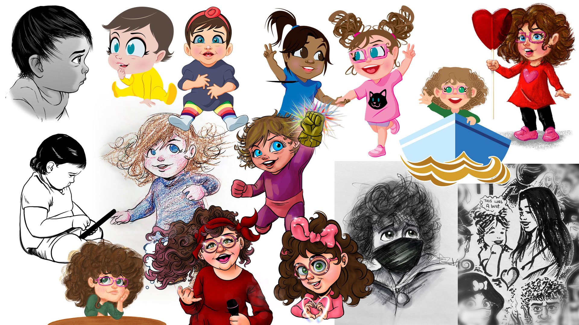
She couldn’t directly contribute to our shared creative endeavors as a baby, but she was still a huge inspiration

Now initially there wasn’t much she could do being a newborn, but that never stopped her from being my newfound muse. Mostly I drew her and it is always a privilege to draw my daughter. It’s very meta to watch my art of her grow with her and that’s something I’ll do for the rest of our lives. I also found fun ways to incorporate her into other mediums.

Also featured are her cousin and mommy!

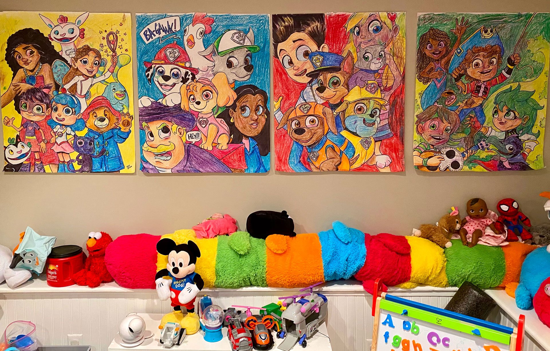
Every kid starts with crayons before their parents introduce—then immediately take away—markers. Of course, these are mediums that we’ll use for years to come. My daughter and I still love drawing giant posters that we hang all over the house. At first there was no rhyme or reason to our drawing. I would casually draw while she would climb all over me and scribble all over the paper, me, the floor, the wall, the television, the cat, and most prominently herself. Nowadays we plan what we will put on our posters (usually characters from whatever she’s currently in to) and then wallpaper the playroom. This isn’t just a fun thing to do, it’s decorative and serves a purpose.

I was convinced we weren’t getting our security deposit back on the apartment we moved from there were so many marks on the walls and floors!

The other fun thing about these giant posters is that they are shared experiences for my wife as well as anyone who comes over to visit. Family always contributes time to coloring these posters and its a great activity anyone can share in.

The real irony is how we no longer really watch any of these particular shows anymore, but we still love having them decorate our playroom

Afterwards, we make something of a big deal when we formally place our poster up on the wall and peruse the place like a museum.

One of our more prominent creative outlets have been our Big Show; a fun little talk show style video series where we chat about any and everything. We’ve even occasionally done a news type segment. This gives her a chance to not only be seen but heard and who doesn’t love watching themselves on TV?

What makes everything we do so much fun is often how new it seems for both of us. Paper maché, construction paper stick puppets, our own newspaper, rock painting, or even just regular playtime. She’s even getting more interested in photography.

Dry erase markers on windows is a lot of fun if you remember to explain only those markers on only the windows

However, what we’re known for throughout our neighborhood is chalk drawing in our driveway (in fact, we even recently created an Instagram account for that we would love for you to follow!). Whether it’s taking suggestions from other kids or making huge holiday murals, I tend to get more carried away than she does. What I have to constantly tell myself is that this is our project, not mine. I may draw the lion share of stuff, but it’s 100% okay for her to contribute or draw over. It’s not messing something up if it’s a collaborative effort she loves as well.

Follow us on Instagram @rosestartsp

I’m also grateful that I’m not the only creative influence she has. We have many variations of talented artists in our family and close circle of friends that expose her to music, dance, writing, acting, and just being silly for the sake of silly.

My wife, dad, brother–in–law, and sister are just a few of the other creative people in my daughter’s life

While drawing will always be my immediate go–to with her, I never want her to feel obligated to follow directly in my footsteps. It’s natural for a creative person to be highly influential in a child’s development, but it’s important they have opportunity to find their own voice, their own style, their own approach. Being creative isn’t limited to, “the arts.” It’s about being able to see things differently so that problem solving is an open–minded pursuit. And if you’re wondering, my daughter adores her school art teacher, insisting, “He’s a way better artist than you, daddy” which I absolutely love. Not just because she doesn’t have an obligation to putting me on such a pedestal, but because she feels comfortable enough to set her own boundaries and even start to appreciate different art forms, styles, and approaches.

Sharing artwork together

My (step) mom always said after she married my dad and became my mom, “There’s no manual” referring to how much of a learning curve there is to being a parent. That continues to make more and more sense the older my daughter gets, but I think there’s something to be said for parental instinct. I started drawing her little pictures for her to find in her lunchbox when she started school before someone my wife and I admire suggested we be careful so as not to make it seem like we were forcing any of our interests onto her, or worse; take attention away from her friends and accidentally redirecting it on to us. Having grown up without my mother often meant I felt I had huge shoes to fill and I didn’t want that burden to be placed on my daughter. After a couple weeks of not placing these drawings in her lunchbox however, she read me the riot act about being disappointed that there were no drawings with her snacks anymore. Now I can draw Louisa from Disney’s Encanto from memory.

Princess Tiana (with a special frog), Luisa from Encanto, a cheese bear-ger, and Bruno also from Encanto

In the end, my personal feeling is that whatever my daughter finds joy in, that is where her passion will lie. Having the creative freedom to find that joy is such a fun and wonderful journey, that it’s beyond developmentally stimulating; it’s foundational too. Please follow me on Instagram and Twitter and follow my blog every Friday!

A little bit silly, a little bit fantasy, a lot of fun, and a healthy helping of “throw a ton of stuff at the wall and see what sticks

Hot Dog 🌭

Do you know what annoys me that I have no good reason for being annoyed by? When I see other artists post things that say, “I’m working on some really big stuff that I can’t talk about right now!” then scamper off into the corner. We get it, you’re a big shot! Who cares?!

So anyway, I’m working on some really big stuff that I can’t talk about right now! That is to say that I (again) have to throw together something way too quickly for my blog this week. As I sat around in my mansion wearing imported silk pajamas whilst sipping vermouth and being fanned with a giant palm branch by my assistant Pippy, I thought about what I could write about. My many instances of drawing Kermit the Frog may have set a dangerous precedent as it was paramount to my thinking this morning when I contemplated how it’s Memorial Day weekend. Traditionally a day to reflect but also a time arrested in the celebration of the start of summer, i.e. barbecues.

It was at that exact moment I realized I draw a lot of hotdogs. They’re not even my favorite food, so why this post? Is it an American delicatessen that needs defending? Perhaps a Freudian cliché? An immature whim to still find the alternative nomenclature “wiener” absolutely hysterical? A sporadic and ill–thought out and last minute idea?

Personal note: Make a blog post about all the memes I’ve ever drawn.

Who cares? It’s a holiday weekend! So enjoy those barbecues, your loved ones, and this ridiculous collection of hot dog art.

Okay, this is ridiculous. You should get an achievement just for clicking this link.

Anthropomorphizing hot dogs is where the real artistic journey begins. Hot dog people are lit.

I’m relatively certain a few people will reach out privately to make sure I’m okay.

When I was trying my hand at writing comics, I thought I had struck gold with Weiner–Man (purposely spelled with “ei” rather than “ie”). He was suave, embroiled in political controversy, yet a kind–hearted soul. Was a star born that fateful day? No. But has he gone on to inspire a cult like following? Again, no. But will he one day make his triumphant return? Most definitely not, no.

The debut of an icon

I can’t even begin to tell you how proud I was with the creation of this character. He was legitimately on my resume and business cards at one point. I’m so ashamed!

Wiener–Man, the all American hero with the rich and mysterious Señior Weñior

And that about closes out this week’s fluff piece. Please follow me on Instagram and Twitter for more exciting hot dog art!

Inspiration: Vintage Graphic Design

I’ve never watched Mad Men, I don’t consider myself an old soul, I love being mindful of the present, and I’m allergic to mold. None of that has stopped me from enjoying one of my true delights and a great source of inspiration, vintage graphic design.

Some of the cool items from my collection.

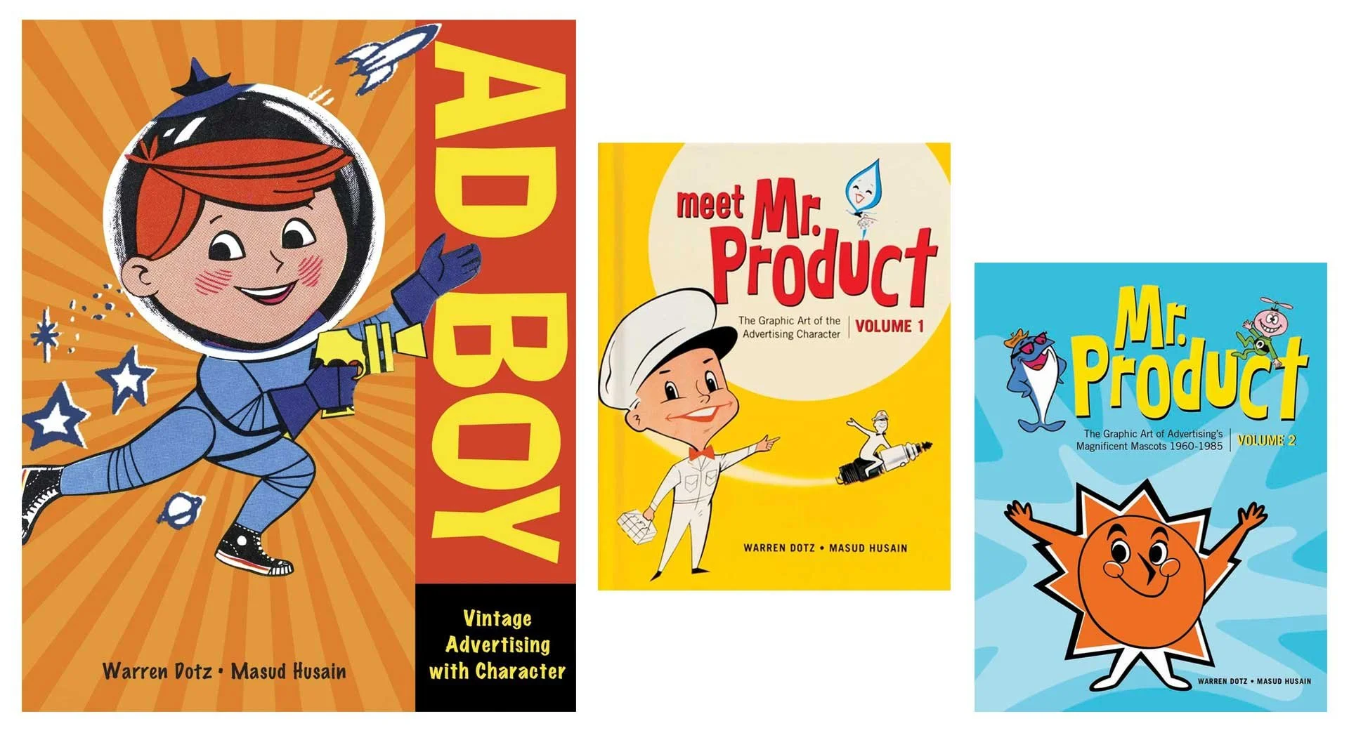
I’ve written about my collection of Muppet memorabilia, and when I was actively coming to the conclusion I wasn’t as interested in collecting that stuff anymore, I moved towards other interests, and my obsessions in vintage advertisements took root. It all started with a book; Ad Boy by Warren Dotz. Others followed from there, but I really got sucked in when I started collecting old magazines and clip art.

Warren Dotz loves vintage graphic design too!

I honed in on things from the 1930s–1960s (and maybe a few from the early 70s) and fell in love with Collier’s, Life, Look, Movie Story, American Artist, The Saturday Evening Post, Classics Illustrated, and Volk Artfile clip art. Whether the illustrations were simple mascots or full spread paintings, I was hooked.

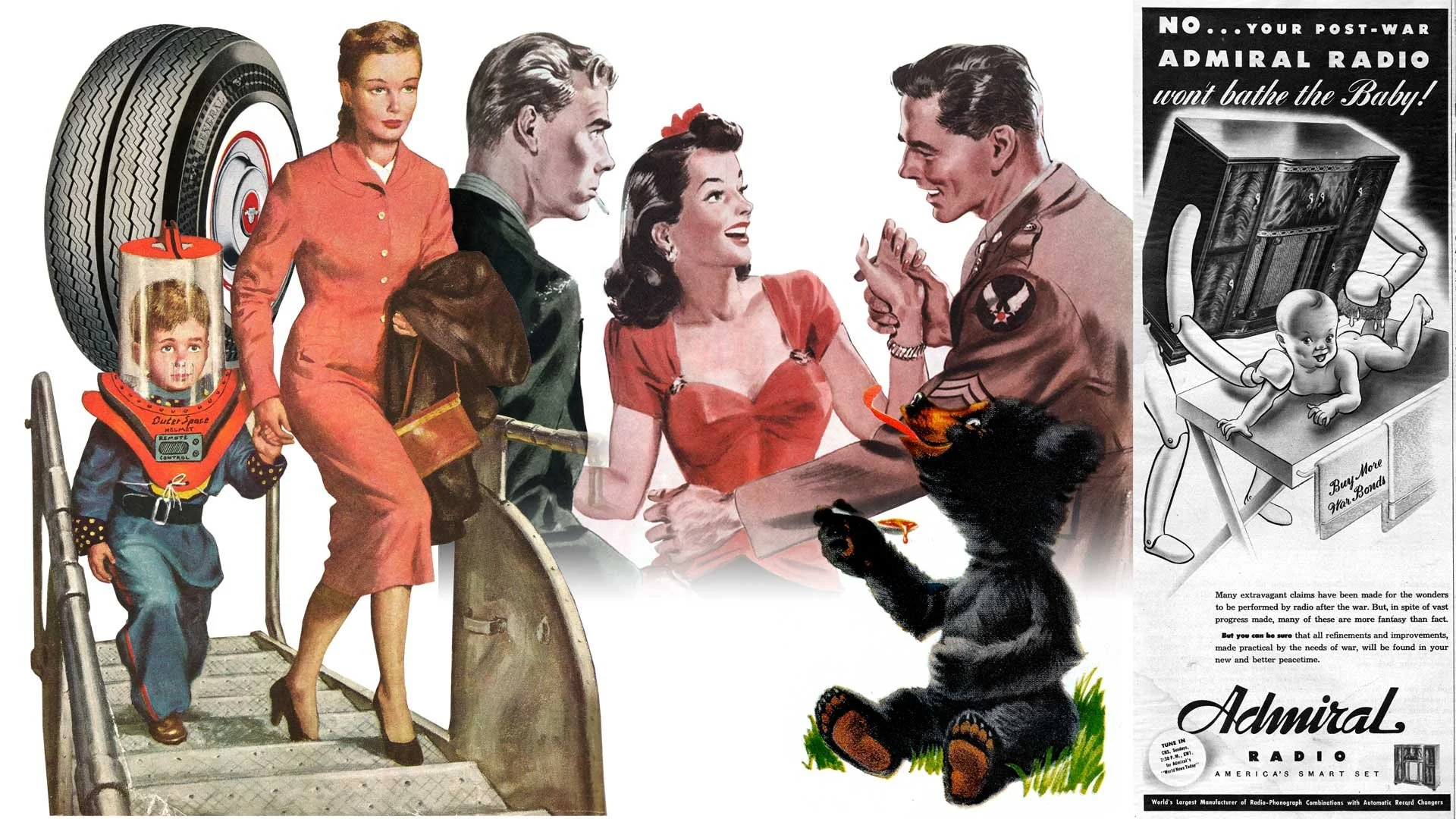
Several fantastic illustrations from throughout the 1950s.

I love masking images (a reversible way to isolate an image or hide part of a picture), and even restoring some of these old ads. Collecting these dusty old publications then is quite literally a layered process (that was a Photoshop pun if you missed it), giving my hobby more validation than just taking up shelf space.

Ads I restored for the Santa Fe Traffic Office (June 23, 1959), Big Yank from Reliance Manufacturing Co. (April 30, 1957), and Barbasol (May 14, 1957) all from various issues of Look Magazine.

I’m not saying these were simpler times. I know my American history. Vintage advertisements do boil down everything to create an aesthetic that presents an idealized life and country. Life was not simpler, but it’s presentation sure was.

All from Collier’s Magazine, April 1944.

More from Collier’s, March & April 1944

It’s not just advertisements but art accompanying headlines and stories too. As you can see, some are fantastical and care free. The style of art captures the atmosphere of the decade and times. I didn’t live in the 40s or 50s (or 60s or even most of the 70s), but looking at all these great pieces transport me there as if I had.

General Dual 90 tires featured in Look Magazine (June 23, 1959), the cover of The Saturday Evening Post (1952), art from the short story Three Day Leave in Colliers (March 1944), Karo Syrup in Look Magazine (June 23, 1959), and a whimsical ad for Admiral Radio in Collier’s (March 1944).

It’s not all cheerful and poppy though. The art and photographs also capture the darkness and troubles of the era as well. Granted it may not always reflect so clear. Many ads and stories are shockingly racist and sexist. I’ve decided not to share those, but to everyone who thinks these were simpler and lighter times, even the public narrative at the time didn’t (always) reflect that. Dramatic paintings project a much stronger emotional reaction.

From the news article Twilight in Germany, Champion Spark Plugs, and Scotch Tape (all from Collier’s March 1944)

Now it wouldn’t be much of an illustrator’s blog about inspiration without a few samples of my own. Anything can be made to look vintage with some paper textures and layer blending, but authenticity feels more parallel to the times when the artwork is pushed to a fun and exaggerated level.

Various illustrations from the last 5 years.

Please follow me on Instagram and Twitter and tune into this blog every Friday for more creative thinking and inspiration!

[Nearly] Every Instance of Kermit the Frog I've Ever Drawn [More Or Less... I Think]

Confession: This week’s blog was supposed to be a tribute to vintage advertising art, but that fell through and I was hard pressed to scrape through my ideas list which had little to nothing I could just slap together. The problem then became, “What the heck do I write about?!” The answer came when I realized this past week was Kermit the Frog’s 67th birthday. Not exactly a milestone year, but then @StarmansArt Tweeted this incredibly sweet shout–out.

Thanks, Richard!

I am a huge Muppet fan, and Kermit is my personal patron saint of sanity and my true north example when it comes to good leadership. Plus, I get a significant and disproportionate amount of likes when I post Muppet stuff so I thought I’d try and see how much Kermit the Frog art I’ve done that I can find. Let’s do this!

Now I drew Kermit a lot as a child, like a lot. Unfortunately I can’t seem to find anything before the 90s, so we’re starting there. Kermit appeared more in tribute rather than in focal portraiture back then because you didn’t get a lot of girls phone numbers like that. Lesson learned though: everybody digs the frog.

Top left: Kermit (and Robin—not that Robin) drawn with a mouse in Microsoft Paint, circa 1995. Bottom left: My Commercial Art semester final illustration in graphite, 1996. Right: Kermit makes a cameo in front of Wayne & Garth whilst I pretend to take notes in Community College, 1997.

2000–2008

Oofa, okay, please understand that every illustrator likes to experiment, especially when they are learning Photoshop for the first time and fresh from graduating. I was an avid member on the Muppet Central forums way back in the early aughts and was anxious to share some fan art. I was having a bit of an identity crisis as a Muppet fan and wanted to stand out so I drew a lot of weird shit. I’m sorry to curse, but you can see for yourself, even I didn’t know what I was trying to pull off.

I was huge into Anime and wanted to desperately mash that with the Muppets. The kawaii Kermit front and center was the pinnacle of those efforts. I was so darn proud of him (I still am now that I think of it). It was the halcyon days of online interactivity, Photoshop held no serious or practical value, and i can has cheezburger was a staple of daily life.

Keeping with the Anime vibe, I pushed hard on this idea. 2008

2009–2012

Commissioned work from Joe’s wife, Sarah.

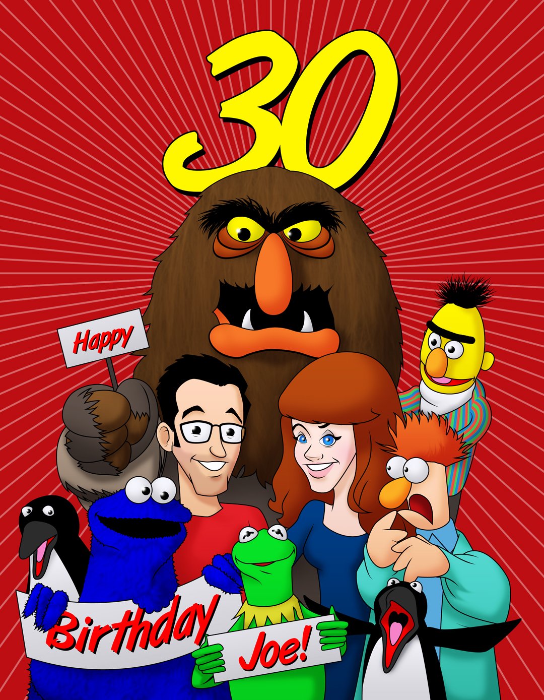
It was around this time I actually started to try and learn how to properly use the tools I had at my disposal to create art that was actually, you know; good. Adobe Illustrator was fast becoming a tool that I relied on heavily, but it also was a time that I got to know a very amazing human being by the name of Joe Hennes; Co–owner and editor at ToughPigs.com. Joe was instrumental in not only getting me online exposure (something I am eternally grateful for and remind him of regularly) but also to actually draw, you know; good.

Despite being over a decade old, The Immaculate Jim, 2010 remains one of my favorite pieces of fan art I’ve ever done.

In 2012, my wife and I went on a cruise. She said to me, “I want this vacation to be really romantic!” so I drew several cards that I gave to her each night. This was one of them (and my favorite). See? Ladies totally dig the frog.

The Muppet Madness Tournament kicked off in 2010 and it was a huge collaborative effort between myself, Joe Hennes, Ryan Roe, Steve Swanson, and Ryan Dosier. It also got decent press online, so understanding my work would be seen by a ton of people, I brought my A game to the table.

It was during this time I started using the full capacity of the Adobe Creative Suite to push my illustrative work further. Kermit was the natural guinea pig to test different techniques on.

Some of the attention the tournament got.

2013–2014

It was during this point in time that I was starting to get noticed. I don’t mean popular because that still hasn’t happened. I mean that actual Muppet people and Muppet adjacent people would make my acquaintance. It was an exciting time, and I was fully immersed in the fandom as I never had been before. The Muppets—I mean the actual people involved with the Muppets—started to know who I was, and I was getting opportunities to know them too.

Transitioning back to working almost exclusively in Illustrator again, I began keeping a consistent color palette for all the Muppets.

I always had a full bin of ideas, but many of them never made it to fruition. One day I plan to finish a tribute to Dan Jurgens Superman the Man of Steel # 37 (DC, 1994) Zero Hour comic cover.

One hundred thousand years ago in 2013, there was a very brief moment in time where an app called Draw Something rivaled the popularity of even Wordle today. I used every opportunity I had to draw the Muppets.

2015

In 2015, I began to steer more towards drawing Kermit my own way rather than on model. Now that didn’t necessarily set a precedent from there on out, but it marked a moment where I considered my fandom and my relationship with it completely my own. In many ways, I had arrived… Exactly where? I can’t say but it smelled a lot nicer and people stopped trying to trip me when I went to the mall.

At this point, I was also creating all Muppet art with the express purpose of showcasing it on ToughPigs.

The most exciting thing about 2015 was being commissioned by Bill Barretta to create individual pieces as gifts for the cast of The Muppets ABC television series. I’ve never ever shared any of those pieces until now. This was done for Steve Whitmire.

2016–2018

At this point I learned that drawing Kermit was becoming gratuitous. I knew if I posted an illustration of him, I’d get attention, so admittedly I was throwing stuff at the wall just to see what would stick.

The bottom right illustration was a thank you gift to Mike Quinn, the performer of Nien Nunb from Star Wars and Kermit’s regular “right hander.”

2019–Present

When I draw Kermit nowadays, it’s usually a therapeutic exercise. Drawing him off model or otherworldly is the next evolutionary step most of the time. My friend and fellow Muppet cupcake enthusiast Zach Woliner commissioned me to do a bunch of Kermits as various pop culture movie iterations for his KermDubs YouTube channel.

Muptober eventually replaced Inktober for me.

If this makes you uncomfortable, then I accomplished what I was setting out to do!

So that’s every Kermit I’ve drawn… that I could find… and “slap together a blog post” that effectively took 12 hours to create. If you want to see more illustrations of Kermit, please follow me on Instagram and Twitter and stay tuned to this blog!

You can’t get a better model than this. 2016

Also, a big thank you to Richard for inspiring this post and being so kind. I’m more than twice his age and I’d wager he’s already drawn Kermit more than I have!

Artist Games Featuring Noah Ginex

Two weeks ago, Will Carroll and I played a game together where we would take a pass at a drawing, back and forth adding to it until it was so crammed with stuff we decided to share it with you. This time around I’m playing again with Noah Ginex! Before we get into any of that, first let’s talk about Noah.

Some of Noah’s characters.

Aside from being a super talented artist (who is also a fellow Muppet Mural alumni), Noah is an award winning puppet builder who has an exceptional sense of humor and is wonderfully and wildly creative. I was very excited to play this game with Noah because he really knows how to look at things from a very different and even unconventional angle. He has also played this type of game with his daughter so this was not his first rodeo. For everyone else who may have missed the first time I played with Will, here’s how this works:

The Rules

One artist draws something rather fleshed out then passes it on to the other. There are no time limits or space restrictions. Either artist can draw as much or as little as they want before passing it on. One artist can add to or obscure the previous work as much as they like as long as they don’t manipulate it (within reason).

The Game

Whenever I play this with an artist, I give them the option of using a full color render of the illustration I did or just the line art. I drew a white gloved cartoon hand holding a phone receiver. Noah chose to stick with the line art.

“It’s for you.”

Noah Ginex: I didnt know what to expect at first. Honestly the first volley was a lot more fully realized than I was expecting, but that just meant i could bite off a bigger chunk myself. I responded with traditional pen and ink the first time, because I didn’t have my Cintiq with me. Which I think directed the piece more to traditional black and white.

Noah’s first pass.

Just as when Will first responded, I was so excited to see that Noah had taken this in a direction I never could have anticipated. For starters, I was excited we were staying black & white, but anthropomorphizing the handset was super cool. My high school nostalgia sparked me to channel my inner Sam Keith and go really off the rails. I also took the opportunity to refine my previous line art to pop more now that the black & white direction had been set.

This weird Radio Shack rabbit then headed back to Noah.

Noah: I see faces everywhere, so it was nice when Dave responded with even more opportunities to add little details. I especially loved the phone cord turning into curly ringlets.

I don’t know what exactly this thing does, but I’m skeptical of its warranty.

Aside from minimal cleanup on my previous passes, I didn’t want to do anything else to the main art. Truth be told, I was completely lost on what I had done and what Noah had done. This fusion that normally marries two different styles together whilst retaining each artists unique styles was somehow obliterated. Noah and I had achieved a very comfortable simpatico… thing and I loved it. Still channeling those Sam Keith vibes I felt before, I opted to add a splash of red and cover it in chaotic text so it looked like a splash page right out of The Maxx.

The final collaboration.

Noah: I think the final piece ended up looking very Ralph Steadman-y, which is fine by me, so I signed it with a Steadman-esque version of my artist stamp. I'm really happy with how it turned out. I think it's perfect.

Again, this was so much fun. I actually am sad when I finish these games because it’s liberating, exciting, and so creatively satisfying. If I were a braver man, I’d consider this for a tattoo!

Thank you to Noah for being a part of this week’s post! Check out all his art by following him on Instagram @artbyNoahginex and his website too: noahginex.com

You can also follow me on Instagram and Twitter and tune in every Friday right here for more creative thinking!

Dave's Muppet Collection 2.0

Unless you’re completely unfamiliar with me or my work (in which case, welcome to my blog and thank you so much for visiting!), I’m a huge Muppet fan. Well, that’s not exactly accurate, I’m a fan of Jim Henson, easily the most influential person to me as a creative professional and dreamer. That being said, I think “Muppet fan” is an acceptable blanket term for me and all my fellow fans, so we don’t take offense. Naturally, as a fan of anything, a collection of merchandise and memorabilia is one of the more defining traits every enthusiast of some form or another has.

Me and all around amazing human Ryan Dosier at The Museum of the Moving Image in Queens, NY for a tribute to Muppet Performer Jerry Nelson, October 27, 2012

Ten years ago (oh my God, TEN years ago?!) I made a nifty little video of my complete collection of Muppet things for my friend Ryan Dosier; then the founder and owner of The Muppet Mindset. I thought I’d cringe at it (more) today, but I’m still pretty proud of that video. It’s moot however, as I have almost none of it in my possession anymore. That’s not to say I don’t have any Muppet collectibles today, in fact I’d argue what I do have is more valuable, even if that value is more personal and sentimental.

Jerome Green, Lisa Bober, and I visit Puppet Kitchen’s Monitor Night with Paul McGinnis. A great time and experience with so many other fans! Photo by Michael Schupbach. December 6, 2016

First let me address what I don’t have and why. I’m willing to bet that most collectors tend to get pigeonholed by their friends and family in regards to their fandom. Not that loved ones define you by your specific likes—even if they are a domineering factor in life—but come birthdays and gift–giving holidays, things from said fandom are very easy go–to’s in that regard. In my aforementioned Muppet collection video, I’d guess that 60–80% of my collection from that time were given to me by very sweet and good intentioned people who love me. I’m very grateful for those things too, and they increased the size of my collection tremendously. The problem is displaying anything—especially a lot of things—can be difficult and impractical. The Muppets in particular are a brand that have had difficulty finding their footing over the last twenty years, so merchandise can be execrable or subpar at best. Yes, that paltry painted, bendable Gonzo dressed in an exercise unitard was very thoughtful, but my limited shelf space isn’t exactly where it should go. I want people to admire my collection, not turn my wall into a bargain basement curio shop. So most of that late 90s/early 21st century stuff (the bulk of my collection) went on eBay or to the Thrift Store. Thanks, I hate it!

J.C. Penniey in 1976. Photo from Birmingham’s Century Plaza

J.C. Penney at Monmouth Mall. Photo from Wikipedia Commons

One of the more prominent pieces I had were the Sesame Street mannequins formerly on display in J.C. Pennies back in the 70s and 80s. So a quick recap here as well; I was hired to work in the art department at the J.C. Pennies at Monmouth Mall in Eatontown, New Jersey back in the mid 90s. Early on we had to clean out the old display storage area which had these life size Sesame characters of Bert, Ernie, Cookie Monster, and Big Bird (Big Bird being smaller than life size as he was only moderately taller than the other three). I took them all home with me (they were destined for the trash!) which was quite the sight as heads and limbs stuck way out the windows and trunk of my car. Cookie Monster and Big Bird were almost immediately damaged from a water leak in my parent’s basement but Bert & Ernie were fine. I even began to restore them, but it became clear very quickly that this was a skill that needed to be left to a professional. They then went up in my parents attic where they waited patiently for 18 years. My parent’s house is (to this day) possessed by water demons, and moisture damage ruined pretty much everything in their attic also, including the iconic duo.

We had fun placing the old pals all over my parent’s house on Memorial Day weekend back in 2010 before they headed back up into the attic

I was heartbroken. My goal was to eventually put them on display at Christmastime for everyone to see, but now I felt like I was also being a really bad fan having let two more very rare treasures succumb to irreparable damage. I reached out to a professional to see if they even could be repaired, but not only would it be costly, the black mold that had developed inside their heads just wouldn’t be worth the trouble. I think about them often as now I finally own a home and think how neat it would be for my daughter and the rest of my neighborhood (which is flush with kids) to see and enjoy something so special from over 40 years ago.

Five years later cleaning out our parent’s attic, my siblings and I discovered extensive moisture damage, July 2015

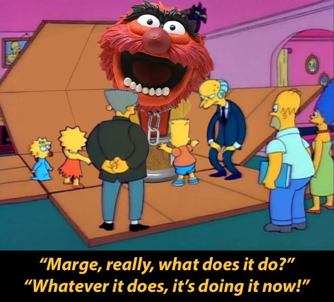
The stuff I kept are all things deemed high quality merchandise. My Palisades figures, books and toys from the 70s and 80s, and a few plush Kermits as well will be cherished forever. I’ve even added to that with vintage stuff from online auctions and good finds elsewhere. I still have my prized possession, my original Fisher Price Kermit the Frog doll that I’ve owned since childhood, but I also found one still in the box that I got at San Diego Comic Con! Talk about precious! Occasionally I’ll pick up something smaller and kitschy but that’s exceptionally rare. The last big Muppet item I bought was ironically the nail in the coffin for collecting physical merchandise for me. The Diamond Select bust of Animal is gorgeous and looks so great on my office bookcase, but it was also expensive, and as soon as I opened it up, I realized getting it was more exciting than having it.

Getting a pristine Fisher Price Kermit at San Diego Comic Con, July 23, 2014

It’s cool, but that’s about it

It was at that moment I fully realized what I had been partially aware of for a few years: experiences are more valuable collectibles than material ones. Getting to be on set with and even commissioned by Muppet performers and production & crew members is way more satisfying and special. Now this could be a 21st century mindset in a day and age where we take pictures of everything for proof of the moment, but while there’s definitely credence to that, I think it’s a little more nuanced. The memories I have of my Muppet experiences are far more special because the photos just can’t encompass everything. For starters, they’re shared experiences. The people I was with make them memorable. Whether it was goofing off on the subway on the way to someplace or dinner afterwards; the full day from start to finish is precious. I don’t want to be pretentious here, and all of those experiences are not just dreams–come–true but also personal. That’s why I’m not littering this post with tons of pictures of me and Muppets. They are mine and they are so special.

On set with my best friends, Hollywood, CA, February 4, 2016

Heading to a puppetry class by Muppet performer Marty Robinson with new found friends, September 20, 2014. Photo by Mike Slawinski Jr.

It’s not just direct Muppet and Henson interactions either, but especially fan occasions that are really fulfilling. The Great Muppet Mural alone is a perfect example of this. Not only is my physical print arguably the nicest collectible I have, but getting to know and work with so many other fans was the penultimate venture. The Museum of The Moving Image in Queens is sort of a Muppet Fan Mecca where I’ve been able to spend so much time with so many incredible people. Yes, it’s always a chance to meet your heroes, but it’s the shared moments with people just as fanatic as you that really make those instances unforgettable.

Inside the Museum of The Moving Image for A Tribute to Jerry Nelson, October 27, 2012

Hanging with Austin Michael Costello (and Artie) at The Museum of the Moving Image for Brian Jay Jones’ biography on Jim Henson. October 1, 2013

All that being said, there’s one special anecdote I will share because the total experience is a sweet story. Back in 2013, Gene Barretta took me and my future brother–in–law to the set of Sesame Street for his son’s birthday. Again, truly an epic day that I have tons of pictures and video of but I’m not going to flaunt them. All I will say is that Gene gave me an adventure I am truly grateful for. Before we left, performer Ryan Dillon rushed over handing me one of Big Bird’s feathers that had fallen off (this happens a lot apparently) that he picked from the set floor. Wow, what a treasure! I held on to it tight and was relieved to have a place for it when we stopped at Midtown Comics on the way back home (another high note adding to the personal nature of the day) and placed it in the brown paper bag with the comics I bought.

With Gene Barretta, his son Ben, and Jerome Green just outside of Midtown Comics after a great day. December 4, 2013

The whole day was crammed with truly humongous moments so I was exhausted when I got home and crashed. The next day I was rushing around, straightening up our apartment and still riding on cloud nine. Just a few days later, I decided I wanted to find a way to display my Big Bird feather… now where did I put it? I looked everywhere and started to panic. Did it fall behind my dresser? Did a rogue breeze from an open window blow it away? Had a cat burglar stole it away in the night as I slept? I tried to think back. I had shown it repeatedly to my wife and everyone else that came by and then… then what? I would put it back in the brown paper bag with the comics. Yes! It’s still in the brown paper bag with my comics! Only my comics had since been removed and put in a long box and the bag, the bag had been thrown away! That was days ago! I ran out to our dumpster tearing open garbage bags furiously but that was futile because the waste management company had already emptied it. My Big Bird feather, the physical totem of that wonderful day was now lost and gone forever. Man was I crushed.

Over a year later for my birthday, my wife surprised me with a very special gift. She had pulled some strings and managed to get a hold of a brand new authentic Big Bird feather! The source confirmed it was just like the previous one—felled from a day of shooting and plucked from the floor of the set. The whole point of this being that the story of how I got the feather is just as remarkable to me as the feather itself. That’s not something a manufacturer can create in resin from a mold or sell on Amazon. True, there are still some collectibles I’m gunning for, but the potential for making more and new memories have been opened wide, and as a result, I just don’t think a Fozzie PEZ dispenser will hold up anymore.

My Big Bird feather and 4’ wide print of The Great Muppet Mural in my home office

So as cheesy as it sounds, it’s being able to exist in the world with the Muppets and other fans rather than collect whatever the Disney store deems marketable. And if I’m being really honest, I think I’ve always known that was the case. When I was a kid, my Muppet fandom was practically what defined me. In the late 90s, early 2000s when the internet became a more community driven vehicle, I was initially upset to learn that not only were there so many more Muppet fans, but that a lot of them rivaled my own fandom and I had a temporary identity crisis! Thanks in part to that breech, my fandom has been brought to a new level and my fellow fans and the niche corner we all exist in has not only introduced me to some really amazing people, but I’ve also formed genuine close friendships and been able to do actual work for the frog and some of his associates!

Hanging with Tough Pigs Ryan Roe & Joe Hennes and Unboxing cool stuff at the Jim Henson Company in Queens NY, with Karen Falk and Cheryl Henson. March 13, 2015.

I have a lot more Muppet stories that I’ll share in the future, so make sure you follow me on Instagram and Twitter and stay tuned to this blog!

Artist Games Featuring Will Carroll

My nibling, niece, and I. November 21, 2010.

As I’ve noted before, kids are a fantastic and fun resource when it comes to stretching those creative muscles, especially when you have a mental block of some kind. When they were little, my nibling, niece, and I would play a really fun game. I would draw something—something incomplete—and then they would add to it. Sometimes we would have time limits, sometimes we would draw until we felt our part was over, but ultimately we would just keep passing the art on to the next of us until there was no room left to draw or we were in stitches laughing too hard to do anything else. This game was a huge influence creatively for all of us and no doubt helped shaped how each of us saw the world around us and was also a great exercise in true collaboration.

That was a game we played for years and years, and now my daughter and I also continue on the tradition as well. Ever since I first had the idea to do this with my family well over a decade ago, I always wondered what it might be like to try it with another artist; someone with experience, style, and imagination. Flash forward to present day coupled with the constant search for blog topics and voila! It’s here that I want to shine a light on this week’s featured artist, Will Carroll.

One of the great joys of working on The Great Muppet Mural for ToughPigs was getting to know so many artists I hadn’t known before. Will Carroll was one of the big stand–outs for me, so I had been looking for an opportunity to do something else with him. Will has a really fun, retro style. As a graduate from the Art Institute of Philadelphia with a degree in animation, his work is instantly recognizable and oozes charm. He’s fast, talented, and he took to this game like a fish in water. So what exactly is the game?

The Rules

Unlike the more simplified and quicker version I played with my nibling & niece, one artist draws something rather fleshed out then passes it on to the other. There are no time limits or space restrictions. Either artist can draw as much or as little as they want before passing it on. One artist can add to or obscure the previous work as much as they like as long as they don’t manipulate it (within reason). That’s about it! So I’ll start things off.

Just broccoli on a fork, but the fork is gold so that counts for something, right?

The Game

When I play this with kids, I’ll draw an eye or a blank head and then the features get added as the illustration gets passed around. With Will, I had more time and freedom. I didn’t want to explode out the gate though and I have grown familiar with his work and was confident he’d take the reins in a wild new direction. So I started out pretty tame and bland, and you can’t get more bland than broccoli on a fork. There’s not much going on here, nor is there much to work with.

Will Carroll: Looking at the picture for the first time made me think back to an old drawing I did about two years ago, which had a little Doozer looking farmer holding a fork with a grape on it like he was holding a pitchfork, and that also made me remember sketches of a character doodle I’ve been meaning to use, so I decided to use it for this project.

Will’s previous designs for his Farmer character.

I always loved seeing tiny little creatures interacting with normal sized objects and adapting them to help them in life, characters like The Smurfs, The Borrowers and most recently The Tiny Chef comes to mind. So I decided to go down that angle and made them a farmer, who harvested “huge” vegetables.

Will’s first pass.

I knew whatever Will sent was going to be cool, but I was super excited when I saw the direction he took it with the little farmer. The fact that he came up with this was more than I had hoped for. I was tempted to stop right here because it was just so clever, but I thought I’d expand on the tiny size idea and place the group in a real world area, so I drew a woman discovering them. At first the “discoverer” was going to be another other–worldly creature but I felt keeping it grounded would be a better fit. Initially I was also going to draw the interior of a refrigerator, but I wanted to savor the creativity of the exercise and held off. I also muted the line art and color of the woman so the focus stayed on the original pass.

Initial sketches and 100% opacity art work.

My second pass back to Will.

Will Carroll: Decided to add more fully into the camp of “little people, BIG WORLD” angle, including making the blank space around the woman, the inside of a kitchen pantry, and adding a hungry cat behind her, a reference to Azrael from The Smurfs. In addition to the pantry, I also added more little guy farmers, the one in the wall’s design I based on the old cartoon character Farmer Alfalfa.

Will’s second pass back to me.

I was thrilled Will took it upon himself to take on the background art and the pantry was much more preferable to my initial idea of a fridge/freezer. It was at this point I channeled my inner Jamie Carroll (no relation to Will) and went full on overboard. I added a couple extra characters of my own and the bottle of fish oil pills just to complete the pantry aesthetic. I thought I’d go over–the–top with creating a magical lighting system with the idea that this pantry is so infrequently used in the “real world” that the tiny farmers just installed all sorts of accoutrements with complete disregard towards their human landlords. It was at this point that Will and I agreed we were done.

The final image!

Will and I both genuinely had so much fun doing this, noting how much it really got our creative juices flowing and were really happy with how it turned out. We’re looking forward to trying this again in the future! Huge thanks to Will Carroll for having fun with me! Make sure you follow him on Twitter @elaboratesunma1, Instagram @toonheads0215, and Facebook, and check out his website too!

Of course I’d love it if you followed me on Instagram and Twitter too! And tune in every Friday here for a new blog post!

Time Lapse Art And The 3 Ways I Use To Create It

One of the more popular things I post besides Muppet fan art are time lapse illustrations of my work. Time lapse art do two things for me: provide additional content and show my process (the latter being arguably more important). That being said, there are three different ways that I create said time lapse videos, so this week I thought I’d share my actual process as well as some examples.

Various ways to traditionally capture footage for time lapse art. Spoiler: None of these work great.

The first is the most basic. All things start with a sketch, and while I tend to work exclusively digitally, I still lean towards the traditional when it comes to sketching. The following Cookie Monster drawing is an overhead shot of me drawing the blue monster with traditional mediums like colored pencils and a Bimoji ink brush pen. I love watching other artists in real time create art like this (Kim Jung Gi is, in my opinion, the master at this). The problem with this is set up. I’ve talked to so many artists about how they manage to float a camera over their work space without it being too intrusive. Yes, I know there are devices available to purchase but they’re either too cheap and unreliable or way over priced. As you can see, I’ve rigged up several different things to try and make do but I like to draw close to my pad and that can create problems as well.

The second setup is easier and sticks to using only my computer. I’ve actually been asked how to do this a few times and it’s very easy. If you use a Mac, just open QuickTime and you can do a screen recording! This is a great way to capture everything you do in real time and when it comes to programs like Adobe Illustrator, it can really show off how to use the various tools and brushes.

Now the problem with the first two types of recording time lapse art is it records in real time. You can use the time–lapse camera feature if you have an iPhone, but you’ll probably still need to play around with timing, so both of those videos require a bit more editing when it comes to putting out your final product. Procreate is a very popular digital painting program for the iPad and it automatically records your process for you. The big leg up here is it only records when your stylus (Apple Pencil) is actively drawing. In other words, if you stop and take a phone call or take a break, unlike set ups for my previous videos, the recording stops. There have been more than a few times I have had to either cut out giant chunks of down time or stop and restart my other time lapse recordings, but Procreate only records when you’re actually actively working. The double edged sword is that Procreate records everything at full constant size, so there’s no inclination I’m zoomed way in or out. Is it a pro or a con? Who knows.

I edit everything in Adobe Premiere for a few reasons. Number one, I know how to use Premiere and as an old man I fear editing using Instagram. Two, I like to try and keep time lapse videos to one minute nowadays so Instagram and Twitter don’t have a fit. I also like to use royalty free music so there’s no copyright infringements.

This was a light fun post this week so I hope you enjoyed a break in reading. As always, please follow me on Instagram and Twitter and check back here every Friday for a new blog post!

The Inside Scoop On Figure Drawing and Why You Should Do It

There are two moments in my adult life that changed how I draw and made me a better artist. The first was listening to an interview with comic book legend Jim Lee on Kevin Smith’s podcast Fatman on Batman. Mr. Lee talked about finishing school then drawing every single day like he had a job in comics (before he actually did) with tight deadlines. The purpose was to develop muscle memory so that even if he was having an “off day,” it wouldn’t impede his work. I had never thought of drawing in that context before and set out to do the same. 

The Kubert School in Dover, NJ

The next thing was a progressive journey that ultimately lead to figure drawing. Long story short, I wanted to enroll in the Joe Kubert School of Cartoon and Graphic Art. At the time, my dad felt a smarter decision was to apply my talents to graphic design—a decision that ultimately proved to be the right one—but one that I continued to question for years after I graduated. Eventually, I stopped internally blaming my parents for not letting me attend a comic book school and just decided to go on my own. The punchline to this quick aside is that the school I went to catastrophically crashed and burned and shut down while the newly renamed Kubert School still stands proudly. 

It was here that I met the accomplished Mike Barreiro, an extraordinary artist and my instructor for Life Drawing 101. Mike is a student from both the Art Institute of Pittsburgh and the aforementioned Kubert School where he would eventually end up teaching for five years. Mike has worked for DC, DC Vertigo, Marvel, Dark Horse, Defiant, and TecknoComix as well as an extensive freelance career in the Pittsburgh area. However, before I get to him in more detail, I want to sing my own personal praises about the lessons he taught me.

Some of Mike’s tremendous work including Sophia Loren, Tom Horn & Geronimo, and Endelyn Moongrave.

At multiple points in an artists life, they will create something that marks a step up in their personal journey into the craft. They may even feel that point hits their apex of ability (and years later they will often marvel at their ignorance towards that moment). Figure drawing (or Life Drawing as it’s also sometimes called) brought my own artistic abilities to a level I didn’t think was possible. It forces a creative person to be practical and a pragmatist to be open to a literal different perspective. To some, the idea of drawing a nude model for hours sounds taboo. I love teasing my mother all the time about this too.

Me and my mom, my biggest cheerleader.

But as I’ve done in the past, I wanted to be a lot more diplomatic about this and get some other artists perspectives on this as well. The main voice of course being an actual instructor, and my former teacher, Mike. I asked Mike what most modern day people might wonder, “Why take a figure drawing class when I can just Google ‘models posing’?” Mike responded;

Photos have a tendency to flatten an image. When you're drawing people it's important to emphasize the curvature of a figure. The second thing is you’re at the mercy of the photographer. If it's lighted poorly or out of focus you have to compensate for that in the drawing. Having a live model that you can pose and light the way you want to makes a huge difference in the quality of the finished drawing.

My own personal taste for a model over a photo is also the ability to move my easel and draw from a completely different angle. Few artists like having to do foreshortening, but it’s a great skill to learn. With figure drawing, you also want to draw different models and different poses. Sure, a beach–bodied super model seems ideal, but beauty doesn’t make a perfect model. So what does? Mike explains;

A good professional model will be able to hold a difficult pose for a short amount of time, can be very helpful by suggesting poses, and will let you know when they need to take a break. Dynamic posing is a very difficult job. Being in good condition is important.

Holding still is a super power in my opinion when it comes to having a good model. Again though, a “good” model doesn’t necessarily mean a chiselled god or goddess. As I continued to take classes, I began to crave variety. Not every model is going to appear in a high–end advertisement, but is there a benefit to drawing those different body types? Mike goes on to say;

Sure, it really depends on what you're using the drawing for. I'm usually looking for the unusual, something that's difficult to do out of your head, but all drawing is beneficial. Many illustrations have attractive people in them. If you're doing a slice of life illo (illustration) then different body shapes are important.

Pink Floyd, Marie Devereaux, and Yaphet Kotto by Mike Barreiro

Now here’s where art verses artist can really get combative. In a very condensed nutshell, my first artistic influence was Garfield by Jim Davis, and so all of my portraits resembled the bastard offspring of Jon Arbuckle and then in 2013, I was confronted with drawing actual human beings as they appeared directly in front of me. Drawing what you see as opposed to how your personal style interprets the subject. I initially found that daunting. That got me thinking about artists with very unique styles and their approach to figure drawing. That’s when I turned to C.W. Roederer—an exceptionally talented illustrator and designer—who also found figure drawing to bring a whole new level of ability to his craft. I asked him if it’s a struggle to move beyond his stylistic ways to draw more realistically? He replies,

I still struggle a lot with “this just looks like Muppets” or “this is just what every illustrator does” (specifically the whole “normally-drawn human but they have Peanuts eyes” thing). One of the best pieces of advice I got from my figure drawing instructor was NOT to just copy exactly what I see, but rather, take what I learned in that class, and mesh it with the more caricature/cartoon background I come from. I’d say good illustrative style comes from just looking at life and reshaping it with your own mental geometry.

Mike and C.W. both provide great insights into their respective approaches, but what about someone who’s never taken a traditional figure drawing class? That’s when I turned to my friend Maria Chamra. Maria is an incredible self–trained artist who teaches “Paint & Sip” classes, has had her work featured in several galleries including the Pollak Theater at Monmouth University, and has done tons of unique freelance around Jersey. I had done an alternative drawing event with Maria in the form of Dr. Sketchy’s in Asbury Park back in 2019. It was an unconventional approach to gesture drawing, but it was a total blast. I had been bugging Maria to take a figure drawing class with me ever since and finally convinced her just last week to come along to the duCret School of Art. She talks about her experience;

I loved how different it was from my previous figure drawing classes. Professional and almost relaxing. Everyone was in their own little world. It was wonderful to put some time aside to refine my skills, focus on shapes, and becoming quicker and sharper at laying down the subject. I struggle with getting caught up in details. I made a point to use the quick one minute poses as an exercise to throw all the shapes down first and then go back in and refine the details. I felt more comfortable as the session went on.

So there you have it, high praise and an all around consensus that figure drawing is a game changer when it comes to “upping your game.” Nothing more needs to be said about… oh, right; the elephant in the room.

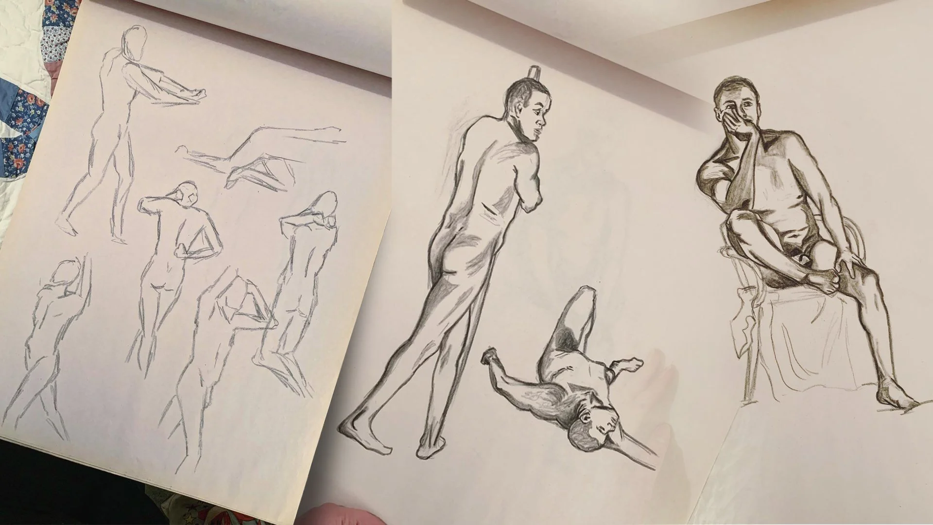
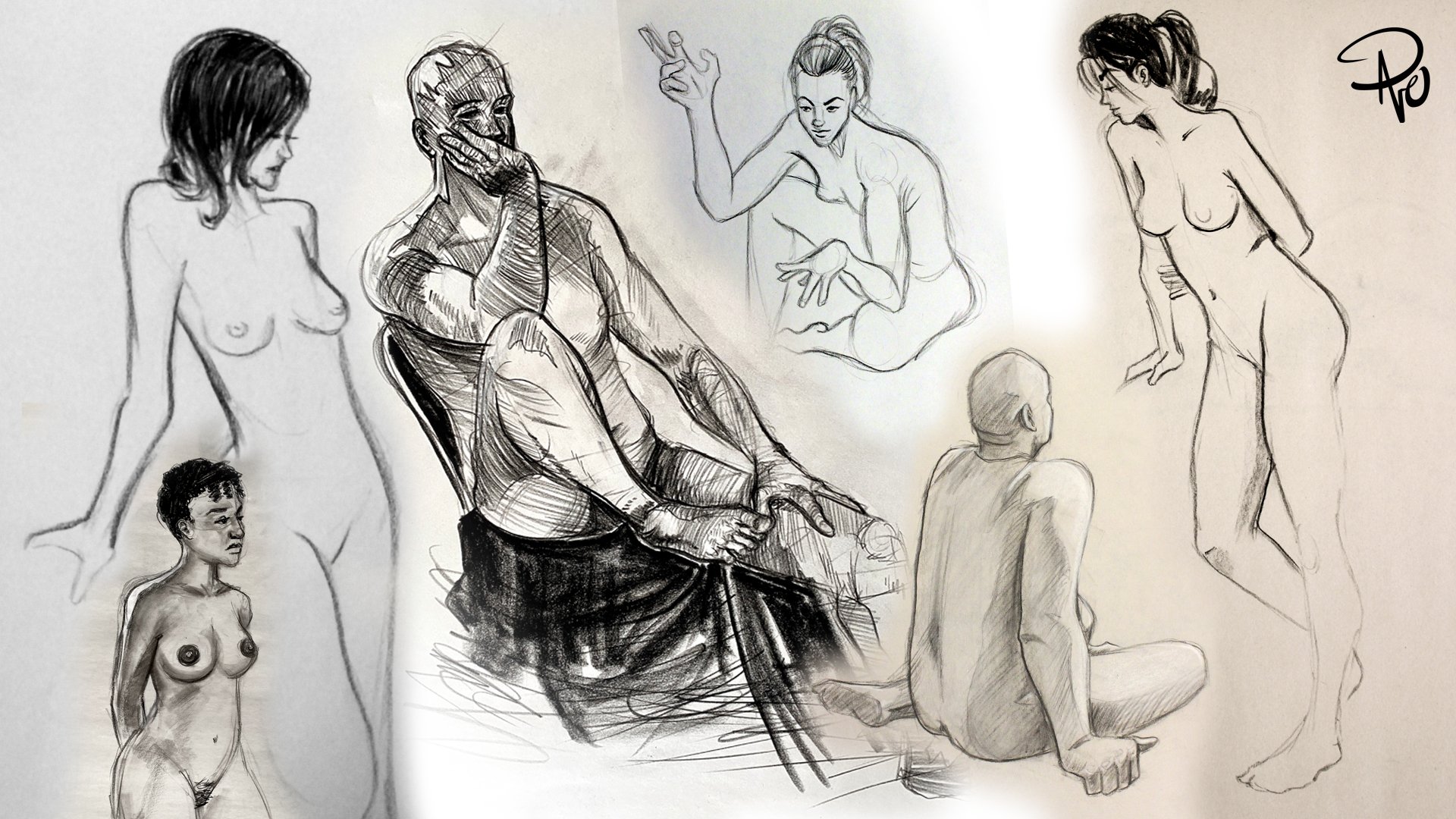
Some of my own charcoal drawings from various figure drawing classes over the years.

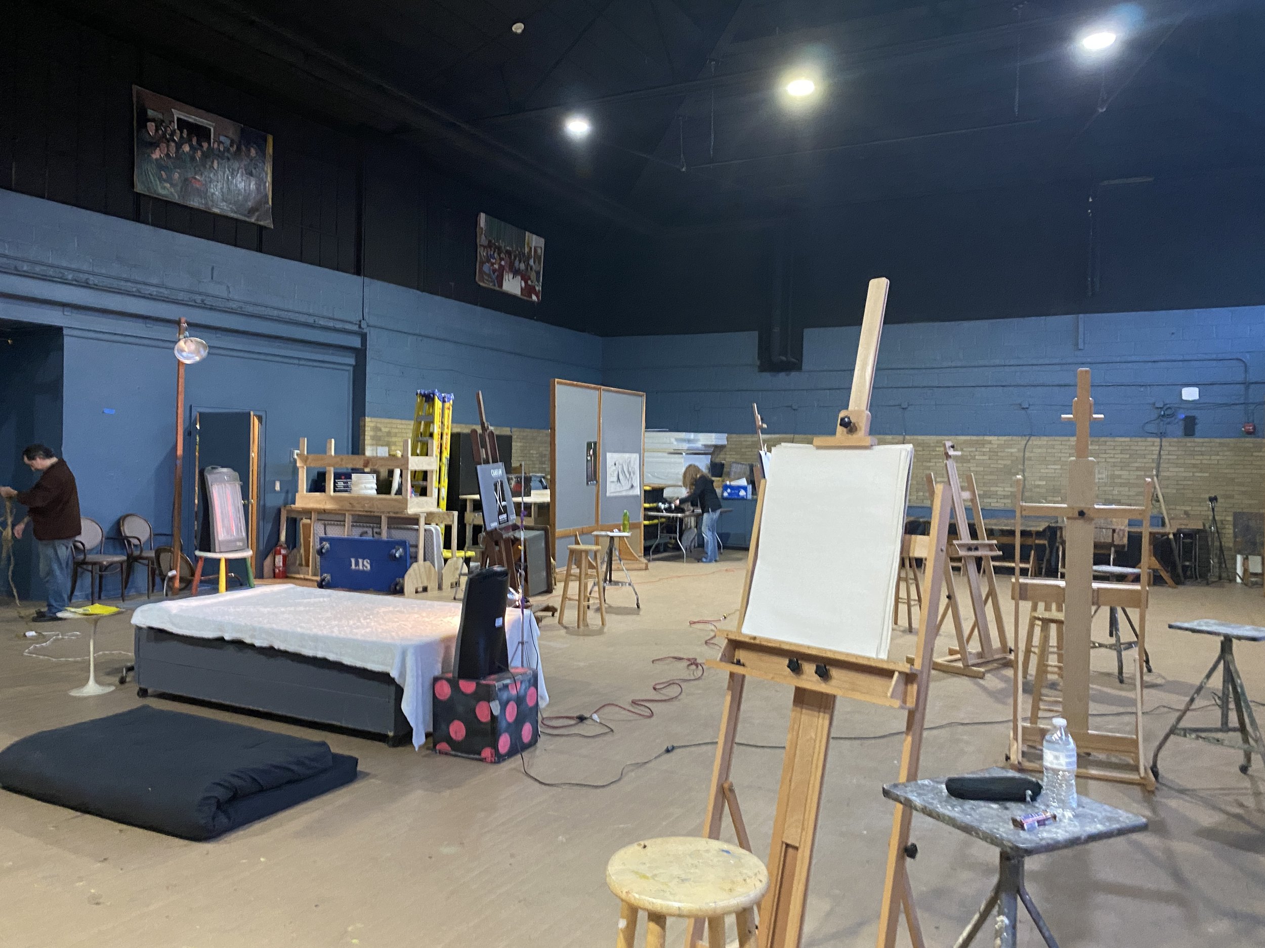
Figure Drawing studio at duCret

Okay, so let’s talk about being in a room with other artists all keenly studying a naked person. I admit, while the first time had a brief moment of surprise, that all goes out the window practically instantly. You take on the perspective of how I assume doctors examine their patients. You become aware of structure, lighting, weight displacement, and—from a religious standpoint—the beauty of the human body. I don’t mean in a fit or attractive way, but just the extraordinary appearance of all humans, how we’re put together and how those bodies interact with the space around them. Of course, if you’ve never taken a figure drawing course, it’s the most asked question you get. Maria puts it this way;

I have done Dr. Sketchy and figure drawing in the past but never with a nude model. I felt I was going to be a bit shy and apprehensive when it came to it, but it was more of a focus on how muscles work and the anatomy of the human body. I found it challenging in a positive way!

Maria and I at Dr. Sketchy’s in Asbury Park, 2019

C.W. speaks to the warm–up exercises of quick poses that forces an artist to push past any unfamiliarity.

The first model I ever drew was a girl, and that was the first time I ever saw a topless girl in the same space as me, so I definitely felt a little flush at the start of it. But figure drawing, if you’re serious about it, really doesn’t leave a lot of room for that outside of first impressions like that. With the mix of artistic math zooming through your head and the adrenaline of just two minutes for a presentable drawing, you don’t really pay attention to the person anymore.

Mike, who’s done and seen it all when it comes to nude models, puts it succinctly;

To each their own. It's not for everyone. Artists throughout time appreciate the human form. It's a stroke of creative genius. What better way to appreciate the divine on Earth?

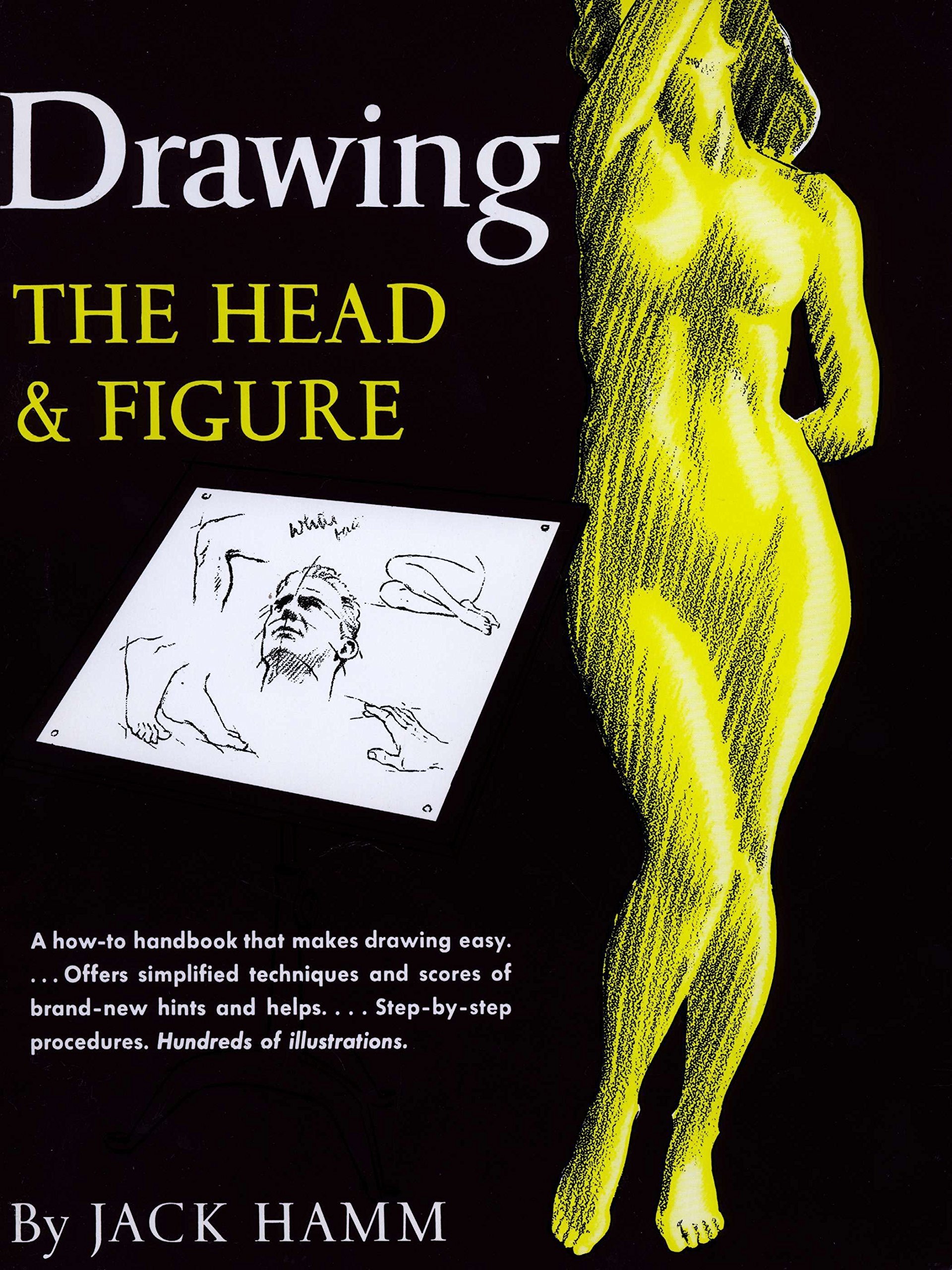
If you are an artist/illustrator of any kind; regardless of ability, style, or experience and you haven’t taken a figure drawing class, do it! When I was a kid, someone in my family who was eager to encourage my artistic inclinations bought me a copy of Jack Hamm’s Drawing The Head & Figure of which I still have today. This book was very helpful when it came to learning how to draw anatomy even if it was in the crude form of a Garfield comic strip. Looking through it though, I never believed even for a second that I could draw like Mr. Hamm (and most might argue I still can’t). It took an actual figure drawing class to break that stigma and push me in ways I never even thought possible! In the words of Mike Barreiro himself,

Get up and move around. A new perspective can be helpful.

A huge thank you to my former teacher Mike Barreiro for taking the time to answer all my questions. This post not only gave me a chance to talk about something I love, but gave me an excuse to chat him up again outside of constantly fawning over his work in the comments. Speaking of which, you should totally do the same and follow him on Instagram and Facebook and check out his website: mikebarreiroart.com

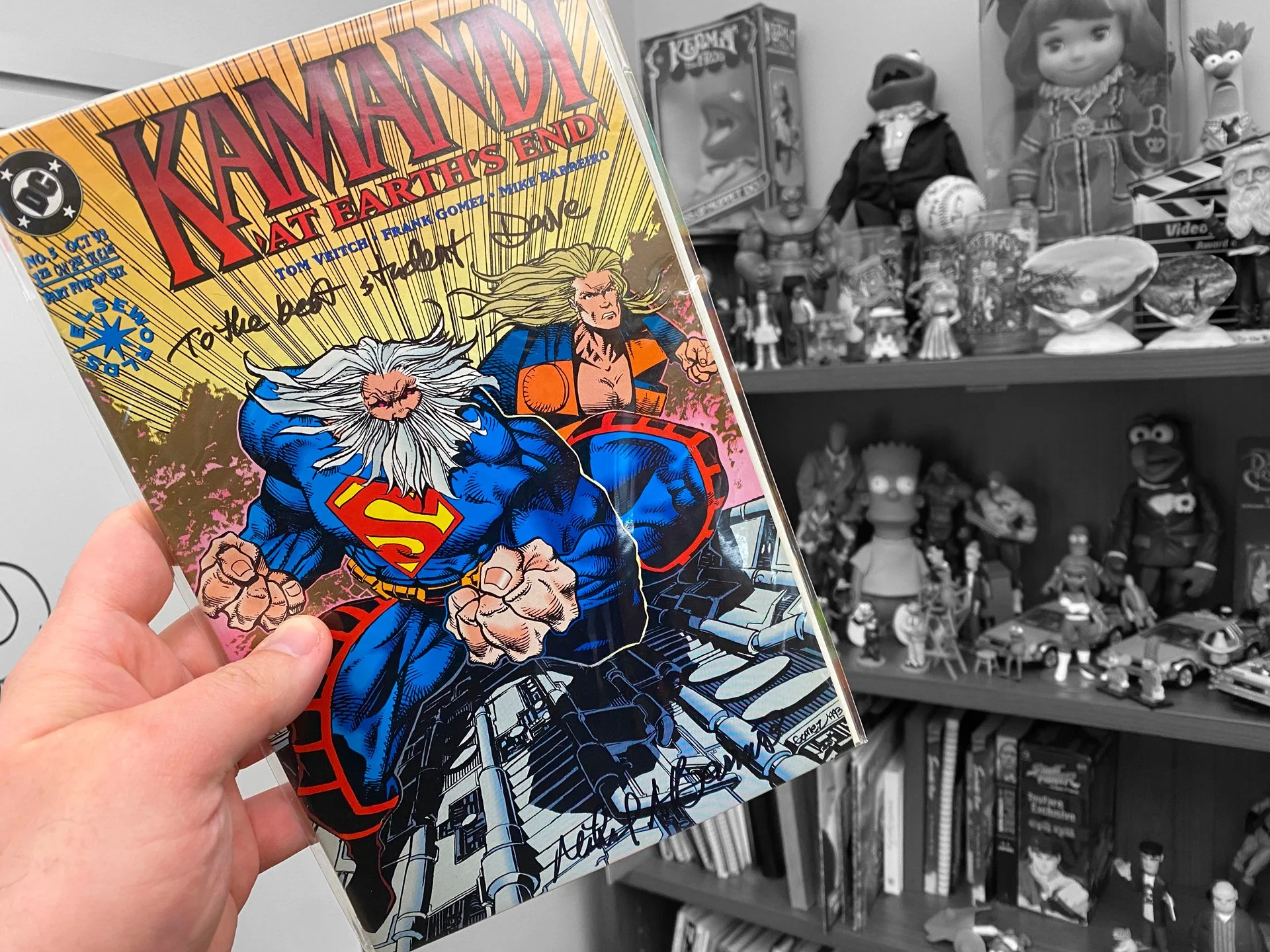
To the best student, Dave.” my signed copy of Kamandi Mike inked that he signed for me!

Special thanks to C.W. Roederer for his time and thoughts, you have not heard from him for the last time on this blog, I can assure you! Follow him on Instagram and check out more of his work on his website: cwroederer.com

Thank you SO much to Maria Chamra for not only contributing to this post but for letting me drag her all the way up to Plainfield, New Jersey to be my accountable art buddy yet again. Absolutely go follow her on Instagram and Facebook and check out her work at her website: mariachamra.com

And as always, I’d appreciate it if you follow me on Instagram and Twitter and follow this blog which posts every Friday all about art, illustration, graphic design, creative thinking, and occasionally even the Muppets!

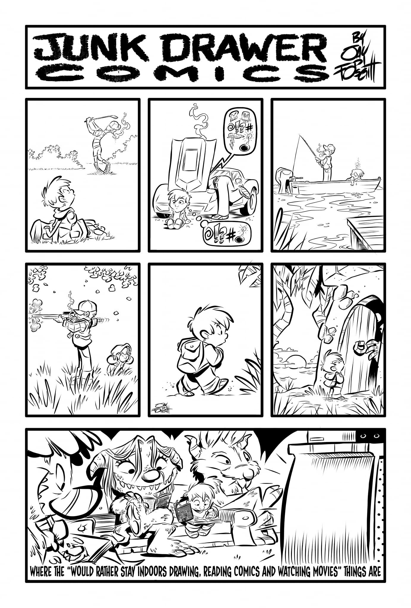
Junk Drawer Comics by Jay Fosgitt who will be talking about writing comics here next week!

Creative Daddy

I’ve had this website for quite some time now, but only recently decided to start using it more actively via this blog as some of you may have noticed. Part of this is simply to justify my annual registration fees, but the other part is more personal and something I’ve touched on briefly before. The reality is that the pandemic has really hit home the idea of just getting stuff done. As the parents of a toddler/pre–schooler, that’s a different scenario my wife and I have faced than others. I don’t mean to insinuate we had/have it harder than anyone else, only that any creative endeavors or dreams pursuant to such did not have the luxury of “finally getting to with all this spare time” during quarantine, you dig?

I’ll spare you the long version, but in short; we weren’t able to have a child when we were ready to. It was many years of heartache, determination, and frustration before our daughter was born. It didn’t just happen, so when it finally did, I was thrilled to put all my dreams, aspirations, and even just basic creative habits on hold for the time being knowing full well I’d resume them eventually and with a new ethos. A lot easier said than done, especially at first, but now that she’s getting older and we can explore our innovative sides together, the internal creative renaissance I’m experiencing through her is greater than I could have ever imagined. Hence this blog! So fade to black, roll credits, “They lived happily ever after” and toss in a copyright so everyone knows to leave the theater.

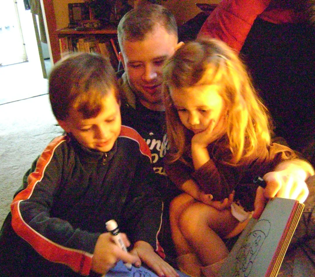
My daughter and father coloring one of our big posters (Dec. 4, 2019) and my daughter fixing up my own drawing (Aug. 16, 2020)

What’s actually happened is a wellspring of ideas thanks to seeing the world almost fully through the eyes of a child again, and if I’m being honest, I’m a bit overwhelmed by it.

A fun experiment I did with my niece back in 2014.

I’m gonna’ take it back for a second and heap all this ridiculous need to show love and guidance to a child on my nibling & niece. How dare they make me love them so much. Anyway, being around kids from a creative standpoint is just—and I am not exaggerating here—the best. I once went way off topic on an article I wrote for ToughPigs that touched upon all of this, just so I could use my niece as a way to explore creativity and how effortlessly kids tear down rules in the most brilliant ways. And I’m sure my sister–and–brother–in–law wouldn’t mind if I took fractional credit for the artistic direction my insanely consummate nibling has taken along with their sister who is also a very talented artist. The three of us based almost all of our time together around creating and creativity. Whether it was making up stories, art projects, silly home movies (a continued childhood tradition with my own sister and brother when they were kids), or drawing games where we’d each “add” to the others picture for a minute before passing it back again. Both of them are almost solely responsible for our desire to have a kid of our own (I love you Z & G!).

My nibling, niece, and I draw their amenable uncle (Sept. 18, 2016).

So now my daughter is Little Miss Personality like all toddlers, and instead of putting innovation and imagination on hold, it extends to every inch of our home. We create giant posters that we hang all over the playroom, we have our own “Big Show” where we talk about every and anything that interests us, we play dress up, we do puppet shows, make books, science experiments, crafts all the time, toys, and even a newspaper!

Paper maché helmets (Jan. 12, 2021) and The Bella Daddy News (March 24, 2019).

I swear, I am not putting all this out there to go, “Whee! Parenting is fun and easy when you’re creative! Look at the things I did!” Because every parent will tell you this life is rewarding but exhausting. I’ll expand more in a bit about getting back on the road towards creative independence, but in the meantime, here’s an actual conversation I had with my daughter one night when I was struggling with how to properly channel all my re–found inspiration.

“Daddy, let’s talk about your feelings”
“Okay.”
“Are you feeling sad?”
“Yes, I have a little sadness right now.”
“Are you feeling angry?”
“Um, maybe a little bit angry, sure.”
“Are you happy?”
“Oh yes, I’m very much happy. In fact all my feelings are connected to you and mommy. I’m a little sad and angry I have to leave you both tomorrow when I go to work. But I’m very happy I’m with you right now and that I get to be with you when I get home.”
“Are you feeling tentinary?”
“What’s tentinary mean?”
“Tentinary means you’re feeling a little soddish. And soddish means you’re feeling a little shy about meeting someone you don’t know. Not like somebody you don’t know, but like somebody you do know. Not really that thinkable like your head is feeling a little weird.”
“Bella, I need help coming up with a word to describe how I’m feeling. If I tell you what I’m feeling, will you come up with a word for it? A word that will describe it?”
“Yes.”
“I have a whole lot of ideas in my head. Like, a whole lot of ideas just running around inside my head, but I don’t know how many—if any—of them are good ideas. What would you call that?”
“How about… snotty?”
“Snotty?!”
“Yeah, snotty.”
“Wait, snotty with a ‘T’ or snoddy with a ‘D’?”
“How about snotty with an ‘S’?
“So… snossy?”
Lots of laughing. “Yeah, snossy!”
“We’ll then, tonight I’m feeling very snossy.”

Blocks” of varying sorts happen in all creative fields and the solution is usually to view things from a different point of view. Kids have zero regard or understanding for creative rules that we build around us so they can easily demolish them. They’re not all brilliant ideas, they just facilitate very helpful ways to see around a problem. For example, my daughter doesn’t have any obligation to kerning (optical, metrical, or otherwise) when writing her name or even to keep it aligned, level, or baselined. You could very easily write it off as a little kid just learning to properly write their name, or you could ask her why she does it like that. The insight proves to be a different point of view and it’s refreshing, even if it defies your personal aesthetic.

When my sister, brother, and I were making home movies without any editing suite, we created things off the cuff, spontaneously, and—in the eyes of a cinematographer—completely wrong. That in turn pushed me to learn more by the time my nibling and niece came along and helped form my sense of storytelling. Now my daughter not only gets to enjoy all that experience but help build upon it for both our benefits. I’m not saying these things made me a consummate professional when it comes to media and video editing, but I don’t think I would have ever been able to make The Making of The Great Muppet Mural without those personal points of reference, and yes I absolutely am still talking about that documentary!

Rockin’ out with my sister & brother (circa 1993) and Attack of the Killer Guinea Pig! with my nibling & niece (May 2015)

Now that my daughter is older, I’m finding (a little) more free time of my own creative volition. This is significant in a few ways. For starters, I’m transitioning back into something familiar but with a newfound and invigorated angle. It’s also like having the training wheels taken off all over again as we enter this new stage of her life. A more world–wary five–year–old will bring new ideas, and her old dad will happily navigate those waters with her. If I could find ways to entertain and teach her as a baby and toddler, imagine what she’ll show me with a full vocabulary, fantastic sense of humor, and an end to doggedly asking me to draw Cookie Monster over and over again (now being replaced with Luisa from Disney’s Encanto).

Luisa Madrigal

My whole point and belief has not changed in nearly twenty years though; kids are one of if not the best resource for finding one’s creative wellspring. It’s not just about breaking down walls and getting new perspectives, it’s about tapping into your own unrestricted and unrequited passion for being a creative person. Misery may love company, but creativity cherishes collaboration, even if it’s with someone who is a fraction of your own age. Inject the musings and whims of a child into your process just once and see if it captures any of your old flares and dreams. As a bonus, the child will benefit immensely as well! The best way to foster creativity and imagination is to show how accessible it is. Don’t try to be “cool” in front of other parents or adults. All that does is build back up the walls of restriction and shows a child they’re not your main priority.

We are normal family.

For stuff other than illustrations of Luisa, I’d love it if you followed me on Instagram & Twitter!

Of course one of my biggest thrills was drawing Luisa for her class!

The Wild World of Stock Image Sites

Recently, I was part of a very informative meeting regarding depictions of human trafficking in media. Essentially, our editorial and design staff were made to understand how common images that were originally used to bring awareness to modern day slavery are now outdated and even harmful as they inaccurately portray trafficking and its survivors. It is crucial for creative people to have an open dialog with professionals from other fields to progressively create content that can inform the public properly and in cases such as human trafficking, even assist law enforcement. These conversations can be difficult and awkward for both sides to understand each other in hopes to produce potent tools that can be used effectively. While right brained designers want to grab your attention with bold graphics and a clear narrative, left brained social workers prefer ethical empowerment and avoid sensationalism.

Human trafficking is a very serious issue that affects tens of millions of people, and as graphic designer, I personally recognize how important it is to have an open dialog with service providers, allied professionals, and government officials so that I can create materials that inform and assist the public in a helpful and sensitive way. There are a lot of solemn instances with different contextual uses of media that require a deft hand when designing resources for such heavy issues, and it’s definitely something all creative people need to be aware of. This particular blog entry—and I cannot stress this enough— is not that conversation. Sorry to lead you on like that, but I think it’s very important to highlight just how oblivious the creative industry can be and how image sites in particular seem to be day drinking heavily.

First off, let me take a minute to explain image sites to those who might not be familiar with them. Every advertisement and publication you see has two sides. The editorial side, and the design side. The editorial side provides all the information you need to know: what something costs, where something goes, and when something starts. The design side is what gets you to look and lets you know who something is for, how it works, and why you should get it. The visual content is usually the last piece of the puzzle to come about because editors and writers are slow and think they are more important than designers. If you have a budget and time, a designer can photograph or illustrate or film whatever they need and make a really cool piece of media they will proudly show everywhere. More often than not however, designers are pressed for time and need to get their hands on photographs, illustrations, or video immediately, I.e.; something that has already been created. Hence, stock image sites.

You’ve no doubt seen a news story with a Getty Images watermark front and center over it. For a fee, an image site will license media to you for an extended period of time. Unsplash, iStock, Story Blocks, Shutter Stock, Adobe Stock, and the multitudes that have been absorbed like Veer, Dollar Photo, and Corbis just to name a few. Image sites are helpful tools for creativity too and usually have media under a truckload of search tags so you can narrow down what you’re looking for to something very specific and still have a decent selection to choose from. Whether or not these sites pricing structures are fair and what cut they pay to the content creator is not what we’re talking about today either. Instead, I’d like to focus on some of the absolutely bananas content these places think creative people need and how out of touch they can sometimes feel.

Disclaimer 1: Initially I thought I’d do cross checks on multiple image stock sites, but the honest to God’s truth is that they are almost all the same. Not only do they feature the same content, they feature the same search results so while I may slip in an image from somewhere else here and there, the majority of what you’ll see here is from Adobestock. I actually really love Adobestock and Adobe products, but if I’m being honest, I’m still a little miffed they bought out Dollar Photos.

Disclaimer 2: There’s a good chance you’ve seen Reddit or other meme sites feature weird, WTF collections of pictures from image sites, but this isn’t that either. There’s a few images that I can’t fathom what they’d be used for, but nothing incredibly out of the ordinary. No “Hide the Pain Harold” here!

Disclaimer 3: I could write a book about this verses a blog post. The images shown here tell their own story and were not cherry picked to prove a point. I will probably write another post in the future with a more studied and researched collection, but for today, these are all images that came up within the first few pages of a search. It’s not rocket science and the algorithm for these searches are something every designer is familiar with and I’ve always found these results to be either hysterical or infuriating.

Words Bad Good

Sometimes a concept is just so lofty an idea that creatively the only way to convey it is to have a picture of the word you’re searching for.

“Okay, so this our new campaign regarding lunch programs for underprivileged…”

“LUNCH!!!”

“Er, what’s that Ralph?”

“LUNCH!! LUNCH!!”

“Sure, okay, let’s go with that.”

Either there’s a much higher demand for pictures of neon signs that say Ralph than I would imagine, or AI is responsible for a lot of these images.

Maybe it’s effective if it’s being used really well, but otherwise, this is the laziest of lazy design. To be fair also, this type of conveyance is heavily used when a concept is a little too abstract like searching for images related to ASAP for example.

Yes, “Condyloma” was one of the very first images that came up when searching for dynamic text.

Totally Not Racist

Everyone wants you to know they’re not racists… well, not overtly racist people because that’s their thing, but on a professional level, corporate America wants you to know they’re not racist. So clients understandably like images that show diversity. To an image site algorithm, “diversity” is a weird metaphor for racial harmony. Like a hit–you–over–the–head–to–say–we–swear–to–God–we’re–not–racist type of energy that tries way too hard. Why are you making hand hearts, or holding hands, or standing so uncomfortably close together? I want something other than just white people, you don’t have to invade each other’s personal space. And why is everyone so happy just to be standing around? To be fair, “diversity” as a search term is very slowly expanding. Now instead of a couple of black people, someone is also wearing a hijab usually so progress, I guess. Asians still can’t catch a break, they’re not invited to the stand around and smile parties.

We’re diverse AND awkward!

Anger, The Funniest Emotion

The easiest thing about capturing happiness on film (Hi! I’m old and say things like ‘on film’!) is that you can elicit a genuine look of it from a subject. All you need is a funny photographer, a wonderful memory, or the threat of not getting paid. Sadness is a little trickier, but good lighting, focusing on trauma, or the threat of not getting paid can make a believable image come to life. Anger? Well, maybe real anger looks too angsty or doesn’t convey just how dark the average human being is, so image sites portray anger as OH MY GOD!

You wouldn’t like me when I’m psychotic.

We’ve all been angry, but somewhere along the journey of visually presenting emotions, people translated “angry” to psycho murder demon. It’s funny, but usually “anger” in advertisements is used in relation to stress relief of some sort. Is your job getting you mad? Is your old appliance on the fritz? Is your internet slow? Are weasels deliberately mispronouncing your name? Well then you need our product! And to get your attention, we’ve used this very relatable approximation of you; violently screaming or punching something because that’s what normal people do every day.

They really hate laptops.

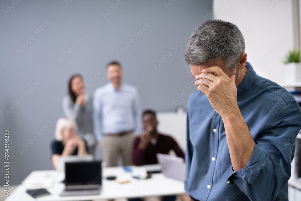
Maybe bullying is tangential to anger, but I get charged per subhead, so it’s going here as well. Also a serious and topical issue, bullying affects way more kids nowadays then when I was a kid. People who think bullying is just a part of childhood and that kids today are pansies can seriously go suck it because way back in the day (before the internet), you had a safe space called home or church or some extracurricular aside where you fit in. Your bully didn’t follow you everywhere which, thanks to social media, that’s exactly what they do today.

That woman in the gray dress is boldly playing both sides.

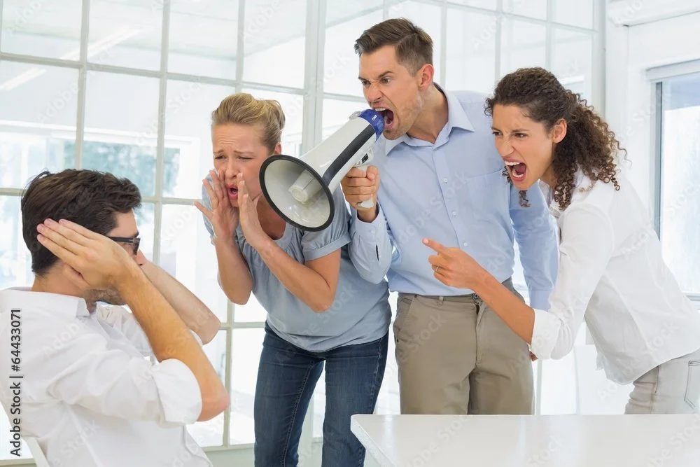
So again, I don’t mean to make light of a serious situation here. I’m Gen X, I sympathize with people and understand the world’s gonna’ keep changing regardless of how I feel. That being said, typically we relate bullying to adolescence. Yeah, I know it exists everywhere in every facet of life, but some of these images are hilarious. Not because someone is being bullied, but the setting for all of these is clearly a corporate environment and the idea that multiple adult coworkers would comedically harass other adult coworkers like they’re in an 80s Ivan Reitman film raises more questions than it sets out to solve. Why are they using a bullhorn? Why does their office have a bullhorn? They’re standing right in front of him, how necessary is the bullhorn?

A bullhorn isn’t a way to get people to listen, it’s a way to force people to hear you.

I’ve been in offices and on teams like this one. When computers are lined up side by side like this, it’s because everyone is working on the same project. Those two idiots are harassing someone who is most likely very consequential to their work and by proxy; deadline and paycheck. Help her out you lunatics! At the very least shun her for bringing unnecessary drama into the office and talk $#!t about her behind her back like a real American!

Ha ha ha! Bob has a headache! Isn’t that hilarious?!

Now this could be anxiety over an oppressive boss, or even something more serious like sexual harassment in the workplace. The problem is the focus is all off. She’s very strangely infatuated with the clipboard and he seems terrified of the succubus’ mouth forming from her chest, ready to devour his head. “Don’t these sales and revenue reports turn you on?

You’re Doing It All Wrong!

If you have a talent, hobby, or interest that requires some degree of knowledge beyond what most people know of said subject, then an image site is rife with inaccuracies. That’s not how you hold a trumpet. The world at large may not know that or even care, so sue me and every other brass aficionado; but some of these are just confounding as to how anyone would use them for any purpose.

Is that woman playing Weird Al? Because it’s clearly a very funny song. Is that boy preaching to God himself? Wouldn’t he be pretty familiar with His own book? Are these people Jedis? Why are their hands so close to the ground? What is the relationship between planes and guitar strings? Did this couple stumble upon a guitar player in the middle of the woods or did they just drag him out in the middle of a forest to play because they’re tired of people criticizing how they clap? What the %@$# is going on?!

You know how you have to transfer all that digital information to paper? How tedious! Why do we even have computers?!

Sexism Everywhere

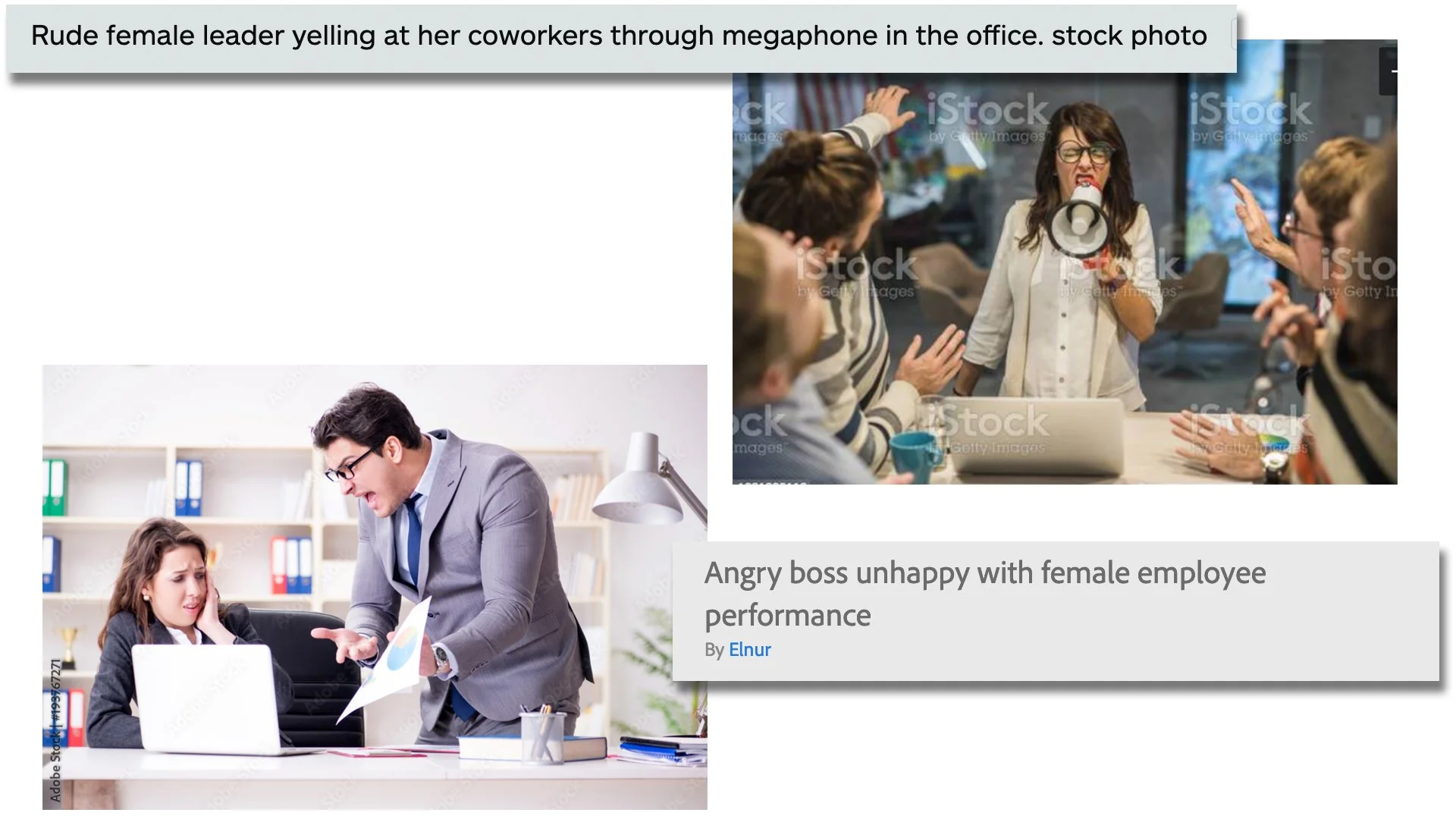
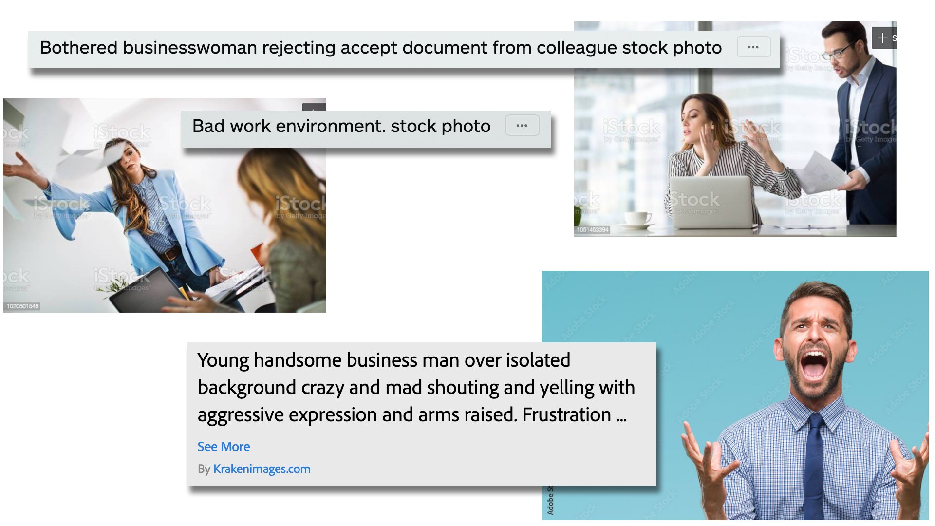
The initial idea that made me want to write this blog post in particularly however surrounded the overtly sexist tones image descriptions and key search words use. Take a look at these images and see if you can pick up on the subtle theme of angry male vs. angry female.

When a male supervisor is yelling at a female subordinate in a lot of these images, the description mentions blame on an ineffective or guilty employee. The male boss is usually labeled as frustrated. When a female supervisor yells at anyone, she’s labeled as unbalanced, superior, rude, or at the very least acknowledging the subordinates are stressed because of her. I understand that when these images are used, they may not be contextualized exactly as their descriptions indicate; but another interesting subtext from a visual standpoint is how often the camera angle changes depending on the sex of the boss. If it’s a dude, the camera is usually perched high, taking on the perspective of the man and from a position of power. When it’s a woman, the camera tends to sit low, taking on the perspective of the worker and from a position of vulnerability. It’s also curious and arguably unnecessary when the image shows just a singular angry person. The guy gets labeled as “handsome” while they double–down with “rage” for the lady.

I realize I’m only showing just a few images, but I’m not overly skewing information here. As mentioned in my earlier disclaimer, these are results from just the first 2 pages of my search. I also realize I’m not saying anything every single woman reading this already knows. “The image sites are sexist too?!” Yeah guys, this is what systemic sexism and racism coupled with unconscious bias look like. It’s literally everywhere.

All in all, stock image sites really are a valuable resource and the algorithms, subject matter, and overall quality continue to improve, but if we’re being honest, it will never be perfect. I had way to much fun with this post and I will most likely tackle this subject again. In fact, I would love to hear if anyone has had similar or other unique experiences when it comes to the world of stock images! Comment below or tell me on Instagram or Twitter!

Do You Have To Be Creative To Be A Graphic Designer?

When I write regarding graphic design or even just introduce myself professionally, I make very little distinction between that and being an illustrator. My professional title is “Graphic Designer/Illustrator” which is driven by pure hubris. Getting that “illustrator” addition was the most satisfying moment of my career, but if we’re going by a definitional account of my job, it’s redundant. A graphic designer is the Swiss Army knife of media professionals. We need to have a working knowledge of published, printed, and digital media and that encompasses a lot of stuff. Typesetting, illustration, user interfaces, web design, production & rendering methods, communications, plus keeping up with changing trends and social & cultural norms just to give a broad perspective of our day–to–day responsibilities.

I’m getting ahead of myself though. Let’s travel back to the very early start of the 21st century when I was still in school. I’ll give a more detailed account another time, but in short, I was enrolled in a trade school for graphic art and design at the corporately named Brick Computer Science Institute. We were finishing up our class for Adobe InDesign (which is a desktop publishing and page layout design software program) when the instructor decided to kill two birds with one stone for our final project assignment. We had to design a “How To” book based on any subject we wanted, then present this instruction manual to our classmates to clumsily complete our public speaking portion of the curriculum. At the time, I was heavily involved in puppetry, even working in local productions, so my “thesis” was how to perform a puppet. The whole farce was good enough to elicit a lot of questions afterwards from my fellow classmates. The one that hit me harder than anything else, and one I still think about today (hence this entire post), was when a kid asked, “(Regarding puppetry) How do you get involved in something like this?” I started by stating rather matter–of–factly that it is similar to any other creative endeavor one might be interested in like dancing or painting. So I asked the class, “Has anyone ever taken singing lessons or gone to an acting camp?” Silence. “Okay, what about figure drawing, sculpting, or even writing short stories?” Heads shook whilst still fixating on me with deadpan stares. I took a breath and went out on a limb convinced I’d get a a tiny bite when I sheepishly asked, “Has anyone here ever tried to do anything creative?” In a mumble from a now awkward choir, the collective replied, “No.” My head began to spin and I have almost no memory of what happened after. I just felt so dizzy wondering how so many kids without even an inkling of desire to be creative in any way had all enrolled in a program with “art” in its title. Was I going into the right field? Was I going to have a leg up of any kind because I could draw? Was I completely off about what I assumed graphic design to be?
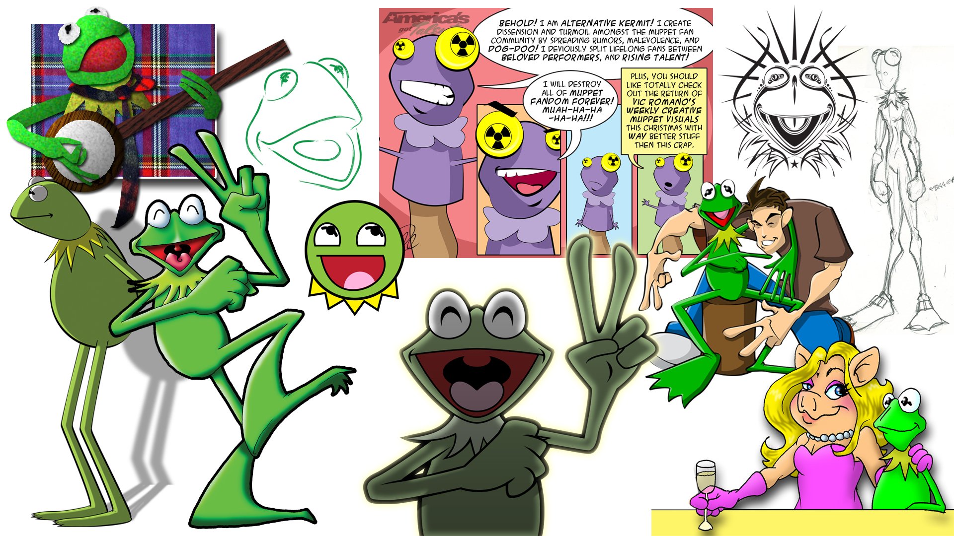
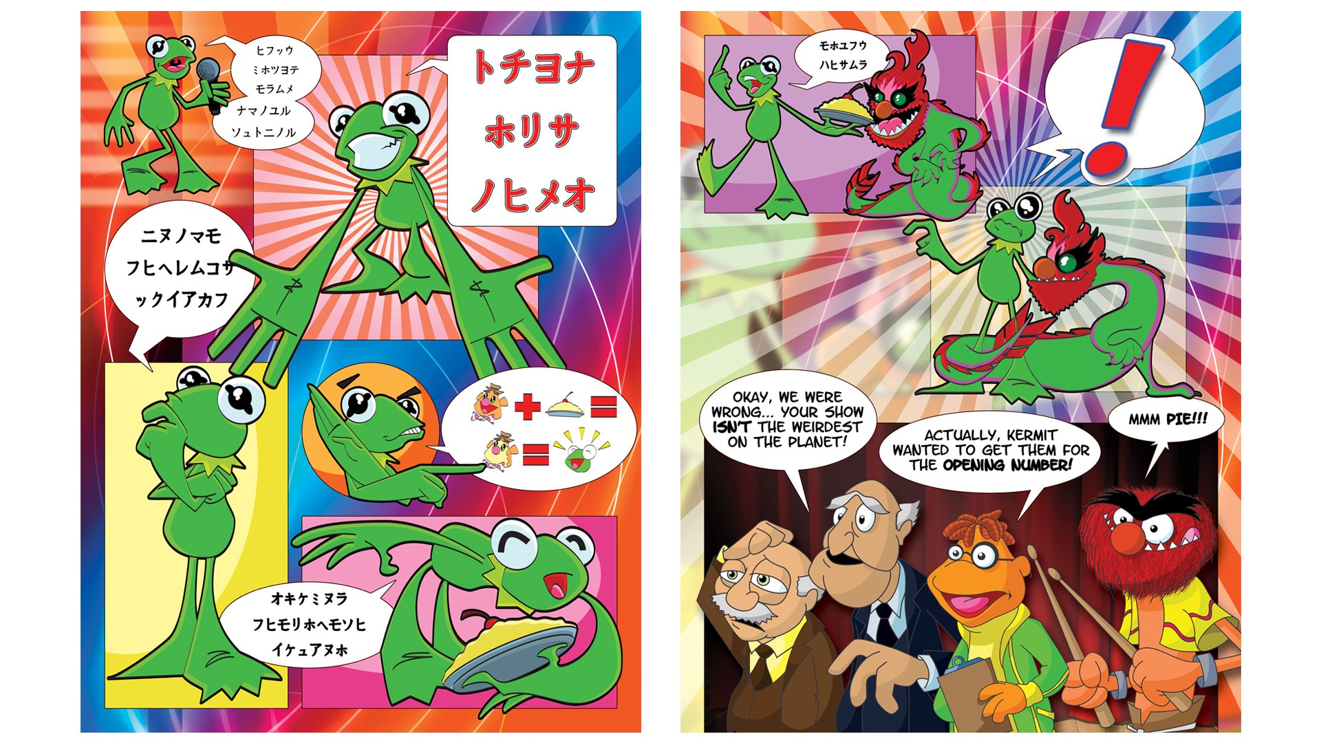
My brief stint as a puppeteer in 1999 and then again only slightly better in 2016.

Maybe it’s not a huge surprise, but of the nearly 60 kids who enrolled, myself and one other student were the only two to graduate from our class. Everyone else dropped out. The institutional credibility of the school notwithstanding, I had placed all my eggs in this basket and headed out into the world afterwards as a green but still hopeful and determined graphic designer. My first job at a flatware company however proved the unimaginative dropouts may have been the majority as nothing I did required an ounce of creativity. My job was to be imitative and unoriginal by simply copying the designs of our competitors so that the work could then be outsourced to our manufacturer in China. One day I decided to take initiative by designing my own line of tableware for the company, fully understanding the Employment Agreement I signed had a strict statement of ownership that any ideas would belong to the company. My boss was visibly very upset at this ambitious move towards his good graces and gave me a real dressing down. One week later I was let go. Two years later I saw my designed tableware from the company on full display on an end cap at Target.

Now very depressing allusions to the life of a graphic designer aside, my story is not uncommon, and it can be justified repeatedly simply by looking at the world around you steeped in really bad graphic design. Graphic design runs along a very substantial bell curve because it’s one of those industries where anyone can—and does—label themselves a “graphic designer” just for owning an outdated, bootleg copy of Photoshop. Every time—and I mean every single time—I see really spectacularly bad design, I wonder if it may have been done by one of my dropout classmates who decided they didn’t need the student loan debt or color theory from good old BCSI and ventured into their own stint as a “graphic designer.” I think of those blank faces staring back at me who openly admit they had, nor would have, any creative interests at all and wonder how widespread that idea may be. It begs the question, do you have to be creative to be a graphic designer?

If you’re asking me, then the answer is obviously and unequivocally yes, but we can be a bit more diplomatic here. I reached out to a bunch of designers whom I admire to get their take on this idea. A lot of them were busy with deadlines and couldn’t contribute (again, the life of a graphic designer), but I cast a large net and spoke with both professional actual real life graphic designers as well as those who successfully manage things on the side as freelancers. There’s a wide range of education and experience here, but all are people I consider talented so I posed the question directly to get their take on this idea of if it’s even necessary to be creative in order to be a graphic designer. Also understanding deadlines and client specifications, I asked them to consider how much of their drive is motivated by inspiration verses profit, art verses functionality, and if they are moved in anyway when seeing good design verses bad design. Here’s what they had to say.

I consider the role of graphic designer most of all as a tool of communication. Anything I produce in that capacity has to send an easily understood message — Read this! Buy that! Being creative doesn't mean having a special sensitivity to taste and aesthetic choices, neither is it a special talent to draw, compose or write a novel — it simply means to effectively use whatever tools at your disposal to get a job done. Problem solving requires creativity. How much does it influence my work? I'd say it's the main ingredient, along with curiosity. One of my professors at SVA used to tell us: "Be informed! Read! Learn! The more you know about the world around you, the better you'll be able to communicate ideas through design." I profoundly agree with that notion. 

Mabel Zorzano

Even if it’s a project that is conceptually dictated or a simple layout, I can’t function without putting some creative spin on it. I don’t necessarily see myself as an “artist” but more of a creative creator 😂 so I can’t help but try to be creative in my approach to any project.  

I’m definitely moved by bad design…moved to hurl. But that doesn’t mean that someone with basic “functional” skills can’t create something pleasing to the eye. My main day job isn’t graphic design, so I feel I can still be motivated by inspiration. It’s still thrilling to start with nothing and end up with a creation.

Doug Berry

Being creative is integral to being a graphic designer. Our role is to take a client’s vision and deliver it in a way that stands out, draws in the desired audience and tells a story. Without creativity, anyone could do what we do. Creativity is what gets both you and your client noticed.

Christine Senak

How creative I get depends on the client. They lead everything. For me, creativity begins with listening to and learning from the client. Sometimes they have a very clear idea, but can't quite articulate it. New ideas are born through collaboration of some sort. I try to be more intimate, so I don't bombard them with a gazillion font choices and colors. I'd rather spend that time talking to them about what they really want. That seems to be rare in this business.

Many artists draw a distinction between artistry and craftsmanship. I think that line has always been a blurry one. Beautifully so. No matter what a design evokes in us, it's going to give each viewer a unique experience and that can never be cynically focus–grouped by a client or executive. I see bad design every day on busses and billboards in the city. Truth be told, it gives me more confidence in mine. Oof! Bad kerning is an epidemic. Good design, however, feeds the soul.

James Carroll

To be honest I have taken for granted the idea that “I am creative” hence “I am a graphic designer.” But, as I reflect on this question, I realize I have some doubts about how axiomatic that link is between creator and designer. In many ways, I feel like a painter is creative but a graphic designer, not so much. When asked if I am an artist, I frequently hesitate and my husband always jumps in to say, “You are an artist.

I am a formally trained artist, there I said it. I attended the School of Visual Arts, but ultimately picked a marketable art form, graphic design. To be fair, as I dove into the art of graphic design I truly fell in love with letter form, typography, grids – an almost mathematical (I always liked math) approach to art. The experience of the reader, the audience, the consumer of my design is always foremost in my mind. I constantly ask myself and my colleagues: will the message be clear? Will the design entice the viewer to consume the content on offer?

Graphic design is most certainly an art form. Look around and one will see design that does not clearly and creatively inform a viewer. Leading and kerning (what a nerd) that seems somehow “off,” making the message hard to discern. Good design is marked by answering the question: why? The answer should never be – it looks cool. The why may not always be the right way to go, but diving into the why is where the creativity lies. It is from “the why” that one builds the design.

Fundamentally, graphic design taught me that creativity is where you find it. I was at heart a photographer, but chose my profession to make a living in the arts. Now I realize, it was perhaps the most creative choice I ever made; seeing how to make the functional beautiful and the seemingly mundane eye–catching. Graphic design, while seemingly all about utility and “marketability” contributes a great deal to our cultural aesthetic and I am proud to be a creative professional that does that.

Lea La Notte Greene

So in the end, the answer is not a definitive yes or no. On the one hand, this is a job and it has to get done if we want to keep the lights on. Clients can be fickle and stubborn and we’ve all created things we’re not proud of. Not everything has to go in the portfolio, but I find this to be rare as most people (clients) are hiring you because they like what you do and trust you to do it well. Granted, things like budgets, personal tastes, changing trends, and omnipotent deadlines can hamper these things and make even the greatest designers add to the pantheon of bad design. On the other hand though, it’s impossible to not admire really good graphic design. For me personally, I see some designers as master artists like Aaron Draplin, Martina Flor, Jed Chisholm, Krill Richert, Demas Rusli, or Gary Percival.

I think this is what tips this idea to an extreme; drawing a direct line between “graphic design” to its more definitively creative based cousin: “art.” We admire good graphic design like we admire good art; ergo graphic design is art, art is creative, therefore graphic design must be creative, right? Dain Walker prefers the title “brand strategist” to graphic designer, but at this point I’m splitting so many semantical hairs I think it’s better to just get to his point. He writes,

"In the minds of business owners, creative design can often be misunderstood as functioning alike art. However there are some important distinctions that must be understood between art & design. First allow me to express that they share things in common, often times they can even overlap or one piece could be both art & design all at once. Many even argue they are the same thing… That design is not art, but a very pointed item created with an objective rather than being subjective, essentially art sends a different message to everyone (pending their interpretation) whereas design tells the same message to everyone."

He goes on to make very broad but effective points like, “Art is to be admired, design has a job to do.” Noting that both art and design can be interchangeable, there’s most certainly two different languages an artist and designer have to speak fluently, that of a creative and that of the client. So effectively we live in a world where both of these are very true and open to a lot of interpretation. We know that graphic design can exist without any creativity because it’s literally everywhere. Whether it’s actual bad design or serves only the purpose of functionality, there is a lot of demand for uncreative graphic design. However, and this is the real silver lining, graphic design—good graphic design—aspires to be so much more.

Just like the work of all the very wonderful people who contributed to this post! Very special thanks to Doug Berry, Jamie Carroll, Lea La Notte Greene, Christine Senak, and Mabel Zorzano for taking the time to reflect on this idea and write me their thoughts. Please check out their stuff and as always, I would love if you followed me on Instagram & Twitter.

I Know What You Meme

I have a nice long list of ideas for blog topics, so “Yay!” I also love to write and make long in–depth posts that are full of ideas and concepts that can take awhile to read, so “Yay?” My point is I wrote a super long post last week and have a super long post next week, but I don’t want to drown the scant number of people who visit this blog and feel like I’m just lecturing, so today is a little dose of fun and silliness. Plus I stole literally all of these memes.

That dafont one hits hard

TheDesignTip on Instagram has lots of relatable graphic design and artist/illustrator memes as well as some great inspiration and follow suggestions. I think the great part about career specific jokes and memes is that they make you feel like you’re part of a greater collective who’s in on the joke… or in on the pain and suffering. Pick your poison!

Behance also has a bunch of humorous observations, rather than memes, but strangely I couldn’t find any in my collection. They’re also a good place for inspiration.

As always, I would love it if you followed me on Instagram and Twitter! Do you have any favorite graphic design/creative memes? I’ll leave you with my absolute favorite one:

I really do love this so much!

Everything I Learned About Making A Documentary

Or The Making of The Making of The Great Muppet Mural

I aspire to be a good storyteller and have a relatively decent understanding of structure so I admit that initially I thought making a documentary—something I’d never done—would more or less hit all the familiar beats of other video essays and projects I’d done before. First, there’s the realization or desire to create something; inspiration is an old friend we all know well… And that’s about as far as I got before understanding this was a very different kind of project.

So here’s a quick rundown to catch everyone up. In January 2021, my very dear friend Jamie and I were looking to collaborate on a project with another couple talented artists (Kenny Durkin & Stuart Reeves) and settled on creating a massive mural featuring as many characters from the various worlds of the late Jim Henson as possible. This would act as the penultimate celebratory centerpiece for fan site ToughPigs.com. That’s as much as I’ll divulge on that as you can literally watch the entire story in the documentary that this article is referring to. To try and get as much mileage as possible out of the project and generate even more content for ToughPigs, it was suggested we try and show the process of how the mural was being made as we were already neck deep in everything and recognized how much effort was being put into it. We were all in a Zoom meeting and I instinctively started to record us. This fortuitously turned into a moment I used in the opening credits where co–owner and editor–in–chief Joe Hennes talks about sharing our story. Here’s an extended version of that clip:

My main focus at that time was obviously on the production of the mural itself, but I took notes here and there and saved various odds and ends I assumed would be useful in making a documentary, but didn’t really start to focus on anything seriously until we were nearly finished and ready to present the final art. I asked Joe to reach out with a couple additional requests for materials from the artists who contributed and was pleased with what was submitted afterwards. I then realized the story needed an actual narrative, so I began interviewing those closest to the project. This was primarily Jamie and Joe at first. We had tons of fun rehashing everything, but I was still really stuck on how to tell this story. I also realized that when a group of friends talk together, it’s off–the–cuff and spontaneous. A blast for us but it lacked the chronological qualities I knew was needed to tell an actual story. I had to have a narrator, but that meant I needed a script and I didn’t have a clue about how to get either.

I knew I couldn’t narrate it. My voice was already too prominent in the interviewing process and I wanted the tone of the underlying story to be consistent. I felt asking the audience to differentiate between “your old buddy Dave who’s cracking jokes and waxing poetic onscreen” and “omniscient voice of off–screen Dave” was undesirable. Shortly before The Great Muppet Mural was presented to the public however, I got an early Christmas gift from a man I’ve admired for awhile. Lucas Ross is exceptionally funny, super talented, and truly one of the most kind and beautifully spirited people I’ve ever met. Trust me, I am not saying this simply because he contributed to this project in a major way. I am genuinely in awe of this guy and I wish with all my heart the world had a few more just like him.

I was so stunned, I forgot how language works.

Lucas reached out wanting to be a part of anything related to the mural, and when I mentioned I needed a narrator, he jumped at the notion. Keep in mind, at this point in time, the only thing I really had was the idea for a documentary, a folder of recorded Zoom & Skype calls, and a couple of rough sketches. This would not be the last time serendipity intervened, but it was proof I needed to really start to dig in and make this thing. I figured I could get it done in about a month.

I was interviewing Joe in early September when I hit upon the idea of telling the story in three parts or acts like an actual stage play or movie. From there I was able to make a rough layout of the film and then direct my interview process better. I realize this seems like a no–brainer, but when you work on something and just move through everything because time is linear, you deal with things as they happen. Even with the mural finished it takes real introspection to compartmentalize things. The artists we worked with, the problems we dealt with, managing our team; these are all things that happened sporadically or all at once so categorizing them was a huge epiphany for me and that’s when things really started to fall into place.

It doesn’t look like much, but this unlocked everything for me.

Suddenly I not only knew what I wanted and needed, but how I wanted and needed it. First things first though, I had to manage the interviews I had done and continued to do in a way that could actually tell my story. As I mentioned before, our chats were conversational, so if we didn’t make the point the way I wanted to or there was an excess of “uhs” and “ums” or we beat around the bush too long or stuttered; that’s when I could clearly write out what needed to be said and have Lucas deliver it with full confidence and in an even cadence.

Turns out it’s a good time to present a documentary as seen in the genre’s rise in popularity creatively shown in this infographic by Bo McCready

Again, this is way easier said than done. I wanted to rely on telling our story firsthand as much as possible, and that meant going through 10 hours, 44 minutes, and 49 seconds of interviews and team meetings, 1 hour, 50 minutes, and 5 seconds of artist submitted clips, 50 minutes and 38 seconds of time lapse process videos, and approximately 5 hours of miscellaneous stuff like web screen recordings, stock footage, animation, vodcasts, and old Tough Pigs interviews. Added up, that’s nearly a full day of footage alone, and that doesn’t even include Lucas’ scratch tracks and onscreen footage! That arbitrary month long deadline was dead in the water.

If there’s one thing I’ve learned when it comes to cinematography of any kind, there is absolutely no such thing as too much B–roll. For those not–in–the–know, B–roll is secondary (usually background) footage that helps keep a film interesting and brings context. For example, if Jamie and I are talking about artist Peter Savieri's amazing work, rather than just having us two onscreen chatting him up, it would be visually more appealing (handsome as we may be) to show some of Peter’s work. That’s B–roll. I was provided with a lot of great stuff, but it never felt like it was enough. I had the brilliant idea to not use any photos of the Muppets or Jim Henson at all, instead choosing to showcase some of the contributing artists’ previous works. I asked everybody for everything and was not disappointed at all. Everyone came through and I’m so grateful I could pester them weeks and months later for stuff and they always delivered.

The insanely talented work of Peter Savieri

Credit Where Credit Is Due

The next big lesson I learned was simpatico with that same idea, and that is that I needed a lot of help. I had a very big and clear picture (eventually) of what I wanted this thing to be, but there was some stuff I just didn’t know how to do or how to do well. Again, I was very lucky to have friends to step in and dig me out of the hole I was in. Amanda Duncan facilitated almost all the music and also helped set the tone when I didn’t know how. Jerome Green hammered down the sound which fluctuated wildly, especially between the artists who took the time to record themselves. He also color corrected the film; a nightmare when none of us were in a studio with any sort of proper lighting and on a split screen more often than not as well! Recording websites is tedious and can be jerky, so James Smith thankfully took that burden from me as well.

I need to sing Lucas’ praise a bit more as well. Lacking in B–roll and understanding his comedic sensibilities plus the fact that he works in a television studio, I reworked the script to give him some onscreen time as well and encouraged him to do whatever he liked and have fun with it. He surprised me to no end when he sent me all of his onscreen dialog with himself placed within the background of the mural! Even he couldn’t have done all that by himself either and relied on his staff at NBC, KFOR-TV Oklahoma City. Man, he was just so perfect, and I really mean it when I say if Morgan Freeman himself approached me to be our narrative voice, I would still easily choose Lucas and I’m so grateful to everyone who stepped up and pitched in.

Along with those directly involved with helping to make the documentary, I am very fortunate to have such an incredibly strong support structure. I will never take 100% credit for anything, even something I worked on by myself. I firmly believe that I owe credit to the people that support me and have helped blossom my abilities and creative drive, even if they weren’t directly involved in the actual process. My dad and grandmother lovingly fostered my love for the Muppets and my mom encouraged my artistic endeavors throughout my life. In regards to this particular project, I was overwhelmed with the excitement and encouragement from my family, friends, and neighbors. People were genuinely excited that I was working on such a unique project.

My sister Morgan made her own version of the mural (with compositional help from Jerome) for my birthday. My mom cried happy tears when I showed her a rough cut and my dad has been proudly sharing it all over Facebook. My wife has always been my biggest fan and supporter and never sugarcoats anything. Not only was she extremely supportive of this project, she gave me honest and helpful feedback. Coincidentally, she was my target audience. I wanted to make something that someone like her—limited knowledge or appreciation of the fandom or creative process—could watch and even enjoy. I was overwhelmed when she reacted with so much pride over the film. Bottom line: any passion project with such a demanding workload requires mental and emotional support. It will make whatever you are doing less burdensome and even more worthwhile.

My sister Morgan—A multi–gold medalist gymnast for The Special Olympics, NJ—surprises me with a very special birthday gift.

Hurdles

There are a few things I wish I had thought to do or have known better. Promotion for one thing somehow became a last minute realization. This was really my baby and Tough Pigs was providing the platform to show it off. In other words, I wanted to help them any way I could as opposed to completing the thing, handing it over, and saying, “It’s your problem now!” That meant creating lots of promotional material. I’m a visual guy, so my go to were fun images and clips from the film. Creating those things, helping to schedule them, and work out the best way to send them out through social media was a huge job in and of itself. I think I began to understand on another level the reasoning behind these massive theatrical releases in regards to their advertising and why there are whole divisions within studios that spend millions upon millions of dollars. It would have definitely benefited us to reach out to someone with more understanding of online marketing as well.

I relied heavily on Tough Pigs pushing everything as they have the bigger audience, but they were also covering the Fraggle Rock revival series, and their attention was understandably split. Jamie helped pick up the slack, but the biggest surprise was Lucas himself who not only posted his own content but even plugged the documentary on his morning show on Central Oklahoma’s NBC affiliate, KFOR–TV!

The other problem I had with promotion is that I never felt that I was engaging properly. This goes hand in hand with being more social media savvy, but rather than promoting something, I started to feel like I was beating people over the head with, “COME LOOK AT THIS!” The people that wanted to see this were going to see it regardless. Trying to extend that to an audience who wasn’t aware felt out of reach. The benefit of this smaller world is communicating to a niche group, but ultimately that can prevent you from targeting a larger and more diverse group. I’d like to claim I was shadow banned but I don’t think that was the case, despite abusing #muppets over and over and over again.

Putting faces with the art was by far my favorite thing to do.

I certainly learned my way through Adobe Premier a lot better too. I was acceptable at best before. Now I’m much more hyper–aware of its tools and how to better organize everything. A documentary uses a lot more assets than a few video clips. My interest to learn After Effects and other video media programs has also peaked and fleshed out some unique resolutions for the new year. Finally, speaking towards that ridiculous one month deadline I foolishly gave myself, I learned time management on something like this can never ever be underestimated.

In the end, I can’t say that the way I went about crafting The Making of The Great Muppet Mural was the right or even the best way, but it sure was the most satisfying way. Every tiny thing I figured out or problem I solved felt like it was just meant to be. It became this giant jigsaw puzzle with millions of pieces that eventually all fit together and man am I so proud of it. I tried really hard to not let my ego get in the way, be respectful of everyone’s input, and above all else; tell an interesting story that people who have little to no knowledge of any of the subject matter would enjoy.

Please check out The Making of The Great Muppet Mural and as always, follow me on Instagram and Twitter!

I NEED THIS ASAP! What Every Client Should Know About Actual Deadlines

Recently I had a chat with my boss where we (unfairly probably) lambasted clients behind their backs for not fully comprehending deadlines—both for their own sake and ours. Indeed, it’s a mindset everyone gets into for any number of things. Most people don’t fill up their gas tanks when they’re 3/4s full. If you’re like me, you might push your cars understanding of just exactly what “empty” actually means and push the record of how far you can get after your display informs you the range has been passed. In those instances, filling up really does become “as soon as possible.”

Now from an illustrator/graphic designer’s perspective who tends to like busting chops, if you commission me and say, “I need this ASAP!” I’ll respond, “Okay, so that’s sometime three years from now.” I’ve got Netflix shows to catch up on, comics to read, video games to play, and my daughter and I have tons of toys to play with; so if prioritizing my work based on how important I think what you’re asking for is any kind of barometer of our relationship; you should expect that to be very low.

Okay, okay, but we do it for the money, right? Sure, but let’s really ask about your timeline. Sometimes that’s obvious. “This is a Christmas present, I need it for Christmas and I’d like a few minutes to wrap it.” If you’re making that request in October, we’re looking at a reasonable deadline to get that to you by the beginning to middle of December the absolute latest. Screaming “AS SOON AS POSSIBLE!” before Halloween makes you so full of baloney that you could open up your own deli (my daughter and I came up with that sick burn!).

Now sometimes ASAP really means right away. “I have a wedding in 3 weeks and I still haven’t sent invitations out.” First of all, yikes. Secondly, that’s now a rush and ASAP probably means, “What I really need is a time machine.” Now we’re talking lots of cash too, and don’t think for a minute I’m not going to charge you out the wazoo for your own procrastination. Not just because I have to bust my hump getting these invitations done, but also because your nervous energy is really going to cramp my style as well.

But none of those are what my boss and I were talking about. No, my experience is that most people request ASAP because they are projecting their own self image onto you, the creative. Sometimes, we really don’t take the time to actually figure out when we need something, but more often than not, we just want to be done with it. That’s understandable (if not insulting), but a good freelance artist of any kind is going to manage their time in a way that’s conducive to their client. Again, if you’re like me, you’ll even be up front about that. I have not been very good at all managing my creative free time since my daughter was born because I just happen to love devoting as much time to my own family as I possibly can. Having the benefit of a full–time job also allows me to turn down requests and commissions relatively freely. When a client is persistent or the job seems fun, I’ll lay out my parameters and let them decide if I’m still worth it.

The bottom line is that it’s so important to trust a professional with your deadlines. I can tell you that if I have a super long time to get something done, I’m not putting it off until last minute. I’m either planning, getting it to the client early, or working within my own schedule to properly accommodate the work and clients expectations. In other words, try to avoid saying “ASAP.” The work will suffer for it.

If you are a freelance creative person, Philip VanDusen has a great video on time management you should check out below and follow him for design trends to digital marketing and everything else in between.

As always, please follow me on Instagram and Twitter and thanks for stopping by!

2021: Year in Illustrative Review

Way back in 2013, I started on a mission to draw every single day. Flash forward to becoming a father who completely gave up on trying to properly manage his creative free time and it should be no surprise that mission went out the window. Now that being said, I still try and draw as much as possible and maintain the guise of a “daily sketch” if in organization only. I aim to really illustrate at least a solid 100 pieces that I can post and I managed to do that this year (even though I still haven’t even finished up Inktober!). 

Obviously I’m not going to post everything I did in 2021. My daughter and I like to draw together a LOT and I’ve gotten pretty good with crayons and sidewalk chalk (if I do say so myself). I also went to a couple life drawing classes at duCret, but I won’t be showing any of that off today (although I hope to write and share more about those things in the coming year). 

The Great Muppet Mural by over 70 artists, illustrators, and industry professionals which I not only contributed to but was privileged to be Assistant Art Director on as well.

Of course the work I’m most proud of is on The Great Muppet Mural but that’s something I’ll be sharing about in droves in a month. For now, I’d really like to showcase the other things I did this past year that I’m proud of and learned so much from. 

Gaffer and Robin from The Muppet Show, and the “Why not both?” girl meme originally from an Old El Paso commercial.

Granted there’s nothing particularly fresh or even that great about these pieces, but drawing Muppets and memes is fun, and isn’t that what creating art is really about?

Christmas in July for The Salvation Army, Asbury Park Citadel Corps and my daughter.

The surfing Santa was a commission, and just like any other time I draw Ol’ Saint Nick, I base him on my dad. The quick sketch of my daughter was one my wife loves so much she made it the home screen on her phone! If the person who knows you and what you’re capable of best does something like that, it’s a big deal when they praise a piece of work. My wife is my greatest critic but in an actual constructive way, so I consider that a huge win.

Sheesh.

The only reason thicc Kermit makes this list is because he did exactly what I wanted him to do: make people very uncomfortable! Look, I said I love drawing Muppets—it gets more likes and attention than literally anything else I do—but often I feel pigeonholed into doing so. If I can subvert expectations and change the narrative for my own sake, then you can bet the farm Leg Day Kermit is going to walk all over your socials and make you stare awkwardly while you fidget in your seat.

Things that I think are cooler than they actually are.

Other artists can really relate to this, but sometimes you’ll post something that gets next to no attention, even though it means the world to you. My Dorkus Malorkus (a tribute to Lisa Simpson) and Drunk Dolly did acceptable numbers (for me), but they were favorites of mine that I was so excited to share on Instagram and Twitter. The Skull Woman in particular was a pose I’ve been trying my hand at for years.

Animation created in Procreate.

I’ll go into depth a little more in awhile, but I leaned in hard to drawing almost completely digitally on my iPad using the Apple Pencil and Procreate. These pieces were early explorations into different brushes, techniques, and even features I was curious (albeit hesitant) to explore. Bottom line: An old dog can indeed learn new tricks.

Ella Fitzgerald

My friend Amanda Duncan is a very creative person whom I try and shoehorn into every really big project I take on, and in this case, she approached me to create something for her live online show Soft Pants Nation. I created several time lapse illustrations of Ella Fitzgerald, but this one was my favorite. No matter what new things I learn, Adobe Illustrator will always be my raison d'etre.

Commission work and a concept I keep pushing without luck.

I’m always happy when I get a commission and create something I’m truly proud of (although I should probably be happiest knowing the client is satisfied instead). Fortunately, the family that hired me was also really pleased. I actually did this Rosie the Riveter Sally very late last year, but I posted it early on in 2021 and have been pushing it every chance I get for any concept that even remotely relates to it. Maybe next year.

Sharpie markers, angst, and patience.

Sticking with stuff that found its genesis in 2020, this poster was a pet project I started during quarantine to relax. I found catharsis in free drawing and using just Sharpie markers. It sat in my attic (then garage) for months before I finally finished it. This is one that’s only special to me.

My friend and cupcake enthusiast Zach Woliner commissioned me to do various Kermit illustrations for his KermDubs Youtube videos. I did a lot, but Kermit Borat was my favorite. I also find lots of inspiration on Instagram, and the very creative Dilpreet Kaur Walia has some great posts and allowed me to draw this one.

Dr. Teeth and Bert & Ernie

Believe me when I say I had much bigger plans for Inktober, aka Muptober, but I burned out fast. I was pretty pleased with these in particularly though.

Selling out for the Apple Pencil, iPad, and Procreate!

Okay, so I’m about to schill for Apple products, but I swear I’m not part of the cult… well, not full–time at least. I was encouraged to get an iPad and try the Apple Pencil and I gotta’ say, these are some seriously intuitive products. The above pieces aren’t anything special (although PePe in Squid Games is dope, right?!), but they mark a turning point for me, particularly how I color digitally. Almost every digital artist I follow on Instagram also uses Procreate and the power between this trinity have been so exciting for me.

I would really love to go into the ludicrous debate about digital artists not being real artists here, but I’ll save that for another entry. The short and sweet version is that these products work more like traditional mediums and I am finding real joy drawing with them. I’ve used tablets, a Cintiq, and various stylus pens in the past, but they felt awkward and lacking a grounded or practical sensation when it came to drawing. I really can’t explain how excited I am to learn more in 2022.

Bessie Coleman

Every year for Black History month I like to learn about amazing people and difficult history and this year I read all about Bessie Coleman. As the first African-American woman to hold a pilot license and the first Black person to earn an international pilot's license, I wanted to capture her likeness as it might have been seen illustrated in the early 1920’s when she was a high-profile pilot in notoriously dangerous air shows. It’s simple, but this is my personal favorite illustration I did in 2021.

As always, if you’d like to see all my work, please follow me on Instagram or Twitter. I’m really looking forward to 2022, so stick around and have a Happy New Year!