Recently, I was part of a very informative meeting regarding depictions of human trafficking in media. Essentially, our editorial and design staff were made to understand how common images that were originally used to bring awareness to modern day slavery are now outdated and even harmful as they inaccurately portray trafficking and its survivors. It is crucial for creative people to have an open dialog with professionals from other fields to progressively create content that can inform the public properly and in cases such as human trafficking, even assist law enforcement. These conversations can be difficult and awkward for both sides to understand each other in hopes to produce potent tools that can be used effectively. While right brained designers want to grab your attention with bold graphics and a clear narrative, left brained social workers prefer ethical empowerment and avoid sensationalism.
Human trafficking is a very serious issue that affects tens of millions of people, and as graphic designer, I personally recognize how important it is to have an open dialog with service providers, allied professionals, and government officials so that I can create materials that inform and assist the public in a helpful and sensitive way. There are a lot of solemn instances with different contextual uses of media that require a deft hand when designing resources for such heavy issues, and it’s definitely something all creative people need to be aware of. This particular blog entry—and I cannot stress this enough— is not that conversation. Sorry to lead you on like that, but I think it’s very important to highlight just how oblivious the creative industry can be and how image sites in particular seem to be day drinking heavily.
First off, let me take a minute to explain image sites to those who might not be familiar with them. Every advertisement and publication you see has two sides. The editorial side, and the design side. The editorial side provides all the information you need to know: what something costs, where something goes, and when something starts. The design side is what gets you to look and lets you know who something is for, how it works, and why you should get it. The visual content is usually the last piece of the puzzle to come about because editors and writers are slow and think they are more important than designers. If you have a budget and time, a designer can photograph or illustrate or film whatever they need and make a really cool piece of media they will proudly show everywhere. More often than not however, designers are pressed for time and need to get their hands on photographs, illustrations, or video immediately, I.e.; something that has already been created. Hence, stock image sites.
You’ve no doubt seen a news story with a Getty Images watermark front and center over it. For a fee, an image site will license media to you for an extended period of time. Unsplash, iStock, Story Blocks, Shutter Stock, Adobe Stock, and the multitudes that have been absorbed like Veer, Dollar Photo, and Corbis just to name a few. Image sites are helpful tools for creativity too and usually have media under a truckload of search tags so you can narrow down what you’re looking for to something very specific and still have a decent selection to choose from. Whether or not these sites pricing structures are fair and what cut they pay to the content creator is not what we’re talking about today either. Instead, I’d like to focus on some of the absolutely bananas content these places think creative people need and how out of touch they can sometimes feel.
Disclaimer 1: Initially I thought I’d do cross checks on multiple image stock sites, but the honest to God’s truth is that they are almost all the same. Not only do they feature the same content, they feature the same search results so while I may slip in an image from somewhere else here and there, the majority of what you’ll see here is from Adobestock. I actually really love Adobestock and Adobe products, but if I’m being honest, I’m still a little miffed they bought out Dollar Photos.
Disclaimer 2: There’s a good chance you’ve seen Reddit or other meme sites feature weird, WTF collections of pictures from image sites, but this isn’t that either. There’s a few images that I can’t fathom what they’d be used for, but nothing incredibly out of the ordinary. No “Hide the Pain Harold” here!
Disclaimer 3: I could write a book about this verses a blog post. The images shown here tell their own story and were not cherry picked to prove a point. I will probably write another post in the future with a more studied and researched collection, but for today, these are all images that came up within the first few pages of a search. It’s not rocket science and the algorithm for these searches are something every designer is familiar with and I’ve always found these results to be either hysterical or infuriating.
Words Bad Good
Sometimes a concept is just so lofty an idea that creatively the only way to convey it is to have a picture of the word you’re searching for.
“Okay, so this our new campaign regarding lunch programs for underprivileged…”
“LUNCH!!!”
“Er, what’s that Ralph?”
“LUNCH!! LUNCH!!”
“Sure, okay, let’s go with that.”
Either there’s a much higher demand for pictures of neon signs that say Ralph than I would imagine, or AI is responsible for a lot of these images.
Maybe it’s effective if it’s being used really well, but otherwise, this is the laziest of lazy design. To be fair also, this type of conveyance is heavily used when a concept is a little too abstract like searching for images related to ASAP for example.
Yes, “Condyloma” was one of the very first images that came up when searching for dynamic text.
Totally Not Racist
Everyone wants you to know they’re not racists… well, not overtly racist people because that’s their thing, but on a professional level, corporate America wants you to know they’re not racist. So clients understandably like images that show diversity. To an image site algorithm, “diversity” is a weird metaphor for racial harmony. Like a hit–you–over–the–head–to–say–we–swear–to–God–we’re–not–racist type of energy that tries way too hard. Why are you making hand hearts, or holding hands, or standing so uncomfortably close together? I want something other than just white people, you don’t have to invade each other’s personal space. And why is everyone so happy just to be standing around? To be fair, “diversity” as a search term is very slowly expanding. Now instead of a couple of black people, someone is also wearing a hijab usually so progress, I guess. Asians still can’t catch a break, they’re not invited to the stand around and smile parties.
We’re diverse AND awkward!
Anger, The Funniest Emotion
The easiest thing about capturing happiness on film (Hi! I’m old and say things like ‘on film’!) is that you can elicit a genuine look of it from a subject. All you need is a funny photographer, a wonderful memory, or the threat of not getting paid. Sadness is a little trickier, but good lighting, focusing on trauma, or the threat of not getting paid can make a believable image come to life. Anger? Well, maybe real anger looks too angsty or doesn’t convey just how dark the average human being is, so image sites portray anger as OH MY GOD!
You wouldn’t like me when I’m psychotic.
We’ve all been angry, but somewhere along the journey of visually presenting emotions, people translated “angry” to psycho murder demon. It’s funny, but usually “anger” in advertisements is used in relation to stress relief of some sort. Is your job getting you mad? Is your old appliance on the fritz? Is your internet slow? Are weasels deliberately mispronouncing your name? Well then you need our product! And to get your attention, we’ve used this very relatable approximation of you; violently screaming or punching something because that’s what normal people do every day.
They really hate laptops.
Maybe bullying is tangential to anger, but I get charged per subhead, so it’s going here as well. Also a serious and topical issue, bullying affects way more kids nowadays then when I was a kid. People who think bullying is just a part of childhood and that kids today are pansies can seriously go suck it because way back in the day (before the internet), you had a safe space called home or church or some extracurricular aside where you fit in. Your bully didn’t follow you everywhere which, thanks to social media, that’s exactly what they do today.
That woman in the gray dress is boldly playing both sides.
So again, I don’t mean to make light of a serious situation here. I’m Gen X, I sympathize with people and understand the world’s gonna’ keep changing regardless of how I feel. That being said, typically we relate bullying to adolescence. Yeah, I know it exists everywhere in every facet of life, but some of these images are hilarious. Not because someone is being bullied, but the setting for all of these is clearly a corporate environment and the idea that multiple adult coworkers would comedically harass other adult coworkers like they’re in an 80s Ivan Reitman film raises more questions than it sets out to solve. Why are they using a bullhorn? Why does their office have a bullhorn? They’re standing right in front of him, how necessary is the bullhorn?
A bullhorn isn’t a way to get people to listen, it’s a way to force people to hear you.
I’ve been in offices and on teams like this one. When computers are lined up side by side like this, it’s because everyone is working on the same project. Those two idiots are harassing someone who is most likely very consequential to their work and by proxy; deadline and paycheck. Help her out you lunatics! At the very least shun her for bringing unnecessary drama into the office and talk $#!t about her behind her back like a real American!
“Ha ha ha! Bob has a headache! Isn’t that hilarious?!”
Now this could be anxiety over an oppressive boss, or even something more serious like sexual harassment in the workplace. The problem is the focus is all off. She’s very strangely infatuated with the clipboard and he seems terrified of the succubus’ mouth forming from her chest, ready to devour his head. “Don’t these sales and revenue reports turn you on?”
You’re Doing It All Wrong!
If you have a talent, hobby, or interest that requires some degree of knowledge beyond what most people know of said subject, then an image site is rife with inaccuracies. That’s not how you hold a trumpet. The world at large may not know that or even care, so sue me and every other brass aficionado; but some of these are just confounding as to how anyone would use them for any purpose.
Is that woman playing Weird Al? Because it’s clearly a very funny song. Is that boy preaching to God himself? Wouldn’t he be pretty familiar with His own book? Are these people Jedis? Why are their hands so close to the ground? What is the relationship between planes and guitar strings? Did this couple stumble upon a guitar player in the middle of the woods or did they just drag him out in the middle of a forest to play because they’re tired of people criticizing how they clap? What the %@$# is going on?!
You know how you have to transfer all that digital information to paper? How tedious! Why do we even have computers?!
Sexism Everywhere
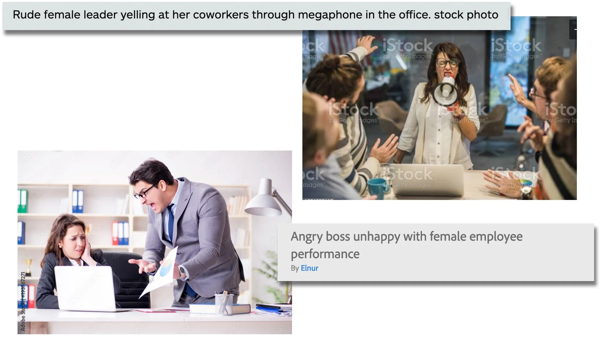
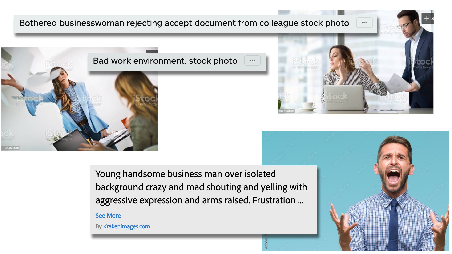
The initial idea that made me want to write this blog post in particularly however surrounded the overtly sexist tones image descriptions and key search words use. Take a look at these images and see if you can pick up on the subtle theme of angry male vs. angry female.
When a male supervisor is yelling at a female subordinate in a lot of these images, the description mentions blame on an ineffective or guilty employee. The male boss is usually labeled as frustrated. When a female supervisor yells at anyone, she’s labeled as unbalanced, superior, rude, or at the very least acknowledging the subordinates are stressed because of her. I understand that when these images are used, they may not be contextualized exactly as their descriptions indicate; but another interesting subtext from a visual standpoint is how often the camera angle changes depending on the sex of the boss. If it’s a dude, the camera is usually perched high, taking on the perspective of the man and from a position of power. When it’s a woman, the camera tends to sit low, taking on the perspective of the worker and from a position of vulnerability. It’s also curious and arguably unnecessary when the image shows just a singular angry person. The guy gets labeled as “handsome” while they double–down with “rage” for the lady.
I realize I’m only showing just a few images, but I’m not overly skewing information here. As mentioned in my earlier disclaimer, these are results from just the first 2 pages of my search. I also realize I’m not saying anything every single woman reading this already knows. “The image sites are sexist too?!” Yeah guys, this is what systemic sexism and racism coupled with unconscious bias look like. It’s literally everywhere.
All in all, stock image sites really are a valuable resource and the algorithms, subject matter, and overall quality continue to improve, but if we’re being honest, it will never be perfect. I had way to much fun with this post and I will most likely tackle this subject again. In fact, I would love to hear if anyone has had similar or other unique experiences when it comes to the world of stock images! Comment below or tell me on Instagram or Twitter!


