Artist Games Featuring Justin Piatt

Yes! It’s time for another Artist Games, this time with the amazing Justin Piatt! Justin has contributed to this blog before, was a major contributor to ToughPigs Great Muppet Mural and its subsequent Making of” documentary, and is one of the kindest and hardest working artists out there! Originally known for his art, Justin now boasts an amazing portfolio of puppets as well! Him and I have known each other for at least 7 years now and have collaborated together on more than a few other projects as well. So it was a no brainer to play this game together.

What game am I talking about? Well if you want an extended look, check out when I played with Will Carroll and Noah Ginex last year, but if you’re anxious to see what Justin and I did, here’s the skinny:

The Rules

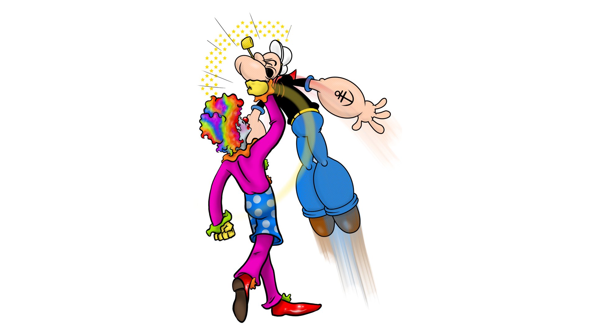
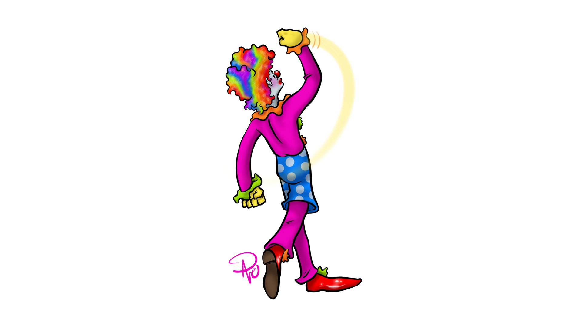
I start first and draw something rather fleshed out then pass it on to Justin. There are no time limits or space restrictions (put a pin in that for now). Either of us can draw as much or as little as we want before passing it back. One artist can add to or obscure the previous work as much as they like as long as they don’t manipulate it (within reason). So to start off, I drew a clown throwing a punch. That’s it! No context, no further instructions.

I don’t like clowns at all. I think I draw them as a face your fears type thing. Coulrophobia anyone?

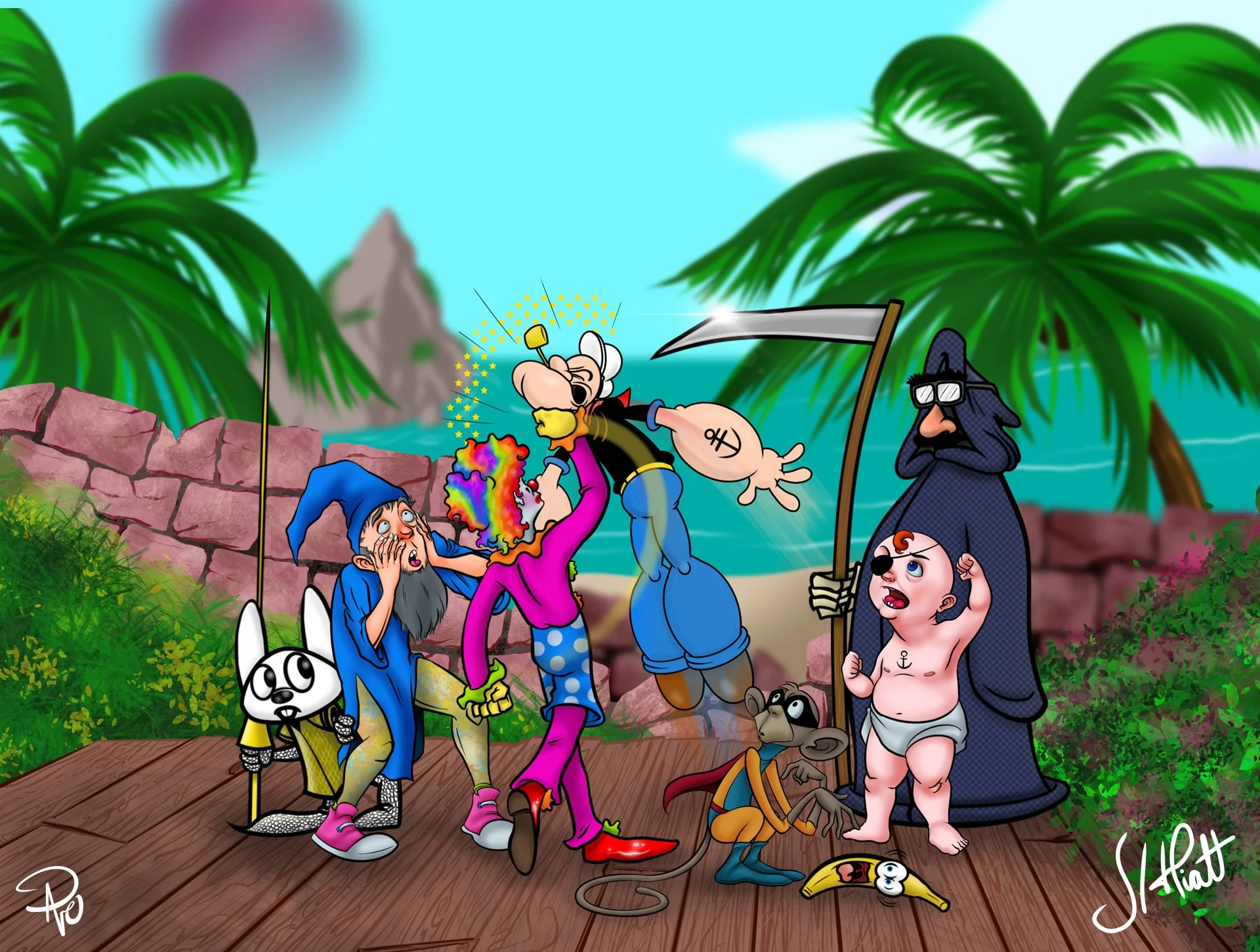
Justin: The pose Dave picked for the clown immediately made me think of Popeye. I didn't even consider drawing anything else because I just had to draw Popeye getting hit in the face by a clown. I could tell you it means something significant. It could be satire, a comment on the current state of comedy and comics, or the physical violence that can be incited by words or the printed page. But I just wanted to draw Popeye getting smacked in the face by a clown.

I'm not sure what else to say on it. I love what he did with the clown. It's such a good pose and I hoped to match it.

Dave: I was thinking of a schoolyard fight but being witnessed by both classic cartoon characters (Justin’s Popeye and my Blip the Monkey) and archetypes that are cartoonish but have real world stand–ins that are fantastical (the clown, a DnD wizard who may just be a weekend dungeon master, and "Pirate Baby" who is a silly character my daughter and I created for when we play).

Justin: I was trying to think of some obscure cartoons and other things that would fit our vague theme. Death seemed like a good fit, just waiting for the loser. I was also thinking that I'd like to have him subtly rooting for one of the characters, preferably the clown. I wasn't sure how to make that work, when I came up with the idea of the Groucho glasses. It was like dressing up rather clownish, but it could also look like Death was trying to stay incognito. 

The banana just sort of happened. I wanted something that wasn't really interested in the rest of the action, because it was only concerned with its own peril. And the monkey looked to be reaching for something, but distracted. It made sense in my head. 

The third character I was trying to grab at a random character from my childhood that nobody remembers. My first inclination was to draw one of Ralph Bakshi's Mighty Heroes, but then I remembered Crusader Rabbit, Jay Ward's series before Rocky and Bullwinkle.

Dave: So Death with Groucho glasses is my newest favorite thing! He needs his own show. Justin needs to patten him and then draw him all the damn time!

I wanted to start to flesh out the world around this odd group, so I was inspired by a scene from The Simpsons when they go to Cuba and there's a boxing match happening outside with the coast line in the background. I went for a slightly more medieval look with lush flora on the sides and a deteriorated brick wall in the background. I also subdued the colors of all that so the focus stays on the fight.

I made the background area bigger than it needs to be with the intention of cropping the final image tighter to the fighters.

So remember in the beginning when I said there was no time limit? I wasn’t kidding! Justin and I initially started this weirdo brawl back in April of 2022. I didn’t jump back on this with the background art until March of 2023. Then Justin—up to his ears in design work—admitted he felt we had brought this about as far as it could go, but I wanted my Cuban street fight, so I fleshed out the rest of the background that is more reminiscent of something otherworldly.

Justin: Just everywhere Dave took this made it a thousand times better and was so unexpected to me and threw me off and made me laugh. I really love the influence of the background being Simpsons/Cuba inspired, which initially made me want to go full Simpson with the sky and paint it pink and yellow, but it drowned out the clown. Ultimately, Dave made the right choice. 

This thing is weird. We made a very weird, strange thing that I very much like. I would want the live action film version, except Robin Williams is gone, and if he weren't, I know Bobcat Goldthwait would get cast as the clown, and I don't like him. So I'm glad this is just a picture we drew instead. 

Thank you, Justin! I love this too! You absolutely need to check out Justin’s website Uzzy Works and his Etsy store and follow him on Instagram, YouTube, Tiktok, Twitter; all as @uzzyworks.

Aah! How great to add this one to the Artist Games! If you’d like to play this game with me, please contact me through here on my site, or follow and contact me through Instagram and Twitter (until it becomes an unmanageable hell scape).

Tedious "To Do" List Lunacy

I was so bad at doing chores and keeping up with my homework as a kid that my parents got me a chore checkoff pad. If you’re old enough to do so, think of a yellow legal pad, only each tear–off page is just the same pre–printed copy of a ludicrous amount of “chores” with check off boxes categorized into different lists, and a bunch of side bar like areas with blank spaces to write in notes and even your own thoughts or special agendas. It was the early to mid 90s and this was a novelty that could only exist before computers and smartphones. Just search “To Do List” in the App Store and you’ll get dozens if not hundreds of Task Manager related hits with more features and personalization resources than a cheap scratch pad from Kmart could have ever offered back in the day.

As a Gen Xer, I’m still genetically predisposed to relying on old fashioned, handwritten or printed media as well as on modern technology in this weird dual reality, and it was that frustratingly detailed chore checkoff pad that serves as today’s inspiration. I keep multiple lists—both physical and digital—that essentially can be broken down into three categories: Things I Need To Do (long term), Things I Want To Do (goals), and Daily To Do lists (aka, “This $#!% Needs To Get Done Now!”).

I could write a lot more extensively on the benefits of these lists, how it’s satisfying to physically drag a pen over an item and cross it out resulting in that tasks completion, or how the whole process is really just a way to compartmentalize life without freaking the hell out, but instead I’m going to write about the absurdity of the second category mentioned, Things I Want To Do and its more specific subcategory, Things To Draw. Now I actually have several of these lists—some more unconventional than others—but they all serve a very specific purpose which can basically be explained as “Staying Creative Insurance.” All creative types know and struggle with creative blocks, and what’s more, they know that creative blocks will always, always be a certainty. So to preempt those blocks, creative people will have “lists” of some kind to assist breaking up those stale moments. This act may be subconscious as I’m sure any number of artists, writers, or Fashion Taxidermists reading this are thinking, “Hold on, I don’t keep lists like that!” But I can assure you that they/you do. A “creative to do list” can take the form of bookmarked content on social media, specially labeled photo albums, Pinterest Boards, bookmarks on your browser, screen captures, a specific shelf in a personal library, scrapbooks, following other artists for daily inspiration, or praying to the Norse God Bragi for guidance on a plausible excuse to post all the hotdog related art you’ve ever done (so far). A “To Do list” or “inspirational collection” then really becomes a matter of semantics.

The other tiny tidbit you should know about these lists—in whatever form they take—are how unique and personal they are to their creator. They will almost always only be decipherable to their author (mostly, but I’ll expand on that more in a bit). We all have our own little idiosyncrasies with everything we do, but when it comes to something more personal like a list of things to do created expressly by and for the only person in the universe designated to see them, those itemized collections can be downright hysterical even if their context is relatively clear (which often it is not). For example, to this day I am haunted by a very old to do list of things to draw with one item simply listed as “Date.” The confidence I must have had when I wrote that is staggering! Was it in reference to an outing I had with a girl? A specific holiday? Did I think there was something to add to Salla’s quote in the monkey death scene in Raiders of the Lost Ark? What’s even wilder is I actually remember the physical act of writing that down, but not the context as to why. If that wasn’t infuriating enough, I kept that drawing prompt idea on said list for years in fear that if I did remove it, I may lose whatever inspiration it ever possessed! It was important enough to write down for some reason.

Case in point, I’m at a place in my life now where even if I suddenly had unlimited time and motivation, all my to do lists would perpetually exist in the same state as my Netflix queue; I’m not going to get to most of it, but I’ll never clear either out as both stand as monuments to my interests if not as one to my goals.

For the purposes of this post however, I’ll be sticking to two “lists” of mine in relation to wanting to draw something very specific. The first is what I’ll call my “Definitely Draw This!” List which is literally a collection of pictures, and screenshots I collect and add to regularly. Incidentally, when I think of my actual “Things To Draw” list, it’s this collection of images I consider as the main one. It’s on a small thumb drive in a folder simply labeled •To Do. The bullet point ensures that no matter what else I save to that thumb drive, that particular folder always remains at the top. A quick browse through it shows mostly images of dynamic poses, facial expressions, architecture, and design styles I want to illustrate. Many of them I already have too, but like my Netflix queue, I don’t remove them after I’ve accomplished what I wanted to. In most cases it’s because those images continue to serve the inspirational purpose as well.

But like my “Date” prompt I mentioned earlier, there are a few pieces that make me wonder why on earth they’re in this folder. Some may take a minute to get (Did I screen cap this book title because I wanted to read it? No, it’s the typography… yeah, that’s it!) Honing in on features, hairstyles, fashion choices, or even specific style choices usually helps, but occasionally I’m at a complete loss.

My second list is more of the scraping–the–bottom–of–the–barrel variety. I love, love, love to write; but art is visual and it’s easier to save a picture with a clear mental note (e.g. “mimic this line art style”) than an overly detailed and usually tedious written direction. If I have an idea that I don’t yet have a visual idea for, I write it down as thorough as I feel I need to in my Notes app. In some cases, this can be relatively short as the prompt in and of itself carries those personal idiosyncrasies I mentioned earlier. For the most part, these have invisible, secondary ideas attached to them like a password or riddle that I and only I would understand. It doesn’t always work as in the “Date” scenario, but usually it does. For example, the prompt “Updated Hamilton” might make most people think I want to do my own take on Lin–Manuel Miranda’s musical, but in actuality it’s an idea to resurrect my own stab at comic writing where one of the antagonists from my strip Lazy Comics is named Hamilton. More detailed prompts like, “Italian/Greek girl, prominent bigger nose, hair in bun on head almost like Egon Spangler” give a pretty clear description of who to draw but offers no context as to why. I know however that this specific caricature was supposed to be part of a series of colorful real life people I observed down the shore when I went to the beach. I certainly won’t take pictures of complete strangers without their permission, and I also know (that in this particular case) I’ve already created a specific style and look, so descriptive written features will allow me to more boldly caricature someone without directly capturing their specific likeness. As for “Fist for a nose”? That’s a “Date” reference again.

What type of lists, prompts, pictures, or collections get you to stave off creative blocks, bring you inspiration, or help remind you to cancel that YouTube Premium free trial? Let me know here or @ me on Twitter and Instagram!

Professional Illustrator

My daughter just turned six and is the most wonderful part of my life. She’s at that amazing age where she’s aware there is a bigger world that exists beyond our neighborhood, but still young enough that her imagination is foundational to that worldview. Case in point, if you were to ask her the most trite and stifling question that all adults ask every child without a hint of comprehension, “What do you want to be when you grow up?” she won’t hesitate to reply, “A princess rock star singer with one hundred kitties living with me in my castle” and hell yes, by the grace of God I want that for her more than she does. Deep down, we all know what a mean–spirited question that is even if we don’t intend for it to be so. “Hey small person who is completely uninformed and currently uncaring about the real world… when you’re neurotic and old like the rest of us, how would you choose to pass the majority of your day so that you have enough money to then retreat to a place where you can contemplate that choice?

When I was six and some dumb adult asked me what I wanted to do when I grew up, I thought to myself, “Well, I have a puppy, I love that puppy, I would very much like to be around more puppies, so a veterinarian seems like a solid way to make that dream happen.” Forget the fact that I am squeamish around blood, do not care to clean up after my own puppy, and have less than a zero interest in medicine, treatment, or healthcare in any form; that two–faced laugh from the dumb adult that just heard that response from me sounds more condescending than quaint, so for that reason alone they can take a long walk off a short pier.

The old adage, “Do something you love and you’ll never work a day in your life” however, is equally threadbare. Now I realize this is all taking a pessimistic tone, but it’s crucial for today’s post which centers around the fact that I am a professional illustrator. I won’t lie, it feels really really good to say that. I am in fact a professional illustrator who gets paid to draw as my full–time job. The irony is that the link from that “I love puppies so I want to be a vet” ideology isn’t a far–fetched detraction from when I was a kid to now as an adult. As I got a little older, I realized the second part of the question, “What do you want to be when you grow up?” Isn’t just tangential to what you want to do, but what you can do. I thought I was decent at drawing so maybe that could play into a full–time job, but in all honesty, the older I got, the more I didn’t know what type of “job” those skill sets could accommodate. But I’m not going to bore you with that trajectory. Let’s just all get on board with the fact that I got to where I am, and today I’m going to explain the pros and cons of that.

Side note: I am hereby dedicating this entire post to my mother. The inside family joke is that one time I was very proud to show her a huge project that I had completed to which she enthusiastically said, “Wow! It almost looks professional!” Granted I had been an actual professional for over a decade by that time, but sure, “almost professional” is better than, “It sucks” I guess. I love you, mom.

As I mentioned a few weeks ago, I have been feeling the lack of a desire to draw on my free time because I’ve been doing so much of it on my paid time. I’m doing what I love, but arguably I’m doing it for other people, so I thought I’d talk about the pros and cons of what that is like. And seeing as we’re already out the gate with the negative, let’s keep that pessimistic vibe going and start with the cons of being a professional illustrator.

The Cons of Being a Professional Illustrator

Real quick, all of this is me venting and not meant to discourage anyone from pursuing their dreams or goals, whether they be an illustrator, veterinarian, or rock star singing princess. Case in point, the first con of being an illustrator?

Little Wooden Drawing Mannequins

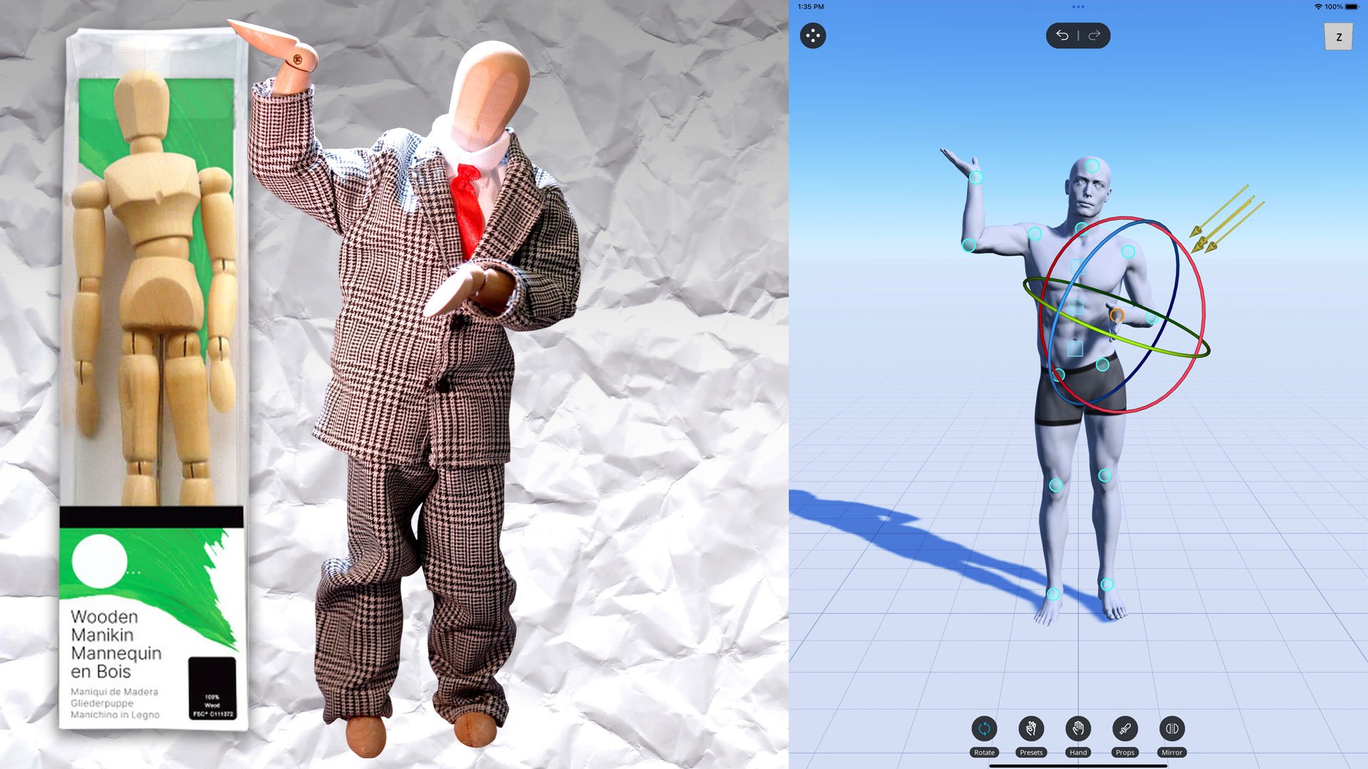
Figure drawing is arguably a key skill set to have and it absolutely raises any illustrator’s game tremendously. The human figure is by far the most illustrated subject world wide. Sometimes it’s not possible to have an actual human model on demand and available to pose exactly how you’d like (and most friends and family won’t be keen to do this in the nude either as is traditionally expected). You can try Googling a pose that’s close to what you need, but even in today’s limitless selection of online images, you’ll never get exactly what you’re looking for. So what’s the the next traditionally available substitute? Androgynous No–Face McSlipper–Hands over here, that’s who.

A standard wooden mannequin, my snazzier wooden mannequin (who was also a mascot from my original website), and the interface of my poser app

The wooden drawing mannequin is as ubiquitous a traditional art tool as a nib pen. They practically give them away with certain drafting supplies at craft stores, but if you’ve ever used one, you know how fallible they are. They don’t hold a pose quite as dynamically as you’d like, they have no defining qualities like muscle or fat, they are completely featureless, and you just know that if they were real, they’d just bore you with bland trivia and complain about the lighting in your studio. If Pinocchio were initially a wooden drawing mannequin come to life, the Blue Fairy would urge Jiminy Cricket to immediately escort him to the fireplace. Yes, they make other, more dynamic mannequins but who cares? Incidentally, I use a poser app instead myself.

You Rarely Draw Cool Stuff

Yes, it’s a thrill to be a published illustrator and having the chance to work on a project that has (or soon will have) a huge following, but when you are an illustrator for any number of blanket projects, you’re not first in line to draw cowboys riding dinosaurs fighting ninjas. It comes up occasionally, but usually it’s things like a graphic to accompany an article about mental health, a helpful hand sign pointing the way to services for mental health, or a cartoon cat who is seeking guidance with their mental health. Yes you’re drawing, but you constantly wonder if it’s having an impact on your own mental health.

Draw Worser

This is an odd one, but you’d be surprised how often I receive the direction to “draw poorly.” I’ve worked on several projects where my work was criticized for being “too refined” or “too professional.” Sometimes it’s because the style of the illustration is supposed to look fast and loose like something from a tourist trap map. Sometimes the art is intended to look like a child drew it which always seems to translate more to “draw like someone who has just suffered severe head trauma and rather than go to the hospital has opted to sketch their family having a sad dinner.” I get the idea of what the client wants, but “drawing like a child” should never mean, “Draw like a wild animal is violently slashing a crayon around in its mouth.” There’s cute, there’s bad, and there’s subjective. Besides, why would someone who can’t draw, direct someone who can? Incidentally if you’re wondering, this assignment usually comes to talented artists because you actually have to be able to draw pretty good to effectively draw pretty bad. It should be a weird breath of fresh air to get notes back that insist that you’re drawing too well and it should be crappier, but I can assure you that it is not.

Unseen Work

The most frustrating aspect of being a professional illustrator is how much work never sees the light of day. There are drafts upon drafts upon drafts that nobody cares about of course, but I’ve done so many fully rendered (or at least nearly fully rendered) illustrations that never saw print or publication for hundreds of reasons. Sometimes the client changes their mind, sometimes deadlines quash the concept, sometimes you’re working with other illustrators and they manage to get the job done to greater satisfaction before you can, sometimes the project is just cancelled, and sometimes you just can’t show anything because of the professional illustrator’s thorn–in–their–side: the NDA. It’s all part of the job and there’s nothing that can be done.

Occasionally something may get resurrected way down the line, but by then, you the illustrator are no longer happy with the initial work and decide to start over. If you’ve ever checked out a book that features a lot of concept art for a project, you should know you are looking at an incredibly tiny fraction of the total work done. That’s just the stuff the publisher wanted (or rather allowed) you to see and it’s usually so they can claim ownership of those unused ideas as well. No artist just draws one picture for a job and that’s all there is. Whether it’s dozens of concept sketches or previous versions that needed further contemplation, every illustrator could literally fill a book with the work that has never nor will ever be seen.

My mom thinks I’m cool

The Pros of Being a Professional Illustrator

Okay, enough Debbie Downer talk, let’s chat about what’s great about being a professional illustrator! Being able to draw is one of those cool parlor tricks everyone wishes for; like sitting down and playing piano at a party, or randomly speaking a foreign language when a distressed stranger needs you to help solve an international crime, or juggling for everyone waiting at the doctor’s office before an invigorating colonoscopy. “You draw for a living?” A bright–eyed little boy marvels as you doodle a helpful sign pointing the way to services for mental health. “I do!” You reply knowing there’s now someone on earth who will briefly see you the way you’ve always dreamed of being seen.

Kids Are Impressed

Being a professional illustrator always catches kids off guard when they find out what I do. I am not exaggerating when I say literally every single child who has ever stumbled upon me drawing always, always asks, “Are you an art teacher?” This question comes to me so often that it depresses me to my core. Not because I think “art teacher” is a bad job (quite the opposite in fact, I think art teachers are the greatest and most inspirational humans on the planet), but because that’s the real world extent kids think an illustrator can do. Illustrators typically aren’t billionaires who like to eat trail mix before paying for it whilst browsing the dollar section at Target such as myself, but there are so many other opportunities other than just functionally rolling out other talented teachers. This is what expectations are though when schools eliminate the arts and music; you force kids to think there’s no other place for them.

But that’s all to say when they find out there are other options, they start to think (and dream) beyond their initial expectations in regards to their own future. That’s right boys and girls, this middle–aged, dollar section bargain hunter can be you. You’re welcome.

Work Pays For Stuff!

If you’re a freelance artist this does not directly apply to you, in fact this may be a con for you, but as an in–house illustrator, my job pays for all my supplies! Adobe CC? Work covers the subscription. My 22” Cintiq HDT? Work. New nibs for the Apple Pencil my job provided me? You guessed it, work! Because I draw professionally, all these toys and tools may not belong to me personally, but I get to use them that way. If you’re a freelancer, you can claim that stuff on your taxes I suppose. Freelance artists will create their pros and cons lists differently I imagine.

I Don’t Know How To Label This Next Part

Nowadays I do 99% of my illustrative work on an iPad Pro which means I get to stretch out on the couch while Netflix drones on in the background. That’s it. That is definitely a pro.

I’m sure there’s a fourth thing to tip the balance in favor of the pros, but honestly if you’ve read this far, let’s call it even and we can all go home early.

A letter from my grade school art teacher after I had reached out to him

I want to take one last opportunity here to mention my love of school art teachers with two short examples. My grade school art teacher Mr Megill was the first person who really encouraged me to see art as an extension of myself. He got me excited to try new techniques and I know all my classmates felt the same. He is one of those educators you think of when you hear about those special teachers who keep the world turning. Mr Megill is a super human and I adore him. The other is my daughter’s art teacher. One day, she came home from school and told me, “Daddy, Mr. Fourre is a way better artist than you! He’s amazing!” You think that would have knocked me down a few pegs but I was so thrilled to hear that. Kids need real world heroes other than their parents and the idea that she sees her art teacher as superior to me absolutely filled me with so much joy. Effectively, she separated me from something she admires more in someone else and man am I so proud of that. Granted, it meant the cat illo I was working on looked too refined and happy for the mental health guidance they were seeking, but I intend to watch season 5 of The Crown while I make those changes anyway.

Thank you so much for stopping by! Follow me on Instagram and Twitter for more reverse mermaids, Muppets, and whatever else I normally push.

I [still] Know What You Meme!

There’s nothing like laughing your life away with a batch of memes that may or may not hit just a little too close to home. So with that being said, here are some memes!

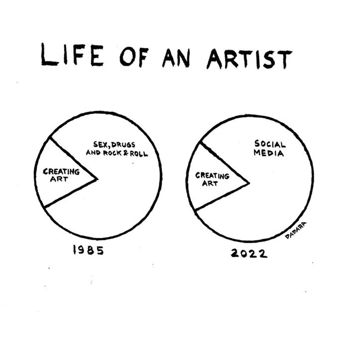
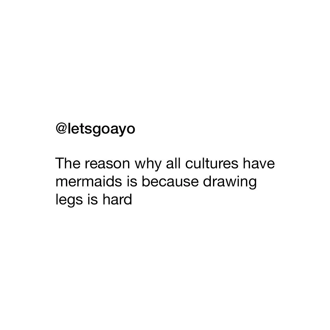
Not quite what you expect with figure drawing

This more accurate than anyone wants to admit

This one is legit my favorite.

Follow me on Instagram and Twitter and tune in to this blog on (most) Fridays for more fun!

Starry Eyed & Tongue Tied

Last Friday I ended a 25 week streak posting my blog and while the world did not end because I didn’t post, I was bummed out. The problem is I am over my head with freelance and full–time work and some of what I’m working on is super cool and very loosely and indirectly related to this post and I cannot wait to share it with you!

Anyhoo, starting in the early aughts, I began attending comic cons regularly. Before I go any further, if you have never been to a comic con, you absolutely need to go. It doesn’t matter if you’re 8 or 88 and it also doesn’t matter if it’s a humongous convention like SDCC or a tiny one in the basement of a VFW hall. Of course, comic cons back in the first part of the 21st century were slightly different than they are now. For starters, they really were all about comics. Today they tend to be more of a “pop culture convention,“ but they are still a blast.

Wizard World Philadelphia. May 30, 2003

Over 20 years ago, they were also primarily populated with mostly male attendees. When my girlfriend (now wife) would accompany me and our friends, there would be somewhat of an awed hush for a moment when she would first walk on the convention floor. This was more of an initial reaction to her sex over her radiant beauty, but times slowly changed and soon conventions became a much more homogeneous experience. Now that we are married, she will often mention she no longer does comic conventions because she “served her time.

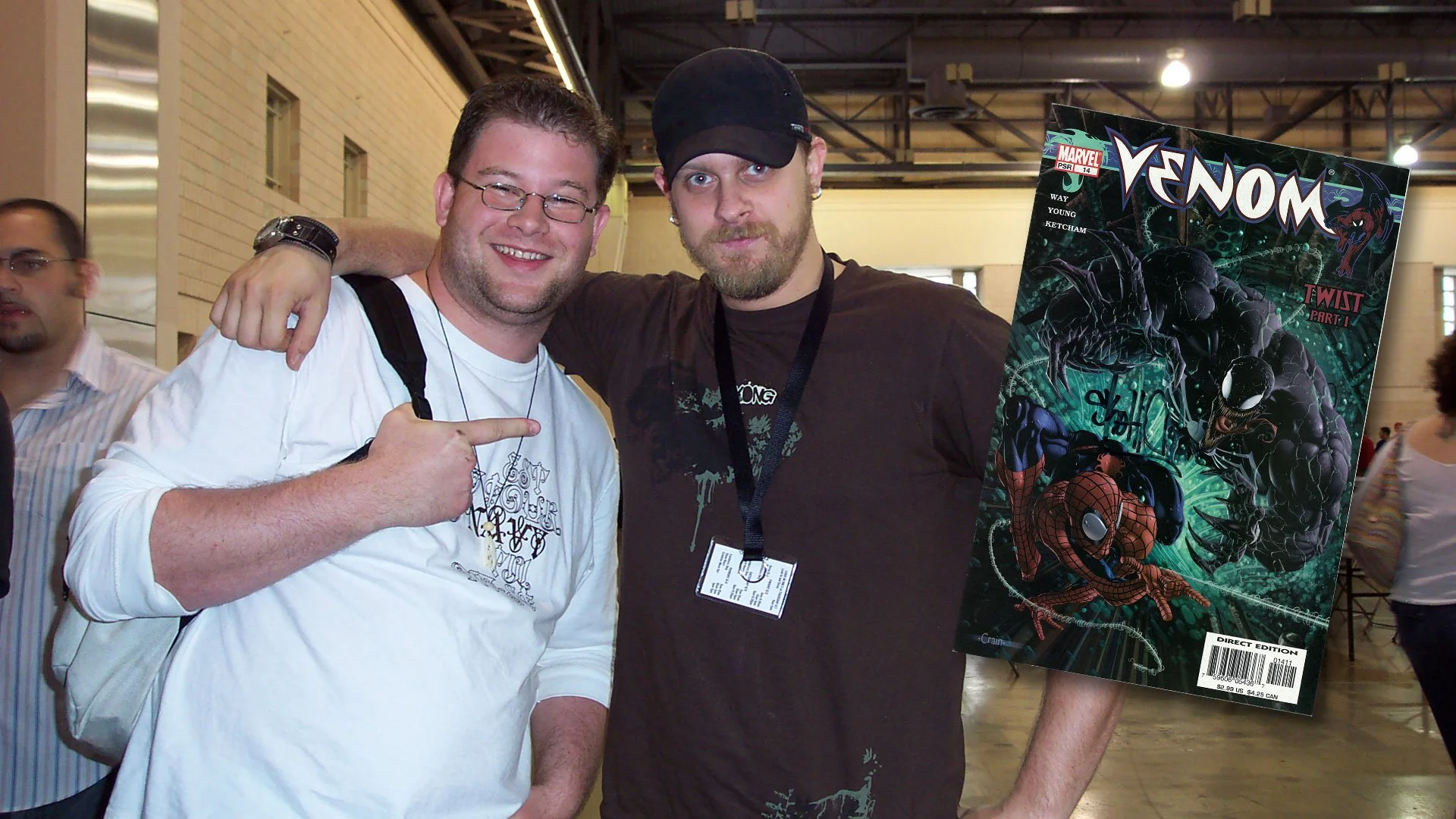
Anyway, in 2006, I dragged her along yet again to Wizard World Philly with my primary goal of meeting comic artist Skottie Young. He is a well renowned artist today, and while he was certainly hot back then, he was arguably still an up-and-coming creator. This can be proved by the fact that he had his own table with no line of swarming fans or even an assistant! It was just Skottie hanging out and drawing alone all day and excited to talk to anyone. 

At the time, he was working on a run of Venom, continuing Marvel’s unconventional trend at the time of showcasing more cartoonish and exaggerated styles on Spider–Man titles along with other artists like Humberto Ramos. I was a super fan, constantly visiting his site to see all his sketches and drawings of any and everything. He wasn’t just an incredible artist, but a super cool guy as well who seemed to have similar pop-culture interests as myself. Not a surprise considering he’s barely 2 months younger than me!

Checking our convention guide, I located where Skottie’s table was and we made a B line so I could ask him to sign my Venom comic and maybe even take a picture with him. As I mentioned, he was alone and just drawing away. When we approached, he lit up like a Christmas tree with excitement. What a fantastic guy! I was so pumped and excited to gush over how great he was. I opened my mouth to greet him and introduce myself only to discover I had completely forgotten the English language. 

Skottie’s table was our very first stop at the con and the one and only thing I truly wanted to do and now that we were finally here I was so star struck that I literally couldn’t speak. I was like Ralphie Parker meeting Santa Claus at Higbee’s in A Christmas Story. I stood with a dumb, open–mouthed smile for a ludicrously long time that made Skottie and my wife shift awkwardly as they waited for me to do absolutely anything. Finally my wife stepped in to save me with a prompting and encouraging, “Hello.” Yes! Hello! What a novel way to start a conversation! I will try saying that, and so I blurted out much too loudly and abruptly, “HELLO!” “Hey! How’s it going!” Skottie replied with renewed energy and a warm friendly smile. I resumed my blank admiring mannequin face as if I was a Make–A–Wish patient who no doubt suffered severe injuries from his love of drinking gasoline straight from the pump. My wife—now staring at me incredulously—saved my bacon again with another encouraging prompt. “He really likes your art.” she said sweetly as I stepped over her last word obnoxiously, “I REALLY LIKE YOUR ART!” 

For the next few minutes, this was pretty much how we communicated. My wife patiently told Skottie what I admired about him and his work and then I would loudly repeat her words in the first person. It was like a bizarre avant–garde ventriloquist act where I was the dummy, my wife the puppeteer, and Skottie as the beleaguered volunteer pulled randomly from the audience. What a complete and total $#!t show. Somehow I managed to get my comic signed and a picture as well. Skottie was polite, patient, enthusiastic, and so kind. He was exactly the type of person I anticipated him to be and I blew it. 

Me still in complete disbelief that is indeed Skottie Young. June 2, 2006

As soon as we were out of earshot from Skottie, my wife turned to me shocked and somewhat exasperated. “What in the world was that?!” she asked. I had returned to earth at that moment as well and was equally stunned. “I have no idea!” I admitted. It was at that exact moment that I had a very serious problem on my hands and I needed to rectify it immediately. My main concern at the time was the realization of just how much this could hinder my own illustrative career. Thanks to sites like ToughPigs and the exposure I was getting from such a niche fandom, I was sure it was only a matter of time before I would have the opportunity to meet actual Muppet performers and maybe even work for them. At my core I knew it was vital they saw me as a peer and not just a fan. Of course if I couldn’t chat up a fellow artist just because he was successful, how would I speak to someone who was partly responsible for molding my childhood, affecting my overall trajectory as a creative person? 

It turned out it was even worse than I imagined as not long after that, I bumped into a family friend—yes, a family friend—whom I greatly admired. Now I had never met him prior, but I had seen pictures and heard recordings of him (he was a very talented musician) so imagine my horror when I got tongue–tied chatting with him as well!

I took the “Face Your Fears” approach by attending every book signing I could find, hung outside every service entrance after a concert, waited in autograph lines at conventions, and attended any speaking engagements featuring celebrities that interested me; all in the hopes I could act like a normal human being around anyone with a modicum of fame so that one day I wouldn’t completely lose my mind if I met someone really famous.

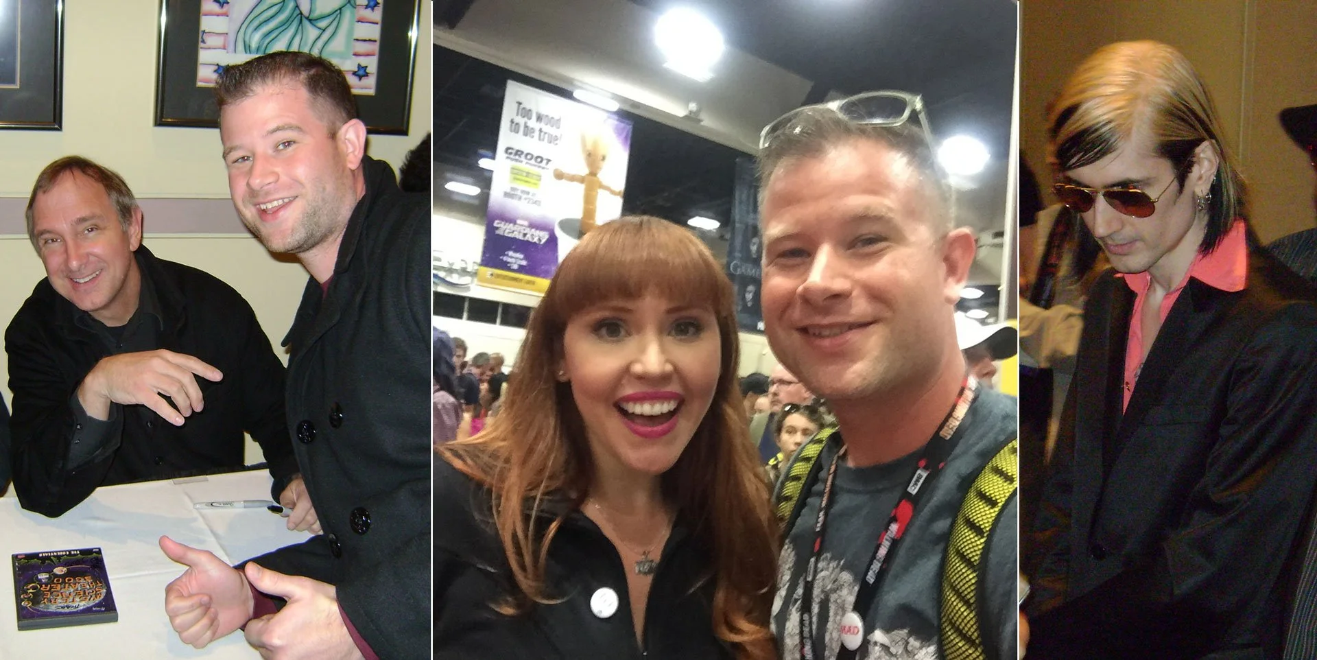
Weird Al Yankovic (2/2/2011), Jesse Ventura (4/7/2011), and Gary “Baba Booey” Dell'Abate (11/9/2010)

I very quickly realized “fame” wasn’t the crux to my star struck nature, it was admiration. If I somehow found myself face to face with someone like Hugh Jackman—something that actually happened —I was excited but maintained my composure easily. However, if I met the likes of Trace Beaulieu, Lorraine Cink, Doc Hammer, Louise Gold, or Stanley Lau, I’d start to choke up. Interacting with them at events did become easier and was also very safe. I was able to see them as actual people and before you knew it, I could at least fake acting casual. When I finally met those lofty Muppet people, at the very least I wasn’t a hot mess. 

MST3k’s Trace Beaulieu (11/27/2010), Marvel’s Lorraine Cink (7/24/2016), and Doc Hammer (4/19/2008) co–creator of The Venture Bros.

I still get very excited when I meet someone I admire—famous or not—and on the inside I’m fan freaking out. If I ever meet Lois Van Baarle or Frank Oz or Jamie Hewlett I think my heart would still explode. At the very least, my wife knows I can control my basic bodily functions without her by my side the entire time. 

Skottie Young, if you’re reading this, thank you so much for being so pleasant and patient and inspiring. Not just to draw better but to get my act together and focus. It changed my career. You really are the GOAT!

I’m not posting much now on Instagram and Twitter but follow me anyway so when I clear my slate you’ll see what I’ve been up to! And come back here every Friday for more creative thinking!

Hot Dog 🌭

Do you know what annoys me that I have no good reason for being annoyed by? When I see other artists post things that say, “I’m working on some really big stuff that I can’t talk about right now!” then scamper off into the corner. We get it, you’re a big shot! Who cares?!

So anyway, I’m working on some really big stuff that I can’t talk about right now! That is to say that I (again) have to throw together something way too quickly for my blog this week. As I sat around in my mansion wearing imported silk pajamas whilst sipping vermouth and being fanned with a giant palm branch by my assistant Pippy, I thought about what I could write about. My many instances of drawing Kermit the Frog may have set a dangerous precedent as it was paramount to my thinking this morning when I contemplated how it’s Memorial Day weekend. Traditionally a day to reflect but also a time arrested in the celebration of the start of summer, i.e. barbecues.

It was at that exact moment I realized I draw a lot of hotdogs. They’re not even my favorite food, so why this post? Is it an American delicatessen that needs defending? Perhaps a Freudian cliché? An immature whim to still find the alternative nomenclature “wiener” absolutely hysterical? A sporadic and ill–thought out and last minute idea?

Personal note: Make a blog post about all the memes I’ve ever drawn.

Who cares? It’s a holiday weekend! So enjoy those barbecues, your loved ones, and this ridiculous collection of hot dog art.

Okay, this is ridiculous. You should get an achievement just for clicking this link.

Anthropomorphizing hot dogs is where the real artistic journey begins. Hot dog people are lit.

I’m relatively certain a few people will reach out privately to make sure I’m okay.

When I was trying my hand at writing comics, I thought I had struck gold with Weiner–Man (purposely spelled with “ei” rather than “ie”). He was suave, embroiled in political controversy, yet a kind–hearted soul. Was a star born that fateful day? No. But has he gone on to inspire a cult like following? Again, no. But will he one day make his triumphant return? Most definitely not, no.

The debut of an icon

I can’t even begin to tell you how proud I was with the creation of this character. He was legitimately on my resume and business cards at one point. I’m so ashamed!

Wiener–Man, the all American hero with the rich and mysterious Señior Weñior

And that about closes out this week’s fluff piece. Please follow me on Instagram and Twitter for more exciting hot dog art!

The Wild World of Stock Image Sites

Recently, I was part of a very informative meeting regarding depictions of human trafficking in media. Essentially, our editorial and design staff were made to understand how common images that were originally used to bring awareness to modern day slavery are now outdated and even harmful as they inaccurately portray trafficking and its survivors. It is crucial for creative people to have an open dialog with professionals from other fields to progressively create content that can inform the public properly and in cases such as human trafficking, even assist law enforcement. These conversations can be difficult and awkward for both sides to understand each other in hopes to produce potent tools that can be used effectively. While right brained designers want to grab your attention with bold graphics and a clear narrative, left brained social workers prefer ethical empowerment and avoid sensationalism.

Human trafficking is a very serious issue that affects tens of millions of people, and as graphic designer, I personally recognize how important it is to have an open dialog with service providers, allied professionals, and government officials so that I can create materials that inform and assist the public in a helpful and sensitive way. There are a lot of solemn instances with different contextual uses of media that require a deft hand when designing resources for such heavy issues, and it’s definitely something all creative people need to be aware of. This particular blog entry—and I cannot stress this enough— is not that conversation. Sorry to lead you on like that, but I think it’s very important to highlight just how oblivious the creative industry can be and how image sites in particular seem to be day drinking heavily.

First off, let me take a minute to explain image sites to those who might not be familiar with them. Every advertisement and publication you see has two sides. The editorial side, and the design side. The editorial side provides all the information you need to know: what something costs, where something goes, and when something starts. The design side is what gets you to look and lets you know who something is for, how it works, and why you should get it. The visual content is usually the last piece of the puzzle to come about because editors and writers are slow and think they are more important than designers. If you have a budget and time, a designer can photograph or illustrate or film whatever they need and make a really cool piece of media they will proudly show everywhere. More often than not however, designers are pressed for time and need to get their hands on photographs, illustrations, or video immediately, I.e.; something that has already been created. Hence, stock image sites.

You’ve no doubt seen a news story with a Getty Images watermark front and center over it. For a fee, an image site will license media to you for an extended period of time. Unsplash, iStock, Story Blocks, Shutter Stock, Adobe Stock, and the multitudes that have been absorbed like Veer, Dollar Photo, and Corbis just to name a few. Image sites are helpful tools for creativity too and usually have media under a truckload of search tags so you can narrow down what you’re looking for to something very specific and still have a decent selection to choose from. Whether or not these sites pricing structures are fair and what cut they pay to the content creator is not what we’re talking about today either. Instead, I’d like to focus on some of the absolutely bananas content these places think creative people need and how out of touch they can sometimes feel.

Disclaimer 1: Initially I thought I’d do cross checks on multiple image stock sites, but the honest to God’s truth is that they are almost all the same. Not only do they feature the same content, they feature the same search results so while I may slip in an image from somewhere else here and there, the majority of what you’ll see here is from Adobestock. I actually really love Adobestock and Adobe products, but if I’m being honest, I’m still a little miffed they bought out Dollar Photos.

Disclaimer 2: There’s a good chance you’ve seen Reddit or other meme sites feature weird, WTF collections of pictures from image sites, but this isn’t that either. There’s a few images that I can’t fathom what they’d be used for, but nothing incredibly out of the ordinary. No “Hide the Pain Harold” here!

Disclaimer 3: I could write a book about this verses a blog post. The images shown here tell their own story and were not cherry picked to prove a point. I will probably write another post in the future with a more studied and researched collection, but for today, these are all images that came up within the first few pages of a search. It’s not rocket science and the algorithm for these searches are something every designer is familiar with and I’ve always found these results to be either hysterical or infuriating.

Words Bad Good

Sometimes a concept is just so lofty an idea that creatively the only way to convey it is to have a picture of the word you’re searching for.

“Okay, so this our new campaign regarding lunch programs for underprivileged…”

“LUNCH!!!”

“Er, what’s that Ralph?”

“LUNCH!! LUNCH!!”

“Sure, okay, let’s go with that.”

Either there’s a much higher demand for pictures of neon signs that say Ralph than I would imagine, or AI is responsible for a lot of these images.

Maybe it’s effective if it’s being used really well, but otherwise, this is the laziest of lazy design. To be fair also, this type of conveyance is heavily used when a concept is a little too abstract like searching for images related to ASAP for example.

Yes, “Condyloma” was one of the very first images that came up when searching for dynamic text.

Totally Not Racist

Everyone wants you to know they’re not racists… well, not overtly racist people because that’s their thing, but on a professional level, corporate America wants you to know they’re not racist. So clients understandably like images that show diversity. To an image site algorithm, “diversity” is a weird metaphor for racial harmony. Like a hit–you–over–the–head–to–say–we–swear–to–God–we’re–not–racist type of energy that tries way too hard. Why are you making hand hearts, or holding hands, or standing so uncomfortably close together? I want something other than just white people, you don’t have to invade each other’s personal space. And why is everyone so happy just to be standing around? To be fair, “diversity” as a search term is very slowly expanding. Now instead of a couple of black people, someone is also wearing a hijab usually so progress, I guess. Asians still can’t catch a break, they’re not invited to the stand around and smile parties.

We’re diverse AND awkward!

Anger, The Funniest Emotion

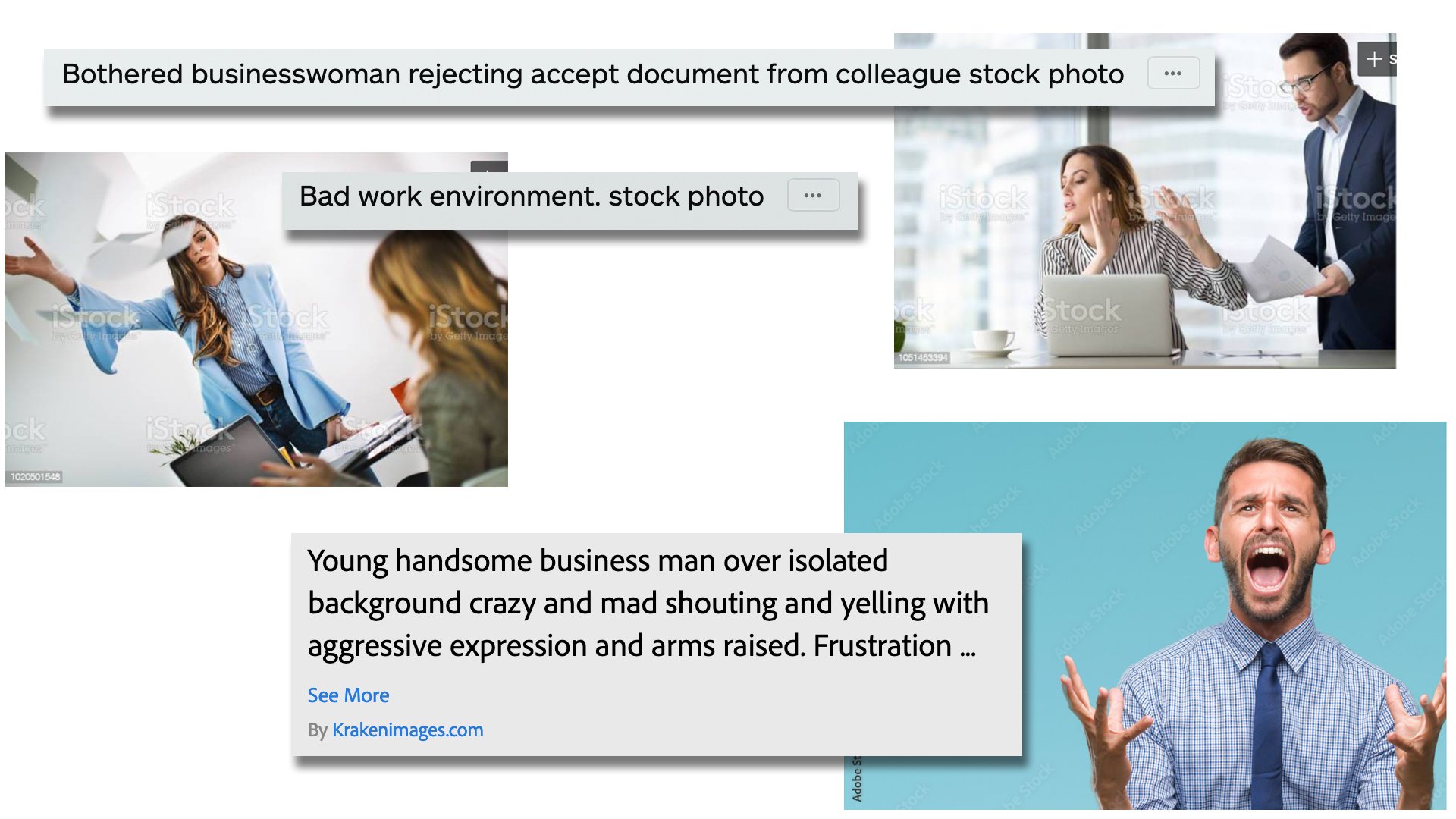
The easiest thing about capturing happiness on film (Hi! I’m old and say things like ‘on film’!) is that you can elicit a genuine look of it from a subject. All you need is a funny photographer, a wonderful memory, or the threat of not getting paid. Sadness is a little trickier, but good lighting, focusing on trauma, or the threat of not getting paid can make a believable image come to life. Anger? Well, maybe real anger looks too angsty or doesn’t convey just how dark the average human being is, so image sites portray anger as OH MY GOD!

You wouldn’t like me when I’m psychotic.

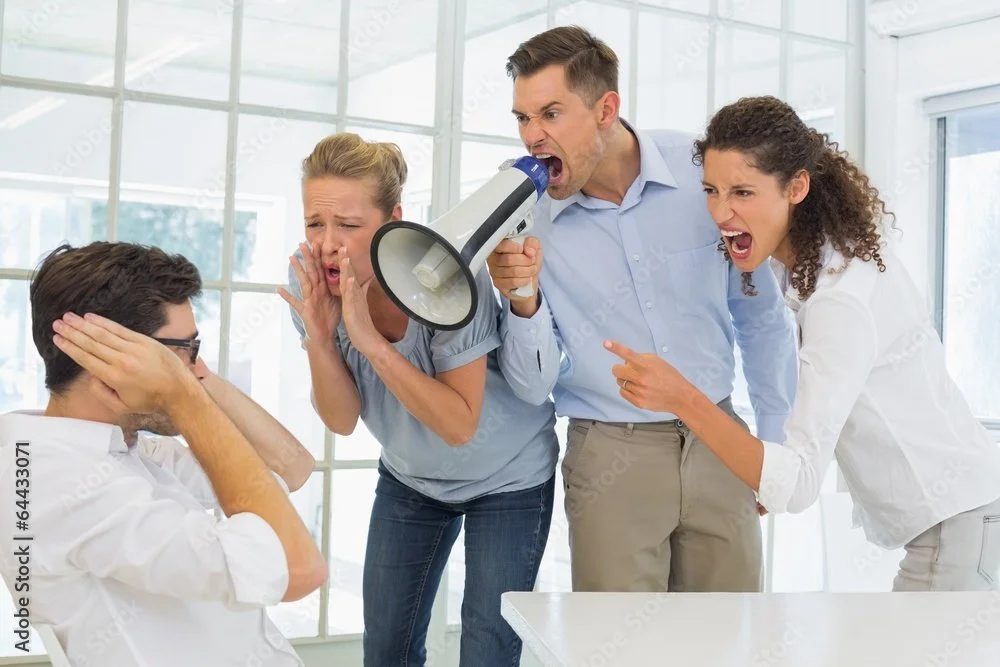
We’ve all been angry, but somewhere along the journey of visually presenting emotions, people translated “angry” to psycho murder demon. It’s funny, but usually “anger” in advertisements is used in relation to stress relief of some sort. Is your job getting you mad? Is your old appliance on the fritz? Is your internet slow? Are weasels deliberately mispronouncing your name? Well then you need our product! And to get your attention, we’ve used this very relatable approximation of you; violently screaming or punching something because that’s what normal people do every day.

They really hate laptops.

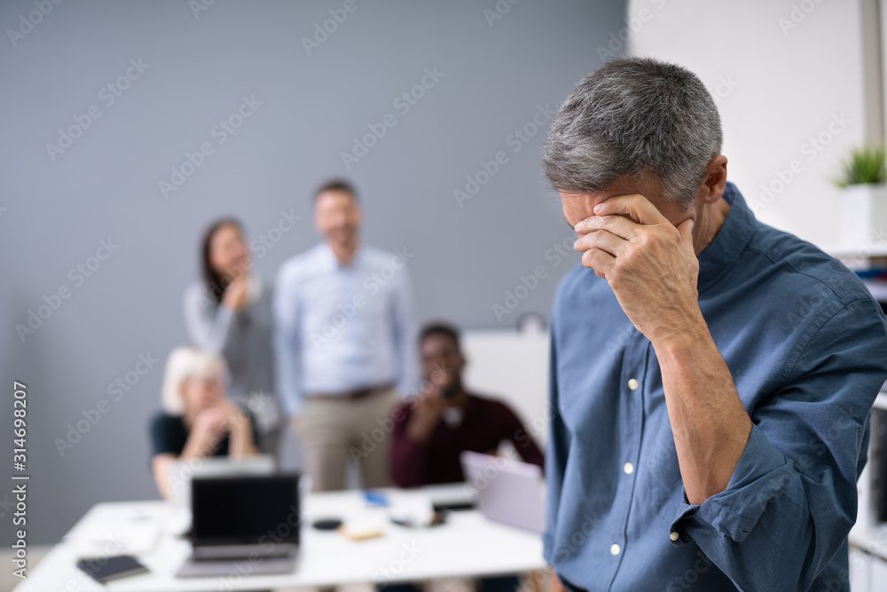
Maybe bullying is tangential to anger, but I get charged per subhead, so it’s going here as well. Also a serious and topical issue, bullying affects way more kids nowadays then when I was a kid. People who think bullying is just a part of childhood and that kids today are pansies can seriously go suck it because way back in the day (before the internet), you had a safe space called home or church or some extracurricular aside where you fit in. Your bully didn’t follow you everywhere which, thanks to social media, that’s exactly what they do today.

That woman in the gray dress is boldly playing both sides.

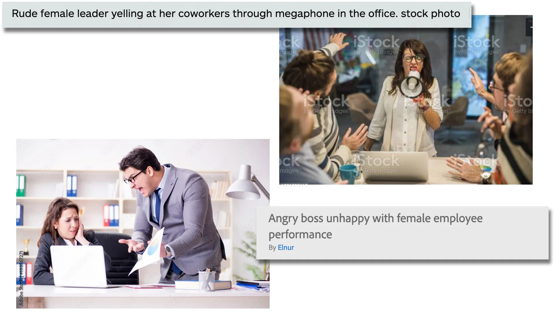
So again, I don’t mean to make light of a serious situation here. I’m Gen X, I sympathize with people and understand the world’s gonna’ keep changing regardless of how I feel. That being said, typically we relate bullying to adolescence. Yeah, I know it exists everywhere in every facet of life, but some of these images are hilarious. Not because someone is being bullied, but the setting for all of these is clearly a corporate environment and the idea that multiple adult coworkers would comedically harass other adult coworkers like they’re in an 80s Ivan Reitman film raises more questions than it sets out to solve. Why are they using a bullhorn? Why does their office have a bullhorn? They’re standing right in front of him, how necessary is the bullhorn?

A bullhorn isn’t a way to get people to listen, it’s a way to force people to hear you.

I’ve been in offices and on teams like this one. When computers are lined up side by side like this, it’s because everyone is working on the same project. Those two idiots are harassing someone who is most likely very consequential to their work and by proxy; deadline and paycheck. Help her out you lunatics! At the very least shun her for bringing unnecessary drama into the office and talk $#!t about her behind her back like a real American!

Ha ha ha! Bob has a headache! Isn’t that hilarious?!

Now this could be anxiety over an oppressive boss, or even something more serious like sexual harassment in the workplace. The problem is the focus is all off. She’s very strangely infatuated with the clipboard and he seems terrified of the succubus’ mouth forming from her chest, ready to devour his head. “Don’t these sales and revenue reports turn you on?

You’re Doing It All Wrong!

If you have a talent, hobby, or interest that requires some degree of knowledge beyond what most people know of said subject, then an image site is rife with inaccuracies. That’s not how you hold a trumpet. The world at large may not know that or even care, so sue me and every other brass aficionado; but some of these are just confounding as to how anyone would use them for any purpose.

Is that woman playing Weird Al? Because it’s clearly a very funny song. Is that boy preaching to God himself? Wouldn’t he be pretty familiar with His own book? Are these people Jedis? Why are their hands so close to the ground? What is the relationship between planes and guitar strings? Did this couple stumble upon a guitar player in the middle of the woods or did they just drag him out in the middle of a forest to play because they’re tired of people criticizing how they clap? What the %@$# is going on?!

You know how you have to transfer all that digital information to paper? How tedious! Why do we even have computers?!

Sexism Everywhere

The initial idea that made me want to write this blog post in particularly however surrounded the overtly sexist tones image descriptions and key search words use. Take a look at these images and see if you can pick up on the subtle theme of angry male vs. angry female.

When a male supervisor is yelling at a female subordinate in a lot of these images, the description mentions blame on an ineffective or guilty employee. The male boss is usually labeled as frustrated. When a female supervisor yells at anyone, she’s labeled as unbalanced, superior, rude, or at the very least acknowledging the subordinates are stressed because of her. I understand that when these images are used, they may not be contextualized exactly as their descriptions indicate; but another interesting subtext from a visual standpoint is how often the camera angle changes depending on the sex of the boss. If it’s a dude, the camera is usually perched high, taking on the perspective of the man and from a position of power. When it’s a woman, the camera tends to sit low, taking on the perspective of the worker and from a position of vulnerability. It’s also curious and arguably unnecessary when the image shows just a singular angry person. The guy gets labeled as “handsome” while they double–down with “rage” for the lady.

I realize I’m only showing just a few images, but I’m not overly skewing information here. As mentioned in my earlier disclaimer, these are results from just the first 2 pages of my search. I also realize I’m not saying anything every single woman reading this already knows. “The image sites are sexist too?!” Yeah guys, this is what systemic sexism and racism coupled with unconscious bias look like. It’s literally everywhere.

All in all, stock image sites really are a valuable resource and the algorithms, subject matter, and overall quality continue to improve, but if we’re being honest, it will never be perfect. I had way to much fun with this post and I will most likely tackle this subject again. In fact, I would love to hear if anyone has had similar or other unique experiences when it comes to the world of stock images! Comment below or tell me on Instagram or Twitter!

I Know What You Meme

I have a nice long list of ideas for blog topics, so “Yay!” I also love to write and make long in–depth posts that are full of ideas and concepts that can take awhile to read, so “Yay?” My point is I wrote a super long post last week and have a super long post next week, but I don’t want to drown the scant number of people who visit this blog and feel like I’m just lecturing, so today is a little dose of fun and silliness. Plus I stole literally all of these memes.

That dafont one hits hard

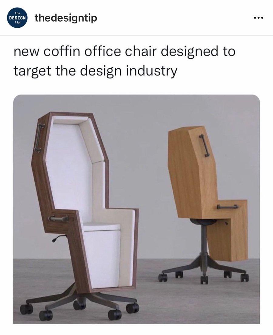
TheDesignTip on Instagram has lots of relatable graphic design and artist/illustrator memes as well as some great inspiration and follow suggestions. I think the great part about career specific jokes and memes is that they make you feel like you’re part of a greater collective who’s in on the joke… or in on the pain and suffering. Pick your poison!

Behance also has a bunch of humorous observations, rather than memes, but strangely I couldn’t find any in my collection. They’re also a good place for inspiration.

As always, I would love it if you followed me on Instagram and Twitter! Do you have any favorite graphic design/creative memes? I’ll leave you with my absolute favorite one:

I really do love this so much!