The Second Redraw Challenge

There’s this super cool trend on TikTok and Instagram where artists will show an older illustration they did and then erase the layer (original art above) exposing their latest take (on the layer below) showing how much they have improved over time. A couple years ago, I wrote a post about redrawing my older artworks (sans cool video editing) and how satisfying that can be. Today I’m doing something (kind of) similar (again, sans cool video editing) and how the more unique illustrations will always be the ones I cherish most.

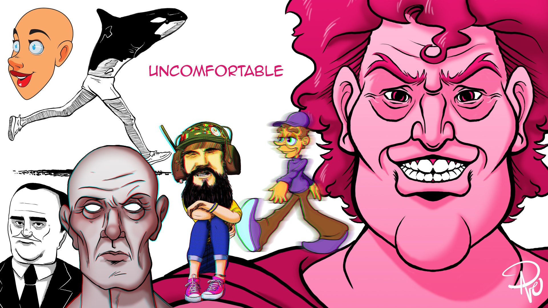
Back in 2017 I sketched a reverse mermaid (pretty self–explanatory once you look at it) which for some reason felt like something I just needed to draw. Five years later I knew I could do better even if I had no idea why I should. The reality is I was very interested in learning what my drawing program Procreate’s brushes could do. In 2017, I sketched Weird Al Yankovic as Batman. Okay, hold on a hot second. Let’s get something cleared up quickly now that I think of it:

  1. Many of these illustrations are really just rough sketches that could be considered concepts and not very well thought out beyond that and refined much, much later.

  2. Something inspired these crimes against humanity, and I really no longer remember what they were, so just come along for the ride with me, m’kay? Thanks.

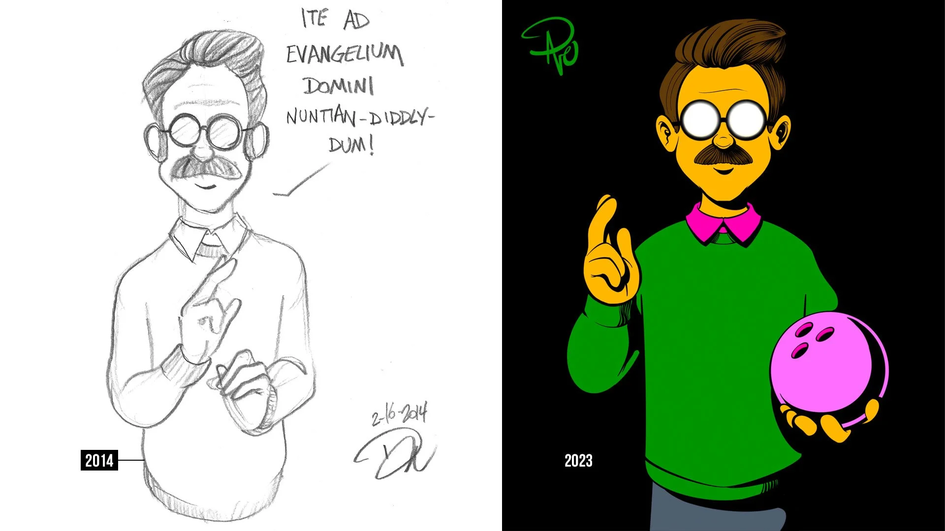
Like many, I love The Simpsons. Their pious neighbor Ned Flanders is my wife’s favorite character and I love building upon creator Matt Groening’s style. I actually wrote in depth about this particular illustration last year if you’re curious about the pose and overall inspiration!

Again, while I don’t remember the inspiration for many of these illustrations, I at least know that both the following 2014 sketch and 2022 recreation are not depictions of the Hindu goddess Lakshmi. No religious disrespect here! I do know that what I was initially drawn to (pun intended) were the hand poses. Holding chopsticks, ASL “I love you”, the Salvator Mundi blessing gesture, and the open hand are really cool and challenging. Also, again I was enjoying learning how to better digitally paint in Procreate as well as trying out some of the adjustments and effects. I’m a real sucker for chromatic aberration.

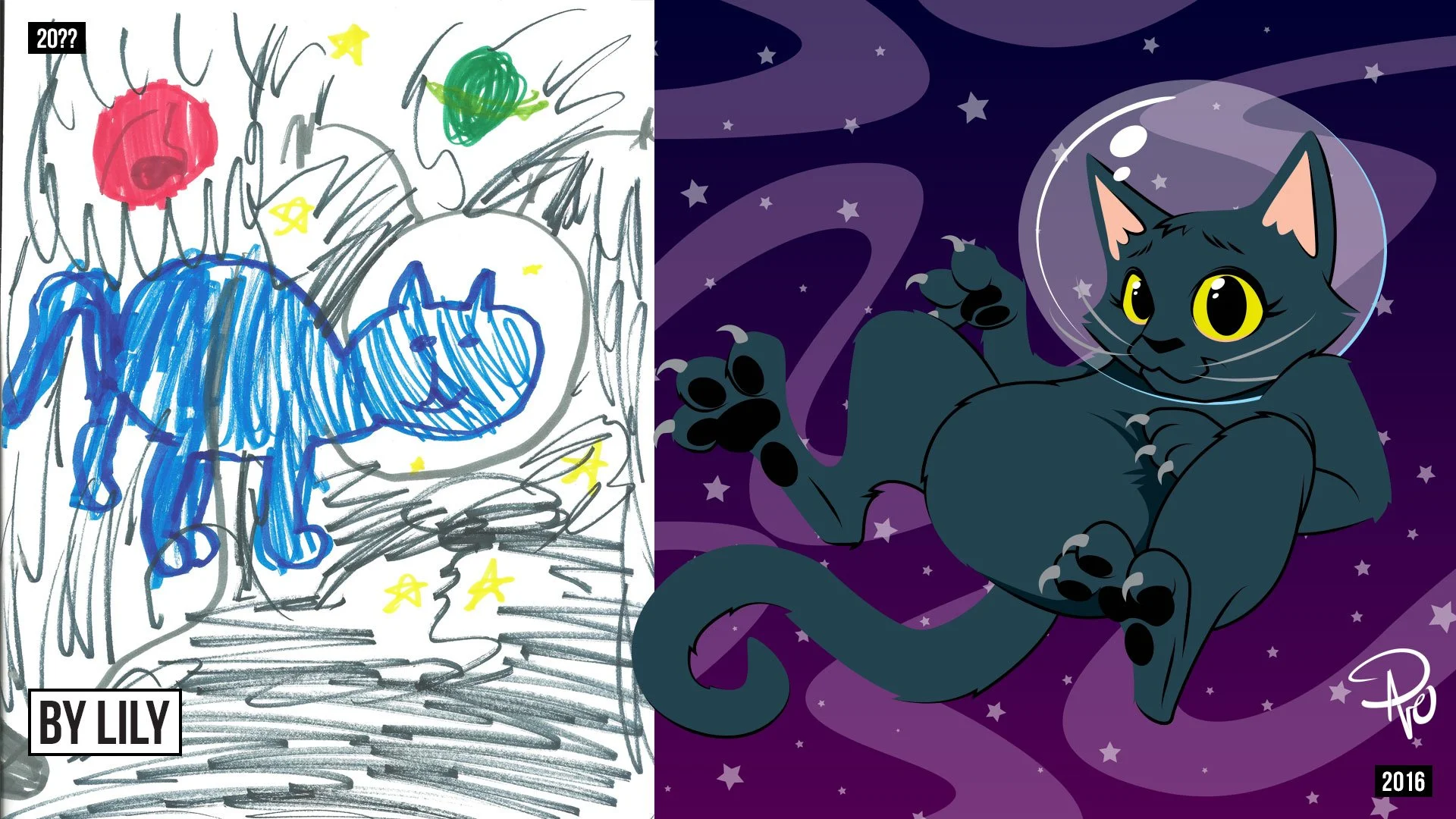
I’ve written a couple times about how kids can bring a really fresh perspective for getting out of a creative block. One of those exercises is to take a drawing a kid makes and put your own spin on it. I have done this so many times and it’s just the most fun thing to do. My cousin Lily (once removed) drew me a picture awhile ago of our late cat Destiny floating around in outer space. I freaking love it so much! I do not remember when she drew this original piece of art but it was definitely a loooooong time ago because Lily is now in college! In 2016, I dug this beautiful gem out of my memory box and took a stab at it myself. Lily’s is still the best one though!

Again, back in 2013, my other cousin once removed, Avery drew this cosmically gorgeous creature that I interpreted myself 11 years later. Avery’s art fills me with so much joy because it is so free and fearless! Draw your dreams! Lovingly foster your imagination! And let family members exploit it in their blog!

The final piece is always the inspiration for these blog posts, and so I proudly present to you, Generations — the musically inspired illustration absolutely nobody asked for. Again, the 2014 sketch should more realistically be called a concept, but there are a few notable tidbits that make this piece special to me. For starters, it’s a ridiculously stupid idea (and therefore makes for some fun art!). Secondly, while it’s not clear in the 2014 original, the jacket is absolutely inspired by Michael Jackson’s Thriller jacket (sorry not sorry, I think that’s the coolest jacket ever). Third, the boombox is a direct homage to the one my siblings and I listened to back in the late 80s and early 90s. I had taken a swing and missed when I tried to draw that same boombox when I created the art for Matt Vogel’s newest podcast Solve For Gen X. I got a lot closer in this go–around.

Fourth, the “grandfather” subject uses my maternal grandmother’s radio as his head. She always had this radio on in her bedroom. It now resides on my own nightstand as a cherished heirloom (despite being manufactured in the mid 1970s even though it looks like one she would have had during the second World War).

Thanks so much for checking out my site! Please follow me on Instagram, TikTok, Substack and X!

The Wall of Suck

Man oh Manischewitz am I excited about today's post! This is one I've been putting together for a few years now and it is all inspired by my good friend and talented graphic designer & illustrator, Jamie Carroll (who is also available for hire and deserves the big bucks people!). Nearly a decade ago now, I interviewed Jamie for Muppet fan site ToughPigs about some of his work and he introduced me to his own home–brewed mood board he called the wall of suck. I know! I was just as intrigued as you are right now. Here's an excerpt from that interview explaining today's post's namesake:

Dave: ...What about the pieces that get completely rejected? Or even better, the ones you yourself scrap?

Jamie: That’s a good question. It’s an incredible privilege to be able to do this stuff. It’s also rather soul crushing when it doesn’t work out. It’s two sides of the same coin. We’re not supposed to admit that, but it stings. I assembled this thing that I refer to as the “wall of suck” in order to deal with the angst. I’m not saying the work sucks. A great deal of care goes into even the simplest pitch. The suck part is in reference to the time and effort. It seems wasted and I can’t really post the full pieces for public view. Those are the breaks. Still, it all needs to go somewhere so it goes to the wall. Projects get nixed for all sorts of reasons. Many of them can’t be predicted. The wall helps me keep a healthy perspective on all the silliness.

Artists often crow about the successes yet hide the many failures that lead up to them. I think all of it should be celebrated!

If you're in a creative field where you have to submit multiple concepts or have brought something nearly to completion if not finished and ready for the world to see it—only to have it completely go down the toilet for one reason or another—than the idea of an essentially failed trophy case for all the "Coulda' Shoulda' Woulda's" probably resonates with you too.

I have had countless concepts rejected that I knew with my whole heart were bangers, or projects that I worked on for hours, days, or weeks, that were scrapped and it can be so discouraging and frustrating when that happens. Most of them I'll never ever be able to show because of nondisclosure agreements (NDA's), or because I technically don't own the work. There are a few other nuanced reasons, but the work I'm writing about today doesn't fall into those categories! These are projects that I'm really proud of, and/or was super excited to develop further, but for one reason or another are now D.O.A.

10 Minute Portraits

I've written extensively about figure drawing and how much I have benefited from taking classes. For awhile, I was consumed with getting better and better with creating more realistic art using traditional mediums. I love soft charcoal on newsprint and was simultaneously discovering I had a knack for it too, so I decided to expand my abilities further. Figure drawing focuses on the body, but I was also interested in creating people's likeness in portraiture as well. So I had the idea of doing free portraits of my coworkers during lunch time. I would get the opportunity to study and draw multiple different models, get comfortable drawing in front of people, get an opportunity to talk with employees I normally wouldn't otherwise, and in turn my coworkers would get a free portrait drawing.

Figure drawing with Maria

I spoke to my boss about it and she gave me tips on how to present the idea to Human Resources. HR then had me write a full proposal on what, why, how, when, and where I planned to do this and how it would ultimately benefit the workplace. That proposal then went up to the building's advisory cabinet who set a trial period to test it out before evaluating further if it was something that could then be done regularly. I was so excited and worked really hard on the proposal. I did several more portraits of celebrities and created a poster to help sell the idea, and brother did it work! Everyone else was excited too, and it was eventually promoted as a trial period where for the next three weeks I would set up an easel and stool in our cafeteria with a small modesty wall to block my models from other coworkers, but put me on full display where anyone could come up and look over my shoulder and ask me questions.

On the premiere day, the front desk used the P.A. system to announce, "Dave Hulteen will be offering free portraits to anyone willing to sit and model for 10 minutes today at lunchtime in the cafeteria!" So cheesy, I know, but I was really proud that I managed to pull this together. That afternoon I did about 4 portraits and it went great! I got to meet new people, got some great feedback, and that feeling that this was going to be the start of something pretty great. I packed up, and left to go home for the weekend. It was Friday, March 6, 2020.

For those of you that need me to explain the punchline, this is right when the United States closed up shop for the Covid 19 Pandemic. My job shut the building down the following Monday, and while we all know how most everything played out, the opportunity to pick right back up kind of passed. Now yes, things are better again and I could resubmit my proposal and try again, but there are some interruptions that put ideas on hold indefinitely for various reasons, and for now, that's where this one will continue to chill.

Our backs are now against the wall? Listen all y'all, it's a sabotage

There are so many other concepts I want to show but can’t!

A common theme you may notice among each of these things is a sense of self–sabotage. I pride myself as a creative who doesn't take constructive criticism personally. "You don't like it? Well then neither do I. See? I'm a big boy!" I also pride myself on my passion and commitment to a project. "You like this direction? Well then I'm going to steer this thing all the way to the finish line and give you the best work you've ever had. See? I'm a big boy!" There are many times however when these two philosophies contradict themselves. That's self preservation lingo for, "Sometimes I can be a monumental pain in the @$s." For example, when I was given the opportunity to design the cover to one of our quarterly publications—something I was honored to even be asked to do—I took the direction of creating Wedha's Pop Art Portrait (WPAP) style to an overly scrutinous level, driving my poor boss crazy as I lectured him over the art form's intricacies that I was now an expert in and he was grossly out of his league to say otherwise. I was quick to admit he made the right call when he handed the work over to another artist. I'm still really pleased with my version, but it joins a growing collection of concepts I've created that were rejected at the time, but occasionally are retooled and resubmitted for other projects that are never quite the right fit for those either.

Coloring Book

Spoiler alert: this one goes the same way my 10 minute portraits did with coronavirus ruining everyone's capitalist dreams. But in a nutshell, I illustrated a coloring book that helps guide kids with how to visit the elderly in nursing homes—something that was absolutely taken off the table when the pandemic hit. What makes this one sting though is that I had nearly complete creative control. The original coloring book was created in 1989 by a brilliant Salvation Army officer who created a valuable resource for kids. The only issue with it was that she wasn't a great illustrator. So I was given carte blanche to recreate all the art however I wanted, and I jammed it with Easter eggs and references to 1980's pop culture, mixing in tributes to the Netflix original series Stranger Things and even nods to PAW Patrol (my daughter’s biggest fandom at the time) as well.

This is one that has the potential to make a come back though. I regularly check in with the client (who has changed over the years as departments continue to merge), and sometimes I get an encouraging update and other times my check in serves as a reminder for them to do do something about the coloring book.

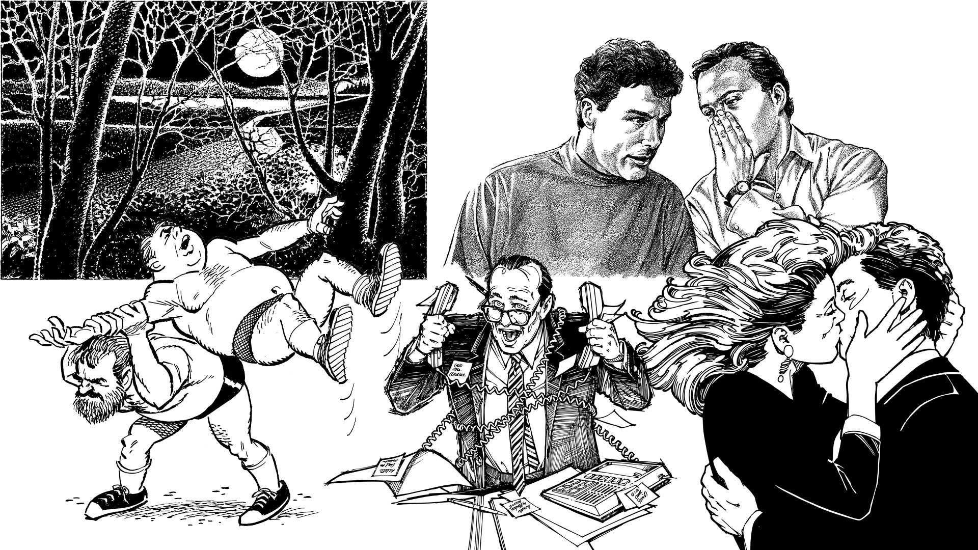
School Mascot

Hoofa, I'd like to introduce this exhibit as the catalyst for this entire post.

I write about my daughter a lot on my blog. She is my world, so when her elementary school sent the call out for a community wide effort to design the school's new mascot, I saw multiple opportunities flash before my eyes. I have designed tons of characters for books, television, animation, puppets, brand identity, and even full bodied walk around costumes. So not only was this right up my alley, but I have dozens of contacts that could then develop my designs into physical media and even merchandising! After doing some quick research, I also learned that school mascots are a pretty limited subset of creatures; namely cubs. Do you have any idea how many school mascots across the country are cubs? Most are unisex creations, but when they're not, they almost always lean male. The sole direction of the mascot design challenge was to encourage kindness and my daughter is the poster child for being kind. After some rough sketches, I had the idea that my design would be an homage to my daughter and the best animalistic choice was an eaglet. "Fly high with the Evergreen Elementary Eaglet!" You guys, I went so hard on this.

I knew as I was working on every little thing that I was putting the cart in front of the horse, writing my own feel–good story of the decade that would appear on the front page of the local newspaper and this very blog. "Local Father Saves All of Humanity with School Mascot Competition That Resembles His Daughter." Oh my gosh you guys, I went way too hard on this.

I knew with every fiber of my being that I was getting way too involved and wrapped up in my presentation. I even sold myself as the professional illustrator to the principle who would work alongside the school to create clip art, promotional material, and provide possible vendors for merchandising opportunities. You guys... even my ego was begging me to step way off. I went so very hard on this.

Now I don't want to blame my friends and family for getting me so hyped, but they were all so supportive that I really wanted to exceed their expectations. In the end, I was actually really relieved when my design wasn't chosen. I was the overly excited dad you roll your eyes at during little league practice. Fortunately all that effort and exertion stayed within the walls of our home with my wife being the one who suffered the loss. I got her just as riled up as I was, so she took the rejection of the Evergreen Eaglet a lot harder than I did. That doesn't mean I'm not bummed out about it, but for the purposes of this post, my cute little eaglet now occupies the wall with a reminder not to overly invest oneself in similar future situations.

I have so many other pieces that belong on the wall of suck that I still can't show or talk about. Perhaps one day I'll do a follow up, but for now, I'd love to hear if you have your own wall of suck and what's on it? Follow me on Instagram and check back in a week here for a new post!

The Life of a Caricature Artist Featuring Kenny Durkin!

Drawing ain’t easy. Drawing something recognizable takes effort. Drawing people is overwhelming. Exploiting peoples’ unique features in a fun and exaggerated way for their entertainment is downright insane. That’s where Kenny Durkin comes in.

Kenny Durkin by Kenny Durkin

I’ve sung Kenny’s praises before and he’s no stranger to this blog or me pestering him for all sorts of things. He graciously agreed to me bombarding him with questions again, but before that, let’s take a quick refresher course. Kenny is a cartoonist who studied Illustration at Milwaukee Institute of Art and Design. He’s performed live caricature entertainment at events across the United States for over 20 years, and drawn caricatures at Walt Disney World retail locations and special events for 15 years. He has his cartoons on apparel for AMC's Duck Dynasty, Disney's The Muppets,  and The Jim Henson Company, writes and illustrates his own online comic strip Father of the Brood, and is a proud member of the prestigious National Cartoonists Society and an award-winning Gold member of  the International Society of Caricature Artists. On a more personal note; Kenny was one of the key heads of the design team for ToughPigs Great Muppet Mural, and has been a patient and wonderful friend who has helped me out personally with tons and tons of other projects. I cannot hype this man up enough because his artistic talent is only matched by his kindness and sense of humor.

Kenny and I hanging at Gene Barretta’s home, May 2015

So let’s start with the basics: how did you get into drawing? And how did you get so good?!

Kenny: I've been drawing for as long as I can remember. The first drawing I can recall was of Kermit and Grover. I was born in 1971 and back then, there was no way of recording a television show to watch later. When the Sesame Street episode of the day was over, I still wanted to spend more time with my "friends", so I drew them. I found that was a great way to express myself creatively, and why Kermit still pops up in my drawings to this day.

Kermit the Frog as Indiana Jones and gorgeous caricatures of Frank Oz and Jim Henson

All that said, I still don't think I'm "good" at it. I think it's like having an athletic ability or being a musician. You're born with an inclination, but you still have to work at it. You have to put in the time and practice every day. And you have to be willing to fail a lot. I'm obsessed with learning to draw better, so I watch instructional videos, take courses, look at art instruction books, and I'm friends with a lot of other artists so I can push myself to soak up as much info as I can. And I've trained myself to when I'm not drawing, I'm OBSERVING. I'm looking at trees, buildings, people, animals, vehicles, clouds, everything I see and deconstructing them. I'm breaking them down into simple shapes and filing them away in the visual encyclopedia in my brain. Then I can pull them out to work out later on paper. In a way, it's a thing that I can't shut off and won't leave me alone!

We all know Jim Henson is a major creative inspiration to you, but who else inspires your artistic talent?

There are a whole lot of people who inspire me. It would be impossible to list them all. I think starting out, it was newspaper cartoonists like Charles Schultz, Walt Kelly, Hank Ketcham, Dik Browne, Jim Davis, Mort Walker, Lynn Johnston, and so many others. Later it was Gary Larson, Berke Breathed, Bill Watterson, John Hambrock, and WAYNO.

MAD Magazine was huge for me. I gobbled up everything I could from artists like Jack Davis, Sam Viviano, Paul Coker, Mort Drucker, Sergio Aragones, Don Martin, Al Jaffee, and Tom Richmond. I wasn’t much of a comic book guy, but I sought out more cartoony titles like Uncle Scrooge, Groo the Wanderer, and Zooniverse. For animation, it was of course Walt Disney, Warner Brothers, Chuck Jones, Fleischer Studios, Hanna Barbara, Don Bluth, Richard Williams, etc.

But beyond cartoons, I suppose there’s not much that DOESN’T inspire me. Anyone involved with the process of creation interests me. Musicians, singers, actors, directors, costume designers, prop builders, effects artists, folk artists and so many others. I’m all over the place.

The casts of Seinfeld and Stranger Things

When and how did you realize your knack for caricatures?

There was a magazine for kids called Dynamite that had celebrity caricatures by Sam Viviano. That was my gateway to the art of caricature. I followed him over to MAD Magazine which was a caricature–heavy publication. I studied what those artists were doing. I would ask myself, “The caricature looks like the person. Now WHY is that so? What is the artist doing that makes the likeness so strong?”. So I’d try drawing actors I’d see on T.V., friends and family, and teachers in school. My parents would get notes from my teachers saying what a great student I was because I was always taking notes. Little did they know, I was actually drawing them!

Caricatures of Muppet performers Jerry Nelson, Dave Goelz, Richard Hunt, Frank Oz, Jim Henson, and Louise Gold

What kind of lessons or classes did you have to take to go pro?

I was fortunate enough to have art classes all through grade school. In high school I took every class that was even remotely connected to art, like printmaking and drafting. I did a lot of scenery and prop building for school plays and musicals. I took classes when offered at museums like mask making.

I went to Milwaukee Institute of Art and Design and studied Illustration and Graphic Design. I also took classes there on Photography, Sculpture, Figure Drawing, Color Theory and Early German Film for some reason.

I’m still constantly educating myself. I watch videos, take online courses, read art instruction books, go to seminars, and take workshops. If you want to EARN, you’ve got to LEARN!

How quickly does it take to draw a single caricature?

It depends. When I’m drawing at events, the task is to draw as many guests as possible. I can draw a shoulders–up caricature in black and white in 1–2 minutes if I have to. At most events I draw faces and bodies in black and white, which take about 5 minutes.

A retail caricature face and body in color is about 12–15 minutes. Studio caricatures, depending on what the client and I have worked out, can take days. 

Steve Buscemi and Daniel Radcliffe

Drawing people well enough to recognize them is hard. Drawing their more prominent features to the extreme and still be able to recognize them is ludicrous. Drawing people with exaggerated features so that they’re still recognizable and doing it fast is impossible. How do you do all of that?

Practice. It takes time to get your speed up. When you first start out, your instinct is to pencil everything in, ink over the top and then erase the pencil.Once you develop a system that works, you won’t need to rely as much on the pencil (or at all). Experimenting with materials, (paper, drawing implements) that can improve your speed. Recognizability is more important than speed. In the end, it has to resemble the person you’re drawing.

Have you ever drawn someone and they reacted negatively because they felt you offended them?

Thankfully not often. One time when I was only a couple of years in, a subject got so mad at how I drew him that he lurked around until I had closed up and he followed me out to my car. Luckily security took care of him.

I did a studio piece for someone one time and after repeated redraws because she claimed it didn’t look like her, I actually TRACED her photograph. When she still insisted it didn’t look like her, I told her what I had done and she went with the first drawing I did.

You have to go into drawing caricatures knowing you’re not going to please everyone all the time. Statistically, it has to happen. So I’ll still get the occasional eye roll, but for the most part, people are pleased. They know what they stood in line for.

Is being sensitive to how someone might react to your caricature something that you consider when you draw them or is that mindset too restrictive and it’s better to believe that they should be aware it’s your job to exaggerate their likeness?

It’s tricky. When someone hires you to draw at their event, you don’t want to be the one insulting their guests, or making the host or booking agency look bad. It’s just not professional. You also don’t want to fall into the trap of drawing “genericatures” or drawing the same way over and over. You have to be sensitive and have empathy. You need to know when to lay back and be “safe” and when to kick it into gear and go for it. It’s an important skill that you have to develop over time. 

Father of the Brood 2023 and 2018 when my daughter and I made a guest appearance!

Wow! And there it is! Proof that Kenny Durkin isn’t just really good at what he does, but why he’s the best there is! Make sure you visit Kenny’s website for more great art, but also follow him on Instagram, Twitter, and YouTube too!

Thanks so much again, Kenny for taking the time to share your story and talent! I am so grateful for you and our friendship. Follow me on Instagram and Twitter, and come back on Friday for a new blog post!

Inspiration: Volk Clip Art

It’s 1995, and a teenage me (Hi! I’m Dave!) is up against the proverbial wall as my senior year of high school begins and I have absolutely no idea what the future holds for me. I have zero direction or ambition to know where I’ll go to further my education (if at all), I’m not even sure what I want to do in a best case scenario, and the bad news is there isn’t a best case scenario anyway because I may not even have enough credits to graduate with the rest of my class. My dad is getting frustrated because all I ever say that I want to do is draw, but how that translates into any kind of career is spectacularly vague and naive at best. Seemingly moments before the first day of school even starts, I’m enrolled in Monmouth County, New Jersey’s stellar vocational education program at the zero hour where my father finds a commercial art class which will give me a far better chance at achieving the necessary math and science credits I’ll need to get a high school diploma. The vocation curriculum is technically two years, meaning I’ll only complete the first and my fellow classmates will all be juniors, but there’s no time to split hairs. As far as Dad, the state of New Jersey, and any future higher education prospects are concerned, the name of the game is to simply graduate Neptune High School with a modest GPA.

Me and my fellow MCV classmates, 1996

If you know me or have read any other blog post here, you know that it all worked out. But I’m not actually writing about my time with the Monmouth County Vocational Commercial Art School in Aberdeen, nor how that class arguably saved my future career, how I made some great friends, or how we all relentlessly tortured our teacher Ms. Camp (I’m so sorry for all those headaches Ms. Camp! We all genuinely love you!), but rather how I discovered an art form that continues to inspire me to this day, the world of Volk Clip Art.

First let’s take a quick crash course through the history of what clip art actually is. As I mentioned when I wrote about stock image sites, designers are busy people, and may not always have the time or ability or money to cultivate graphics and images for their projects, so they turn to other methods by relying on pre–made works with varying licensing managements. Clip art specifically covers illustrated pieces for publishing products that offer a huge variety of content and illustrative styles. The term clip art comes from physically cutting images from printed works and pasting them into new publishing projects with type and/or other graphics. This would be done by a layout artist, mechanical artist, or production artist on a printing press back in the day. Thanks to desktop publishing though, we’ve condensed all that down to the noble graphic designer.

Now there’s a lot more to cover, but for brevity’s sake we’re just going to hit some bullet points here. Many publications and smaller businesses didn’t have the budget to hire illustrators, so clip art became a mainstay for consumption. I’m going to briefly skip over the main course of today’s post for a minute here, but eventually the ink–based, comic book style of clip art that I’m referencing today became dated, but not useless. So sometime in the 1970s, those higher quality, older designed and stylized clip art made it’s way into trade paperback books for the masses. At that point, all you needed was a collection of (mostly) public domain illustrations and a Xerox machine, and now anyone could create relatively high quality designs. Flash forward to today, and you can very easily get your hands on quality, royalty free clip art from a variety of online locations for dirt cheap or even free. In fact, a lot of those cool, vintage illustrations that we’ll be talking about in a second are even archived on sites like Flickr!

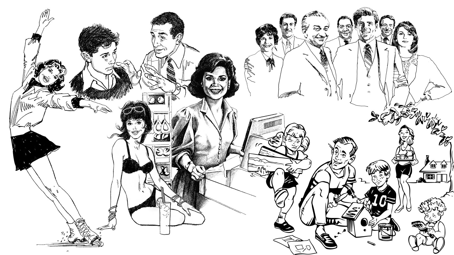
Back to 1995 and a young and green Dave is confronted with a fantastic collection of clip art and unlimited Xerox privileges. It’s at this point where we finally get to the meat of this post and the very specific art house that was arguably the titan of clip art: Volk. I’ve mentioned a few times before that even if you’ve never heard of a certain so–and–so, their work probably crossed your path. Unless you’ve been living under a rock and outside of the United States (and even then there’s an excellent chance), you have most definitely seen something from a Volk catalog. Ironically located just 84 miles south from my former vocational school, Harry Volk, Jr.—a former journalist—opened his art studio in Pleasantville, New Jersey in the mid 1950s that pumped out high quality, copyright free, clip art in saddle stitched paper booklets. These collections were organized into various themes that covered absolutely everything from popular holidays, space exploration, school activities, sales gimmicks, various occupations, elections, travel, and practically everything in between. Each booklet would cost just a few dollars and would be packed with fantastic, high quality illustrations that simultaneously reflected American values and societal changes surrounding race & gender, all at the same time somehow maintaining a specific but generic look.

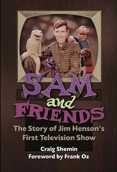
The superstar of Volk was a man named Tom Sawyer. Yes, I know, but trust me, his name is the least intriguing thing about him. Thomas B. Sawyer’s work for Volk was ubiquitous, seen internationally in magazines, newspapers, pamphlets, sign boards, and on television. Mr. Sawyer isn’t just a top notch illustrator though. He’s a best selling novelist, author, screenwriter, playwright, producer, and story editor; but his biggest claim to fame was as the head writer and show runner for the classic CBS series Murder, She Wrote starring Angela Lansbury. I reached out to Mr. Sawyer for an interview seeing as his book, The Adventures of the Real Tom Sawyer shares the same publisher (Bear Mountain Media) as Sam and Friends – The Story of Jim Henson’s First Television Show by Craig Shemin, but I never heard back from him.

But Tom Sawyer was just one of the illustrators working for Volk. The vast collections of notable mid–century style drawings from Volk’s studio are exceptional. The weird thing is how little information there is anywhere about those other illustrators or even Harry Volk, Jr. himself! Seriously, there is almost nothing about him, his studio, or its employees other than Thomas Sawyer online. This blog post will hopefully garner him a few more fans. Perhaps one day I’ll even make the pilgrimage to his old studio!

Roughly a decade or so ago, I was helping a client/friend/coworker of mine who was working as the head preservationist, curator, and director of The Salvation Army’s Eastern Territory Heritage Museum when she presented me with a huge collection of Volk clip art, not only well preserved, but still in its plastic organizing case—an even rarer find than the art contained within! Opening that case (even still) is like a time machine, not only transporting me back to the essence of 1950s & 60s design, but even more specifically to Ms. Camp’s Commercial Art class to a host of Gen X teenagers irresponsibly taking advantage of the school’s copy machine and trying to get high off sniffing Krylon far away from the designated ventilation booth. Initially, that institutional green colored box was bound for the trash, but she gave it to me (a million thank you’s again, Kathy!).

Most of my collection is from the 70s through 90s

Ironically, this tale shares a much bigger, real world counterpart to publicly available clip art from Volk and other studios as well. A New York Times employee named Bart Solenthaler who worked in the advertising department was tasked with throwing away a massive collection of clip art, but instead took the time to scan and upload it to Flickr! You should absolutely check that collection out here.

Did you ever use clip art from Volk? All the images in this post are from my personal collection which are primarily from catalogs from the 80s and 90s, so they don’t reflect that cool mid–century style I’ve been talking about. However, you can find even more classic Volk clip art here. If you’d like to learn a little more detail about this type of clip art, check out my sources by visiting this article on Tedium and this one on Fast Company. For more vintage design inspiration, check out this article I wrote about my classic magazine collection.

Follow me on Instagram and Twitter and check back here on Fridays for more creative thinking and inspiration!

Return to Innocence

Aaaaand that’s about a long enough break from this blog. Let’s get back to it!

This isn’t today’s topic, but I have been feeling disenchanted—or at the very least bored—with drawing lately because I’ve been doing so much of it professionally. This has made my personal time drawing to relax feel tedious and exhausting. You see, even though it’s how I make a living, it’s also something I love to do. The problem is that when you do anything a lot—especially when you have to—it can sometimes feel burdensome. This is a topic I will absolutely write more about soon, but in the meantime I have been trying to rediscover how to rekindle my love for illustrating. These trials have resulted in a lot of fun exercises (all of which I’ll also write about in the near future as well), but none of them were hitting their mark, and neither were previously reliable standards either. It wasn’t until I took things all the way back that I rediscovered my original muse—my childhood dog, Ballington.

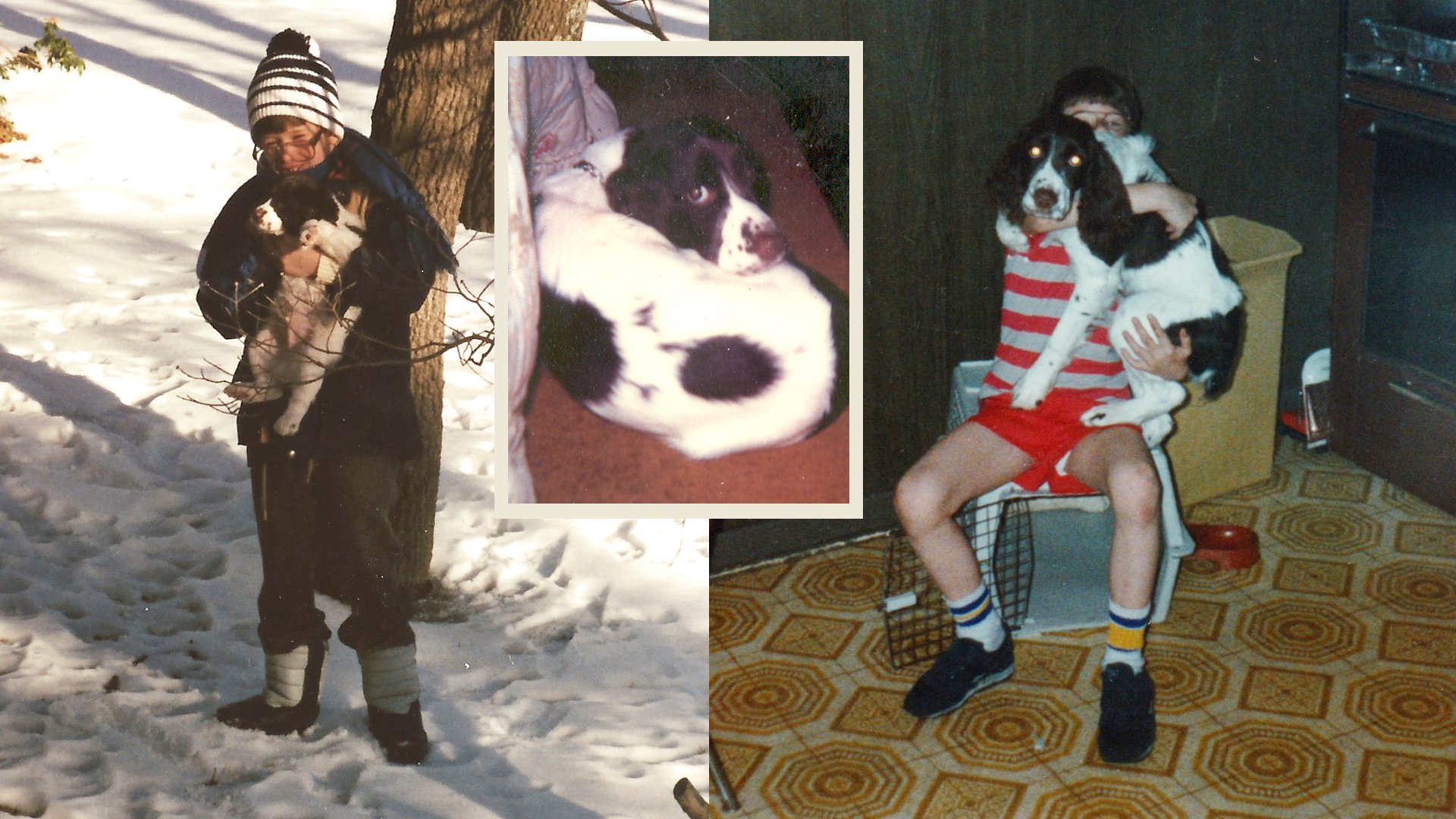
1985–86

First off, it’s very important to me you know how to pronounce his name properly. The first part is not pronounced ball like a spherical object you play sports with. It’s softer and lighter like the touristy Indonesian province, Bali (incidententally also Ballington’s nickname). Ballington was my 7th birthday present from my dad who’s primary directive was to name all our pets after (founder of The Salvation Army) William Booth’s children. We also had a dog, Bramwell and a cat, Evie (short for Evangeline). This entire paragraph is substantially more information than anyone would ever care to know for a blog dedicated to art, illustration, graphic design, and creative thinking, but after my Canadian cousin found too much glee teasing me as a child by calling him “Barflington”, it’s become a bit of an idiosyncrasy of mine to over–inform on this one.

Ballington left and me (circa 1983) with Bramwell & Evie right

My creative pool of illustrators at age seven was understandably shallow, promoting cartoonist Jim Davis way above his station as my artistic gold standard. As a result, everything and everyone I drew looked marginally related to Jon Arbuckle. Jim Davis drew Garfield, so I drew Ballington. If you’re a Simpsons fan, there’s a 13th season episode called “I Am Furious (Yellow)” where a cartoonist comes to Springfield Elementary to promote his comic, “Danger Dog” resulting in every single student creating their own derivative work like Danger Cat, Trouble Dog, and Danger Dude. This is a pretty good analogy for how I was inspired to start drawing my dog after admiring daily Garfield strips.

All my favorites including my grandmother (1989), early art of Ballington (mid to late 80s)

I don’t recall ever thinking that drawing comic strips about my hyper–active English Springer Spaniel—who in reality humped any and everything—would be a career choice, but I loved anthropomorphizing him and would include him in absolutely everything all throughout my childhood and well into my adulthood. As a kid, he would express ideas and thoughts I was too sheepish to say myself. He had adventures with his friends, was a perpetual optimist, and wore every emotion he had on his sleeve. While he never strayed too far from his initial Garfield inspired design, he picked up other influences along the way, embracing madcap and overly cartoonish flare, eventually embodied by the 90s resurgence of the Looney Toons and the collective renaissance of animation from films like Who Framed Roger Rabbit? and Aladdin. Like every single other kid who draws, he was an OC (original character) that only mattered to his creator. His dreams would always surpass his reality and be a mega star to an audience of one. Deep down I knew this and when I would see other illustrator friends embrace and promote their own characters, I completely understood that love and pride they had. No one else knew who they were, what they represented, or why they existed, but they were very special to their creators. I think it’s the equivalent of someone extending the life of a security blanket, teddy bear, or in my case; childhood pet.

Various Ballington drawings from the late 80s–early 90s

Ballington would silently star in many personal projects like comics and flip books, as well as play the lead role in college assignments like my first ever vector drawing and gif animation. Bali would accompany my well wishes in a friend’s birthday card, a doodle made for a high school crush, my signature in a classmate’s yearbook, and even a presentation slide for a meeting at my dad’s work. The cartoon Ballington was indestructible, not just as an over stylized, personal mascot, but as a pet too. My family wasn’t able to keep the real life Ballington, and after a few years by my side, he moved up the block to spend the rest of his life with my grandmother. I still took care of him every day, but by then my love for the unnaturally proportioned, puff–chested, illustrated Ballington outweighed his own real life counterpart. Maybe it was an emotional defense mechanism to let him go, maybe it was the imagination of a suburban white boy who spent too much time day dreaming, or maybe it was the safe space of believing the inked version could never die when the writing was on the wall that my real life childhood pet soon would. Loved ones will always come and go, just like life experiences, but the cartoon creation of a seven–year–old is immortal.

Posters I made that hung on my wall as a child, my grandmother again with Ballington (and Bramwell, late 80s), and comic books I made of Ballington from 1988, 1992, and 1994 respectively

Variations and updates to Ballington between the mid 90s through the early 2010s

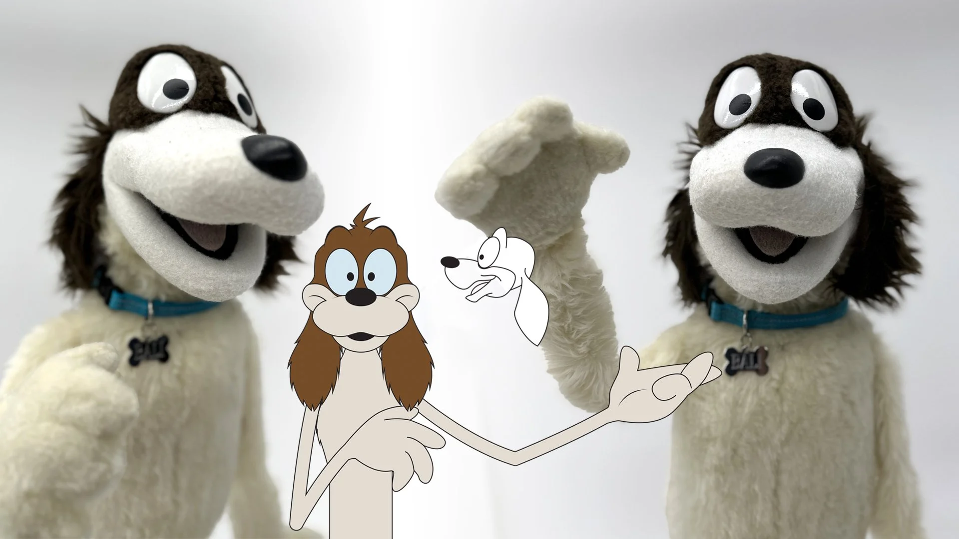
For a short time, my soon–to–be brother–in–law and I started our own production company that enjoyed a modicum of success. While Ballington was not our collective OC, our small sensation in the form of The Bang and Bump Show put me in contact with so many talented people that I was eventually able to commission the very talented builder James Kemp to make a Ballington puppet. I had to update Bali’s initial design for the obvious reason that I didn’t want Jim Davis to sue me, but also because that old style wasn’t conducive to a three dimensional puppet. James kept me in the loop with things like vacu–forming the eyes, shaving the fur for different styles, and dying the fleece. Having that puppet masterfully built and brought into the real world and off the reams of dot matrix computer paper my father brought home for me to draw on was a surreal moment in my life. I felt like I had completed something that I had always wanted to, and now that it was done, I was able to move on. Ballington was no longer confined to just my imagination anymore, so I effectively stopped drawing him.

Ballington puppet by @jameskemppuppets along with my updated illustration

Until recently.

I’ve always been quick to acknowledge that I never developed my own distinctive artistic style, and Ballington was proof positive of that. But I have learned new techniques and attitudes and was randomly doodling a dog this past week—trying to spark some artistic interest as I mentioned at the top—when I noticed he could kind of look like Ballington… if I wanted him to. It was an exceptionally humbling moment that made me think of the 1993 new age song Return to Innocence by Enigma.

Don't be afraid to be weak
Don't be too proud to be strong
Just look into your heart my friend
That will be the return to yourself
The return to innocence

The doodle–dog that inspired this post, Ballington IRL (as an adult mid 90s), my latest Ballington art and he’s still got it!

What a testament to the immortal imagination of a child. I’ve often thought the best way to grow as an artist of any kind is to push past your ability, leave your comfort zone, embrace your flaws and grow from them; but I never once considered that sometimes it’s the complete opposite. Ballington will most likely never have a weekly comic strip, appear as anything other than a background Easter egg in any media, nor will he break out as the star I always saw him as. I don’t say any of that from a defeatist point of view though. I say that because he’s not for that, he’s not for any of you. Ballington is for me. He always has been, and I’m so grateful to realize that he always will.

I’m hoping to keep this blog relatively consistent again, but the best way to know for sure is to follow me on Instagram and Twitter. You should also follow James Kemp on Instagram @jameskemppuppets as well, and if you’d like a brief but deeper dive into his time building Ballington, he blogged a bit about it too starting back in December, 2013 through March, 2014 that you can read in three parts:

Balli the dog for Dave Hulteen
Update on Bali for Dave Hulteen
Bali completion!

2022 Year in review

As 2023 comes upon us, I wanted to reflect on what I’ve learned, accomplished, and celebrated over the year and also what I’m looking forward to!

Personal Projects

The Making of The Great Muppet Mural

While almost everything about ToughPigs pièce de résistance happened in 2021 (including all the work that saw the project to fruition), the documentary premiered on January 29th of 2022 and it was a huge and wonderful experience. Recently I learned that this labor of love did not make it to the final selections it was entered into for a couple independent film festivals, but it still remains one of my own personal Crown Jewels of the year. I will be singing its praises and all those involved for decades to come.

This Blog!

I've been doing a relatively acceptable job maintaining this blog for over a year now, and there are a few posts I'm very proud of. I was also very fortunate to have so many wonderful people contribute as well, so if you haven't already, you should give some of these articles a read and support their contributors as well!

Do You Have to be Creative to be a Graphic Designer?

Seriously, I'‘m super proud of these posts!

Illustrative Stuff

I did not draw much this year at all (outside of commissioned work) but what I did do continued my understanding and development of my craft and the mediums I use to create them. I also did not keep up with my figure drawing classes to the extent I had wanted, but I’m already trying to arrange things for next year so that I don’t slack again.

Some of the illustrations I’m most proud of from 2022

Of everything I drew on my own time, my illustration of Luisa Madrigal in the style of Charles Dana Gibson was my favorite. I have plans for more redraw challenges as well as doing more artist games like I did with Will Carroll and Noah Ginex.

Freelance

For the first real time since my daughter was born, I started taking on serious freelance work again. I took on several more notable clients this time around the sun as well as connected with some old friends. The biggest one of course was getting the opportunity to work with Craig Shemin on his newest book, Sam and Friends: The Story Of Jim Henson’s Television Show.

Being back in demand was wonderful, but in many ways I feel that I jumped the gun and bit off more than I could chew, so…

Biggest Lesson Learned

I willingly and happily put almost all creative endeavors aside when my daughter was born with the understanding that someday when she was older, I’d resume drawing regularly (daily), taking on freelance again, and other passion projects. As she has grown more independent, 2022 seemed like the year to dip my toes back in the water for all of that. Unfortunately, I think I dove in the deep end and over–immersed myself. I’ve always been very good about my time management, but along with everything else, I’m a little rusty here too. 

In general, when you work full time (regardless of what your actual job is), it’s difficult at worst to manage your time properly and seemingly unnecessary at best if you’re good and well paid. The latter is very ambitious, but it’s an easy excuse to turn things down if you just don’t feel like doing them. These are all things I will consider in the coming new year.

New Year’s Resolutions 

Having learned that there will never be enough time to do everything, I am hoping to focus on expanding my tool set a little more in 2023. I would like to become proficient in Adobe After Effects, as well as the 3D modeling program, Blender. Part of this is a continued fascination with video production, but more than a few times in the recent past, I’ve realized the tools that I already know aren’t capable of creating some of the concepts I had hoped to present to clients. Learning new software will accommodate this tremendously.

So here’s looking to 2023 and everything that it has in store for all of us. Thank you so much to every wonderful, talented, and awesome person who has helped me on my journey, contributed to this blog, and taken a moment out of there day to give a blog post a read, an Instagram pic a double–tap, or a retweet on Twitter. See you all in 2023!

Personal Clients

Or Should You Ever Do Freelance for Friends and Family?

I will do a more expansive review for everything at the end of the year, but I wanted to write today about doing freelance work for friends and family. Now the old adage when it comes to working for friends and family is, “don’t.” There’s definitely merit to that but more often than not, I find that to be a pretty rare exception—at least on the basis of difficulty to work with, but I’ll break that down too.

My mom teaching her Sunday school class, early 90s

Truth be told, pretty much all beginner freelance is exclusively for friends and family when you start out. Realistically, no one else is going to hire you! While I certainly didn’t have a solid directional plan when I was younger, I knew that illustration was something that would figure into my adult career if even only tangentially. My mother recognized this and fostered that creativity by being my first and arguably only client for years if not decades. She was responsible for all the youth programs at our church and would ask me to draw giant “pages” for stories she would tell in Sunday school (Christian education geared for kids during or around church time). Now a mother’s admiration and love is hardly good justification for quality, but while she swore up and down my poster size drawings helped keep her kids attention, they were hardly good. However, they did enforce several very important things to me such as deadlines and keeping up with design trends (if only what cartoon characters were popular with a very specific demographic at the time). These “jobs” also helped me refine my ability, so while I’m thrilled no one outside of a very select few have ever seen them, they set things in motion.

This year, I was able to pay those things forward with more than a few friends and family, and I’d like to talk about how those experiences are still really important for experienced professionals and not just those starting out. Typically, you’re not getting a decent payday from friends and family because it will hopefully be important for you to maintain those relationships on a deeper level than just “Jane and Johnny Client,” but that doesn’t mean they can’t still have an impact on you and your career.

Now speaking of only getting hired by friends and family in the beginning, I was really excited to work with an old friend who arguably had one of, if not the most, influence on my career. Even before I started my education, John Lambert was one of the very first adults I ever knew that always treated me like an equal, never ever talking down to me as a child, but also taking a key role guiding and teaching me as well. I was even his ring bearer at his wedding!

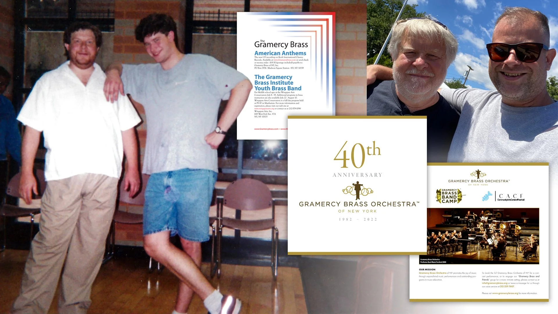
He had started the Gramercy Brass of New York in 1982, so when I was starting to put together my portfolio, it was this prestigious organizational name that I exploited for my resume. John had me help with everything from building sets and stages to giving me the opportunity to create my very first print ad. When I went on an interview, it was almost exclusively the work I did for John that got me in the door. Now John will modestly tell you he was asking me because I was eager to help and only lived a few blocks away, but the reality is that he was the first person to set a standard of quality. I would have to develop multiple concepts, ensure overall print quality, and above all else—strive for something that actually looked somewhat professional. Now none of that early work is good, but it was the catalyst, so I was very excited and honored when he asked me to help with creating the Gramercy Brass’ 40th Anniversary Journal. I can’t say I did anything over the top or groundbreaking, but when you have a relationship that’s about as old as you are, there’s a freedom with candor and understanding that you just can’t manufacture with a client, even if you’ve known them for years. This is primarily because John isn’t just a dear friend, but someone I put on a pedestal for helping me get started.

Left to right: John & I at a Gramercy Brass Orchestra concert in August, 1997. The very bad—but also my very first—print ad for the orchestra’s newest album at the time, American Anthems (2001). The cover and a single page for the GBO’s 40th Anniversary Journal. And finally, two significantly older but wiser men still happy to work together.

One could argue that this could easily be seen as an obligation rather than a job, but neither of us saw it that way and I was so happy to get to work with him like this again. In so many ways, it felt like it was 1997 all over again, and I loved it.

The next project and “client” I want to mention is Lucas Ross. Now I’ve talked about Lucas and how great a guy he is ad nauseam in the past, and it’s possible because of all that adulation he reached out to me to help him with his newest live album, There Will Be Banjo. Again, taking on this job could be seen as the logical “thanks” for all the work Lucas did as the host for my documentary from earlier in the year, The Making of The Great Muppet Mural (which you should totally watch today!). But Lucas and I had that spark of a moment multiple times during the documentary where we really just enjoyed working and talking together. While my intentions were to do so much more for Lucas, he was gracious enough to take what he could get from me with several illustrations he then assembled together himself, but Lucas was also a great client as well as a friend with how we continued to communicate.

Lucas with the Oklahoma Opry and the album cover to the live album

You see, when your day job, freelance, and hobby are all the same thing—in my case, drawing—there’s a nuanced way of going about such a thing with equal respect and attention to all three. Lucas has somewhat of a similar understanding with his music, and so I not only felt comfortable being more open with him about everything from technique to personal concerns, but also letting him use and manipulate my illustrations however he wanted. Lucas was also the key person in helping me understand how I need to better manage and even understand my time (something I’ll most likely write about in the coming weeks or months), and I had no compunctions telling him this. My inside joke is that these things will help me to best work with (just) Lucas again soon, but my reality is Lucas really helped me understand myself better in that way, and I can guarantee that’s never something I would have recognized with “just another client.” (Thanks again for that, man!)

The last instance is a combination of working with both a childhood, lifelong friend and my dad. Now both of these men have known me not just longer than everyone else, but better than everyone too. Plus, both of them needed my talents with a much quicker turnaround (although to be fair, with my dad, it was my fault as I kept putting it off). I grew up with (now Major) Myron Smith as one of my closest best friends. As tiny children, we would play basketball and music together—both for fun and competitively—to which Myron would always always best me. As teenagers, we would go to the beach and the ice rink weekly where we would skate and talk to girls—I was only slightly more adept at these over Myron, so I’ll take my trophy on this one. Technically, what my dad asked was just an update on something I had already done in the past, but as I’ve mentioned numerous times as well, my dad is a big deal to me, so it goes without saying he didn’t have to twist my arm (just remind me constantly!).

So if John and Lucas were varying levels of circles, Myron and dad are on the inner most ones. There are cons to working with people that know you that well for that long, but there’s also a freedom to it as well. You can experiment and try out techniques you wouldn’t with other clients because those close friends and family sure aren’t going to take their business elsewhere. You will also find rationalizing your own choices easier as well, because like them, you’re locked into those relationships too.

left to right: Myron an I in the mid 90s, all grown up (June, 2022), and my dad and I at an art show displaying his work (May, 2010)

In the end, all of these “jobs” secure a more fundamental appeal, and that’s getting the chance to reconnect with them. Do you ever say yes or no right away when friends or family commission you? What type of layering does it add to old relationships? How likely are you to work with or for an old friend or close family member? I’d love to hear your thoughts here, Instagram, or Twitter!

My Story with Sam and Friends, Part I

I’ve been waiting to really break down a huge and wonderful experience I had and today is the day I finally (start to) talk about the work I did for Sam and Friends: The Story of Jim Henson’s First Television Show. There’s a lot to cover so let’s start with some basics. As I have written about numerous times, I’m a huge fan of Jim Henson and all his creative works. Jim has always been my leading creative influence starting when I was a toddler all the way through to today. When Jim was a kid himself, he was fascinated with television and broke onto the scene with a black and white puppet series in 1955 on WRC–TV in Washington, DC. Craig Shemin—who I’ll also talk a whole lot more about in a bit—took on the huge task of writing a book about this particular introductory foray into Jim’s career, and would eventually bring me on to this fantastic adventure. But let’s slow it down now and get into more detail.

Images from the MuppetWiki

Every true Muppet fan knows who Craig Shemin is, but to the lay person, he’s a massive contributor to preserving the memory and legacy of Jim Henson. At his core, Craig is a writer who has written for television shows like The Wubbulous World of Dr. Seuss, Telling Stories with Tomie dePaola, Donna's Day, and Dog City. He's also written short stories, video game scripts, press interviews & appearances, text for licensed products, concert scripts, and liner notes. He's also hosted live events, screenings, & panels and prepared additional video content for such things. He has a ton of other credits like director, curator, and consultant as well as his current title of president of The Jim Henson Legacy. To say he is incredibly talented is putting it mildly, but he's also genuinely a wonderful person.

Sam and Friends saw the birth of a lot of what would be in store for Jim Henson's future including the unique and newly innovated techniques in puppetry for what would become the Muppets as we know them today. Chief amongst those Muppets would be Kermit the Frog who was only vaguely amphibian at the time. Jim Henson's complete creative collective would be splintered after his untimely death in 1990 with Kermit and his friends from The Muppet Show eventually being purchased by The Walt Disney Company, Sesame Street transitioning full ownership to Sesame Workshop, and things like Fraggle Rock, Labyrinth, and The Dark Crystal remaining with the Henson Company. Sam and Friends would become known as a "frozen property" essentially meaning that nothing new can be developed with the characters. I'll expand on that later, but ultimately this is a long and convoluted way of saying that if you really want to know more about Sam and Friends, then you should absolutely buy the book.

So now we come to late April of this year when Craig reached out to me asking if I'd be interested in creating promotional materials for the book. There were a few things I was really excited about for this, but the main draw was that I was being hired to create printed materials that would look like Jim Henson had created them himself. This was huge and I was stoked and honored. Initially I had to create four pieces: a bookplate that Craig could sign at publicity events, a campaign poster that was inspired by a 1960 sketch where Sam ran for president, a sticker, and a bookmark.

Professor Madcliffe's Bookmark

Of all of these, the bookmark was the most ambitious. Professor Madcliffe's Manual Marking Machine for Books would be completely illustrated save for the character himself whom I meticulously but lovingly masked from a 1959 photograph. This was where I set some guidelines for myself from here on out. Because I was drawing every other element aside from the professor, I wanted this particular piece to look like it was actual set design that would have been painted on wood or cardboard much like Jim had done for the actual show. As a result, the pieces that would be further set deeper in the background would be out of focus slightly on camera, so layering everything in Photoshop not only allowed me to move everything freely and easier, but the depth of field was changed as well. A subtle film grain was also added.

I need to quickly add something here that I neglected to before. While Craig was the gatekeeper on what I did, everything had to then be approved by The Jim Henson Company. For the most part that meant just making sure nothing from the show was being used without proper permission from the lawyers, but it also had to meet merit as to how it looked comparatively to what Jim was doing back in the late 50s and early 60s. I've talked about how a committee can complicate this process sometimes but also how scrutinous it can be. Higher–ups tend to need very good visual representation, so early on I was advised to have more fully fleshed out illustrations as opposed to sketches. Again, I've walked down this road thousands of times, so this wasn't a huge ask. Some of the notes that came back though made me tighten up where I found my creative direction.

All the props I created for the bookmark including the rejected ones!

For example, while I used a fantastic (and now out of print) book called Imagination Illustrated by Head Archivist for The Jim Henson Company, Karen Falk for reference, I quickly realized there wasn't quite enough material to re–create Jim's aesthetic without directly plagiarizing it. I found most of my design inspiration from the classic Rocky and Bullwinkle Show. The mid century style was fun to create and a style I've enjoyed emulating for quite some time now.

Imagination Illustrated by Karen Falk and screenshots I took from Rocky & Bullwinkle

One of the notes that came back that I appreciated was the push to stray away from things like mechanical gloved hands and wooden signs as they were too reminiscent of the Looney Tunes, whereas Jim used more ornate and flowing designs as opposed to Warner Bros. more industrial style props. I did try and hide a few Easter eggs though. Here they are:

  • Professor Madcliffe's "Mirth–Meter" was changed from "Smiles per Second" to "Smiles per Page"

  • The wooden board is taken from a sketch where Chicken Liver plays a sheriff from the old west

  • A Wilkins Coffee cup (a main commercial entity who sponsored a lot of Jim's work) is obscured just enough to the left of Professor Madcliffe

  • The television EKG monitor, tape reals, machine with bulbs on it, and the odd phone looking device are all illustrations of things found from various Madcliffe sketches

  • The pickle jar is a reference to the campaign sketch from the Sam for President poster where the character Moldy Hay discovers there's no surplus of pickles

  • The red phone is my own tribute to the Muppet Newsman from The Muppet Show

  • The intricate round mirror on the back is a recreation of the frame used for their sponsor Esskay Meats

However, the best Easter eggs are the ones Craig created when I requested to label the dials, knobs, switches, and screens (much like Jim did on the show). Almost all of them are obscured, but he wrote so many great ones and then wrote more!

Paper Thickness
Ink Opacity
Avg. Read Speed (WPM)
Page Turn Count
Between the Lines Content
Font Definition
Binding Integrity
Indexing Index
Recycled paper content
Subtext Comprehension
Page Density
Chapter Adapter
Margin Marginalization
Hinge Protector
Colophonograph
Gutter Guard
Comprehension Override
Pulp Friction
Kerning Kompensation
Print Offset Offset
Paper Strength
Appendix Inflammation
Little to Big Word Ratio

Sam for President

The campaign poster seemed like it should be more straightforward and easy, but other campaign posters of the time were relatively bland. In 1960, the notable comparison was that of Kennedy and Nixon. To a modern audience though, it was important that Sam's poster looked nothing like favoring one political party over the other. I had varying degrees of making the poster look aged 60+ years, but the main goal was to reproduce (at least in aesthetic) how it would have looked printed from a 1950s press so I leaned heavily on exploiting its color halftone look.

I didn't realize it at the time, but just creating the "Sam for President" text (to match the Sam and Friends title card) would play a huge role later when I would design the cover, but I'll get more into that next week.

ToughPigs.com editor–in–chief and co–owner Joe Hennes and designer/illustrator extraordinaire Jamie Carroll (who frequently consults on classic Muppet character design for toy companies) became integral to me for notes and critiques. I relied heavily on their input to make sure everything I created here on out looked and felt authentic. When I say none of this stuff was created in a bubble, I genuinely mean it.

Sticker & Bookplate

The last two promotional pieces were the sticker and bookplate. As I mentioned before, Karen Falk's Imagination Illustrated was very helpful, particularly for these two pieces, especially because they really relied heavily on Jim's fanciful and fun, yet intricate border designs. Craig was insistent on having my art credit listed on all of these things primarily so no one thought Jim actually created them. This was one of the most appealing things for me because not only did I share legit credit with my hero, but a few people missed it and thought they actually were drawn by Jim.

Aside from a few non–specific looking creatures that may or may not evoke certain classic characters from all the Muppets, the only true Easter egg was my daughter's (and coincidentally, Craig's grandmother's) name in the first draft of the sticker's border that ultimately was removed.

Ironically, none of this is what I would be known for once the book's official release date was announced and I was then credited as the cover artist! But that's another story for part 2! Tune in next week when I discuss getting the honor to be a much bigger part of the history for Sam and Friends! In the meantime, follow me on Instagram and Twitter and you should also buy the book at Bear Manor Media in soft and hard cover.

Part 2

Part 3

The Redraw Challenge: Part I

I am super excited about today and next week’s post because it is all about progress and rediscovery! If you’re truly passionate about anything, you’ll notice growth in your endeavors. Experience and patience develops all skills, hence the old axiom, “Practice makes perfect” or more to the point in today’s post, “Practice makes progress.” I can very clearly remember many specific moments all throughout my life where I would draw something that made me feel like I just leveled up. I don’t just mean I drew something a certain way and was proud; I remember where I was, what I was drawing, and very clearly understanding I had just crossed a new threshold. It’s always exciting but more than anything, it’s rewarding.

Now every time I’ve experienced leveling up (can you tell I’m also a gamer?!)—particularly when I was younger—I believed I had just hit the apex of my ability. In my mind, I had reached my full potential and I was elated. As time passed, I began to understand I was comprehending things I hadn’t fully previously and in looking back, those breakthrough drawings I felt were the best of the best I had ever done and would ever do, in reality kind of sucked… like a lot. What’s also become a revelation is how those specific illustrations—however good or bad they actually were or still are—only now mark any level progression to me. Those moments are very important because they push you to do better, even when you believe that’s your best. They don’t end an era of creating a certain way, they mark the start of learning new techniques and styles. And the absolute best part? They don’t stop when you’re young! You keep leveling up well into adulthood! There are few things in this world that can bring that kind of joy as you age, but furthering your talents is totally one of them! I’ve said it before and I’ll say it again, an old dog really can learn new tricks!

Now reevaluating those pinnacle moments is nothing new; redrawing old artworks can be seen all over social media and other artistic platforms, so I’m not doing anything groundbreaking here. However, today I’d like to look at a few instances where I hit some personal milestones only to go back and figure out what made them so special. This is part one of my Redraw Challenge!

Okay… let’s make this super awkward and embarrassing. As a cisgender male, I have been intrigued with drawing the female form since I was a child. One of my earliest leveling up experiences was drawing ladies as inspired by comics artist Mark Badger, specifically his work on Marvel Comics Excalibur. Even more specifically the mutant Meggan Puceanu. I got really into comics starting with Excalibur Volume 1, #37 and would redraw the panels from it. I stuck tight with Excalibur and gravitated towards Alan Davis’ work on it as well. My versions were much cartoon–ier but they helped me understand some basic structure and lead to an aforementioned level up. Side note: I am actively hoping for an Excalibur movie or Disney + series in the MCU. Come on Mr. Feige! Make it happen!

Excalibur #37: the first comic book I ever bought, Meggan (and other art) by Alan Davis. Meggan & Kurt Wagner (AKA Nightcrawler from the X–Men) had a very flirtatious relationship and I wanted them together more than her main squeeze Brian Braddock (AKA Captain Britain)

One of my biggest moments came when I started taking figure drawing (or life drawing) classes. Even at my first class, I began to understand what I needed to do, and a few months later it all clicked. I had one of the best sessions ever and I noted it was a level up experience and I was thrilled, even though I popped a tire on the drive home from the studio, I was still on cloud nine.

A flat tire right after one of the best classes I ever had. February 19, 2014

Before all that though, in 2006, I was hired to illustrate my first book. Man, what a thrill to be able to say you’re a published illustrator! I had just settled in on a technique to marry my traditional line art drawings with digital coloring and effects that eliminated most residual imperfections/digital debris after scanning. I was ready and I was excited. I worked very close with the author and editors and even the printer to make sure everything I did was exactly how we all envisioned it. I was very proud when it came out, but it didn’t take long at all before I leveled up further, and soon my pride of being associated with an ISBN number felt embarrassing.

Just a couple years later and my techniques had changed again. The figure drawing classes pushed my abilities further along, so my book now felt dated and subpar at best. Eight years and even more classes later, I decided to at least take a second shot at the cover. The cover was something I wasn’t happy with originally anyway, so it felt like a good exercise. Applying what I had learned as well as using new tools like Daz 3D to create a virtual model for reference, I upgraded my original art. Although only a brief yet serendipitous moment, at that time the author had been contemplating a second printing of the book, and my art director excitedly showed him my new and unsolicited art which he liked. The new cover never got the full green light and the book stayed out of print. I would imagine the idea to re–do all the interior illustrations came up as well and possibly added to the decision not to do a separate printing. Regardless, here we are another 8 years later and I’m still not only proud of my redrawn cover, but content with it as well.

A 3D poser model was my reference for the new pose

The original 2006 cover and my 2014 redesign

Not all redrawing is a calculated exercise. Many artists will sketch a rough draft with the intentions of completely redrawing it some other time. The sketch merely acts as a note or reminder to draw it properly later. Anyway, I had seen a picture of an Instagram model posing and taking a mirror selfie and really liked the pose. I did a quick sketch and saved the photo for reference so I could do a better render some other day which I totally did and—as I already mentioned the process—the second illustration came out much better. What I didn’t do however was finalize the drawing immediately after I did the second sketch. I left it alone for awhile and then picked it up again several weeks later. The problem was I used the original sketch! Even as I was inking and coloring, I was wondering why I thought this illustration was worth completing. It wasn’t until I finished it that I found my second attempt. I basically redrew this twice and for no good reason.

The original photo that inspired plus the first quick sketch, and the better second sketch, 2020

Finals up close. Even the phone is done better!

None of these particular creative forays were the inspiration for this post though. The real deal and nightmare that made me want to write and try this exercise will post next week and man was it a journey! Follow me on Instagram and Twitter and please, please, please tune in next week for a real redraw challenge in part 2!

Hot Dog 🌭

Do you know what annoys me that I have no good reason for being annoyed by? When I see other artists post things that say, “I’m working on some really big stuff that I can’t talk about right now!” then scamper off into the corner. We get it, you’re a big shot! Who cares?!

So anyway, I’m working on some really big stuff that I can’t talk about right now! That is to say that I (again) have to throw together something way too quickly for my blog this week. As I sat around in my mansion wearing imported silk pajamas whilst sipping vermouth and being fanned with a giant palm branch by my assistant Pippy, I thought about what I could write about. My many instances of drawing Kermit the Frog may have set a dangerous precedent as it was paramount to my thinking this morning when I contemplated how it’s Memorial Day weekend. Traditionally a day to reflect but also a time arrested in the celebration of the start of summer, i.e. barbecues.

It was at that exact moment I realized I draw a lot of hotdogs. They’re not even my favorite food, so why this post? Is it an American delicatessen that needs defending? Perhaps a Freudian cliché? An immature whim to still find the alternative nomenclature “wiener” absolutely hysterical? A sporadic and ill–thought out and last minute idea?

Personal note: Make a blog post about all the memes I’ve ever drawn.

Who cares? It’s a holiday weekend! So enjoy those barbecues, your loved ones, and this ridiculous collection of hot dog art.

Okay, this is ridiculous. You should get an achievement just for clicking this link.

Anthropomorphizing hot dogs is where the real artistic journey begins. Hot dog people are lit.

I’m relatively certain a few people will reach out privately to make sure I’m okay.

When I was trying my hand at writing comics, I thought I had struck gold with Weiner–Man (purposely spelled with “ei” rather than “ie”). He was suave, embroiled in political controversy, yet a kind–hearted soul. Was a star born that fateful day? No. But has he gone on to inspire a cult like following? Again, no. But will he one day make his triumphant return? Most definitely not, no.

The debut of an icon

I can’t even begin to tell you how proud I was with the creation of this character. He was legitimately on my resume and business cards at one point. I’m so ashamed!

Wiener–Man, the all American hero with the rich and mysterious Señior Weñior

And that about closes out this week’s fluff piece. Please follow me on Instagram and Twitter for more exciting hot dog art!

Inspiration: Vintage Graphic Design

I’ve never watched Mad Men, I don’t consider myself an old soul, I love being mindful of the present, and I’m allergic to mold. None of that has stopped me from enjoying one of my true delights and a great source of inspiration, vintage graphic design.

Some of the cool items from my collection.

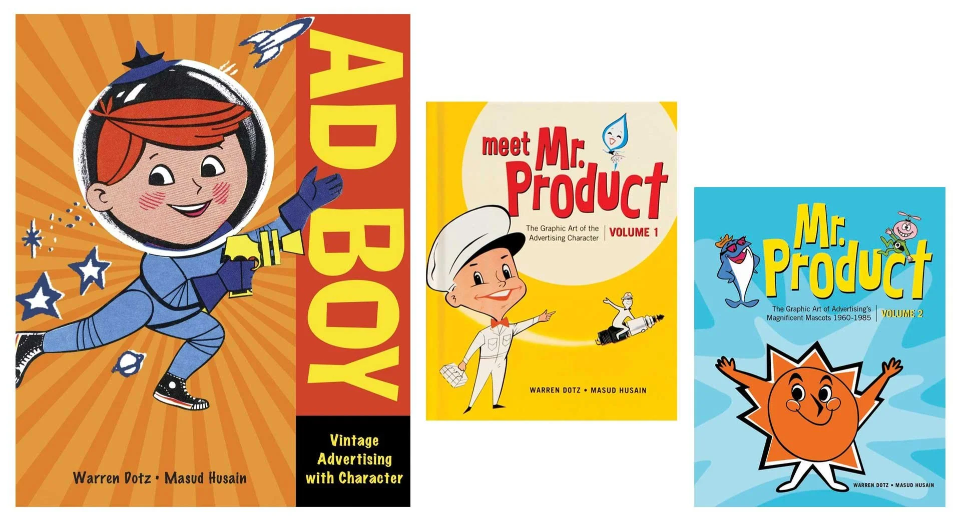
I’ve written about my collection of Muppet memorabilia, and when I was actively coming to the conclusion I wasn’t as interested in collecting that stuff anymore, I moved towards other interests, and my obsessions in vintage advertisements took root. It all started with a book; Ad Boy by Warren Dotz. Others followed from there, but I really got sucked in when I started collecting old magazines and clip art.

Warren Dotz loves vintage graphic design too!

I honed in on things from the 1930s–1960s (and maybe a few from the early 70s) and fell in love with Collier’s, Life, Look, Movie Story, American Artist, The Saturday Evening Post, Classics Illustrated, and Volk Artfile clip art. Whether the illustrations were simple mascots or full spread paintings, I was hooked.

Several fantastic illustrations from throughout the 1950s.

I love masking images (a reversible way to isolate an image or hide part of a picture), and even restoring some of these old ads. Collecting these dusty old publications then is quite literally a layered process (that was a Photoshop pun if you missed it), giving my hobby more validation than just taking up shelf space.

Ads I restored for the Santa Fe Traffic Office (June 23, 1959), Big Yank from Reliance Manufacturing Co. (April 30, 1957), and Barbasol (May 14, 1957) all from various issues of Look Magazine.

I’m not saying these were simpler times. I know my American history. Vintage advertisements do boil down everything to create an aesthetic that presents an idealized life and country. Life was not simpler, but it’s presentation sure was.

All from Collier’s Magazine, April 1944.

More from Collier’s, March & April 1944

It’s not just advertisements but art accompanying headlines and stories too. As you can see, some are fantastical and care free. The style of art captures the atmosphere of the decade and times. I didn’t live in the 40s or 50s (or 60s or even most of the 70s), but looking at all these great pieces transport me there as if I had.

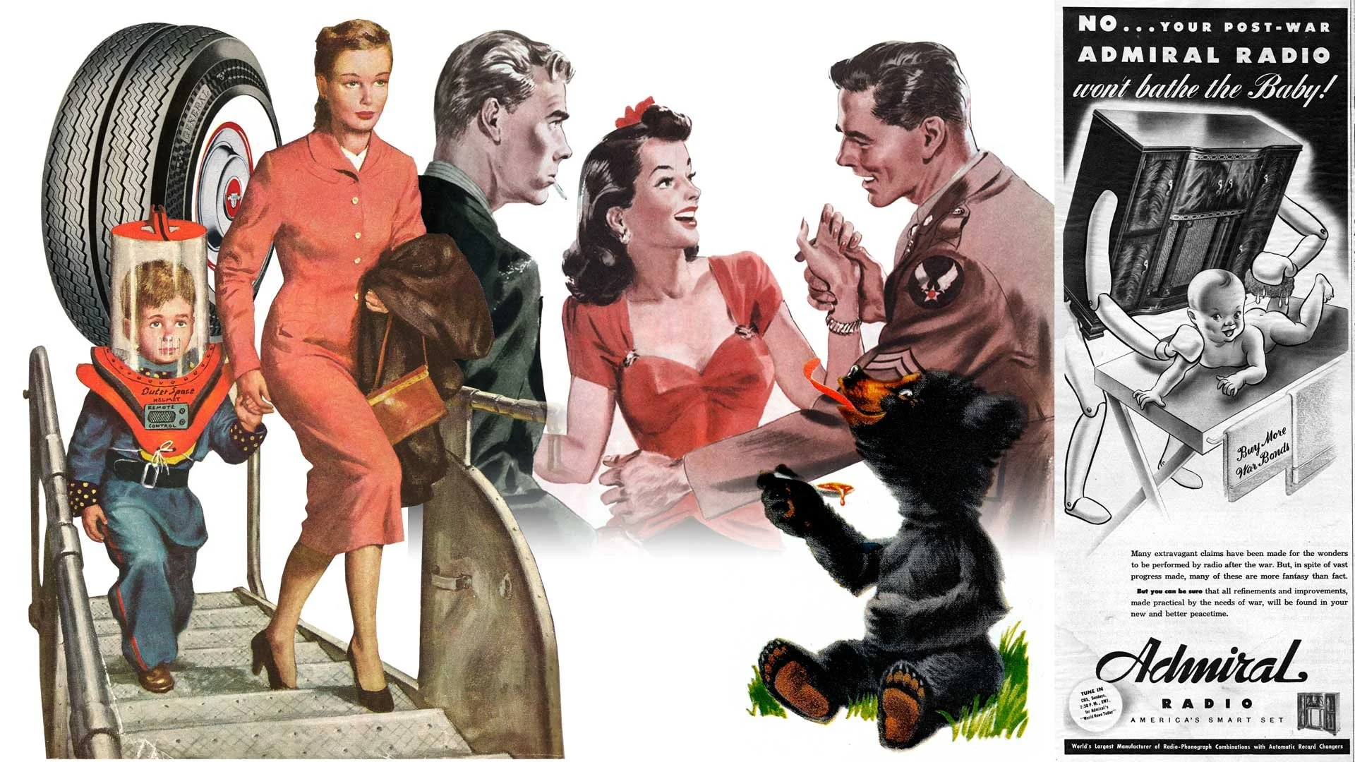
General Dual 90 tires featured in Look Magazine (June 23, 1959), the cover of The Saturday Evening Post (1952), art from the short story Three Day Leave in Colliers (March 1944), Karo Syrup in Look Magazine (June 23, 1959), and a whimsical ad for Admiral Radio in Collier’s (March 1944).

It’s not all cheerful and poppy though. The art and photographs also capture the darkness and troubles of the era as well. Granted it may not always reflect so clear. Many ads and stories are shockingly racist and sexist. I’ve decided not to share those, but to everyone who thinks these were simpler and lighter times, even the public narrative at the time didn’t (always) reflect that. Dramatic paintings project a much stronger emotional reaction.

From the news article Twilight in Germany, Champion Spark Plugs, and Scotch Tape (all from Collier’s March 1944)

Now it wouldn’t be much of an illustrator’s blog about inspiration without a few samples of my own. Anything can be made to look vintage with some paper textures and layer blending, but authenticity feels more parallel to the times when the artwork is pushed to a fun and exaggerated level.

Various illustrations from the last 5 years.

Please follow me on Instagram and Twitter and tune into this blog every Friday for more creative thinking and inspiration!