How Much A.I. is Too Much A.I.?

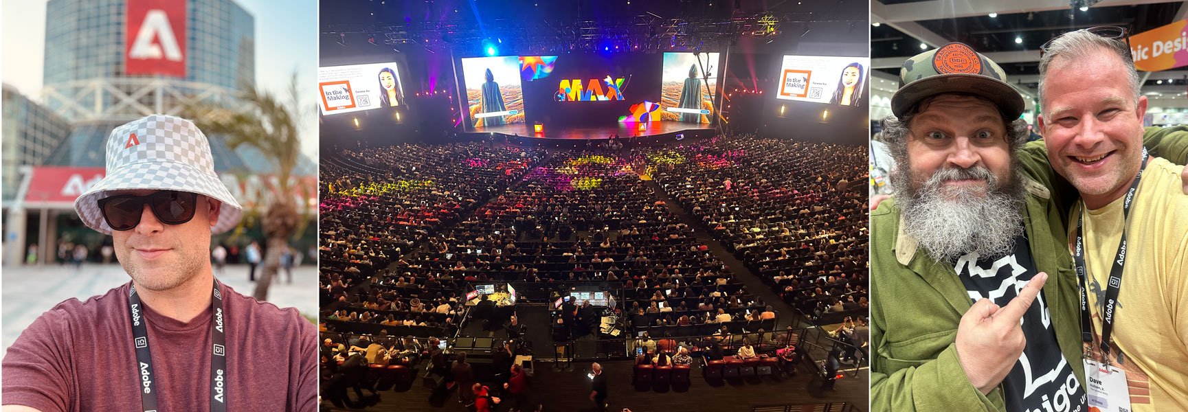
I don’t blog enough to be topical or cover current trends, and I like to keep things light and funny, or positive and optimistic in general. In fact, at the end of 2022 when I actually tried to be topical and write about artificial intelligence, I did it from a pretty altruistic standpoint with the hope that working with the changing landscape that a.i. isn’t going anywhere is a better approach then railing against it. At my core, I still believe that, and I’ll put a pin in that for now, but today I’d like to revisit a.i. with a little more experience after having had the wonderful opportunity to visit the Adobe Max Conference in Los Angeles as an attendee.

At the Adobe Max Conference, October 2023 where I got to meet Aaron Draplin!

I say, “a little more experience” because not long after my initial blog post about a.i. in December, I followed that up in April of this year (I told you I don’t blog enough to be topical!) with a post detailing my impressions using ChatGPT and Dall–E which very quickly became dated after both platforms made serious advancements technologically. I think for most people at that time, a.i. was still a fun and funny little moment of pop culture that humorously added to the zeitgeist with things like Keaton Patti’s bananas Olive Garden commercials and Trump Rallies—all created by feeding hours of those particular brands original content into a.i. bot programs. Maybe the undercurrent had a slight worrisome tone of the inevitability of robot overlords, but it was still relatively light–hearted and quaint. Who could have ever imagined we’d be pining for the simpler times of 2022.

Of course, like most technological milestones, once something starts to get traction, it really takes off. Granted, a.i. has actually existed since the mid 20th century (starting with the Perceptron Mark I in 1957), but really started to generate public interest in the 80s with the goal of revolutionizing computer processing. It’s directly because of this that artificial intelligence has thrived recently—not so much because tech geniuses have learned more about a.i. themselves—but rather because computer storage, memory, and speed have increased beyond what most average consumers even need. And in 2023, Dall•E released its latest text–to–image model featuring significantly more nuance and detail, and ChatGPT became the fastest growing consumer software application which now offers it’s GPT–3.5 engine operating its services on a freemium model while ChatGPT Plus offers its GPT–4 engine to users for $20 USD a month. If that’s not impressive enough, as of this post, ChatGPT itself isn’t even a full year old yet having launched in November of 2022! In March 2023, Adobe released its generative a.i. tools to Photoshop in beta testing. Today, those a.i. tools are fully integrated into Photoshop and Firefly a.i. is in beta for Adobe Illustrator—creating editable and functional vector illustrations—as well as Adobe Premiere Pro which also offers beta tools for speech to text editing for videos. It is insanely easy to use and saves lots of time.

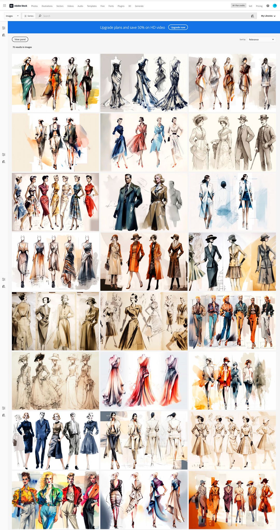
All of these images on Adobe Stock are generative a.i.

Let’s step back and address just a couple quick bullet points I made previously regarding a.i.’s learning technique. Now initially I made a mistake and thought the process was called stable diffusion, but that is in fact the name of a latent diffusion model developed by a company called Stability AI. Artificial intelligence uses machine learning to develop a deep knowledge of whatever subject it’s tasked to create. I’m cutting out a lot of context here for the sake of brevity, but imagine a robot who has the capacity to instantly read every single book on a particular subject so that it can then use that knowledge to compose its own creation based on that immediate education. It only has the information it has acquired, so it bases everything it can do on that information alone. I read hundreds of text books about various software programs when I was in school, but it almost all felt useless after I actually started working and realized experience was vastly more important. As a result, most of my initial professional work looks ridiculous, much like what a robot who only learned from reading and not actually doing.

Now imagine that same robot is instructed to paint a masterpiece, but in order to do that, it has to visually take in every painting currently on display in the Louvre. So it rushes around the museum and sees works from DaVinci, Géricault, Michelangelo, and Jacques-Louis David. Afterwards, you ask the robot to paint its own masterpiece, but upon completion you notice it hasn't really painted anything original, but rather cut and pasted elements like the Mona Lisa's smile or Roman columns from the Oath of the Hoaratii. It's specifically these issues that have a lot of creative people feeling pretty upset because the robot hasn't actually created anything, it's just stolen components from others. But then you also notice that because the a.i.'s creators have basically told this robot to go out and learn everything from the internet, you start getting into real troublesome areas because if you haven't noticed, there's some pretty horrible stuff online and it's not exactly hidden either. So now on top of being an art thief, the robot has also learned to be racist, sexist, and creepy. You know, like actual real life people.

Again, I'm really compacting a lot here to keep things from getting bogged down with technical jargon, but these are real concerns that have had companies like Adobe make serious public efforts to proactively promote responsible guidelines for generative a.i. learning and sharing, as well as protecting intellectual property and reflecting diversity in a positive way. For the most part, this corporate responsibility and good faith approach has been necessary, not just because of the reactions from creatives worldwide, but because of the accountability these types of organizations can be held to legally. Remember, theft of any kind is generally frowned upon.

So now we get to the Max conference where the undeniable star was Adobe's generative text–to–image a.i. program, Firefly. All over the conference floor, in its classrooms and displays, and promoted heavily at each keynote session were strikingly beautiful images all created by artificial intelligence. What Firefly offered was so prominent that it sometimes felt invasive. Is it cool and will it save designers from doing tedious things like masking, editing, and rough concepts that require super quick turnaround? Oh man, you bet your a$$ it will. But as one classroom speaker jokingly noted at the beginning of one session that it was the only conference event not promoting any new artificial intelligence tools, he was met with a roaring standing ovation.

Adobe competently showed that it's a.i. deep learning methods were trained solely on its own library of photographs, illustrations, images, and graphics (pretty much its entire stock library) and that its engineers were working tirelessly to integrate guardrails so that diversity and inclusion were represented equally and respectfully. So there you go! Problem solved. You can stop worrying now about everything. Robots are kind, love is love, intellectual property theft is a thing of the past, and the system works great.

Even if all that were true, there's still a hiccup or two. Now put your personal feelings about a.i. aside for just a bit and let's pull that pin out regarding my optimistic outlook from earlier. The cold hard fact is that a.i. isn't going anywhere, and just by looking at what was just a year ago and what is now today, it's pretty obvious that what a.i. can create is only going to get more impressive and it's going to be up to everyone to ensure it's guided properly, safely, and responsibly. Up until the Max conference, I could be heard saying, "Man, if this is where it's at now, imagine what it'll be like in ten years!" But that was out dated thinking when I first wrote about a.i. Especially when Adobe has expressed its expectation to see user generated a.i. images increase 5 times more in the next 3 years than it currently already has which is already over 15 billion!

So while ethically we have a lot of work to do, I think it's also fair to say that we're currently pretty early on in this saga and we're already experiencing some pretty heavy a.i. fatigue, and to that point, I'd like to redirect your attention to stock images. I love stock images, like I adore stock images and I've written about them before (and it's a funny article I'm really proud of too), but because I almost exclusively use Adobe Stock, and because Adobe Stock is the epicenter of Adobe a.i.'s learning process, it's kind of saturating the store with its own product and nothing else. Imagine going to your local grocery store, and all they sold was their brand of corn flakes. No produce, no deli, no butcher; just aisle after aisle of varying sized boxes of store brand corn flakes and nothing else. Because Adobe's generative a.i. has come along so far and has gotten so good, it offers generative a.i. images as stock image options. Originally you'd see one ore two pop up, then it became the majority of what was offered. Now depending on what you're looking for, a.i. generative images can be all that's available.

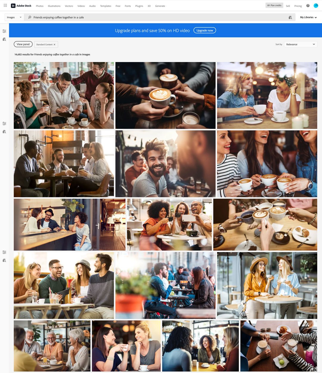
Real quickly if you haven't read my post on stock image sites; they provide a designer access to photos, graphics, templates, or illustrations the designer wouldn't otherwise have time to create themselves. Creating an ad for a new coffee chain? I can search for something like, "Friends enjoying coffee together in a cafe" on a stock image site just like I might look for something in a search engine and I will get various results that will hopefully match the look and vibe I'm going for.

So just to clarify, I don't have an issue with a.i. generated images. The quality is really good and getting better. There will be times when an a.i. generated image is much better than anything else the stock image site is offering, but it's frustrating how much of it there is. When searching for "Friends enjoying coffee together in a cafe", the language in the search itself is referring to a very human experience. The generative a.i. image is good, but it's not perfect. Plus I think there's a subconscious bias that I personally have that (at least in this instance) using something that was not created by humans but that is supposed to be representative of a human experience does not feel like a genuine, intentional choice to encourage others to buy into the design I'm making.

This image was generated by a.i. Can you tell?

I realize there's so much to unpack there. I'm using a computer to design this resource, is it really that bad that I'm requesting a computer create an additional element to that? Will future designers be less likely to have such a bias if they grow up understanding how ubiquitous this technology is? How "human" does an image have to be to properly reflect a human experience when we're all already familiar with shorthand cues like seeing people in such settings—photographed, illustrated, or otherwise—that creating that established connection is even necessary?

For their part, Adobe has a very clear and up front policy regarding their ethical standards and practices regarding posting, hosting, sharing, and creating generative a.i. images. Now people will point out a lot of that responsibility falls heavily on the users respecting that system, and this is what I personally believe is at the heart of all of this and creates the endless loop of debate surrounding this. Policing people from playing with this technology may be noble, but it's also antithetical to creativity in general. I'll repeat it again:

Artificial intelligence is not going anywhere and will continue to develop, but a.i. is a mirror reflecting back on the people who use it, interact with it, and engage others with it. Just like the world we live in, what we put in will be synonymous with what it gives back.

A.I. images generated from Dall E 2 and Firefly using the prompt, “Renaissance painting of a black cat in a pink tu tu

But what do you think? Is a.i. the cool new future that will bring the world peace and prosperity? Is this the beginning of the end? Will a.i. steal jobs from creative people as well as blue and white collar workers? Or am I just fixated on the loving memory of our cat Destiny and want a.i. to realize how special she was like my wife and I do?

Our actual (late) cat Destiny killing it better than any artist—a.i. generated or otherwise—ever could. Rest in Peace, sweet girl.

Thanks so much for stopping by, and I really would love to hear your thoughts on this. Please follow me on Instagram and let me know! Also like last time, here are more sources as well as some other great articles about a.i.:

2022 Year in review

As 2023 comes upon us, I wanted to reflect on what I’ve learned, accomplished, and celebrated over the year and also what I’m looking forward to!

Personal Projects

The Making of The Great Muppet Mural

While almost everything about ToughPigs pièce de résistance happened in 2021 (including all the work that saw the project to fruition), the documentary premiered on January 29th of 2022 and it was a huge and wonderful experience. Recently I learned that this labor of love did not make it to the final selections it was entered into for a couple independent film festivals, but it still remains one of my own personal Crown Jewels of the year. I will be singing its praises and all those involved for decades to come.

This Blog!

I've been doing a relatively acceptable job maintaining this blog for over a year now, and there are a few posts I'm very proud of. I was also very fortunate to have so many wonderful people contribute as well, so if you haven't already, you should give some of these articles a read and support their contributors as well!

Do You Have to be Creative to be a Graphic Designer?

Seriously, I'‘m super proud of these posts!

Illustrative Stuff

I did not draw much this year at all (outside of commissioned work) but what I did do continued my understanding and development of my craft and the mediums I use to create them. I also did not keep up with my figure drawing classes to the extent I had wanted, but I’m already trying to arrange things for next year so that I don’t slack again.

Some of the illustrations I’m most proud of from 2022

Of everything I drew on my own time, my illustration of Luisa Madrigal in the style of Charles Dana Gibson was my favorite. I have plans for more redraw challenges as well as doing more artist games like I did with Will Carroll and Noah Ginex.

Freelance

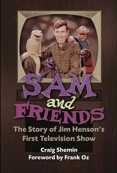
For the first real time since my daughter was born, I started taking on serious freelance work again. I took on several more notable clients this time around the sun as well as connected with some old friends. The biggest one of course was getting the opportunity to work with Craig Shemin on his newest book, Sam and Friends: The Story Of Jim Henson’s Television Show.

Being back in demand was wonderful, but in many ways I feel that I jumped the gun and bit off more than I could chew, so…

Biggest Lesson Learned

I willingly and happily put almost all creative endeavors aside when my daughter was born with the understanding that someday when she was older, I’d resume drawing regularly (daily), taking on freelance again, and other passion projects. As she has grown more independent, 2022 seemed like the year to dip my toes back in the water for all of that. Unfortunately, I think I dove in the deep end and over–immersed myself. I’ve always been very good about my time management, but along with everything else, I’m a little rusty here too. 

In general, when you work full time (regardless of what your actual job is), it’s difficult at worst to manage your time properly and seemingly unnecessary at best if you’re good and well paid. The latter is very ambitious, but it’s an easy excuse to turn things down if you just don’t feel like doing them. These are all things I will consider in the coming new year.

New Year’s Resolutions 

Having learned that there will never be enough time to do everything, I am hoping to focus on expanding my tool set a little more in 2023. I would like to become proficient in Adobe After Effects, as well as the 3D modeling program, Blender. Part of this is a continued fascination with video production, but more than a few times in the recent past, I’ve realized the tools that I already know aren’t capable of creating some of the concepts I had hoped to present to clients. Learning new software will accommodate this tremendously.

So here’s looking to 2023 and everything that it has in store for all of us. Thank you so much to every wonderful, talented, and awesome person who has helped me on my journey, contributed to this blog, and taken a moment out of there day to give a blog post a read, an Instagram pic a double–tap, or a retweet on Twitter. See you all in 2023!

Thanks, Jim

How you define yourself is such a personal thing and yet it’s something you also want to put on blast. “This is what I like, this is what interests me, this is who I am.” Only, how difficult is it to categorize all those complexities into just one thing? Father, artist, husband, illustrator, son, writer, brother, designer, friend, gamer, CIS gender male, cheese–based snack enthusiast… I’m all of these things but none of them exclusively. This is a real hot button topic that can also both interest and infuriate people and yet all of us across every spectrum of life consider these things and consider them consequential.

Let’s play a game though for just a brief second and pretend you absolutely have to boil all those things down so that you can at the very least point in a general direction to who you identify as and so you can write a manageable blog post. That’s why today I want to briefly highlight my personal admiration for Jim Henson. Good God, I mean I’ve indirectly and directly credited his influence on my life so many times that I don’t even know which past post would even suffice to make that point. Tomorrow however—Saturday, September 24, 2022—would have been his 86th birthday. Side note: Can someone please tell me if referring to someone’s upcoming birthday in the past tense due to their death is grammatically correct? Maybe strike “writer” from my previous list of defining monikers.

Illustrations © DaveHulteenDesign.com

Creatively, Jim is my ultimate true north. His sensibilities and ethos have all strongly influenced my own. When I was younger, I’d say, “If Jim started a religion, I’d convert.” A tongue–in–cheek joke even I wasn’t sure was true or not. But even that way of thinking was inspired by him.

Illustrations © DaveHulteenDesign.com

The reality though is that I can’t even express those thoughts into a cohesive post. Not because I lack the ability to convert those feelings to text, but because I honestly don’t even know where I would start. I know someone who can though, and I’ll turn it over to them in just a second. First I want to share how I’ll be celebrating that upcoming 86th birthday.

Illustrations © DaveHulteenDesign.com

I’ve teased about it, I’ve shared snippets on social media, but I’ve yet to actually talk about the work I’ve done for Craig Shemin on his newest book, Sam and Friends: The Story of Jim Henson’s First Book. Part of this is because my involvement has evolved over the last few months, part of it is because it’s super gauche to discuss a project before it’s completed, and part of it is because this particular story isn’t quite complete yet. For the purposes of this post however, I’ll be at the Museum of the Moving Image with Craig and lots of other fans for the book’s release. Having been given that chance to be a part of this book has pulled my admiration full circle, and I’d like to believe that if Jim were still here and gearing up for this 86th party, he’d know my name—maybe even speak it out loud—and my Lord, what a euphoric, dopamine–inducing daydream that is!

It’s most likely moot at this point, but not being able to fully layout my thoughts on how to express what Jim did for me, all I can really do—and for the record—is say, “Thank you, Jim. Thank you for inspiring so many of us. You absolutely made this world a much much better place, and we are all so grateful that you did.

Illustration © DaveHulteenDesign.com

Now while this post is an opportunity to share my thoughts and art that pays tribute to Jim, I have to turn it over to Julia Gaskill (I was going to label her a poet but as I mentioned before, we’re all so many different things and putting just one label on her would be a huge crime). Awhile back, she created an exceptional video entitled An Open Letter from Kermit the Frog to Jim Henson that just floored me. She said everything I wished I could in this post only so much better than I could have ever hoped to, and so, I’m extactic to give her the final word on this.

For more of Julia’s work, you absolutely must follow her on Instagram and Twitter @geekgirlgrownup. Also, if you haven’t ordered it yet, pick up Craig’s new book about Sam and Friends in either soft or hardcover and learn a little bit more about the guy who inspired so much for so many.

Too Many Cooks in the Kitchen

Whether it’s freelance or work from my day job, I usually work for one client per job or with a very small team. This allows for good collaboration but without causing too many unnecessary problems. A couple weeks ago I wrote in depth about how unnecessary opinions from other peoples can influence a client, especially when they’re not even directly involved with the project to begin with. 

Occasionally I will work on a project that has to go before a committee for final approval. Where I work, they are known as “the cabinet.“ The cabinet is a substantive collection of management that needs to review larger projects that will have a national or even international audience. Fortunately, by the time a project goes before them, they aren’t necessarily making changes or suggesting frivolous design choices, but rather ticking off all the boxes to make sure the project is ready for final approval. Things like making sure there is proper representation, a clear message, that there’s no misinterpretation, and that it includes all necessary information. Of course there have been a couple nightmare situations in the past, but for the most part, the cabinet exists as a good eye for checks and balances.

The Cabinet” sounds like an NBC crime drama series, right?

Joe Hennes and Cookie Monster

As I love to do, I reached out to some creative professionals to see if anyone had any unique stories when it came to dealing with a situation where there were just too many cooks in the kitchen as the old axiom goes. Writer extraordinaire, co–owner & editor of ToughPigs, and my dear friend, Joe Hennes responded with the penultimate and quite literal interpretive telling of having too many cooks in the kitchen. Here’s his fantastic story:

I have very rarely been a project-based "work for hire" type. For most of the projects I've been involved with, I've either created it for my own needs or been a part of a larger, corporate production company. For the latter, it can be very difficult—and yet, very easy—to get a creative project off the ground. Confusing!

There's an unspoken rule on the business side of production that creative choices should be left to the creatives, especially if we're paying them money for their talents. Sure, there are internal think tanks and approval processes, but it's surprisingly difficult to scratch that creative itch when those responsibilities are handed off to the artists. On the flip side, being on the other side of the table means that you have a better idea of what's possible and what's not, what the company really wants, and how to cut every cost before an idea gets too big.

Back in 2014, I was working in an administrative role at Sesame Workshop, and constantly trying to find ways to be a part of creative projects. A truly bizarre viral video hit the internet that year - "Too Many Cooks", an 11-minute long spoof of sitcom opening sequences that originally aired on Adult Swim. And as all viral videos do, it was the hottest thing for a few days.

Part of my (unofficial) role at Sesame Workshop was to try and brainstorm fun content for grownup fans like myself. Very few of my pitches came to fruition (the most notable being "Big Birdman" - a spoof of the Oscar-winning film "Birdman", starring Caroll Spinney), but when "Too Many Cooks" hit our radars, it seemed like it'd be a HUGE opportunity to develop a "Too Many Cookies" spoof starring Cookie Monster. I mean, the joke was right there in the name!!

Joe with Big Bird & Oscar the Grouch performer Caroll Spinney

This is where that "business side of creative" stuff comes into play. What's the pecking order for getting something like this approved and made? As always, money comes first. Since this would be aimed toward adults, that meant it would be released on social media, so that division of the Marketing Department would be paying for it. I pitched the idea to the head of the social media group, and he agreed that we should do it. But he also recognized that there's no predicting how long things can be viral, so we had to act FAST.

Literally running down the hallway, we went to the Production Department, as they'd be the ones actually putting the video together. The Executive Producer wasn't in her office, but since time was of the essence, one colleague volunteered to start pulling videos of Cookie Monster and editing them together. Once this thing was approved, at least the work would have already started.

Our next stop was with Curriculum & Research, as all things at Sesame Workshop need to be approved through them. It took some convincing (there was literally nothing educational about what we wanted to make), but since there was nothing harmful, and the video would be aimed primarily toward adults, they reluctantly gave us the go-ahead.

Looping back around to Production, the Executive Producer was still absent. We couldn't do anything without her approval, and the clock was ticking. By the end of the day, we couldn't get in touch with her and the social media director made the call to cancel the project. Understandably, if we couldn't get it all approved and created by the end of the day, there was no guarantee that this little video would still be relevant 24 hours later.

Feeling a little dejected, I went home that evening and realized that there was no reason I couldn't keep moving forward with the project on a smaller level. I wouldn't have the resources of a big production company, but that's never stopped me before. I quickly wrote lyrics for a spoof of the "Too Many Cooks" song and recorded myself playing it on the ukulele while my wife Sarah sang. I ripped some videos of Cookie Monster off of YouTube and edited a short video together. (In case you were wondering, I figured out that the original "Too Many Cooks" video featured the "Full House" font.)

In the end, we were right - the video needed to go up at that exact time to benefit from the viral buzz. "Too Many Cookies" currently has over 74k views, almost all of which came in those first few days. Naturally, those numbers would probably be in the millions if Sesame had created it, but I got to keep all that attention for myself. Sure, I didn't make any money off of it, and it didn't do much to help increase my clout at work, but it just goes to show that when the kitchen truly has too many cooks, it just takes one absent sous chef to bring the whole thing crashing down.

For what it's worth, the next day the missing Executive Producer said that she absolutely would've greenlit the project. Oh well!!

Me, my daughter, and Joe, January 29, 2022

What a blast! Joe busts his hump over at ToughPigs, so I am very grateful he took the time to retell his experience here. Make sure you are following ToughPigs everywhere: on Facebook, Instagram, Twitter, and YouTube! If you like, you can also me on Twitter and Instagram and check back every Friday to this blog!

Creative Daddy II: The First 5 Years

When I wrote about finding a creative outlet through kids and how exciting it can be, I neglected to really show off what that entailed. I suggest you check that post out first if you haven’t already, but with Father’s Day a little over two weeks away, I thought I would share some of what that actually looks like and present some of what my daughter and I have a blast doing.

She couldn’t directly contribute to our shared creative endeavors as a baby, but she was still a huge inspiration

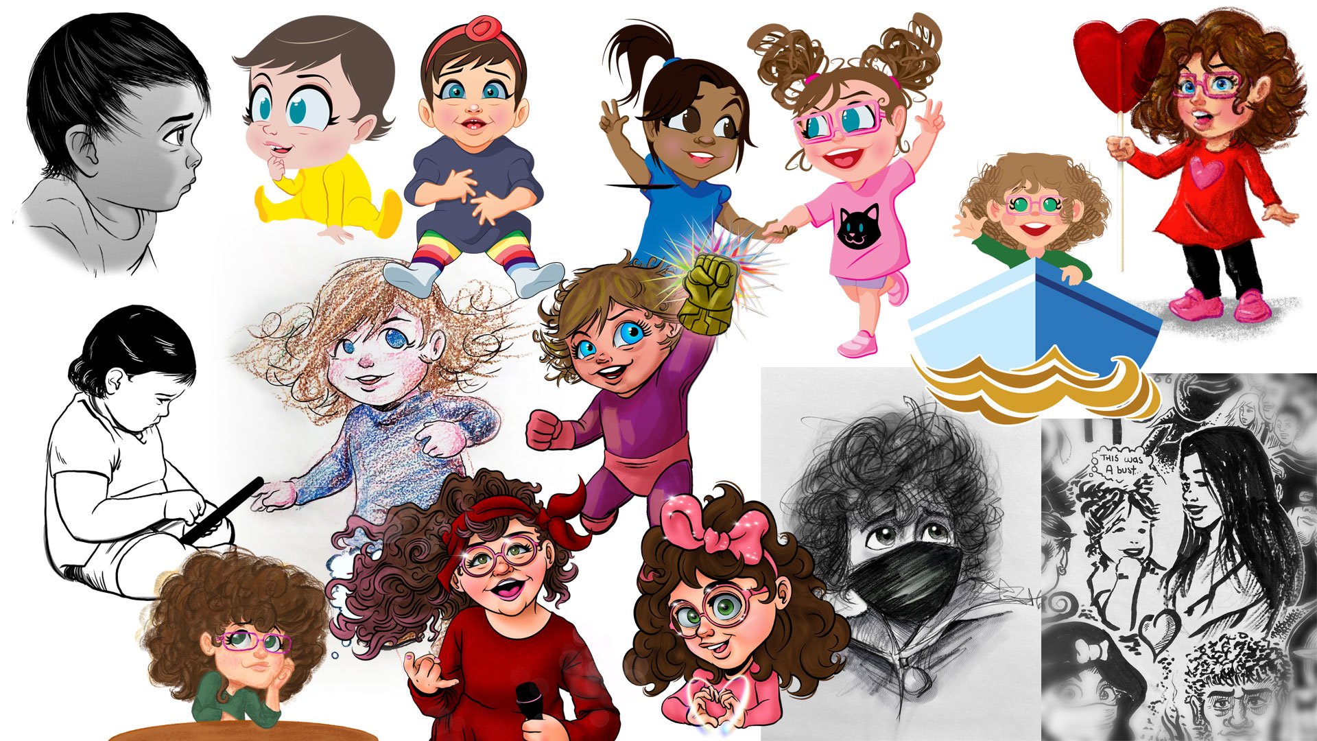
Now initially there wasn’t much she could do being a newborn, but that never stopped her from being my newfound muse. Mostly I drew her and it is always a privilege to draw my daughter. It’s very meta to watch my art of her grow with her and that’s something I’ll do for the rest of our lives. I also found fun ways to incorporate her into other mediums.

Also featured are her cousin and mommy!

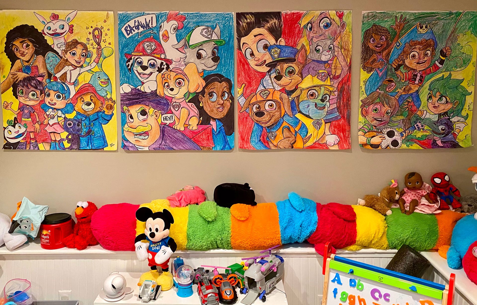
Every kid starts with crayons before their parents introduce—then immediately take away—markers. Of course, these are mediums that we’ll use for years to come. My daughter and I still love drawing giant posters that we hang all over the house. At first there was no rhyme or reason to our drawing. I would casually draw while she would climb all over me and scribble all over the paper, me, the floor, the wall, the television, the cat, and most prominently herself. Nowadays we plan what we will put on our posters (usually characters from whatever she’s currently in to) and then wallpaper the playroom. This isn’t just a fun thing to do, it’s decorative and serves a purpose.

I was convinced we weren’t getting our security deposit back on the apartment we moved from there were so many marks on the walls and floors!

The other fun thing about these giant posters is that they are shared experiences for my wife as well as anyone who comes over to visit. Family always contributes time to coloring these posters and its a great activity anyone can share in.

The real irony is how we no longer really watch any of these particular shows anymore, but we still love having them decorate our playroom

Afterwards, we make something of a big deal when we formally place our poster up on the wall and peruse the place like a museum.

One of our more prominent creative outlets have been our Big Show; a fun little talk show style video series where we chat about any and everything. We’ve even occasionally done a news type segment. This gives her a chance to not only be seen but heard and who doesn’t love watching themselves on TV?

What makes everything we do so much fun is often how new it seems for both of us. Paper maché, construction paper stick puppets, our own newspaper, rock painting, or even just regular playtime. She’s even getting more interested in photography.

Dry erase markers on windows is a lot of fun if you remember to explain only those markers on only the windows

However, what we’re known for throughout our neighborhood is chalk drawing in our driveway (in fact, we even recently created an Instagram account for that we would love for you to follow!). Whether it’s taking suggestions from other kids or making huge holiday murals, I tend to get more carried away than she does. What I have to constantly tell myself is that this is our project, not mine. I may draw the lion share of stuff, but it’s 100% okay for her to contribute or draw over. It’s not messing something up if it’s a collaborative effort she loves as well.

Follow us on Instagram @rosestartsp

I’m also grateful that I’m not the only creative influence she has. We have many variations of talented artists in our family and close circle of friends that expose her to music, dance, writing, acting, and just being silly for the sake of silly.

My wife, dad, brother–in–law, and sister are just a few of the other creative people in my daughter’s life

While drawing will always be my immediate go–to with her, I never want her to feel obligated to follow directly in my footsteps. It’s natural for a creative person to be highly influential in a child’s development, but it’s important they have opportunity to find their own voice, their own style, their own approach. Being creative isn’t limited to, “the arts.” It’s about being able to see things differently so that problem solving is an open–minded pursuit. And if you’re wondering, my daughter adores her school art teacher, insisting, “He’s a way better artist than you, daddy” which I absolutely love. Not just because she doesn’t have an obligation to putting me on such a pedestal, but because she feels comfortable enough to set her own boundaries and even start to appreciate different art forms, styles, and approaches.

Sharing artwork together

My (step) mom always said after she married my dad and became my mom, “There’s no manual” referring to how much of a learning curve there is to being a parent. That continues to make more and more sense the older my daughter gets, but I think there’s something to be said for parental instinct. I started drawing her little pictures for her to find in her lunchbox when she started school before someone my wife and I admire suggested we be careful so as not to make it seem like we were forcing any of our interests onto her, or worse; take attention away from her friends and accidentally redirecting it on to us. Having grown up without my mother often meant I felt I had huge shoes to fill and I didn’t want that burden to be placed on my daughter. After a couple weeks of not placing these drawings in her lunchbox however, she read me the riot act about being disappointed that there were no drawings with her snacks anymore. Now I can draw Louisa from Disney’s Encanto from memory.

Princess Tiana (with a special frog), Luisa from Encanto, a cheese bear-ger, and Bruno also from Encanto

In the end, my personal feeling is that whatever my daughter finds joy in, that is where her passion will lie. Having the creative freedom to find that joy is such a fun and wonderful journey, that it’s beyond developmentally stimulating; it’s foundational too. Please follow me on Instagram and Twitter and follow my blog every Friday!

A little bit silly, a little bit fantasy, a lot of fun, and a healthy helping of “throw a ton of stuff at the wall and see what sticks

Inspiration: Vintage Graphic Design

I’ve never watched Mad Men, I don’t consider myself an old soul, I love being mindful of the present, and I’m allergic to mold. None of that has stopped me from enjoying one of my true delights and a great source of inspiration, vintage graphic design.

Some of the cool items from my collection.

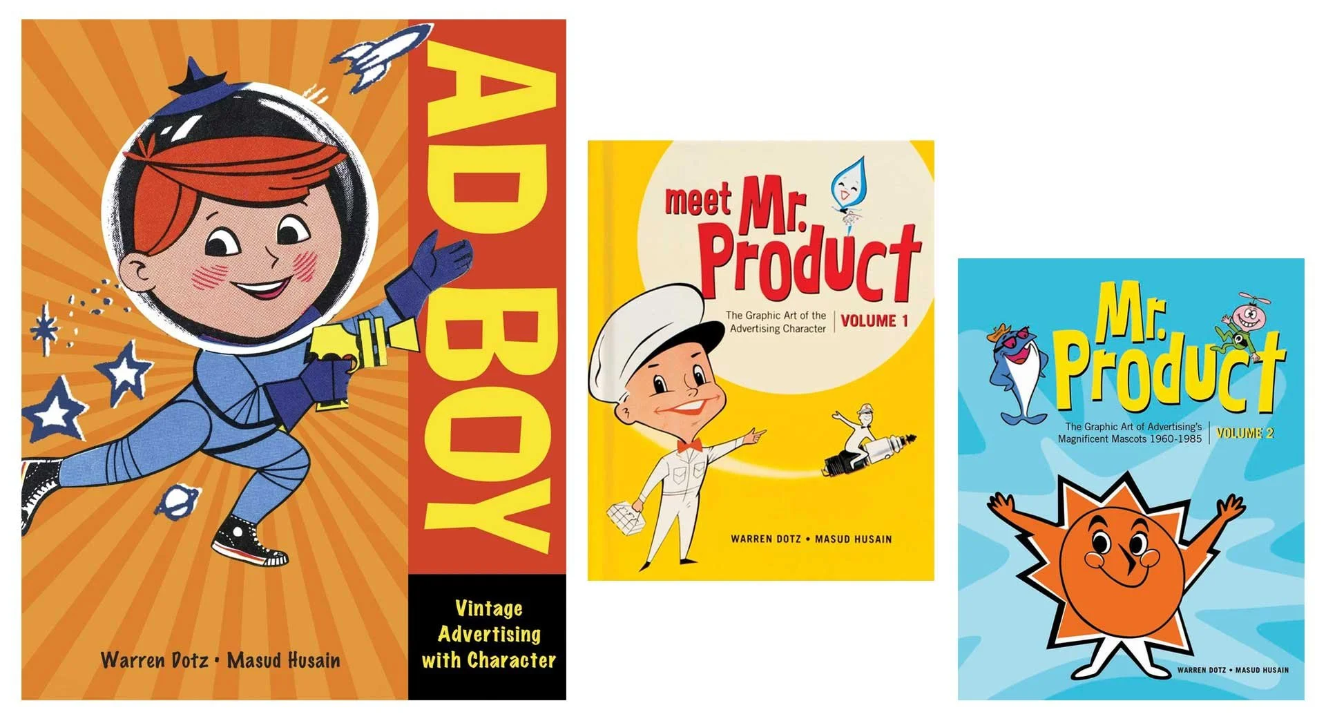
I’ve written about my collection of Muppet memorabilia, and when I was actively coming to the conclusion I wasn’t as interested in collecting that stuff anymore, I moved towards other interests, and my obsessions in vintage advertisements took root. It all started with a book; Ad Boy by Warren Dotz. Others followed from there, but I really got sucked in when I started collecting old magazines and clip art.

Warren Dotz loves vintage graphic design too!

I honed in on things from the 1930s–1960s (and maybe a few from the early 70s) and fell in love with Collier’s, Life, Look, Movie Story, American Artist, The Saturday Evening Post, Classics Illustrated, and Volk Artfile clip art. Whether the illustrations were simple mascots or full spread paintings, I was hooked.

Several fantastic illustrations from throughout the 1950s.

I love masking images (a reversible way to isolate an image or hide part of a picture), and even restoring some of these old ads. Collecting these dusty old publications then is quite literally a layered process (that was a Photoshop pun if you missed it), giving my hobby more validation than just taking up shelf space.

Ads I restored for the Santa Fe Traffic Office (June 23, 1959), Big Yank from Reliance Manufacturing Co. (April 30, 1957), and Barbasol (May 14, 1957) all from various issues of Look Magazine.

I’m not saying these were simpler times. I know my American history. Vintage advertisements do boil down everything to create an aesthetic that presents an idealized life and country. Life was not simpler, but it’s presentation sure was.

All from Collier’s Magazine, April 1944.

More from Collier’s, March & April 1944

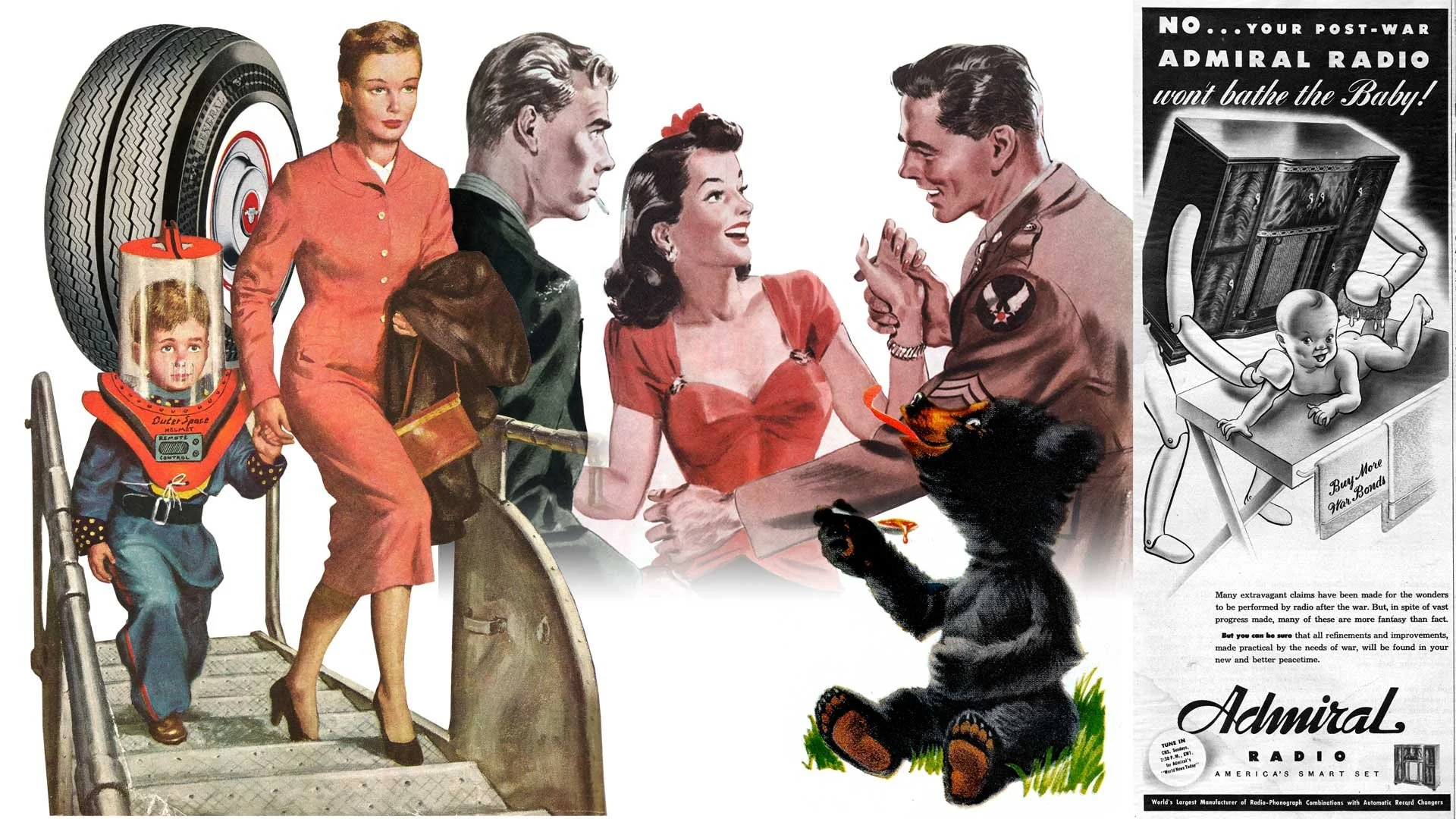
It’s not just advertisements but art accompanying headlines and stories too. As you can see, some are fantastical and care free. The style of art captures the atmosphere of the decade and times. I didn’t live in the 40s or 50s (or 60s or even most of the 70s), but looking at all these great pieces transport me there as if I had.

General Dual 90 tires featured in Look Magazine (June 23, 1959), the cover of The Saturday Evening Post (1952), art from the short story Three Day Leave in Colliers (March 1944), Karo Syrup in Look Magazine (June 23, 1959), and a whimsical ad for Admiral Radio in Collier’s (March 1944).

It’s not all cheerful and poppy though. The art and photographs also capture the darkness and troubles of the era as well. Granted it may not always reflect so clear. Many ads and stories are shockingly racist and sexist. I’ve decided not to share those, but to everyone who thinks these were simpler and lighter times, even the public narrative at the time didn’t (always) reflect that. Dramatic paintings project a much stronger emotional reaction.

From the news article Twilight in Germany, Champion Spark Plugs, and Scotch Tape (all from Collier’s March 1944)

Now it wouldn’t be much of an illustrator’s blog about inspiration without a few samples of my own. Anything can be made to look vintage with some paper textures and layer blending, but authenticity feels more parallel to the times when the artwork is pushed to a fun and exaggerated level.

Various illustrations from the last 5 years.

Please follow me on Instagram and Twitter and tune into this blog every Friday for more creative thinking and inspiration!

Artist Games Featuring Noah Ginex

Two weeks ago, Will Carroll and I played a game together where we would take a pass at a drawing, back and forth adding to it until it was so crammed with stuff we decided to share it with you. This time around I’m playing again with Noah Ginex! Before we get into any of that, first let’s talk about Noah.

Some of Noah’s characters.

Aside from being a super talented artist (who is also a fellow Muppet Mural alumni), Noah is an award winning puppet builder who has an exceptional sense of humor and is wonderfully and wildly creative. I was very excited to play this game with Noah because he really knows how to look at things from a very different and even unconventional angle. He has also played this type of game with his daughter so this was not his first rodeo. For everyone else who may have missed the first time I played with Will, here’s how this works:

The Rules

One artist draws something rather fleshed out then passes it on to the other. There are no time limits or space restrictions. Either artist can draw as much or as little as they want before passing it on. One artist can add to or obscure the previous work as much as they like as long as they don’t manipulate it (within reason).

The Game

Whenever I play this with an artist, I give them the option of using a full color render of the illustration I did or just the line art. I drew a white gloved cartoon hand holding a phone receiver. Noah chose to stick with the line art.

“It’s for you.”

Noah Ginex: I didnt know what to expect at first. Honestly the first volley was a lot more fully realized than I was expecting, but that just meant i could bite off a bigger chunk myself. I responded with traditional pen and ink the first time, because I didn’t have my Cintiq with me. Which I think directed the piece more to traditional black and white.

Noah’s first pass.

Just as when Will first responded, I was so excited to see that Noah had taken this in a direction I never could have anticipated. For starters, I was excited we were staying black & white, but anthropomorphizing the handset was super cool. My high school nostalgia sparked me to channel my inner Sam Keith and go really off the rails. I also took the opportunity to refine my previous line art to pop more now that the black & white direction had been set.

This weird Radio Shack rabbit then headed back to Noah.

Noah: I see faces everywhere, so it was nice when Dave responded with even more opportunities to add little details. I especially loved the phone cord turning into curly ringlets.

I don’t know what exactly this thing does, but I’m skeptical of its warranty.

Aside from minimal cleanup on my previous passes, I didn’t want to do anything else to the main art. Truth be told, I was completely lost on what I had done and what Noah had done. This fusion that normally marries two different styles together whilst retaining each artists unique styles was somehow obliterated. Noah and I had achieved a very comfortable simpatico… thing and I loved it. Still channeling those Sam Keith vibes I felt before, I opted to add a splash of red and cover it in chaotic text so it looked like a splash page right out of The Maxx.

The final collaboration.

Noah: I think the final piece ended up looking very Ralph Steadman-y, which is fine by me, so I signed it with a Steadman-esque version of my artist stamp. I'm really happy with how it turned out. I think it's perfect.

Again, this was so much fun. I actually am sad when I finish these games because it’s liberating, exciting, and so creatively satisfying. If I were a braver man, I’d consider this for a tattoo!

Thank you to Noah for being a part of this week’s post! Check out all his art by following him on Instagram @artbyNoahginex and his website too: noahginex.com

You can also follow me on Instagram and Twitter and tune in every Friday right here for more creative thinking!

Do You Have To Be Creative To Be A Graphic Designer?

When I write regarding graphic design or even just introduce myself professionally, I make very little distinction between that and being an illustrator. My professional title is “Graphic Designer/Illustrator” which is driven by pure hubris. Getting that “illustrator” addition was the most satisfying moment of my career, but if we’re going by a definitional account of my job, it’s redundant. A graphic designer is the Swiss Army knife of media professionals. We need to have a working knowledge of published, printed, and digital media and that encompasses a lot of stuff. Typesetting, illustration, user interfaces, web design, production & rendering methods, communications, plus keeping up with changing trends and social & cultural norms just to give a broad perspective of our day–to–day responsibilities.

I’m getting ahead of myself though. Let’s travel back to the very early start of the 21st century when I was still in school. I’ll give a more detailed account another time, but in short, I was enrolled in a trade school for graphic art and design at the corporately named Brick Computer Science Institute. We were finishing up our class for Adobe InDesign (which is a desktop publishing and page layout design software program) when the instructor decided to kill two birds with one stone for our final project assignment. We had to design a “How To” book based on any subject we wanted, then present this instruction manual to our classmates to clumsily complete our public speaking portion of the curriculum. At the time, I was heavily involved in puppetry, even working in local productions, so my “thesis” was how to perform a puppet. The whole farce was good enough to elicit a lot of questions afterwards from my fellow classmates. The one that hit me harder than anything else, and one I still think about today (hence this entire post), was when a kid asked, “(Regarding puppetry) How do you get involved in something like this?” I started by stating rather matter–of–factly that it is similar to any other creative endeavor one might be interested in like dancing or painting. So I asked the class, “Has anyone ever taken singing lessons or gone to an acting camp?” Silence. “Okay, what about figure drawing, sculpting, or even writing short stories?” Heads shook whilst still fixating on me with deadpan stares. I took a breath and went out on a limb convinced I’d get a a tiny bite when I sheepishly asked, “Has anyone here ever tried to do anything creative?” In a mumble from a now awkward choir, the collective replied, “No.” My head began to spin and I have almost no memory of what happened after. I just felt so dizzy wondering how so many kids without even an inkling of desire to be creative in any way had all enrolled in a program with “art” in its title. Was I going into the right field? Was I going to have a leg up of any kind because I could draw? Was I completely off about what I assumed graphic design to be?

My brief stint as a puppeteer in 1999 and then again only slightly better in 2016.

Maybe it’s not a huge surprise, but of the nearly 60 kids who enrolled, myself and one other student were the only two to graduate from our class. Everyone else dropped out. The institutional credibility of the school notwithstanding, I had placed all my eggs in this basket and headed out into the world afterwards as a green but still hopeful and determined graphic designer. My first job at a flatware company however proved the unimaginative dropouts may have been the majority as nothing I did required an ounce of creativity. My job was to be imitative and unoriginal by simply copying the designs of our competitors so that the work could then be outsourced to our manufacturer in China. One day I decided to take initiative by designing my own line of tableware for the company, fully understanding the Employment Agreement I signed had a strict statement of ownership that any ideas would belong to the company. My boss was visibly very upset at this ambitious move towards his good graces and gave me a real dressing down. One week later I was let go. Two years later I saw my designed tableware from the company on full display on an end cap at Target.

Now very depressing allusions to the life of a graphic designer aside, my story is not uncommon, and it can be justified repeatedly simply by looking at the world around you steeped in really bad graphic design. Graphic design runs along a very substantial bell curve because it’s one of those industries where anyone can—and does—label themselves a “graphic designer” just for owning an outdated, bootleg copy of Photoshop. Every time—and I mean every single time—I see really spectacularly bad design, I wonder if it may have been done by one of my dropout classmates who decided they didn’t need the student loan debt or color theory from good old BCSI and ventured into their own stint as a “graphic designer.” I think of those blank faces staring back at me who openly admit they had, nor would have, any creative interests at all and wonder how widespread that idea may be. It begs the question, do you have to be creative to be a graphic designer?

If you’re asking me, then the answer is obviously and unequivocally yes, but we can be a bit more diplomatic here. I reached out to a bunch of designers whom I admire to get their take on this idea. A lot of them were busy with deadlines and couldn’t contribute (again, the life of a graphic designer), but I cast a large net and spoke with both professional actual real life graphic designers as well as those who successfully manage things on the side as freelancers. There’s a wide range of education and experience here, but all are people I consider talented so I posed the question directly to get their take on this idea of if it’s even necessary to be creative in order to be a graphic designer. Also understanding deadlines and client specifications, I asked them to consider how much of their drive is motivated by inspiration verses profit, art verses functionality, and if they are moved in anyway when seeing good design verses bad design. Here’s what they had to say.

I consider the role of graphic designer most of all as a tool of communication. Anything I produce in that capacity has to send an easily understood message — Read this! Buy that! Being creative doesn't mean having a special sensitivity to taste and aesthetic choices, neither is it a special talent to draw, compose or write a novel — it simply means to effectively use whatever tools at your disposal to get a job done. Problem solving requires creativity. How much does it influence my work? I'd say it's the main ingredient, along with curiosity. One of my professors at SVA used to tell us: "Be informed! Read! Learn! The more you know about the world around you, the better you'll be able to communicate ideas through design." I profoundly agree with that notion. 

Mabel Zorzano

Even if it’s a project that is conceptually dictated or a simple layout, I can’t function without putting some creative spin on it. I don’t necessarily see myself as an “artist” but more of a creative creator 😂 so I can’t help but try to be creative in my approach to any project.  

I’m definitely moved by bad design…moved to hurl. But that doesn’t mean that someone with basic “functional” skills can’t create something pleasing to the eye. My main day job isn’t graphic design, so I feel I can still be motivated by inspiration. It’s still thrilling to start with nothing and end up with a creation.

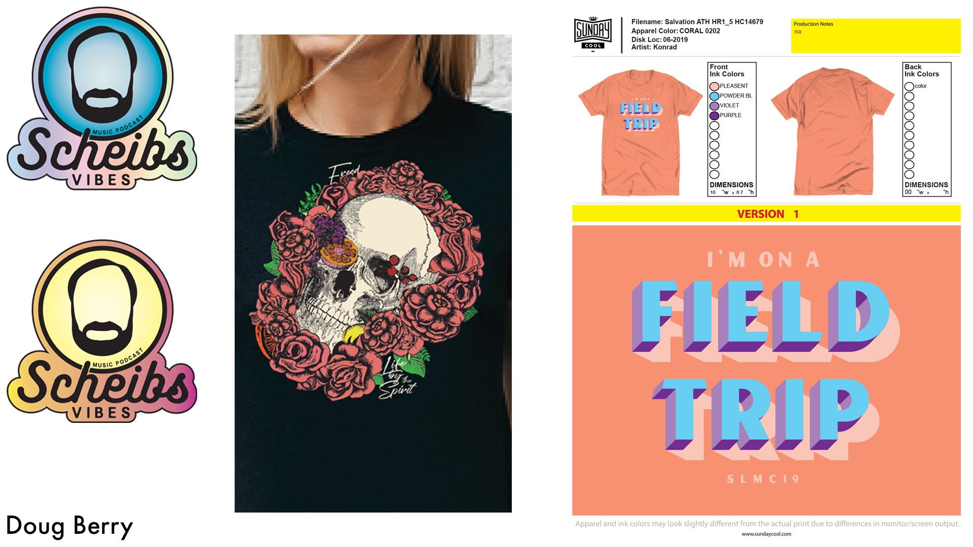
Doug Berry

Being creative is integral to being a graphic designer. Our role is to take a client’s vision and deliver it in a way that stands out, draws in the desired audience and tells a story. Without creativity, anyone could do what we do. Creativity is what gets both you and your client noticed.

Christine Senak

How creative I get depends on the client. They lead everything. For me, creativity begins with listening to and learning from the client. Sometimes they have a very clear idea, but can't quite articulate it. New ideas are born through collaboration of some sort. I try to be more intimate, so I don't bombard them with a gazillion font choices and colors. I'd rather spend that time talking to them about what they really want. That seems to be rare in this business.

Many artists draw a distinction between artistry and craftsmanship. I think that line has always been a blurry one. Beautifully so. No matter what a design evokes in us, it's going to give each viewer a unique experience and that can never be cynically focus–grouped by a client or executive. I see bad design every day on busses and billboards in the city. Truth be told, it gives me more confidence in mine. Oof! Bad kerning is an epidemic. Good design, however, feeds the soul.

James Carroll

To be honest I have taken for granted the idea that “I am creative” hence “I am a graphic designer.” But, as I reflect on this question, I realize I have some doubts about how axiomatic that link is between creator and designer. In many ways, I feel like a painter is creative but a graphic designer, not so much. When asked if I am an artist, I frequently hesitate and my husband always jumps in to say, “You are an artist.

I am a formally trained artist, there I said it. I attended the School of Visual Arts, but ultimately picked a marketable art form, graphic design. To be fair, as I dove into the art of graphic design I truly fell in love with letter form, typography, grids – an almost mathematical (I always liked math) approach to art. The experience of the reader, the audience, the consumer of my design is always foremost in my mind. I constantly ask myself and my colleagues: will the message be clear? Will the design entice the viewer to consume the content on offer?

Graphic design is most certainly an art form. Look around and one will see design that does not clearly and creatively inform a viewer. Leading and kerning (what a nerd) that seems somehow “off,” making the message hard to discern. Good design is marked by answering the question: why? The answer should never be – it looks cool. The why may not always be the right way to go, but diving into the why is where the creativity lies. It is from “the why” that one builds the design.

Fundamentally, graphic design taught me that creativity is where you find it. I was at heart a photographer, but chose my profession to make a living in the arts. Now I realize, it was perhaps the most creative choice I ever made; seeing how to make the functional beautiful and the seemingly mundane eye–catching. Graphic design, while seemingly all about utility and “marketability” contributes a great deal to our cultural aesthetic and I am proud to be a creative professional that does that.

Lea La Notte Greene

So in the end, the answer is not a definitive yes or no. On the one hand, this is a job and it has to get done if we want to keep the lights on. Clients can be fickle and stubborn and we’ve all created things we’re not proud of. Not everything has to go in the portfolio, but I find this to be rare as most people (clients) are hiring you because they like what you do and trust you to do it well. Granted, things like budgets, personal tastes, changing trends, and omnipotent deadlines can hamper these things and make even the greatest designers add to the pantheon of bad design. On the other hand though, it’s impossible to not admire really good graphic design. For me personally, I see some designers as master artists like Aaron Draplin, Martina Flor, Jed Chisholm, Krill Richert, Demas Rusli, or Gary Percival.

I think this is what tips this idea to an extreme; drawing a direct line between “graphic design” to its more definitively creative based cousin: “art.” We admire good graphic design like we admire good art; ergo graphic design is art, art is creative, therefore graphic design must be creative, right? Dain Walker prefers the title “brand strategist” to graphic designer, but at this point I’m splitting so many semantical hairs I think it’s better to just get to his point. He writes,

"In the minds of business owners, creative design can often be misunderstood as functioning alike art. However there are some important distinctions that must be understood between art & design. First allow me to express that they share things in common, often times they can even overlap or one piece could be both art & design all at once. Many even argue they are the same thing… That design is not art, but a very pointed item created with an objective rather than being subjective, essentially art sends a different message to everyone (pending their interpretation) whereas design tells the same message to everyone."

He goes on to make very broad but effective points like, “Art is to be admired, design has a job to do.” Noting that both art and design can be interchangeable, there’s most certainly two different languages an artist and designer have to speak fluently, that of a creative and that of the client. So effectively we live in a world where both of these are very true and open to a lot of interpretation. We know that graphic design can exist without any creativity because it’s literally everywhere. Whether it’s actual bad design or serves only the purpose of functionality, there is a lot of demand for uncreative graphic design. However, and this is the real silver lining, graphic design—good graphic design—aspires to be so much more.

Just like the work of all the very wonderful people who contributed to this post! Very special thanks to Doug Berry, Jamie Carroll, Lea La Notte Greene, Christine Senak, and Mabel Zorzano for taking the time to reflect on this idea and write me their thoughts. Please check out their stuff and as always, I would love if you followed me on Instagram & Twitter.