Throughout my career, one of the things that consistently hinders my work is background art. Typically, it’s not something I consider enough when planning out my timelines or even roughing out the concept. Backgrounds are needed to literally set the scene, while simultaneously not overwhelming it either. It has to exist without taking center stage. It is its own art form, and there’s a real skill to using it effectively. But how?
A few years ago, I discovered artist Daniel Beckwith whose recent work on his series The Muppets Celebrate The National Parks has been turning heads everywhere. Danny’s soft and inviting style mixed with his love of nature have produced some of the most striking and lovely pieces I’ve ever seen. Danny’s work is next level, elevating him far beyond that of just a “fan artist” and I was very interested in learning everything I could about his process. So today I’m thrilled to share that conversation with all of you!
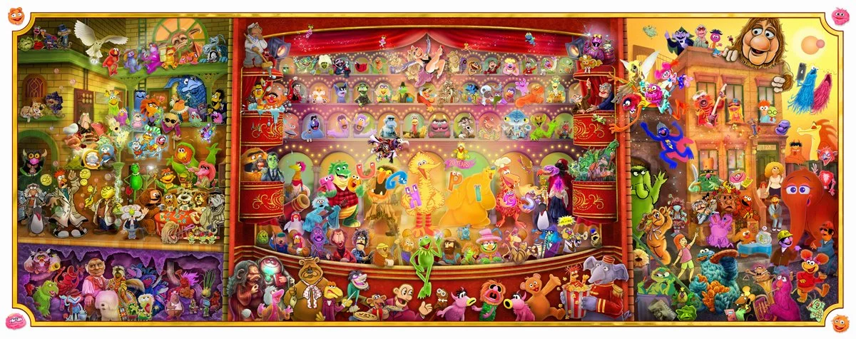
Dave: You are one of many artists I learned about when we all took part in ToughPigs 20th Anniversary project; The Great Muppet Mural. Like many of the other artists involved in that particular project, Jim Henson's influence on our work isn't the only one (even if it's usually the most potent). What has drawn me to your work in particular is your gorgeous series, The Muppets Celebrate the National Parks. It's a wonderful pairing, but I'm curious about your background in painting such sweeping landscapes. Can you tell me what inspired that particular area of your work?
Danny: Let’s start by saying I have no formal training in painting landscapes. It was something I had avoided for such a long time. It wasn’t until I had finally visited Kings Canyon and Sequoia National Park and wanted to share my story that I decided I wanted to get better at landscapes. I wanted to work on telling the story of our world through its beautiful natural wonders.
I’m always in awe of the beauty of our planet and the mysteries it holds. It’s not static. Besides nature, I have been greatly influenced by film: the water color backgrounds of early Disney films, Lord of the Rings where the landscapes are almost literal characters in the film, and Hayao Miyazaki films, like My Neighbor Totoro. [There’s a moment] with a snail climbing the stalk of a plant.that follows a chaotic sequence. Eventually I learned about the concept of ma—or emptiness—that is intentionally in his films. Those moments of rest and reflection that allows the audience to feel and interpret what is happening with the character. I wanted to capture this feeling in my own work. I wanted to give people a moment of rest and reflection. And the Muppet characters seemed like a perfect blend of the chaotic with ma.
Dave: What is your typical medium to create such landscapes?
Danny: As of late, it’s almost all digital. It allows me to change things and iterate quickly. However, photography has played a critical role in understanding landscapes. My Sequoia series is almost entirely made from reference I took while there. Those are deeply personal parts of the series.
Dave: What inspired you to create this series?
Danny: The Muppets Celebrate the National Parks was inspired by a trip to Kings Canyon & Sequoia National Park.I found such peace there and clarity of mind and emotion. I saw the Milky Way for the first time. I hiked trails alone for hours through changing environments and elevation. I could refresh in the cold mountain water. I woke up with the greyness of the morning and watched color come back into the world as the sun climbed higher into the sky.
The original WPA National Park Posters, Ranger Doug’s Enterprises, and The Fifty-Nine Parks Project were large influences. I wanted to do tributes to our National Parks art history and how these posters shaped a collective image of our National Parks for generations. I never intended to make every National Park. But it made for a wonderful challenge.
John Denver and the Muppets - Rocky Mountain Holiday and Jim Henson’s interest in nature and the beauty of our world were very inspirational to me. You see it in the quiet moments in The Muppet Show. Seeing the Muppet characters in the real-world is always amazing and magical. I wanted to build on what Jim had started and contribute to the world in a positive and optimistic way.
Dave: When you compose these works—especially with including the Muppets—I’m curious what that process is like?
Danny: I set some criteria for myself pretty quickly after I made the first poster (which you can see does not follow the criteria):
Time: These started as an exercise in speed painting; I wanted to work on capturing the essence of a landscape, a moment in time, a feeling
Tone: wonder, natural magic, whimsy
Iconic, yet personal. I didn’t want to just repeat every other National Park poster of the same landmark. I wanted to give people viewing these posters and parks, something to wonder about, a sense that maybe the world has some magic still in it.
Include a full body Muppet. I broke this rule twice. One poster I went back and fixed. It didn’t feel right and it came out so much better when I spent the time to make it better. The second one still needs to be updated.
8 colors max. I wanted to practice color harmony and building palettes. I wanted to replicate the classic screen printed process I admire so much as an art form (This rule I broke a few times, but it always felt necessary).
Creativity happens best with constraints. I believe the rules are there so you think about them before you break them. Eventually I made a spreadsheet of every National Park. I then had another column of every Muppet I would like to try and include. I rarely partnered Muppets and Parks until I had a better sense of the Park I was working on. Creativity really comes out when you have strange juxtapositions.
Dave: You mentioned working digitally earlier. What program do you create in and what is your hardware setup?
Danny: I work almost exclusively in Photoshop on my Mac. I have an old school Huion tablet. I’ve been branching out to Procreate recently on my iPad. I like using Procreate to sketch first and then importing into Photoshop to paint. I also like to be challenged and love learning. So jumping across platforms and devices keeps me sharp and not complacent in one method or style. There’s always a problem to be solved which then forces creativity.
I also still do a lot of sketching on paper. I’ll probably never give that up!
Dave: While going through and enjoying this series now armed with the knowledge of your process and selection methods (especially your limited color palettes), I noticed you keep to characters from The Muppet Show with what could arguably extend to The Jim Henson Hour and Muppets Tonight as well if I’m being a nitpick (although, I also appreciate Yorick’s appearance). Any interest in including characters from Sesame Street and Fraggle Rock?
Danny: I’m so glad you asked this! The answer is yes and it’s complicated, simultaneously. There’s always a chance Fraggle Rock (which I considered long and hard for the cave parks, but ultimately felt it was too easy of a fit and didn’t quite fill my desire to surprise) and Sesame Street characters will show up in future posters. I found it really enjoyable to go through the Muppet characters first (and some Sam and Friends) with the thread that each of the characters were connected through Kermit in some way.
It really forced me to dig deep into my own understanding of those characters, reckon with characters that are not necessarily my favorite and literally paint them in a new light. I have other plans for Fraggle Rock, but you’ll have to wait and see.
Dave: As an artist who is usually commissioned with a primary subject or subjects and not background art of any kind, I find creating landscapes requires a completely different mindset or approach. Is that the case with you or do you easily shift between the two? Regardless, what advice can you give to someone like me who sees drawing a focal subject and its surrounding environment as two very different assignments and struggles between the two?
Danny: I view the landscape as a character. It’s got personality. It’s got its own story to tell. It has history and is subject to other external forces. It has its own soul. These posters in particular were meant to focus on the landscape as a character.
Even when I do a subject without a background or landscape, I often imagine where they might be. I find it helpful to place a character in an imaginary landscape, since that landscape will affect that character’s pose, action/reaction, lighting, and expression.
I believe in the idea of invisible ink and approach everything from a story perspective. What you don’t see matters as much as what you do see. A good theme is a North Star, guiding your way and allowing you to vet decisions about your work through a certain lens. I always start with a theme and then ask myself, “Does this design reinforce or support my theme?” It works for me!
And here’s what I always say about advice: I can share my experiences on a subject, but that does not mean what I say will work for you. Listen and find what works for you. Take what you want and leave what you don’t.
Dave: Can you give me some insight on how you chose to pair certain characters with certain parks?
Danny: I often crafted stories in my head about the character, asking myself: Why are they here? How did they get here? What’s special about this place that might represent a part of the character or contrast with this character? Is there a good visual gag or pun I could use?
Kermit and Robin at Sequoia and Kings Canyon - Kermit is really my stand-in for my trip and I really wanted another character for Kermit to talk to and share the wilderness adventure. Robin seemed natural. Robin represents who we need to preserve and protect these natural places for - the next generation. It’s our job to care for them so everyone can experience the magic, the wonder, and connection to this beautiful world. Kermit is so grounded yet still has time for daydreaming, managing this group of crazies; he just feels as strong and sturdy as a sequoia.
Gonzo and Camilla at Great Sand Dunes - I was aiming for a bright, rich autumnal landscape and it worked out so well. This is one poster I’m so proud of in many ways. The Great Sand Dunes are also a really weird place in the middle of the country with such a diverse landscape of grasslands, wetlands, forests, alpine lakes, and tundra.
Beaker at Kilauea Volcano - I really wanted to do Beaker in a somewhat perilous moment, so I looked at his main colors and a volcano popped into my head! I tell myself the story here is that Bunsen made lava proof shoes and Beaker has to test them! I have visited Oahu and tried to reflect what I felt was the essence of the Hawaiian islands. Beaker sort of has this dual personality of endless patience and panic, and the juxtaposition of the destructive force of a volcano with the tranquil pristine jungle really made this pairing work.
Beauregard at White Sands - I went in completely clueless at first. The idea of white was daunting. I considered the sand and the mess it makes on your shoes and how it gets in everything and thought, “Ya know, someone would have to clean all of that up.” And Beauregard came to mind. The story just seemed so appropriate and fun.
Walter at New River Gorge - I wanted to pair the newest Muppet with the newest National Park. Once I knew that thematic pairing, I had to choose Walter in an outfit and an element of the park that matched somewhat in color. Easier said than done!
My goal was to get as many different characters into this series as I could. As you get to Series 6 and beyond, I started pulling from more obscure characters (though I think they are all important in their own way). More to come!
Dave:What are your hopes for this series?
Danny: My main hope is that people who view or see these pieces will reflect on themselves, our world, and our role in it. That life is beautiful and amazing, full of song and silliness, creativity and connection. I hope people will get outside, off the beaten path and away from the hustle and bustle of routine. Whether that be to a National Park, a remote area of the world, or their own backyard. I hope they stop and take a moment to treasure the everyday magic that makes this such a wonderful world.
It would be amazing to go to a National Park and see one of these posters at their nature or visitor center. That would be incredible. And if folks could purchase this to hang in their home or place of work, to remind them to escape from their current reality into the reality that exists just down the hiking path and find a place that truly brings them peace.
I hope to continue making these posters based on National Recreation Areas, National Monuments, National Historic Trails, National Seashores, National Lakeshores, and National Preserves.
Thank you, Danny!
I strongly encourage you to check out the rest of Danny’s The Muppet’s Celebrate the National Parks series on his website. There are so many more and they are all incredibly stunning. Check out the rest of his work too, and make sure you follow him on X and Instagram.
Please follow me on Instagram, TikTok, BlueSky, and Substack and here on my blog!


