A lot of blogs offer helpful content as opposed to just opinions and stories from an illustrator, so I guess this is my foray into creating some useful tips. I’ve talked about my love for Adobe Illustrator in the past, as well as recognizing it’s a program that tends to scare off a lot of people. While I manage around it relatively comfortably, there are more than a few things I forget how to do. There’s also a few things that I think are small but helpful that I don’t always take advantage of. So in a lot of ways, this post is just as helpful for me as it may be for others and this way I won’t have to go searching for these specific tips scattered across the internet but rather all together here in one place. Let’s go!
Regular/Normal 5 Pointed Star Shape
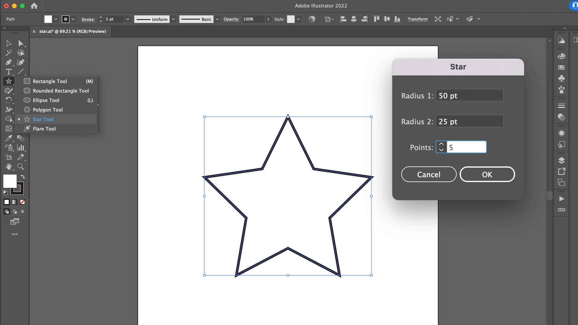
This seems like a dumb one, but this is one of the most useful tips for me in particular. Illustrator has a very useful shape tool for creating things like a rectangle, ellipse, polygon, and star. The default star shape looks more like something you’d see taped up on a bulletin board in a school classroom rather than the type of star you would see on a flag. The tool creates a star shape based on an outer and inner radius as well as selecting how many points it should have. The default star shape has five points but uses the two different radiuses of a ratio of the second radius being approximately half the size of the first. This results in a bloated looking star where the points aren’t perfectly aligned between its points.
John B. Hall went ahead and did the math to figure out that a normal looking star would have an outer radius of 100 points with an inner radius of 38.2 points. He has also since noted that creating a normal star shape can be done simply by holding down the option (Mac) or alt (Windows) key and clicking and dragging, creating the star from its center point out. Make sure to hold the Shift key as you drag to keep the star perfectly straight and upright!
Make Anything A Guide
Guides are crucial for all Adobe products. They allow you to set boundaries, margins, or just helpful markers for consistency. You can also turn anything with a stroke into a guide as well! While Illustrator has several useful tools for perspective, sometimes you just need a placeholder of sorts to figure out perspective, or maybe a unique shape to help you avoid placing artwork where text or an image will be placed in a different program like InDesign. Simply use the selection tool (black arrow) in Illustrator to pick the shape or line/stroke you want to make a guide and hit Command (Mac) or Control (Windows) and then 5! It won’t work on text, but if you expand text into a shape, that will work too!
You can also have everything snap to your guides by hitting Command (Mac) U or Control (Windows) U to turn Smart Guides on and off
Creating a Long Shadow
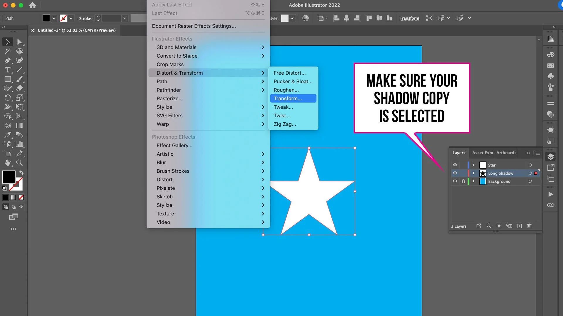
There are more complex ways to do this with varying styles, but this is the quickest and easiest way. First, take your object and copy and then paste it either directly behind the original object or create a new layer below it. Change the fill color on the copied object to black (or whatever color you want). With your copied object selected, from the drop down menu select Effect > Distort & Transform > Transform.
In the new pop–up dialog box, you only want to concern yourself with the Move sliders and the Copies input box. You can play around with the Horizontal & Vertical sliders all you want, but keep the numeric values low. I find that between 0.2 pt and 0.5 pt keep the shadow tight (more on that in a second). For copies, enter any number you want understanding the higher the copies, the longer the shadow. Check the Preview box to see your progress. After you click OK, zoom in to see how jagged your shadow actually is. For the most part, you won’t see the copies when viewing your illustration from a reasonable distance.
If it’s too spaced out to your liking, open the Appearance window while having your newly created shadow object selected, and click the Transform property you just applied. This will reopen the Transform Effect options allowing you to go back and tweak your numbers.
Check for Clipping Masks
Oftentimes I’ll get artwork from another designer or stock image site and want to separate pieces that seem to be grouped together. However, after trying several times, the individual elements won’t release or there is no longer anything grouped. Usually that means a Clipping Mask is involved. From the drop down menus go to Object > Clipping Mask > Release. Now your individual objects should be free!
Expand Fonts
Fonts are finicky. For the most part, you’ll live your life day to day with no problems, but a year or so later they can seem temperamental due to Adobe updating, the font licensing change or expire, or any number of things. If your Illustrator file uses text of any kind, make a separate layer and paste all your text there. Then on your main art layer, expand the text. Now you have two copies: One that you can edit down the line (or even just check which font is being used so you can compensate for further designing), and one that maintains the original look you’ve worked on that won’t change years from now.
“Live text” as indicated by the path it rests on and the start and end points for alignment
“Expanded text” as indicated by the anchor points and empty stroke lines
I once lost a logo because I lost the font and had to recreate it from scratch. Having a backup layer that you may or may not be able to edit in the future can save time and headaches.
“Live text” that is missing the proper font, hence the odd substitution, poor kerning, and pink highlight
I realize these tips and tricks are unconventional and unique at best, so if there are any other things you’d like me to cover or tricks and tips you yourselves have discovered, comment below or contact me through my about page! Follow me on Instagram and Twitter and check back here next Friday for more creative thinking posts!


