The Wall of Suck

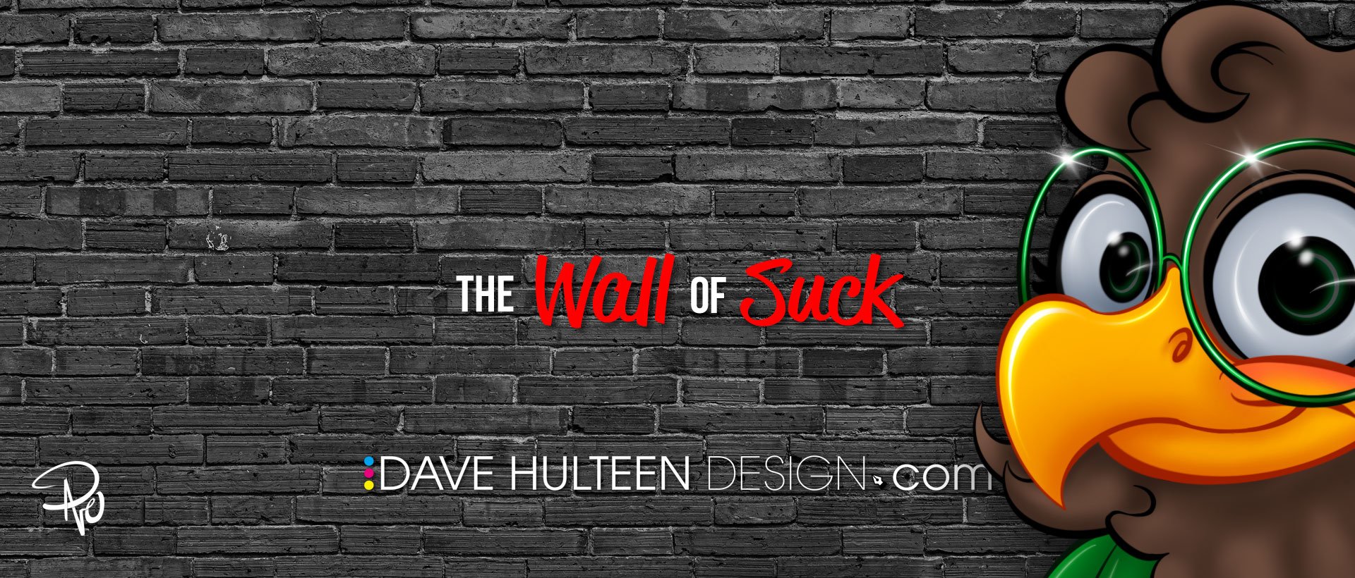
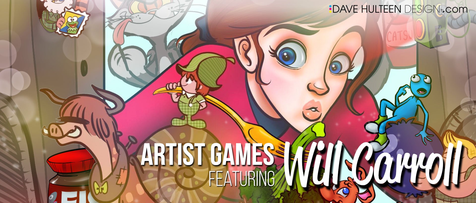
Man oh Manischewitz am I excited about today's post! This is one I've been putting together for a few years now and it is all inspired by my good friend and talented graphic designer & illustrator, Jamie Carroll (who is also available for hire and deserves the big bucks people!). Nearly a decade ago now, I interviewed Jamie for Muppet fan site ToughPigs about some of his work and he introduced me to his own home–brewed mood board he called the wall of suck. I know! I was just as intrigued as you are right now. Here's an excerpt from that interview explaining today's post's namesake:

Dave: ...What about the pieces that get completely rejected? Or even better, the ones you yourself scrap?

Jamie: That’s a good question. It’s an incredible privilege to be able to do this stuff. It’s also rather soul crushing when it doesn’t work out. It’s two sides of the same coin. We’re not supposed to admit that, but it stings. I assembled this thing that I refer to as the “wall of suck” in order to deal with the angst. I’m not saying the work sucks. A great deal of care goes into even the simplest pitch. The suck part is in reference to the time and effort. It seems wasted and I can’t really post the full pieces for public view. Those are the breaks. Still, it all needs to go somewhere so it goes to the wall. Projects get nixed for all sorts of reasons. Many of them can’t be predicted. The wall helps me keep a healthy perspective on all the silliness.

Artists often crow about the successes yet hide the many failures that lead up to them. I think all of it should be celebrated!

If you're in a creative field where you have to submit multiple concepts or have brought something nearly to completion if not finished and ready for the world to see it—only to have it completely go down the toilet for one reason or another—than the idea of an essentially failed trophy case for all the "Coulda' Shoulda' Woulda's" probably resonates with you too.

I have had countless concepts rejected that I knew with my whole heart were bangers, or projects that I worked on for hours, days, or weeks, that were scrapped and it can be so discouraging and frustrating when that happens. Most of them I'll never ever be able to show because of nondisclosure agreements (NDA's), or because I technically don't own the work. There are a few other nuanced reasons, but the work I'm writing about today doesn't fall into those categories! These are projects that I'm really proud of, and/or was super excited to develop further, but for one reason or another are now D.O.A.

10 Minute Portraits

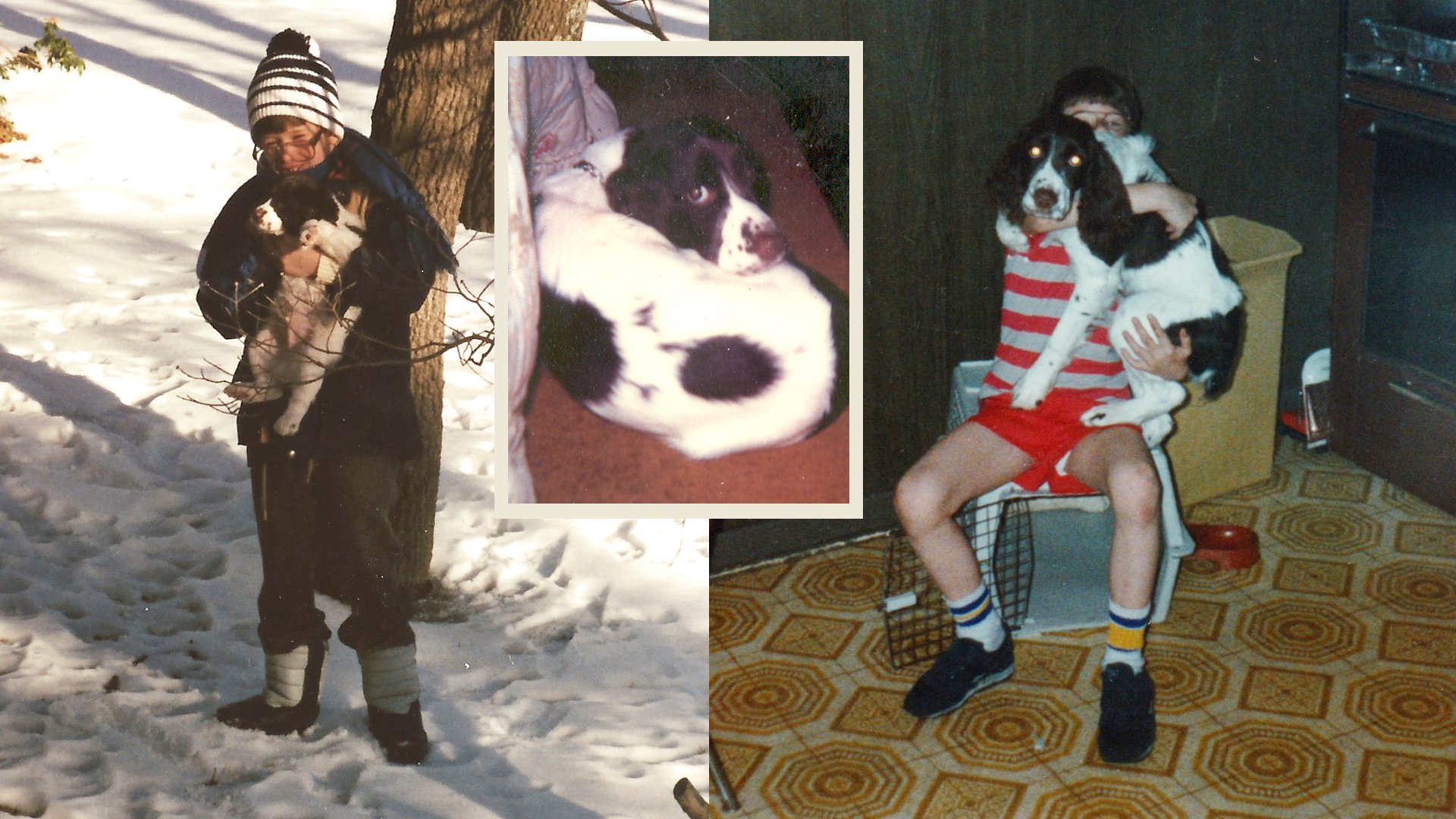
I've written extensively about figure drawing and how much I have benefited from taking classes. For awhile, I was consumed with getting better and better with creating more realistic art using traditional mediums. I love soft charcoal on newsprint and was simultaneously discovering I had a knack for it too, so I decided to expand my abilities further. Figure drawing focuses on the body, but I was also interested in creating people's likeness in portraiture as well. So I had the idea of doing free portraits of my coworkers during lunch time. I would get the opportunity to study and draw multiple different models, get comfortable drawing in front of people, get an opportunity to talk with employees I normally wouldn't otherwise, and in turn my coworkers would get a free portrait drawing.

Figure drawing with Maria

I spoke to my boss about it and she gave me tips on how to present the idea to Human Resources. HR then had me write a full proposal on what, why, how, when, and where I planned to do this and how it would ultimately benefit the workplace. That proposal then went up to the building's advisory cabinet who set a trial period to test it out before evaluating further if it was something that could then be done regularly. I was so excited and worked really hard on the proposal. I did several more portraits of celebrities and created a poster to help sell the idea, and brother did it work! Everyone else was excited too, and it was eventually promoted as a trial period where for the next three weeks I would set up an easel and stool in our cafeteria with a small modesty wall to block my models from other coworkers, but put me on full display where anyone could come up and look over my shoulder and ask me questions.

On the premiere day, the front desk used the P.A. system to announce, "Dave Hulteen will be offering free portraits to anyone willing to sit and model for 10 minutes today at lunchtime in the cafeteria!" So cheesy, I know, but I was really proud that I managed to pull this together. That afternoon I did about 4 portraits and it went great! I got to meet new people, got some great feedback, and that feeling that this was going to be the start of something pretty great. I packed up, and left to go home for the weekend. It was Friday, March 6, 2020.

For those of you that need me to explain the punchline, this is right when the United States closed up shop for the Covid 19 Pandemic. My job shut the building down the following Monday, and while we all know how most everything played out, the opportunity to pick right back up kind of passed. Now yes, things are better again and I could resubmit my proposal and try again, but there are some interruptions that put ideas on hold indefinitely for various reasons, and for now, that's where this one will continue to chill.

Our backs are now against the wall? Listen all y'all, it's a sabotage

There are so many other concepts I want to show but can’t!

A common theme you may notice among each of these things is a sense of self–sabotage. I pride myself as a creative who doesn't take constructive criticism personally. "You don't like it? Well then neither do I. See? I'm a big boy!" I also pride myself on my passion and commitment to a project. "You like this direction? Well then I'm going to steer this thing all the way to the finish line and give you the best work you've ever had. See? I'm a big boy!" There are many times however when these two philosophies contradict themselves. That's self preservation lingo for, "Sometimes I can be a monumental pain in the @$s." For example, when I was given the opportunity to design the cover to one of our quarterly publications—something I was honored to even be asked to do—I took the direction of creating Wedha's Pop Art Portrait (WPAP) style to an overly scrutinous level, driving my poor boss crazy as I lectured him over the art form's intricacies that I was now an expert in and he was grossly out of his league to say otherwise. I was quick to admit he made the right call when he handed the work over to another artist. I'm still really pleased with my version, but it joins a growing collection of concepts I've created that were rejected at the time, but occasionally are retooled and resubmitted for other projects that are never quite the right fit for those either.

Coloring Book

Spoiler alert: this one goes the same way my 10 minute portraits did with coronavirus ruining everyone's capitalist dreams. But in a nutshell, I illustrated a coloring book that helps guide kids with how to visit the elderly in nursing homes—something that was absolutely taken off the table when the pandemic hit. What makes this one sting though is that I had nearly complete creative control. The original coloring book was created in 1989 by a brilliant Salvation Army officer who created a valuable resource for kids. The only issue with it was that she wasn't a great illustrator. So I was given carte blanche to recreate all the art however I wanted, and I jammed it with Easter eggs and references to 1980's pop culture, mixing in tributes to the Netflix original series Stranger Things and even nods to PAW Patrol (my daughter’s biggest fandom at the time) as well.

This is one that has the potential to make a come back though. I regularly check in with the client (who has changed over the years as departments continue to merge), and sometimes I get an encouraging update and other times my check in serves as a reminder for them to do do something about the coloring book.
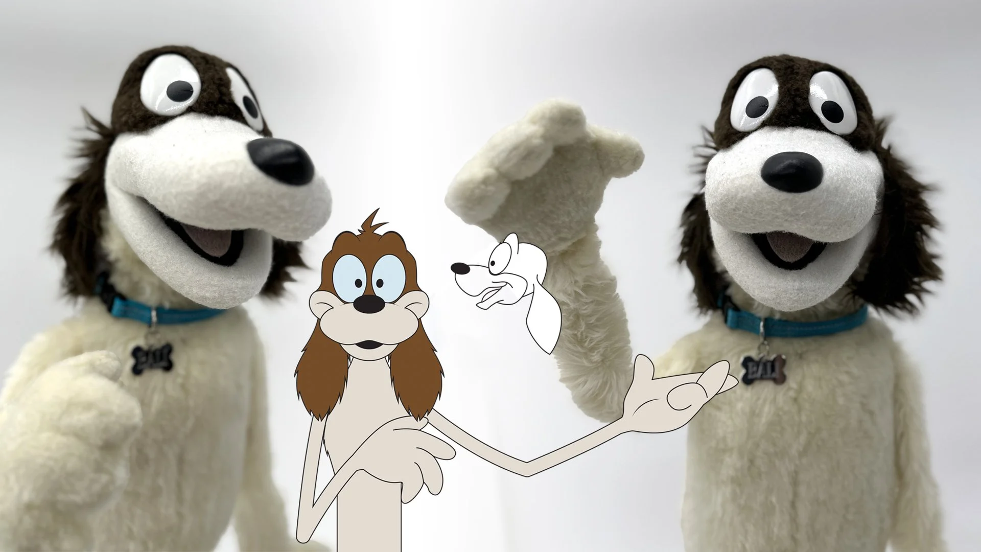
School Mascot

Hoofa, I'd like to introduce this exhibit as the catalyst for this entire post.

I write about my daughter a lot on my blog. She is my world, so when her elementary school sent the call out for a community wide effort to design the school's new mascot, I saw multiple opportunities flash before my eyes. I have designed tons of characters for books, television, animation, puppets, brand identity, and even full bodied walk around costumes. So not only was this right up my alley, but I have dozens of contacts that could then develop my designs into physical media and even merchandising! After doing some quick research, I also learned that school mascots are a pretty limited subset of creatures; namely cubs. Do you have any idea how many school mascots across the country are cubs? Most are unisex creations, but when they're not, they almost always lean male. The sole direction of the mascot design challenge was to encourage kindness and my daughter is the poster child for being kind. After some rough sketches, I had the idea that my design would be an homage to my daughter and the best animalistic choice was an eaglet. "Fly high with the Evergreen Elementary Eaglet!" You guys, I went so hard on this.

I knew as I was working on every little thing that I was putting the cart in front of the horse, writing my own feel–good story of the decade that would appear on the front page of the local newspaper and this very blog. "Local Father Saves All of Humanity with School Mascot Competition That Resembles His Daughter." Oh my gosh you guys, I went way too hard on this.

I knew with every fiber of my being that I was getting way too involved and wrapped up in my presentation. I even sold myself as the professional illustrator to the principle who would work alongside the school to create clip art, promotional material, and provide possible vendors for merchandising opportunities. You guys... even my ego was begging me to step way off. I went so very hard on this.

Now I don't want to blame my friends and family for getting me so hyped, but they were all so supportive that I really wanted to exceed their expectations. In the end, I was actually really relieved when my design wasn't chosen. I was the overly excited dad you roll your eyes at during little league practice. Fortunately all that effort and exertion stayed within the walls of our home with my wife being the one who suffered the loss. I got her just as riled up as I was, so she took the rejection of the Evergreen Eaglet a lot harder than I did. That doesn't mean I'm not bummed out about it, but for the purposes of this post, my cute little eaglet now occupies the wall with a reminder not to overly invest oneself in similar future situations.

I have so many other pieces that belong on the wall of suck that I still can't show or talk about. Perhaps one day I'll do a follow up, but for now, I'd love to hear if you have your own wall of suck and what's on it? Follow me on Instagram and check back in a week here for a new post!

Drawing Muppets at NYCC

There are two fundamental things that I have loved my entire life: The Muppets and comics. So when my dear friend and ToughPigs Editor–in–Chief, Joe Hennes asked if I wanted to draw Muppets at a panel for New York Comic Con back in October of last year, it was a complete no–brainer. Remember that for later!

From left to right (starting at the podium): Joe Hennes, Jay Fosgitt, Richard Gomez, Dave Hulteen (Hi!), and Christopher “Smig” Smigliano

Wizard World Philadelphia, 2003

Let’s talk real quick about Comic Con and Comic Con panels. In short, they’re great! Moving on! Oh okay, fine. A comic book convention is the ultimate fan experience. Whether it’s in the basement of a VFW or a sprawling convention center in a major metropolitan city, comic cons are safe, fun spaces where people are encouraged to nerd it up and be fanatical. Panels are the glue to that experience. In my personal opinion, there are two types of panels: functional and absurd. Both are so much fun but represent different experiences.

Functional panels are like live interactive updates. They usually feature creators connected to a fandom talking about upcoming story arcs, characters, and news. These panels can become news worthy like when the Avengers cast members first come together before you see them assembled on the big screen in full costume. It’s a great opportunity for fans to come face to face with their heroes and ask them burning questions that only matter to them.

Sam and Friends panel from NYCC, 2022

Functional panels can also be informative or educational. Ever wonder how your favorite voice actor comes up with how they want a character from a video game to sound? They can tell you! Want to write and publish a book? There’s a writer’s panel that has tips! Maybe you just want to hear music from your favorite YouTube creator. There’s a concert in Ballroom 7!

Absurd panels are everything else and they are my favorite. Want to see the most offensive cartoons from the 60s? There’s a panel for that! Have you ever contemplated the religious nature of the Smurfs? No, neither have I, but if you wanted to see a bunch of Tough Pigs guys draw obscure Muppets for an hour, Room 408 at the Javit’s Center is the place for you!

Now ToughPigs themselves have written about this entire event in much better detail that you can read about here. If you don’t want to read about it though, you can just watch the whole panel for yourself!

Panel art I created for promotional materials

So enough has already been covered about the event, but I want to expand on the experience from a more personal standpoint. The main takeaway being that I was by far the low man on the totem pole. I’m not disparaging myself so much as building everyone else up, but drawing well and drawing quickly are two very different and distinct traits, and I only have the former. The other guys though? They’re powerhouses! And they’re really fast.

Just to give an overview; Joe would turn to the panel audience for suggestions, but the overall concept was to give us artists a prompt, and then we’d get to work and crank out something in around a minute.

With Richard Gomez

Richard Gomez might have been the youngest on the panel, but he’s clearly the heart. Richard has grown in prominence a lot over the last couple years and it’s so easy to see why. Aside from being exceptionally talented, he brings a whimsical element that elevates everyone else. A talented puppet builder as well, Richard sees the world around him in a unique and colorful way. Whether it’s turning a paper towel roll into a singing sensation or converting the ELMO brand projector into Elmo; Richard is brilliantly imaginative. He’s also really fast!

An old comic strip I drew of myself, Smig, & Joe (2016)

Chris “Smig” Smigliano is ToughPigs resident artist and is easily the funniest artist on the dais. Smig was the cartoonist for the Salem News where he developed a keen ability to visually tell a gag with limited space. Also an avid fan of MAD Magazine, Smig harnessed his inner Don Martin to create very funny comics that easily leaned right up against the line of being inappropriate without actually crossing it. Smig is so fast that the amount of art he produces is just as staggering as how fast he created it. I have always admired Smig, but he stepped up his entire game for this panel and truly showed he has exceptional comedic chops.

With Jay Fosgitt at San Diego Comic Con, 2014

The biggest name on the panel though was Jay Fosgitt. If ever there was an artist that this panel was made for, it’s Jay. As a professional comic artist and writer, Jay consistently drew really funny and crisp illustrations. Truth be told, if he was the only artist on the panel, the event would have been just as great as it already was. Jay’s take on classic characters is distinct, well refined, and just perfect. Jay has the added bonus of being able to draw really obscure characters from memory. Like the others, Jay is also really fast, but Jay is fast because that’s his job. I know that Jay has self doubts and concerns that every artist has, but to watch him draw is a treat that would convince you he could do it in is sleep. Watching the entire time he was up there was magical. He would take a beat to compose his idea before laying it down effortlessly. If this were a game, Jay would have been the MVP every single round.

From left to right: Shane Keating, Joe Hennes, Bruce Connelly, Chris Smigliano, Will Carroll (Will was the alternate for our panel), Matthew Soberman, Richard Gomez, and Dave Hulteen (me!) after our panel, October 2023.

As an added bonus, in the audience was Bruce Connelly, Muppet performer of Sesame Street’s Barkley the dog since 1993! So it was very apropos when Joe suggested we each draw the lovable pooch in honor of having Bruce at our panel. Afterwards, ToughPigs staff handed out all the illustrations we did to people who attended the panel. Bruce wanted the drawing I had created of Barkley holding a banner that said, “We love you, Bruce!” but it had been picked by someone else already. My brother–in–law and I had met Bruce 9 years earlier at NYCC when we were promoting our own YouTube production of The Bang and Bump Show which Bruce was very supportive of. So I promised him I would draw a better version of my Barkley tribute—this time at my own speed and not in front of a live audience (I know my weaknesses). Six months later and I finally sent it to him too!

Bang and Bump at NYCC, 2014

I had the best time with my friends at Comic Con even if that particular setting wasn’t the best match for me (alternate Will Carroll can cover for me in 2024!). I don’t know if we’ll do another panel this year, but I do plan to be at NYCC again. In the mean time, I’ve got some more posts planned for this blog, so stay tuned and follow me on Instagram too!

My art proper created for Bruce Connelly

How Much A.I. is Too Much A.I.?

I don’t blog enough to be topical or cover current trends, and I like to keep things light and funny, or positive and optimistic in general. In fact, at the end of 2022 when I actually tried to be topical and write about artificial intelligence, I did it from a pretty altruistic standpoint with the hope that working with the changing landscape that a.i. isn’t going anywhere is a better approach then railing against it. At my core, I still believe that, and I’ll put a pin in that for now, but today I’d like to revisit a.i. with a little more experience after having had the wonderful opportunity to visit the Adobe Max Conference in Los Angeles as an attendee.

At the Adobe Max Conference, October 2023 where I got to meet Aaron Draplin!

I say, “a little more experience” because not long after my initial blog post about a.i. in December, I followed that up in April of this year (I told you I don’t blog enough to be topical!) with a post detailing my impressions using ChatGPT and Dall–E which very quickly became dated after both platforms made serious advancements technologically. I think for most people at that time, a.i. was still a fun and funny little moment of pop culture that humorously added to the zeitgeist with things like Keaton Patti’s bananas Olive Garden commercials and Trump Rallies—all created by feeding hours of those particular brands original content into a.i. bot programs. Maybe the undercurrent had a slight worrisome tone of the inevitability of robot overlords, but it was still relatively light–hearted and quaint. Who could have ever imagined we’d be pining for the simpler times of 2022.

Of course, like most technological milestones, once something starts to get traction, it really takes off. Granted, a.i. has actually existed since the mid 20th century (starting with the Perceptron Mark I in 1957), but really started to generate public interest in the 80s with the goal of revolutionizing computer processing. It’s directly because of this that artificial intelligence has thrived recently—not so much because tech geniuses have learned more about a.i. themselves—but rather because computer storage, memory, and speed have increased beyond what most average consumers even need. And in 2023, Dall•E released its latest text–to–image model featuring significantly more nuance and detail, and ChatGPT became the fastest growing consumer software application which now offers it’s GPT–3.5 engine operating its services on a freemium model while ChatGPT Plus offers its GPT–4 engine to users for $20 USD a month. If that’s not impressive enough, as of this post, ChatGPT itself isn’t even a full year old yet having launched in November of 2022! In March 2023, Adobe released its generative a.i. tools to Photoshop in beta testing. Today, those a.i. tools are fully integrated into Photoshop and Firefly a.i. is in beta for Adobe Illustrator—creating editable and functional vector illustrations—as well as Adobe Premiere Pro which also offers beta tools for speech to text editing for videos. It is insanely easy to use and saves lots of time.

All of these images on Adobe Stock are generative a.i.

Let’s step back and address just a couple quick bullet points I made previously regarding a.i.’s learning technique. Now initially I made a mistake and thought the process was called stable diffusion, but that is in fact the name of a latent diffusion model developed by a company called Stability AI. Artificial intelligence uses machine learning to develop a deep knowledge of whatever subject it’s tasked to create. I’m cutting out a lot of context here for the sake of brevity, but imagine a robot who has the capacity to instantly read every single book on a particular subject so that it can then use that knowledge to compose its own creation based on that immediate education. It only has the information it has acquired, so it bases everything it can do on that information alone. I read hundreds of text books about various software programs when I was in school, but it almost all felt useless after I actually started working and realized experience was vastly more important. As a result, most of my initial professional work looks ridiculous, much like what a robot who only learned from reading and not actually doing.

Now imagine that same robot is instructed to paint a masterpiece, but in order to do that, it has to visually take in every painting currently on display in the Louvre. So it rushes around the museum and sees works from DaVinci, Géricault, Michelangelo, and Jacques-Louis David. Afterwards, you ask the robot to paint its own masterpiece, but upon completion you notice it hasn't really painted anything original, but rather cut and pasted elements like the Mona Lisa's smile or Roman columns from the Oath of the Hoaratii. It's specifically these issues that have a lot of creative people feeling pretty upset because the robot hasn't actually created anything, it's just stolen components from others. But then you also notice that because the a.i.'s creators have basically told this robot to go out and learn everything from the internet, you start getting into real troublesome areas because if you haven't noticed, there's some pretty horrible stuff online and it's not exactly hidden either. So now on top of being an art thief, the robot has also learned to be racist, sexist, and creepy. You know, like actual real life people.

Again, I'm really compacting a lot here to keep things from getting bogged down with technical jargon, but these are real concerns that have had companies like Adobe make serious public efforts to proactively promote responsible guidelines for generative a.i. learning and sharing, as well as protecting intellectual property and reflecting diversity in a positive way. For the most part, this corporate responsibility and good faith approach has been necessary, not just because of the reactions from creatives worldwide, but because of the accountability these types of organizations can be held to legally. Remember, theft of any kind is generally frowned upon.

So now we get to the Max conference where the undeniable star was Adobe's generative text–to–image a.i. program, Firefly. All over the conference floor, in its classrooms and displays, and promoted heavily at each keynote session were strikingly beautiful images all created by artificial intelligence. What Firefly offered was so prominent that it sometimes felt invasive. Is it cool and will it save designers from doing tedious things like masking, editing, and rough concepts that require super quick turnaround? Oh man, you bet your a$$ it will. But as one classroom speaker jokingly noted at the beginning of one session that it was the only conference event not promoting any new artificial intelligence tools, he was met with a roaring standing ovation.

Adobe competently showed that it's a.i. deep learning methods were trained solely on its own library of photographs, illustrations, images, and graphics (pretty much its entire stock library) and that its engineers were working tirelessly to integrate guardrails so that diversity and inclusion were represented equally and respectfully. So there you go! Problem solved. You can stop worrying now about everything. Robots are kind, love is love, intellectual property theft is a thing of the past, and the system works great.

Even if all that were true, there's still a hiccup or two. Now put your personal feelings about a.i. aside for just a bit and let's pull that pin out regarding my optimistic outlook from earlier. The cold hard fact is that a.i. isn't going anywhere, and just by looking at what was just a year ago and what is now today, it's pretty obvious that what a.i. can create is only going to get more impressive and it's going to be up to everyone to ensure it's guided properly, safely, and responsibly. Up until the Max conference, I could be heard saying, "Man, if this is where it's at now, imagine what it'll be like in ten years!" But that was out dated thinking when I first wrote about a.i. Especially when Adobe has expressed its expectation to see user generated a.i. images increase 5 times more in the next 3 years than it currently already has which is already over 15 billion!

So while ethically we have a lot of work to do, I think it's also fair to say that we're currently pretty early on in this saga and we're already experiencing some pretty heavy a.i. fatigue, and to that point, I'd like to redirect your attention to stock images. I love stock images, like I adore stock images and I've written about them before (and it's a funny article I'm really proud of too), but because I almost exclusively use Adobe Stock, and because Adobe Stock is the epicenter of Adobe a.i.'s learning process, it's kind of saturating the store with its own product and nothing else. Imagine going to your local grocery store, and all they sold was their brand of corn flakes. No produce, no deli, no butcher; just aisle after aisle of varying sized boxes of store brand corn flakes and nothing else. Because Adobe's generative a.i. has come along so far and has gotten so good, it offers generative a.i. images as stock image options. Originally you'd see one ore two pop up, then it became the majority of what was offered. Now depending on what you're looking for, a.i. generative images can be all that's available.

Real quickly if you haven't read my post on stock image sites; they provide a designer access to photos, graphics, templates, or illustrations the designer wouldn't otherwise have time to create themselves. Creating an ad for a new coffee chain? I can search for something like, "Friends enjoying coffee together in a cafe" on a stock image site just like I might look for something in a search engine and I will get various results that will hopefully match the look and vibe I'm going for.

So just to clarify, I don't have an issue with a.i. generated images. The quality is really good and getting better. There will be times when an a.i. generated image is much better than anything else the stock image site is offering, but it's frustrating how much of it there is. When searching for "Friends enjoying coffee together in a cafe", the language in the search itself is referring to a very human experience. The generative a.i. image is good, but it's not perfect. Plus I think there's a subconscious bias that I personally have that (at least in this instance) using something that was not created by humans but that is supposed to be representative of a human experience does not feel like a genuine, intentional choice to encourage others to buy into the design I'm making.

This image was generated by a.i. Can you tell?

I realize there's so much to unpack there. I'm using a computer to design this resource, is it really that bad that I'm requesting a computer create an additional element to that? Will future designers be less likely to have such a bias if they grow up understanding how ubiquitous this technology is? How "human" does an image have to be to properly reflect a human experience when we're all already familiar with shorthand cues like seeing people in such settings—photographed, illustrated, or otherwise—that creating that established connection is even necessary?

For their part, Adobe has a very clear and up front policy regarding their ethical standards and practices regarding posting, hosting, sharing, and creating generative a.i. images. Now people will point out a lot of that responsibility falls heavily on the users respecting that system, and this is what I personally believe is at the heart of all of this and creates the endless loop of debate surrounding this. Policing people from playing with this technology may be noble, but it's also antithetical to creativity in general. I'll repeat it again:

Artificial intelligence is not going anywhere and will continue to develop, but a.i. is a mirror reflecting back on the people who use it, interact with it, and engage others with it. Just like the world we live in, what we put in will be synonymous with what it gives back.

A.I. images generated from Dall E 2 and Firefly using the prompt, “Renaissance painting of a black cat in a pink tu tu

But what do you think? Is a.i. the cool new future that will bring the world peace and prosperity? Is this the beginning of the end? Will a.i. steal jobs from creative people as well as blue and white collar workers? Or am I just fixated on the loving memory of our cat Destiny and want a.i. to realize how special she was like my wife and I do?

Our actual (late) cat Destiny killing it better than any artist—a.i. generated or otherwise—ever could. Rest in Peace, sweet girl.

Thanks so much for stopping by, and I really would love to hear your thoughts on this. Please follow me on Instagram and let me know! Also like last time, here are more sources as well as some other great articles about a.i.:

Celebrating Jim Henson the BEST Way!

Back in September on Jim Henson’s birthday, I got to be a part of a fantastic fan celebration with wonderful people, puppets, and music. Today I’m sharing those memories!

Joe Hennes with Heather Henson—our guides for the day.

Pulitzer Fountain at Grand Army Plaza with Bergdorf Goodman on the left and the Plaza Hotel on the right, as seen in The Muppets Take Manhattan. (MuppetWiki)

The day started out meeting up with Heather Henson from Ibex Puppetry (and Jim’s youngest daughter) at the Plaza Hotel just across the street from Central Park. The exterior of the building facing Grand Army Plaza was featured in The Muppets Take Manhattan for the scene where Miss Piggy spies on Kermit the Frog and Jenny after Kermit pitches Manhattan Melodies to Leonard Winesop. After Piggy is harassed by a trio of cat-callers, she returns to her job next door at Bergdorf Goodman (from the MuppetWiki).

Will Carroll helps Heather Henson show various clips that were filmed on location.

Heather Henson & Joe Hennes.

We then headed into Central Park where numerous Muppet related projects were filmed like the previously mentioned The Muppets Take Manhattan, a National Wildlife Federation spot starring Kermit the Frog and Fozzie Bear, and various segments from Sesame Street.

Heather takes a selfie in front of her dad’s bench

John Papovitch and his pal with yours truly

Jim’s bench all decked out!

A motley crew of Muppet fans!

Eventually we all made our way to the mall section of Central Park, specifically along Literary Walk—a wonderful spot I’ve visited numerous times before that has benches remembering many great historic figures. Legendary Sesame Street director Jon Stone has a bench right next to one for Jim. All of us decorated the benches with flowers, puppets (built by Richard Gomez), and chalk drawings before joining in an impromptu performance singing Happy Birthday and The Rainbow Connection. It was magical, or as our fearless leader Joe put it, “You all just had your own New York moment!

The townhouse at 117 East 69th Street. As you can see, this is a holy place for us fans.

Heather draws an outline of Kermit’s feet just beyond the still visible foot prints.

We left Central Park and made our way past the old Henson Townhouse and the old Henson Workshop which is now a gym. However, as Heather pointed out, the impression of Kermit’s heels are still partially visible on the sidewalk!

Will Carroll, Lucas Ross, and Richard Gomez.

From left to right: Me, Heather Henson, Lucas Ross, and Joe Hennes. Heather & Joe’s shirts also designed by the talented Richard Gomez!

Oh look! Promotional items for Craig Shemin’s book, Sam and Friends: The Story of Jim Henson’s First Television Show!

Next we all filed into the Henson Carriage House where we ate lunch, mingled, and geeked out to the extreme over our shared fandom. It was then that Lucas Ross—oh yeah, did I mention he was there too?!—played his banjo and had us all singing and laughing.

Front row: Will Carroll and myself. 2nd row: Tau Bennett, Richard Gomez, Joe Hennes, and Gav. 3rd row: Tori from Muppets No Context, Chris Stulz from Muppet Stuff, and John Papovitch.

Lucas Ross performing various Muppet fan favorite songs.

With Tori from Muppets No Context and Will Carroll.

With Chris Stulz from Muppet Stuff

Lucas Ross and Kermit read the Sam and Friends book while Shane Keating contemplates all of this.

After we left the Carriage House, the real party started over at The Museum of the Moving Image in Queens—a place I’ve referred to as the mecca of Muppet fandom—where Craig Shemin showed an amazing collection of clips featuring Rowlf on The Jimmy Dean Show!

It was an incredibly magical and wonderful day and a reminder how much I not only love being a part of this fandom, but how much I love all its fans too. Special thanks to Ibex Puppetry, Lucas Ross, Joe Hennes, Chris Stulz, Will Carroll, and everyone else who took and shared photos with me. Follow me on Instagram and thanks for stopping by!

With Kenny Durkin at The Museum of the Moving Image. Kenny wasn’t at this event, but him and I did visit two weeks earlier and I wanted to share that here!

Artist Games Featuring Justin Piatt

Yes! It’s time for another Artist Games, this time with the amazing Justin Piatt! Justin has contributed to this blog before, was a major contributor to ToughPigs Great Muppet Mural and its subsequent Making of” documentary, and is one of the kindest and hardest working artists out there! Originally known for his art, Justin now boasts an amazing portfolio of puppets as well! Him and I have known each other for at least 7 years now and have collaborated together on more than a few other projects as well. So it was a no brainer to play this game together.

What game am I talking about? Well if you want an extended look, check out when I played with Will Carroll and Noah Ginex last year, but if you’re anxious to see what Justin and I did, here’s the skinny:

The Rules

I start first and draw something rather fleshed out then pass it on to Justin. There are no time limits or space restrictions (put a pin in that for now). Either of us can draw as much or as little as we want before passing it back. One artist can add to or obscure the previous work as much as they like as long as they don’t manipulate it (within reason). So to start off, I drew a clown throwing a punch. That’s it! No context, no further instructions.

I don’t like clowns at all. I think I draw them as a face your fears type thing. Coulrophobia anyone?

Justin: The pose Dave picked for the clown immediately made me think of Popeye. I didn't even consider drawing anything else because I just had to draw Popeye getting hit in the face by a clown. I could tell you it means something significant. It could be satire, a comment on the current state of comedy and comics, or the physical violence that can be incited by words or the printed page. But I just wanted to draw Popeye getting smacked in the face by a clown.

I'm not sure what else to say on it. I love what he did with the clown. It's such a good pose and I hoped to match it.

Dave: I was thinking of a schoolyard fight but being witnessed by both classic cartoon characters (Justin’s Popeye and my Blip the Monkey) and archetypes that are cartoonish but have real world stand–ins that are fantastical (the clown, a DnD wizard who may just be a weekend dungeon master, and "Pirate Baby" who is a silly character my daughter and I created for when we play).

Justin: I was trying to think of some obscure cartoons and other things that would fit our vague theme. Death seemed like a good fit, just waiting for the loser. I was also thinking that I'd like to have him subtly rooting for one of the characters, preferably the clown. I wasn't sure how to make that work, when I came up with the idea of the Groucho glasses. It was like dressing up rather clownish, but it could also look like Death was trying to stay incognito. 

The banana just sort of happened. I wanted something that wasn't really interested in the rest of the action, because it was only concerned with its own peril. And the monkey looked to be reaching for something, but distracted. It made sense in my head. 

The third character I was trying to grab at a random character from my childhood that nobody remembers. My first inclination was to draw one of Ralph Bakshi's Mighty Heroes, but then I remembered Crusader Rabbit, Jay Ward's series before Rocky and Bullwinkle.

Dave: So Death with Groucho glasses is my newest favorite thing! He needs his own show. Justin needs to patten him and then draw him all the damn time!

I wanted to start to flesh out the world around this odd group, so I was inspired by a scene from The Simpsons when they go to Cuba and there's a boxing match happening outside with the coast line in the background. I went for a slightly more medieval look with lush flora on the sides and a deteriorated brick wall in the background. I also subdued the colors of all that so the focus stays on the fight.

I made the background area bigger than it needs to be with the intention of cropping the final image tighter to the fighters.

So remember in the beginning when I said there was no time limit? I wasn’t kidding! Justin and I initially started this weirdo brawl back in April of 2022. I didn’t jump back on this with the background art until March of 2023. Then Justin—up to his ears in design work—admitted he felt we had brought this about as far as it could go, but I wanted my Cuban street fight, so I fleshed out the rest of the background that is more reminiscent of something otherworldly.

Justin: Just everywhere Dave took this made it a thousand times better and was so unexpected to me and threw me off and made me laugh. I really love the influence of the background being Simpsons/Cuba inspired, which initially made me want to go full Simpson with the sky and paint it pink and yellow, but it drowned out the clown. Ultimately, Dave made the right choice. 

This thing is weird. We made a very weird, strange thing that I very much like. I would want the live action film version, except Robin Williams is gone, and if he weren't, I know Bobcat Goldthwait would get cast as the clown, and I don't like him. So I'm glad this is just a picture we drew instead. 

Thank you, Justin! I love this too! You absolutely need to check out Justin’s website Uzzy Works and his Etsy store and follow him on Instagram, YouTube, Tiktok, Twitter; all as @uzzyworks.

Aah! How great to add this one to the Artist Games! If you’d like to play this game with me, please contact me through here on my site, or follow and contact me through Instagram and Twitter (until it becomes an unmanageable hell scape).

Taking On Famous Works of Art, Part I

Have you ever had a creative block? Three months ago I wrote about how I was frustrated I hadn’t been drawing for myself and how creative blocks can arise when your hobby and passion share the spotlight with your career. I get to draw for a living, but when I get busy drawing for clients, it’s hard to find a balance and return to what you do as a hobby when it’s also your bread and butter. Now there are lots of ways I’ve shared as an illustrator to help get out of such a block; drawing what you enjoy, returning to subjects that fueled you as a child, celebrating your fandoms, new takes on your older works, or finding joy drawing with children. Today I’m going to share yet another way to get your creative juices flowing and it also happens to be educational too (but not boring).

When you’re starting out, you draw what you see and love and while you try your hardest, no matter what, you’ll always give your own take on those things. When looking for a creative spark, taking this mentality to the masters is a great way to go! So today I’m showing off how recreating famous works of art is insightful, inspiring, educational, and best of all; fun!

Mona Lisa
1503–1506
Oil on white Lombardy poplar panel
Leonardo DaVinci

By far the most popular (and most parodied) painting of all time, the Mona Lisa actually owes its fame to its theft in 1911 (and subsequent recovery three years later). An opera, two films, and Nat King Coles smash hit song from 1949 have also attributed to its prominence. In my family, it’s also notable for having the same name as my mom!

Vector Art, 2013 & Photoshop of my mother, 2010

The Scream
1893
Edvard Munch

This painting's popularity stems from something everyone can relate to: anxiety of the human condition. The story goes that while on a walk on a fjord overlooking Oslo, the sunlight turned the clouds blood red giving Munch a sense that an "infinite scream was passing through nature." Scholars have suggested the odd light that evening were from the effects of a volcanic eruption... or the anxiety Edvard was experiencing due to the fact that his sister had been committed to a nearby asylum.

Digital Painting (Photoshop), 2015 & Vector Art, 2013

We Can Do It!
1943
J. Howard Miller (Westinghouse)

All the day long,
Whether rain or shine,
She's a part of the assembly line.
She's making history,
Working for victory,
Rosie the Riveter.

There are two famous works featuring Rosie, but today, most are familiar with Miller's render of the strong female production worker flexing while rolling her sleeves up. Back in 1943 however, most Americans wouldn't have seen that poster but rather have known Norman Rockwell's Saturday Evening Post cover. Miller's piece wasn't even originally associated with the Rosie figure and was only seen by Westinghouse workers when it was displayed internally for only two weeks in February, 1943—sponsored by the company's internal War Production Co-Ordinating Committee—and wasn't rediscovered until the early 1980s. The Rosie character was originally popularized in song in 1942 by Suzy Bogguss and was a representation of the women who worked in shipyards and factories during World War II, replacing the men who joined the military.

I created my own version of Rosie for a Christmas card concept in 2020 for The Salvation Army. It was rejected, but that hasn't stopped me from resubmitting it every year since and for a number of other Army related projects too. For me personally though, it's the version of Miss Piggy as Rosie that I designed for ToughPigs 10th Anniversary in 2011 and which they've continued to use as their avatar across social media—something I'm incredibly proud of.

2011, Vector Art & Digital Painting (Procreate) 2020

La Dama Bianca
Marcello Dudovich
1918

Imitation is the sincerest form of flattery. Usually someone says that when they're caught making fun of someone else and are trying to placate them before getting into more trouble. I'm using it as a creative crutch to help inspire my own art and write this entire blog post. In regards to this famous Art Deco poster however, it's frustratingly apropos. Marcello Dudovich is celebrated as one of Italy's greatest poster artists known for his very distinct and colorful style. From what I have gathered however, in regards to this famous Martini & Rossi commissioned poster (The White Lady), Dudovich designed the art to reflect the style of Leonetto Cappiello—another famous Italian painter known for his French posters. You can buy prints of this painting almost everywhere online, but there's very little information about the actual poster Dudovich painted available.

Dudovich’s original, and my own (Photoshop digital painting, 2019)

My take with Janice from The Electric Mayhem was part of a larger Inktober project you should checkout on ToughPigs!

The Son of Man
René Magritte
1964
Oil on canvas

Magritte’s original, and my own (Procreate digital painting, 2023)

When I was young and even more pretentious, I first saw some paintings by Jackson Pollock and scoffed, "How is this art? I could do this! Heck, anyone could do this!" To which my father immediately countered, "But you didn't." I hope he reveled in that moment as a dad by saying something so simple and yet so profound that it shut his obnoxious, teenage son up instantly. I've heard similar smart aleck comments about The Son of Man, and its initial knee–jerk reaction as just a dude with an apple over his face. But what's really fascinating about this piece is what it doesn't tell you. Everything you want to see—the man's face, the low wall, the seascape—are all obscured. Magritte explains his own art best, "It's something that happens constantly. Everything we see hides another thing, we always want to see what is hidden by what we see. There is an interest in that which is hidden and which the visible does not show us. This interest can take the form of a quite intense feeling, a sort of conflict, one might say, between the visible that is hidden and the visible that is present." Maybe it was the apple, but I originally wanted to make my own version out of emoji’s but decided to just draw it in that style myself.

The Thinker
Auguste Rodin
1904
Bronze sculpture

Rodin’s original (sort of) and my own (Photoshop digital painting, 2020)

The thinker has been cast in multiple versions around the world, but its complete history is a little murky. Rodin's first version was small and made out of plaster, but there are much larger versions, the most famous residing in Paris. The sculpture is usually associated with philosophy, but was originally named “The Poet” and was part of a larger commission for a doorway surround based on The Divine Comedy. Rodin's model was one of Rodin's regulars; a physically impressive prizefighter and wrestler who mostly appeared in France's red–light district.

The Creation of Adam
Michelangelo
1512
Fresco

Michelangelo's work on and involvement with the Sistine Chapel's ceiling proves that artists and designers have been dealing with the same bull$#!% for at least 500 years now. You see, originally he was commissioned by the Pope to build his holiness' tomb with a five year deadline (it took 40 and Mikey never felt satisfied with it). Another painter was miffed Michelangelo got the tomb gig and convinced the Pope to hire Michelangelo to do the chapel ceiling in a medium Mikey was unfamiliar with. That other artist's sole motivation being that this would result in Michelangelo failing (because what better way to elevate yourself by making the competition look bad?). Michelangelo convinced the Pope to let him wing it with a different (albeit more complex) design scheme than originally envisioned (because being your own boss gives you even more freedom) and thus, we have The Creation of Adam (along with the rest of the chapel ceiling).

The Immaculate Jim (Photoshop digital painting, 2010)

My own take is one I'm still very proud of featuring my hero Jim Henson and a few of his more iconic characters (including a certain frog and my boy Sam).

Man, I have a lot more of these than I anticipated! So tune in next week for more famous art, more fun historical trivia, and more ridiculousness from me! In the meantime, follow me on Instagram and Twitter! See you next week!

The Life of a Caricature Artist Featuring Kenny Durkin!

Drawing ain’t easy. Drawing something recognizable takes effort. Drawing people is overwhelming. Exploiting peoples’ unique features in a fun and exaggerated way for their entertainment is downright insane. That’s where Kenny Durkin comes in.

Kenny Durkin by Kenny Durkin

I’ve sung Kenny’s praises before and he’s no stranger to this blog or me pestering him for all sorts of things. He graciously agreed to me bombarding him with questions again, but before that, let’s take a quick refresher course. Kenny is a cartoonist who studied Illustration at Milwaukee Institute of Art and Design. He’s performed live caricature entertainment at events across the United States for over 20 years, and drawn caricatures at Walt Disney World retail locations and special events for 15 years. He has his cartoons on apparel for AMC's Duck Dynasty, Disney's The Muppets,  and The Jim Henson Company, writes and illustrates his own online comic strip Father of the Brood, and is a proud member of the prestigious National Cartoonists Society and an award-winning Gold member of  the International Society of Caricature Artists. On a more personal note; Kenny was one of the key heads of the design team for ToughPigs Great Muppet Mural, and has been a patient and wonderful friend who has helped me out personally with tons and tons of other projects. I cannot hype this man up enough because his artistic talent is only matched by his kindness and sense of humor.

Kenny and I hanging at Gene Barretta’s home, May 2015

So let’s start with the basics: how did you get into drawing? And how did you get so good?!

Kenny: I've been drawing for as long as I can remember. The first drawing I can recall was of Kermit and Grover. I was born in 1971 and back then, there was no way of recording a television show to watch later. When the Sesame Street episode of the day was over, I still wanted to spend more time with my "friends", so I drew them. I found that was a great way to express myself creatively, and why Kermit still pops up in my drawings to this day.

Kermit the Frog as Indiana Jones and gorgeous caricatures of Frank Oz and Jim Henson

All that said, I still don't think I'm "good" at it. I think it's like having an athletic ability or being a musician. You're born with an inclination, but you still have to work at it. You have to put in the time and practice every day. And you have to be willing to fail a lot. I'm obsessed with learning to draw better, so I watch instructional videos, take courses, look at art instruction books, and I'm friends with a lot of other artists so I can push myself to soak up as much info as I can. And I've trained myself to when I'm not drawing, I'm OBSERVING. I'm looking at trees, buildings, people, animals, vehicles, clouds, everything I see and deconstructing them. I'm breaking them down into simple shapes and filing them away in the visual encyclopedia in my brain. Then I can pull them out to work out later on paper. In a way, it's a thing that I can't shut off and won't leave me alone!

We all know Jim Henson is a major creative inspiration to you, but who else inspires your artistic talent?

There are a whole lot of people who inspire me. It would be impossible to list them all. I think starting out, it was newspaper cartoonists like Charles Schultz, Walt Kelly, Hank Ketcham, Dik Browne, Jim Davis, Mort Walker, Lynn Johnston, and so many others. Later it was Gary Larson, Berke Breathed, Bill Watterson, John Hambrock, and WAYNO.

MAD Magazine was huge for me. I gobbled up everything I could from artists like Jack Davis, Sam Viviano, Paul Coker, Mort Drucker, Sergio Aragones, Don Martin, Al Jaffee, and Tom Richmond. I wasn’t much of a comic book guy, but I sought out more cartoony titles like Uncle Scrooge, Groo the Wanderer, and Zooniverse. For animation, it was of course Walt Disney, Warner Brothers, Chuck Jones, Fleischer Studios, Hanna Barbara, Don Bluth, Richard Williams, etc.

But beyond cartoons, I suppose there’s not much that DOESN’T inspire me. Anyone involved with the process of creation interests me. Musicians, singers, actors, directors, costume designers, prop builders, effects artists, folk artists and so many others. I’m all over the place.

The casts of Seinfeld and Stranger Things

When and how did you realize your knack for caricatures?

There was a magazine for kids called Dynamite that had celebrity caricatures by Sam Viviano. That was my gateway to the art of caricature. I followed him over to MAD Magazine which was a caricature–heavy publication. I studied what those artists were doing. I would ask myself, “The caricature looks like the person. Now WHY is that so? What is the artist doing that makes the likeness so strong?”. So I’d try drawing actors I’d see on T.V., friends and family, and teachers in school. My parents would get notes from my teachers saying what a great student I was because I was always taking notes. Little did they know, I was actually drawing them!

Caricatures of Muppet performers Jerry Nelson, Dave Goelz, Richard Hunt, Frank Oz, Jim Henson, and Louise Gold

What kind of lessons or classes did you have to take to go pro?

I was fortunate enough to have art classes all through grade school. In high school I took every class that was even remotely connected to art, like printmaking and drafting. I did a lot of scenery and prop building for school plays and musicals. I took classes when offered at museums like mask making.

I went to Milwaukee Institute of Art and Design and studied Illustration and Graphic Design. I also took classes there on Photography, Sculpture, Figure Drawing, Color Theory and Early German Film for some reason.

I’m still constantly educating myself. I watch videos, take online courses, read art instruction books, go to seminars, and take workshops. If you want to EARN, you’ve got to LEARN!

How quickly does it take to draw a single caricature?

It depends. When I’m drawing at events, the task is to draw as many guests as possible. I can draw a shoulders–up caricature in black and white in 1–2 minutes if I have to. At most events I draw faces and bodies in black and white, which take about 5 minutes.

A retail caricature face and body in color is about 12–15 minutes. Studio caricatures, depending on what the client and I have worked out, can take days. 

Steve Buscemi and Daniel Radcliffe

Drawing people well enough to recognize them is hard. Drawing their more prominent features to the extreme and still be able to recognize them is ludicrous. Drawing people with exaggerated features so that they’re still recognizable and doing it fast is impossible. How do you do all of that?

Practice. It takes time to get your speed up. When you first start out, your instinct is to pencil everything in, ink over the top and then erase the pencil.Once you develop a system that works, you won’t need to rely as much on the pencil (or at all). Experimenting with materials, (paper, drawing implements) that can improve your speed. Recognizability is more important than speed. In the end, it has to resemble the person you’re drawing.

Have you ever drawn someone and they reacted negatively because they felt you offended them?

Thankfully not often. One time when I was only a couple of years in, a subject got so mad at how I drew him that he lurked around until I had closed up and he followed me out to my car. Luckily security took care of him.

I did a studio piece for someone one time and after repeated redraws because she claimed it didn’t look like her, I actually TRACED her photograph. When she still insisted it didn’t look like her, I told her what I had done and she went with the first drawing I did.

You have to go into drawing caricatures knowing you’re not going to please everyone all the time. Statistically, it has to happen. So I’ll still get the occasional eye roll, but for the most part, people are pleased. They know what they stood in line for.

Is being sensitive to how someone might react to your caricature something that you consider when you draw them or is that mindset too restrictive and it’s better to believe that they should be aware it’s your job to exaggerate their likeness?

It’s tricky. When someone hires you to draw at their event, you don’t want to be the one insulting their guests, or making the host or booking agency look bad. It’s just not professional. You also don’t want to fall into the trap of drawing “genericatures” or drawing the same way over and over. You have to be sensitive and have empathy. You need to know when to lay back and be “safe” and when to kick it into gear and go for it. It’s an important skill that you have to develop over time. 

Father of the Brood 2023 and 2018 when my daughter and I made a guest appearance!

Wow! And there it is! Proof that Kenny Durkin isn’t just really good at what he does, but why he’s the best there is! Make sure you visit Kenny’s website for more great art, but also follow him on Instagram, Twitter, and YouTube too!

Thanks so much again, Kenny for taking the time to share your story and talent! I am so grateful for you and our friendship. Follow me on Instagram and Twitter, and come back on Friday for a new blog post!

Inspiration: Volk Clip Art

It’s 1995, and a teenage me (Hi! I’m Dave!) is up against the proverbial wall as my senior year of high school begins and I have absolutely no idea what the future holds for me. I have zero direction or ambition to know where I’ll go to further my education (if at all), I’m not even sure what I want to do in a best case scenario, and the bad news is there isn’t a best case scenario anyway because I may not even have enough credits to graduate with the rest of my class. My dad is getting frustrated because all I ever say that I want to do is draw, but how that translates into any kind of career is spectacularly vague and naive at best. Seemingly moments before the first day of school even starts, I’m enrolled in Monmouth County, New Jersey’s stellar vocational education program at the zero hour where my father finds a commercial art class which will give me a far better chance at achieving the necessary math and science credits I’ll need to get a high school diploma. The vocation curriculum is technically two years, meaning I’ll only complete the first and my fellow classmates will all be juniors, but there’s no time to split hairs. As far as Dad, the state of New Jersey, and any future higher education prospects are concerned, the name of the game is to simply graduate Neptune High School with a modest GPA.

Me and my fellow MCV classmates, 1996

If you know me or have read any other blog post here, you know that it all worked out. But I’m not actually writing about my time with the Monmouth County Vocational Commercial Art School in Aberdeen, nor how that class arguably saved my future career, how I made some great friends, or how we all relentlessly tortured our teacher Ms. Camp (I’m so sorry for all those headaches Ms. Camp! We all genuinely love you!), but rather how I discovered an art form that continues to inspire me to this day, the world of Volk Clip Art.

First let’s take a quick crash course through the history of what clip art actually is. As I mentioned when I wrote about stock image sites, designers are busy people, and may not always have the time or ability or money to cultivate graphics and images for their projects, so they turn to other methods by relying on pre–made works with varying licensing managements. Clip art specifically covers illustrated pieces for publishing products that offer a huge variety of content and illustrative styles. The term clip art comes from physically cutting images from printed works and pasting them into new publishing projects with type and/or other graphics. This would be done by a layout artist, mechanical artist, or production artist on a printing press back in the day. Thanks to desktop publishing though, we’ve condensed all that down to the noble graphic designer.

Now there’s a lot more to cover, but for brevity’s sake we’re just going to hit some bullet points here. Many publications and smaller businesses didn’t have the budget to hire illustrators, so clip art became a mainstay for consumption. I’m going to briefly skip over the main course of today’s post for a minute here, but eventually the ink–based, comic book style of clip art that I’m referencing today became dated, but not useless. So sometime in the 1970s, those higher quality, older designed and stylized clip art made it’s way into trade paperback books for the masses. At that point, all you needed was a collection of (mostly) public domain illustrations and a Xerox machine, and now anyone could create relatively high quality designs. Flash forward to today, and you can very easily get your hands on quality, royalty free clip art from a variety of online locations for dirt cheap or even free. In fact, a lot of those cool, vintage illustrations that we’ll be talking about in a second are even archived on sites like Flickr!

Back to 1995 and a young and green Dave is confronted with a fantastic collection of clip art and unlimited Xerox privileges. It’s at this point where we finally get to the meat of this post and the very specific art house that was arguably the titan of clip art: Volk. I’ve mentioned a few times before that even if you’ve never heard of a certain so–and–so, their work probably crossed your path. Unless you’ve been living under a rock and outside of the United States (and even then there’s an excellent chance), you have most definitely seen something from a Volk catalog. Ironically located just 84 miles south from my former vocational school, Harry Volk, Jr.—a former journalist—opened his art studio in Pleasantville, New Jersey in the mid 1950s that pumped out high quality, copyright free, clip art in saddle stitched paper booklets. These collections were organized into various themes that covered absolutely everything from popular holidays, space exploration, school activities, sales gimmicks, various occupations, elections, travel, and practically everything in between. Each booklet would cost just a few dollars and would be packed with fantastic, high quality illustrations that simultaneously reflected American values and societal changes surrounding race & gender, all at the same time somehow maintaining a specific but generic look.

The superstar of Volk was a man named Tom Sawyer. Yes, I know, but trust me, his name is the least intriguing thing about him. Thomas B. Sawyer’s work for Volk was ubiquitous, seen internationally in magazines, newspapers, pamphlets, sign boards, and on television. Mr. Sawyer isn’t just a top notch illustrator though. He’s a best selling novelist, author, screenwriter, playwright, producer, and story editor; but his biggest claim to fame was as the head writer and show runner for the classic CBS series Murder, She Wrote starring Angela Lansbury. I reached out to Mr. Sawyer for an interview seeing as his book, The Adventures of the Real Tom Sawyer shares the same publisher (Bear Mountain Media) as Sam and Friends – The Story of Jim Henson’s First Television Show by Craig Shemin, but I never heard back from him.

But Tom Sawyer was just one of the illustrators working for Volk. The vast collections of notable mid–century style drawings from Volk’s studio are exceptional. The weird thing is how little information there is anywhere about those other illustrators or even Harry Volk, Jr. himself! Seriously, there is almost nothing about him, his studio, or its employees other than Thomas Sawyer online. This blog post will hopefully garner him a few more fans. Perhaps one day I’ll even make the pilgrimage to his old studio!

Roughly a decade or so ago, I was helping a client/friend/coworker of mine who was working as the head preservationist, curator, and director of The Salvation Army’s Eastern Territory Heritage Museum when she presented me with a huge collection of Volk clip art, not only well preserved, but still in its plastic organizing case—an even rarer find than the art contained within! Opening that case (even still) is like a time machine, not only transporting me back to the essence of 1950s & 60s design, but even more specifically to Ms. Camp’s Commercial Art class to a host of Gen X teenagers irresponsibly taking advantage of the school’s copy machine and trying to get high off sniffing Krylon far away from the designated ventilation booth. Initially, that institutional green colored box was bound for the trash, but she gave it to me (a million thank you’s again, Kathy!).

Most of my collection is from the 70s through 90s

Ironically, this tale shares a much bigger, real world counterpart to publicly available clip art from Volk and other studios as well. A New York Times employee named Bart Solenthaler who worked in the advertising department was tasked with throwing away a massive collection of clip art, but instead took the time to scan and upload it to Flickr! You should absolutely check that collection out here.

Did you ever use clip art from Volk? All the images in this post are from my personal collection which are primarily from catalogs from the 80s and 90s, so they don’t reflect that cool mid–century style I’ve been talking about. However, you can find even more classic Volk clip art here. If you’d like to learn a little more detail about this type of clip art, check out my sources by visiting this article on Tedium and this one on Fast Company. For more vintage design inspiration, check out this article I wrote about my classic magazine collection.

Follow me on Instagram and Twitter and check back here on Fridays for more creative thinking and inspiration!

Tedious "To Do" List Lunacy

I was so bad at doing chores and keeping up with my homework as a kid that my parents got me a chore checkoff pad. If you’re old enough to do so, think of a yellow legal pad, only each tear–off page is just the same pre–printed copy of a ludicrous amount of “chores” with check off boxes categorized into different lists, and a bunch of side bar like areas with blank spaces to write in notes and even your own thoughts or special agendas. It was the early to mid 90s and this was a novelty that could only exist before computers and smartphones. Just search “To Do List” in the App Store and you’ll get dozens if not hundreds of Task Manager related hits with more features and personalization resources than a cheap scratch pad from Kmart could have ever offered back in the day.

As a Gen Xer, I’m still genetically predisposed to relying on old fashioned, handwritten or printed media as well as on modern technology in this weird dual reality, and it was that frustratingly detailed chore checkoff pad that serves as today’s inspiration. I keep multiple lists—both physical and digital—that essentially can be broken down into three categories: Things I Need To Do (long term), Things I Want To Do (goals), and Daily To Do lists (aka, “This $#!% Needs To Get Done Now!”).

I could write a lot more extensively on the benefits of these lists, how it’s satisfying to physically drag a pen over an item and cross it out resulting in that tasks completion, or how the whole process is really just a way to compartmentalize life without freaking the hell out, but instead I’m going to write about the absurdity of the second category mentioned, Things I Want To Do and its more specific subcategory, Things To Draw. Now I actually have several of these lists—some more unconventional than others—but they all serve a very specific purpose which can basically be explained as “Staying Creative Insurance.” All creative types know and struggle with creative blocks, and what’s more, they know that creative blocks will always, always be a certainty. So to preempt those blocks, creative people will have “lists” of some kind to assist breaking up those stale moments. This act may be subconscious as I’m sure any number of artists, writers, or Fashion Taxidermists reading this are thinking, “Hold on, I don’t keep lists like that!” But I can assure you that they/you do. A “creative to do list” can take the form of bookmarked content on social media, specially labeled photo albums, Pinterest Boards, bookmarks on your browser, screen captures, a specific shelf in a personal library, scrapbooks, following other artists for daily inspiration, or praying to the Norse God Bragi for guidance on a plausible excuse to post all the hotdog related art you’ve ever done (so far). A “To Do list” or “inspirational collection” then really becomes a matter of semantics.

The other tiny tidbit you should know about these lists—in whatever form they take—are how unique and personal they are to their creator. They will almost always only be decipherable to their author (mostly, but I’ll expand on that more in a bit). We all have our own little idiosyncrasies with everything we do, but when it comes to something more personal like a list of things to do created expressly by and for the only person in the universe designated to see them, those itemized collections can be downright hysterical even if their context is relatively clear (which often it is not). For example, to this day I am haunted by a very old to do list of things to draw with one item simply listed as “Date.” The confidence I must have had when I wrote that is staggering! Was it in reference to an outing I had with a girl? A specific holiday? Did I think there was something to add to Salla’s quote in the monkey death scene in Raiders of the Lost Ark? What’s even wilder is I actually remember the physical act of writing that down, but not the context as to why. If that wasn’t infuriating enough, I kept that drawing prompt idea on said list for years in fear that if I did remove it, I may lose whatever inspiration it ever possessed! It was important enough to write down for some reason.

Case in point, I’m at a place in my life now where even if I suddenly had unlimited time and motivation, all my to do lists would perpetually exist in the same state as my Netflix queue; I’m not going to get to most of it, but I’ll never clear either out as both stand as monuments to my interests if not as one to my goals.

For the purposes of this post however, I’ll be sticking to two “lists” of mine in relation to wanting to draw something very specific. The first is what I’ll call my “Definitely Draw This!” List which is literally a collection of pictures, and screenshots I collect and add to regularly. Incidentally, when I think of my actual “Things To Draw” list, it’s this collection of images I consider as the main one. It’s on a small thumb drive in a folder simply labeled •To Do. The bullet point ensures that no matter what else I save to that thumb drive, that particular folder always remains at the top. A quick browse through it shows mostly images of dynamic poses, facial expressions, architecture, and design styles I want to illustrate. Many of them I already have too, but like my Netflix queue, I don’t remove them after I’ve accomplished what I wanted to. In most cases it’s because those images continue to serve the inspirational purpose as well.

But like my “Date” prompt I mentioned earlier, there are a few pieces that make me wonder why on earth they’re in this folder. Some may take a minute to get (Did I screen cap this book title because I wanted to read it? No, it’s the typography… yeah, that’s it!) Honing in on features, hairstyles, fashion choices, or even specific style choices usually helps, but occasionally I’m at a complete loss.

My second list is more of the scraping–the–bottom–of–the–barrel variety. I love, love, love to write; but art is visual and it’s easier to save a picture with a clear mental note (e.g. “mimic this line art style”) than an overly detailed and usually tedious written direction. If I have an idea that I don’t yet have a visual idea for, I write it down as thorough as I feel I need to in my Notes app. In some cases, this can be relatively short as the prompt in and of itself carries those personal idiosyncrasies I mentioned earlier. For the most part, these have invisible, secondary ideas attached to them like a password or riddle that I and only I would understand. It doesn’t always work as in the “Date” scenario, but usually it does. For example, the prompt “Updated Hamilton” might make most people think I want to do my own take on Lin–Manuel Miranda’s musical, but in actuality it’s an idea to resurrect my own stab at comic writing where one of the antagonists from my strip Lazy Comics is named Hamilton. More detailed prompts like, “Italian/Greek girl, prominent bigger nose, hair in bun on head almost like Egon Spangler” give a pretty clear description of who to draw but offers no context as to why. I know however that this specific caricature was supposed to be part of a series of colorful real life people I observed down the shore when I went to the beach. I certainly won’t take pictures of complete strangers without their permission, and I also know (that in this particular case) I’ve already created a specific style and look, so descriptive written features will allow me to more boldly caricature someone without directly capturing their specific likeness. As for “Fist for a nose”? That’s a “Date” reference again.

What type of lists, prompts, pictures, or collections get you to stave off creative blocks, bring you inspiration, or help remind you to cancel that YouTube Premium free trial? Let me know here or @ me on Twitter and Instagram!

Professional Illustrator

My daughter just turned six and is the most wonderful part of my life. She’s at that amazing age where she’s aware there is a bigger world that exists beyond our neighborhood, but still young enough that her imagination is foundational to that worldview. Case in point, if you were to ask her the most trite and stifling question that all adults ask every child without a hint of comprehension, “What do you want to be when you grow up?” she won’t hesitate to reply, “A princess rock star singer with one hundred kitties living with me in my castle” and hell yes, by the grace of God I want that for her more than she does. Deep down, we all know what a mean–spirited question that is even if we don’t intend for it to be so. “Hey small person who is completely uninformed and currently uncaring about the real world… when you’re neurotic and old like the rest of us, how would you choose to pass the majority of your day so that you have enough money to then retreat to a place where you can contemplate that choice?

When I was six and some dumb adult asked me what I wanted to do when I grew up, I thought to myself, “Well, I have a puppy, I love that puppy, I would very much like to be around more puppies, so a veterinarian seems like a solid way to make that dream happen.” Forget the fact that I am squeamish around blood, do not care to clean up after my own puppy, and have less than a zero interest in medicine, treatment, or healthcare in any form; that two–faced laugh from the dumb adult that just heard that response from me sounds more condescending than quaint, so for that reason alone they can take a long walk off a short pier.

The old adage, “Do something you love and you’ll never work a day in your life” however, is equally threadbare. Now I realize this is all taking a pessimistic tone, but it’s crucial for today’s post which centers around the fact that I am a professional illustrator. I won’t lie, it feels really really good to say that. I am in fact a professional illustrator who gets paid to draw as my full–time job. The irony is that the link from that “I love puppies so I want to be a vet” ideology isn’t a far–fetched detraction from when I was a kid to now as an adult. As I got a little older, I realized the second part of the question, “What do you want to be when you grow up?” Isn’t just tangential to what you want to do, but what you can do. I thought I was decent at drawing so maybe that could play into a full–time job, but in all honesty, the older I got, the more I didn’t know what type of “job” those skill sets could accommodate. But I’m not going to bore you with that trajectory. Let’s just all get on board with the fact that I got to where I am, and today I’m going to explain the pros and cons of that.

Side note: I am hereby dedicating this entire post to my mother. The inside family joke is that one time I was very proud to show her a huge project that I had completed to which she enthusiastically said, “Wow! It almost looks professional!” Granted I had been an actual professional for over a decade by that time, but sure, “almost professional” is better than, “It sucks” I guess. I love you, mom.

As I mentioned a few weeks ago, I have been feeling the lack of a desire to draw on my free time because I’ve been doing so much of it on my paid time. I’m doing what I love, but arguably I’m doing it for other people, so I thought I’d talk about the pros and cons of what that is like. And seeing as we’re already out the gate with the negative, let’s keep that pessimistic vibe going and start with the cons of being a professional illustrator.

The Cons of Being a Professional Illustrator

Real quick, all of this is me venting and not meant to discourage anyone from pursuing their dreams or goals, whether they be an illustrator, veterinarian, or rock star singing princess. Case in point, the first con of being an illustrator?

Little Wooden Drawing Mannequins

Figure drawing is arguably a key skill set to have and it absolutely raises any illustrator’s game tremendously. The human figure is by far the most illustrated subject world wide. Sometimes it’s not possible to have an actual human model on demand and available to pose exactly how you’d like (and most friends and family won’t be keen to do this in the nude either as is traditionally expected). You can try Googling a pose that’s close to what you need, but even in today’s limitless selection of online images, you’ll never get exactly what you’re looking for. So what’s the the next traditionally available substitute? Androgynous No–Face McSlipper–Hands over here, that’s who.

A standard wooden mannequin, my snazzier wooden mannequin (who was also a mascot from my original website), and the interface of my poser app

The wooden drawing mannequin is as ubiquitous a traditional art tool as a nib pen. They practically give them away with certain drafting supplies at craft stores, but if you’ve ever used one, you know how fallible they are. They don’t hold a pose quite as dynamically as you’d like, they have no defining qualities like muscle or fat, they are completely featureless, and you just know that if they were real, they’d just bore you with bland trivia and complain about the lighting in your studio. If Pinocchio were initially a wooden drawing mannequin come to life, the Blue Fairy would urge Jiminy Cricket to immediately escort him to the fireplace. Yes, they make other, more dynamic mannequins but who cares? Incidentally, I use a poser app instead myself.

You Rarely Draw Cool Stuff

Yes, it’s a thrill to be a published illustrator and having the chance to work on a project that has (or soon will have) a huge following, but when you are an illustrator for any number of blanket projects, you’re not first in line to draw cowboys riding dinosaurs fighting ninjas. It comes up occasionally, but usually it’s things like a graphic to accompany an article about mental health, a helpful hand sign pointing the way to services for mental health, or a cartoon cat who is seeking guidance with their mental health. Yes you’re drawing, but you constantly wonder if it’s having an impact on your own mental health.

Draw Worser

This is an odd one, but you’d be surprised how often I receive the direction to “draw poorly.” I’ve worked on several projects where my work was criticized for being “too refined” or “too professional.” Sometimes it’s because the style of the illustration is supposed to look fast and loose like something from a tourist trap map. Sometimes the art is intended to look like a child drew it which always seems to translate more to “draw like someone who has just suffered severe head trauma and rather than go to the hospital has opted to sketch their family having a sad dinner.” I get the idea of what the client wants, but “drawing like a child” should never mean, “Draw like a wild animal is violently slashing a crayon around in its mouth.” There’s cute, there’s bad, and there’s subjective. Besides, why would someone who can’t draw, direct someone who can? Incidentally if you’re wondering, this assignment usually comes to talented artists because you actually have to be able to draw pretty good to effectively draw pretty bad. It should be a weird breath of fresh air to get notes back that insist that you’re drawing too well and it should be crappier, but I can assure you that it is not.

Unseen Work

The most frustrating aspect of being a professional illustrator is how much work never sees the light of day. There are drafts upon drafts upon drafts that nobody cares about of course, but I’ve done so many fully rendered (or at least nearly fully rendered) illustrations that never saw print or publication for hundreds of reasons. Sometimes the client changes their mind, sometimes deadlines quash the concept, sometimes you’re working with other illustrators and they manage to get the job done to greater satisfaction before you can, sometimes the project is just cancelled, and sometimes you just can’t show anything because of the professional illustrator’s thorn–in–their–side: the NDA. It’s all part of the job and there’s nothing that can be done.

Occasionally something may get resurrected way down the line, but by then, you the illustrator are no longer happy with the initial work and decide to start over. If you’ve ever checked out a book that features a lot of concept art for a project, you should know you are looking at an incredibly tiny fraction of the total work done. That’s just the stuff the publisher wanted (or rather allowed) you to see and it’s usually so they can claim ownership of those unused ideas as well. No artist just draws one picture for a job and that’s all there is. Whether it’s dozens of concept sketches or previous versions that needed further contemplation, every illustrator could literally fill a book with the work that has never nor will ever be seen.

My mom thinks I’m cool

The Pros of Being a Professional Illustrator

Okay, enough Debbie Downer talk, let’s chat about what’s great about being a professional illustrator! Being able to draw is one of those cool parlor tricks everyone wishes for; like sitting down and playing piano at a party, or randomly speaking a foreign language when a distressed stranger needs you to help solve an international crime, or juggling for everyone waiting at the doctor’s office before an invigorating colonoscopy. “You draw for a living?” A bright–eyed little boy marvels as you doodle a helpful sign pointing the way to services for mental health. “I do!” You reply knowing there’s now someone on earth who will briefly see you the way you’ve always dreamed of being seen.

Kids Are Impressed

Being a professional illustrator always catches kids off guard when they find out what I do. I am not exaggerating when I say literally every single child who has ever stumbled upon me drawing always, always asks, “Are you an art teacher?” This question comes to me so often that it depresses me to my core. Not because I think “art teacher” is a bad job (quite the opposite in fact, I think art teachers are the greatest and most inspirational humans on the planet), but because that’s the real world extent kids think an illustrator can do. Illustrators typically aren’t billionaires who like to eat trail mix before paying for it whilst browsing the dollar section at Target such as myself, but there are so many other opportunities other than just functionally rolling out other talented teachers. This is what expectations are though when schools eliminate the arts and music; you force kids to think there’s no other place for them.

But that’s all to say when they find out there are other options, they start to think (and dream) beyond their initial expectations in regards to their own future. That’s right boys and girls, this middle–aged, dollar section bargain hunter can be you. You’re welcome.

Work Pays For Stuff!

If you’re a freelance artist this does not directly apply to you, in fact this may be a con for you, but as an in–house illustrator, my job pays for all my supplies! Adobe CC? Work covers the subscription. My 22” Cintiq HDT? Work. New nibs for the Apple Pencil my job provided me? You guessed it, work! Because I draw professionally, all these toys and tools may not belong to me personally, but I get to use them that way. If you’re a freelancer, you can claim that stuff on your taxes I suppose. Freelance artists will create their pros and cons lists differently I imagine.

I Don’t Know How To Label This Next Part

Nowadays I do 99% of my illustrative work on an iPad Pro which means I get to stretch out on the couch while Netflix drones on in the background. That’s it. That is definitely a pro.

I’m sure there’s a fourth thing to tip the balance in favor of the pros, but honestly if you’ve read this far, let’s call it even and we can all go home early.

A letter from my grade school art teacher after I had reached out to him

I want to take one last opportunity here to mention my love of school art teachers with two short examples. My grade school art teacher Mr Megill was the first person who really encouraged me to see art as an extension of myself. He got me excited to try new techniques and I know all my classmates felt the same. He is one of those educators you think of when you hear about those special teachers who keep the world turning. Mr Megill is a super human and I adore him. The other is my daughter’s art teacher. One day, she came home from school and told me, “Daddy, Mr. Fourre is a way better artist than you! He’s amazing!” You think that would have knocked me down a few pegs but I was so thrilled to hear that. Kids need real world heroes other than their parents and the idea that she sees her art teacher as superior to me absolutely filled me with so much joy. Effectively, she separated me from something she admires more in someone else and man am I so proud of that. Granted, it meant the cat illo I was working on looked too refined and happy for the mental health guidance they were seeking, but I intend to watch season 5 of The Crown while I make those changes anyway.

Thank you so much for stopping by! Follow me on Instagram and Twitter for more reverse mermaids, Muppets, and whatever else I normally push.

A.I. Blog Post Fun Time

Last year I wrote a blog post about A.I. that dealt with how stable diffusion lead to claims of art theft. I’m really proud of that article and you should totally read it here. In short, I took a different stance than most of my peers and tried to approach the subject from a slightly less biased angle and looked at the idea of trying to encourage other artists to embrace A.I. or at the very least, try and find a way to live along side it.

Today I thought I’d put my money where my mouth is and make a post almost completely made by artificial intelligence. The images are all created by Dall–E 2 and the post is written by the controversial Chat GPT. Now I’ve messed around with Dall–E 2 before but this is my first time using Chat GPT. I figured the main reason I started this blog was to reflect how I have grown as a creative and as a father/uncle and how kids help foster creativity in adults. So it seemed apropos that I should ask Chat GPT to tackle that very same thing and then pepper in images from Dall–E 2 with the prompts like: “creatively stifled adult finding inspiration by drawing simple pictures with a child” and “a children's drawing of a busy, frustrated adult.” Here’s how it went:

Chat GPT: Hello! How can I help you?

Dave: Please write a blog post for my website https://www.davehulteendesign.com/blog

Chat GPT: Sure, I'll be happy to write a blog post for your website. What topic would you like me to write about?

Dave: Finding creative inspiration by drawing with children

Chat GPT: Great topic! Here's the blog post:

Finding Creative Inspiration by Drawing with Children

As adults, we often get caught up in the daily grind and struggle to find creative inspiration. Whether you’re a professional artist, graphic designer, or just someone who enjoys doodling in their free time, it’s important to find ways to stay inspired and motivated. That’s why drawing with children can be such a magical and fulfilling experience.

Children have a unique perspective on the world, and their imagination is boundless. They see things differently than we do, and their creativity is not yet limited by experience or practicality. When you draw with a child, you’re invited into their world, and you get to see things from their point of view. This can spark new ideas and perspectives, and help you see your craft in a whole new light.

But drawing with children is not just about finding inspiration. It’s also about connecting with them on a deeper level. Drawing is a form of communication, and when you draw with a child, you’re sharing a moment of creativity and expression. This can build trust and foster a deeper relationship, as you’re creating something together that is unique to your bond.

So, how do you go about drawing with children? Here are a few tips to get you started:

  1. Choose a simple subject: Pick a subject that’s easy to draw, such as an animal, a flower or a tree. Avoid complicated shapes or structures, as it may be too overwhelming for a child.

  2. Let the child take the lead: Allow the child to choose the subject, the materials, and to create the initial sketch. This will empower them and make it more fun for them.

  3. Encourage experimentation: Children love to experiment, so encourage their ideas and let them explore different colors and techniques. Be open to their suggestions and don’t be afraid to try new things yourself.

  4. Make it fun: Keep the session light and fun, without any pressure to create a masterpiece. Think of it as a playful exercise in creativity, not a high-stakes art project.

Drawing with children can be a truly rewarding experience. It allows you to tap into your own inner child, while connecting with a younger generation. It’s a chance to create something beautiful together and to inspire each other to keep on creating.

So next time you’re feeling stuck or in need of a fresh perspective, grab a piece of paper and some crayons, and draw with a child. You may be surprised at what you’ll learn, and the inspiration it may spark.

Okay, Dave here again, and aside from being a little bland? I gotta’ say I’m impressed! Especially the 4th tip to “keep things light and fun” and not think of it as “a high–stakes art project.” The Dall–E 2 images are also not too shabby! I especially love this one; look at that kid’s face! He’s so angry!

Dall–E 2 generated image

The reason I was really curious about trying this out was A: It seemed like an easy lay–up that would require minimal work on my end (meh, not so much), and B: I’ve been seeing lots of ads for A.I. writing blog posts. I wanted to dig just a little deeper and find out if this is wide–spread and the answer seems to be, Maybe?

According to an August 2022 article on Story Chief Insights, Dayana Mayfield writes that search engines like Google tend to be negatively biased towards A.I. written posts because they are very derivative, don’t represent a brands specific voice, and can produce false information. Now most bloggers who do use A.I. use a service called Jasper which allows for more control and uses a more intuitive A.I. Jasper also boasts that major companies like IBM, iHeart Media, and Harper Collins use their services, which lead me to believe this may be more ubiquitous than I assumed, but finding exact figures is understandably hard to determine. That being said, most media outlets feel A.I. is better used by assisting writing rather than replacing—a consensus that seems to be echoed by graphic designers the world over as well.

I personally write because it’s therapeutic rather than being content driven; my three month hiatus is proof–positive of that. However, as I’ve said before, I do see the benefits of A.I. and try to stay open–minded while being responsible. I mean look at these A.I. generated pictures of a black cat I had Dall–E 2 create! Are they good? Meh. Are they entertaining? Absolutely.

Please follow me on Instagram and Twitter and thanks for stopping by! Please let me know your thoughts on A.I. and how it contributed to this article.

Video Game Inspired Art

Next week, The Super Mario Bros. Movie hits theaters and my whole family is psyched! To celebrate, I thought I’d show off as much of my own work as I can that’s been inspired by video games!

Starting off with the titular characters themselves… originally, the top left illustration was going to be an exercise in traditional animation but I wasn’t happy with the running sprite I had created (2018). Mario gazing at the star was for Inktober (also 2018). A fun Mario & Luigi sketch in the bottom left corner (2014). A dapper classic NES color Mario (2016). Digital painting inspired by the Luigi Death Stare meme from Mario Kart 8 (2014). And finally a fun Eastern European take on the famous brothers created in Adobe Illustrator (2019).

The far left 3 pictures are illustrations I did for my daughter to find in her lunchbox of Rosalina (2022), Racoon Mario (2022), and a smiley Simpson–esque Mario (2023). In front of those are the Bros. in their classic NES colors (2016). Mario tipping his hat immediately to the right was labled as “hot” when I first posted it (2017). Luigi in similar Simpson–esque design drawn in Procreate (2023). And overly stylized to look aggressively Italian on the far right are the Bros. digitally painted in Procreate (2021).

I’ve been a Nintendo kid since 1987, but my nibling eventually got me hooked on the Genesis, so starting at the top left we have Tails in colored pencil (2015) and an over–stylized Sonic in Adobe Illustrator (2017). The teenagers playing PlayStation and the older gang keeping up the tradition behind them were for a GTA IV release party my wife and I threw (2008). The little gamer girl was inspired by a picture my friend had posted of his daughter (2016).

I love Fallout New Vegas and Fallout 4… Fallout 76, not so much. However, the Vault Boy 76 on the left was very well received upon the game’s announcement (2018), The Vault Boy front and center is vector while the nuclear explosion background was digitally painted in Photoshop with way too many layers (2016). And as a fan of both the games and the meme, the Vault Boy in the top right is a vector drawing with digital effects painted over (2020).

Games like GTA IV and Left 4 Dead changed online gaming for me forever. On the left is me and my online friends IRL about to play both of those (2009). Sketches of Bill, Francis, Zoey, and Louis from Left 4 Dead (2015). Claude from GTA III comforting a bunny for some unknown reason (2008). A stylized Peashooter from Plants vs Zombies top right (2015).

Classic NES games are always a fun source of inspiration. From left to right: Bald Bull from Mike Tyson’s Punchout, digital sketch (2018). Bases Loaded, pen & ink (2016). Kung Fu, vector art (2022). a teddy bear as a Pokemon trainer (2016). Megaman vector art (2018). Contra, digital sketch (2018).

Vector art controllers (2018). NES with light gun and controller vector art (2017). Incidentally, the sprite on the NES cartridge is the main character from Lode Runner, my favorite NES game.

Left: a lunchbox doodle for my daughter of Hermoine from Lego Harry Potter—a game we were enjoying together at the time (2022). Middle: election humor for Inktober (2016). Right: a classic arcade cabinet, vector art (2017).

In 2019, instead of Inktober, I did Muptober where I made mash–ups of various pop culture fandoms with the Muppets. From left to right: vector art of Fozzie Bear from The Muppet Show & Pac Man, vector art of Rosita from Sesame Street & Minecraft, and a digital sketch of Kira from The Dark Crystal & Chun Li from Street Fighter. If you’d like to see the rest, check out my feature on ToughPigs.

Halloween, 2022

What’s your favorite video game? Do you enjoy drawing protagonists from games? Follow me on Instagram and Twitter and let me know!

Return to Innocence

Aaaaand that’s about a long enough break from this blog. Let’s get back to it!

This isn’t today’s topic, but I have been feeling disenchanted—or at the very least bored—with drawing lately because I’ve been doing so much of it professionally. This has made my personal time drawing to relax feel tedious and exhausting. You see, even though it’s how I make a living, it’s also something I love to do. The problem is that when you do anything a lot—especially when you have to—it can sometimes feel burdensome. This is a topic I will absolutely write more about soon, but in the meantime I have been trying to rediscover how to rekindle my love for illustrating. These trials have resulted in a lot of fun exercises (all of which I’ll also write about in the near future as well), but none of them were hitting their mark, and neither were previously reliable standards either. It wasn’t until I took things all the way back that I rediscovered my original muse—my childhood dog, Ballington.

1985–86

First off, it’s very important to me you know how to pronounce his name properly. The first part is not pronounced ball like a spherical object you play sports with. It’s softer and lighter like the touristy Indonesian province, Bali (incidententally also Ballington’s nickname). Ballington was my 7th birthday present from my dad who’s primary directive was to name all our pets after (founder of The Salvation Army) William Booth’s children. We also had a dog, Bramwell and a cat, Evie (short for Evangeline). This entire paragraph is substantially more information than anyone would ever care to know for a blog dedicated to art, illustration, graphic design, and creative thinking, but after my Canadian cousin found too much glee teasing me as a child by calling him “Barflington”, it’s become a bit of an idiosyncrasy of mine to over–inform on this one.

Ballington left and me (circa 1983) with Bramwell & Evie right

My creative pool of illustrators at age seven was understandably shallow, promoting cartoonist Jim Davis way above his station as my artistic gold standard. As a result, everything and everyone I drew looked marginally related to Jon Arbuckle. Jim Davis drew Garfield, so I drew Ballington. If you’re a Simpsons fan, there’s a 13th season episode called “I Am Furious (Yellow)” where a cartoonist comes to Springfield Elementary to promote his comic, “Danger Dog” resulting in every single student creating their own derivative work like Danger Cat, Trouble Dog, and Danger Dude. This is a pretty good analogy for how I was inspired to start drawing my dog after admiring daily Garfield strips.

All my favorites including my grandmother (1989), early art of Ballington (mid to late 80s)

I don’t recall ever thinking that drawing comic strips about my hyper–active English Springer Spaniel—who in reality humped any and everything—would be a career choice, but I loved anthropomorphizing him and would include him in absolutely everything all throughout my childhood and well into my adulthood. As a kid, he would express ideas and thoughts I was too sheepish to say myself. He had adventures with his friends, was a perpetual optimist, and wore every emotion he had on his sleeve. While he never strayed too far from his initial Garfield inspired design, he picked up other influences along the way, embracing madcap and overly cartoonish flare, eventually embodied by the 90s resurgence of the Looney Toons and the collective renaissance of animation from films like Who Framed Roger Rabbit? and Aladdin. Like every single other kid who draws, he was an OC (original character) that only mattered to his creator. His dreams would always surpass his reality and be a mega star to an audience of one. Deep down I knew this and when I would see other illustrator friends embrace and promote their own characters, I completely understood that love and pride they had. No one else knew who they were, what they represented, or why they existed, but they were very special to their creators. I think it’s the equivalent of someone extending the life of a security blanket, teddy bear, or in my case; childhood pet.

Various Ballington drawings from the late 80s–early 90s

Ballington would silently star in many personal projects like comics and flip books, as well as play the lead role in college assignments like my first ever vector drawing and gif animation. Bali would accompany my well wishes in a friend’s birthday card, a doodle made for a high school crush, my signature in a classmate’s yearbook, and even a presentation slide for a meeting at my dad’s work. The cartoon Ballington was indestructible, not just as an over stylized, personal mascot, but as a pet too. My family wasn’t able to keep the real life Ballington, and after a few years by my side, he moved up the block to spend the rest of his life with my grandmother. I still took care of him every day, but by then my love for the unnaturally proportioned, puff–chested, illustrated Ballington outweighed his own real life counterpart. Maybe it was an emotional defense mechanism to let him go, maybe it was the imagination of a suburban white boy who spent too much time day dreaming, or maybe it was the safe space of believing the inked version could never die when the writing was on the wall that my real life childhood pet soon would. Loved ones will always come and go, just like life experiences, but the cartoon creation of a seven–year–old is immortal.

Posters I made that hung on my wall as a child, my grandmother again with Ballington (and Bramwell, late 80s), and comic books I made of Ballington from 1988, 1992, and 1994 respectively

Variations and updates to Ballington between the mid 90s through the early 2010s

For a short time, my soon–to–be brother–in–law and I started our own production company that enjoyed a modicum of success. While Ballington was not our collective OC, our small sensation in the form of The Bang and Bump Show put me in contact with so many talented people that I was eventually able to commission the very talented builder James Kemp to make a Ballington puppet. I had to update Bali’s initial design for the obvious reason that I didn’t want Jim Davis to sue me, but also because that old style wasn’t conducive to a three dimensional puppet. James kept me in the loop with things like vacu–forming the eyes, shaving the fur for different styles, and dying the fleece. Having that puppet masterfully built and brought into the real world and off the reams of dot matrix computer paper my father brought home for me to draw on was a surreal moment in my life. I felt like I had completed something that I had always wanted to, and now that it was done, I was able to move on. Ballington was no longer confined to just my imagination anymore, so I effectively stopped drawing him.

Ballington puppet by @jameskemppuppets along with my updated illustration

Until recently.

I’ve always been quick to acknowledge that I never developed my own distinctive artistic style, and Ballington was proof positive of that. But I have learned new techniques and attitudes and was randomly doodling a dog this past week—trying to spark some artistic interest as I mentioned at the top—when I noticed he could kind of look like Ballington… if I wanted him to. It was an exceptionally humbling moment that made me think of the 1993 new age song Return to Innocence by Enigma.

Don't be afraid to be weak
Don't be too proud to be strong
Just look into your heart my friend
That will be the return to yourself
The return to innocence

The doodle–dog that inspired this post, Ballington IRL (as an adult mid 90s), my latest Ballington art and he’s still got it!

What a testament to the immortal imagination of a child. I’ve often thought the best way to grow as an artist of any kind is to push past your ability, leave your comfort zone, embrace your flaws and grow from them; but I never once considered that sometimes it’s the complete opposite. Ballington will most likely never have a weekly comic strip, appear as anything other than a background Easter egg in any media, nor will he break out as the star I always saw him as. I don’t say any of that from a defeatist point of view though. I say that because he’s not for that, he’s not for any of you. Ballington is for me. He always has been, and I’m so grateful to realize that he always will.

I’m hoping to keep this blog relatively consistent again, but the best way to know for sure is to follow me on Instagram and Twitter. You should also follow James Kemp on Instagram @jameskemppuppets as well, and if you’d like a brief but deeper dive into his time building Ballington, he blogged a bit about it too starting back in December, 2013 through March, 2014 that you can read in three parts:

Balli the dog for Dave Hulteen
Update on Bali for Dave Hulteen
Bali completion!

2022 Year in review

As 2023 comes upon us, I wanted to reflect on what I’ve learned, accomplished, and celebrated over the year and also what I’m looking forward to!

Personal Projects

The Making of The Great Muppet Mural

While almost everything about ToughPigs pièce de résistance happened in 2021 (including all the work that saw the project to fruition), the documentary premiered on January 29th of 2022 and it was a huge and wonderful experience. Recently I learned that this labor of love did not make it to the final selections it was entered into for a couple independent film festivals, but it still remains one of my own personal Crown Jewels of the year. I will be singing its praises and all those involved for decades to come.

This Blog!

I've been doing a relatively acceptable job maintaining this blog for over a year now, and there are a few posts I'm very proud of. I was also very fortunate to have so many wonderful people contribute as well, so if you haven't already, you should give some of these articles a read and support their contributors as well!

Do You Have to be Creative to be a Graphic Designer?

Seriously, I'‘m super proud of these posts!

Illustrative Stuff

I did not draw much this year at all (outside of commissioned work) but what I did do continued my understanding and development of my craft and the mediums I use to create them. I also did not keep up with my figure drawing classes to the extent I had wanted, but I’m already trying to arrange things for next year so that I don’t slack again.

Some of the illustrations I’m most proud of from 2022

Of everything I drew on my own time, my illustration of Luisa Madrigal in the style of Charles Dana Gibson was my favorite. I have plans for more redraw challenges as well as doing more artist games like I did with Will Carroll and Noah Ginex.

Freelance

For the first real time since my daughter was born, I started taking on serious freelance work again. I took on several more notable clients this time around the sun as well as connected with some old friends. The biggest one of course was getting the opportunity to work with Craig Shemin on his newest book, Sam and Friends: The Story Of Jim Henson’s Television Show.

Being back in demand was wonderful, but in many ways I feel that I jumped the gun and bit off more than I could chew, so…

Biggest Lesson Learned

I willingly and happily put almost all creative endeavors aside when my daughter was born with the understanding that someday when she was older, I’d resume drawing regularly (daily), taking on freelance again, and other passion projects. As she has grown more independent, 2022 seemed like the year to dip my toes back in the water for all of that. Unfortunately, I think I dove in the deep end and over–immersed myself. I’ve always been very good about my time management, but along with everything else, I’m a little rusty here too. 

In general, when you work full time (regardless of what your actual job is), it’s difficult at worst to manage your time properly and seemingly unnecessary at best if you’re good and well paid. The latter is very ambitious, but it’s an easy excuse to turn things down if you just don’t feel like doing them. These are all things I will consider in the coming new year.

New Year’s Resolutions 

Having learned that there will never be enough time to do everything, I am hoping to focus on expanding my tool set a little more in 2023. I would like to become proficient in Adobe After Effects, as well as the 3D modeling program, Blender. Part of this is a continued fascination with video production, but more than a few times in the recent past, I’ve realized the tools that I already know aren’t capable of creating some of the concepts I had hoped to present to clients. Learning new software will accommodate this tremendously.

So here’s looking to 2023 and everything that it has in store for all of us. Thank you so much to every wonderful, talented, and awesome person who has helped me on my journey, contributed to this blog, and taken a moment out of there day to give a blog post a read, an Instagram pic a double–tap, or a retweet on Twitter. See you all in 2023!

A.I. Art: Clarification & Controversy

I wasn’t even planning on writing a blog post this week let alone one on such a topic as art generated by artificial intelligence, but as it is part of my industry and I’ve seen so much outrage from my peers (many who are friends) I thought I’d do a little digging and put something a little more comprehensive together than, “Support artists! Denounce technology!

I’m going to try and keep all of this as brief, simple, and informative as I possibly can, but I’m also going to try and approach this from a (slightly) less biased angle.

What is A.I., and is it Bad?

You don’t have to be relatively well informed to know what AI is. It covers all aspects of our lives from taking care of minor tasks we don’t even think about to the stuff of science fiction nightmares requiring Will Smith to show us that even machines can—and in fact do—love. 

Recently I finished reading Yuval Noah Harari’s Homo Deus: A Brief History of Tomorrow, a follow up to his bestseller Sapiens: A Brief History of Humankind. Harari writes a lot about AI and its benefits. Without going into too much detail and wasting time here, the three big takeaways for now are that:

  • AI is actually a really good thing that can drastically help with all sorts of things to improve life everywhere for everyone 

  • Fundamentally, human life as we continue to understand how it works is not that different from how AI learns, adapts, and grows itself

  • It’s becoming clearer that creative things people believed AI could never reproduce aren’t far off and many areas like classical music are actually surpassing humans in quality, structure, and beauty 

I know most people will not believe any of what I have just written, and that’s completely fine. I would never insist you take my word (or anyone else’s) on anything as gospel at–a–glance. I would strongly encourage you to do your own research though. The point is, however, that whether we like it or not, the world is going to continue to change, it always has, and it’s certainly not going to stop because a few of us don’t like the idea of being replaced by anyone or anything. Automation has been changing how we do our jobs and live our lives for centuries, and the whole process has continued to increase at breakneck speed, especially since the 1980s. In other words, AI is most definitely here to stay, and it’s probably better we figure out how to change with it, rather than stubbornly anchor ourselves against it until the next generation sees us as living fossils who refuse to accept change.

But we’re not here for a lecture on science or philosphy from some Muppet–loving Jersey boy whose blog readership doesn’t extend far past his own family and close friends. So let’s instead talk about AI generated art, specifically the latest fad known as Lensa or “Magic Avatars” because there’s a lot to unpack and it gets complicated. 

Avatar Insanity or High Art?

Remember Bitmojis? I hated Bitmojis when they first debuted. Not because of how well or poorly they’re drawn (depending on your tastes), but because I didn’t come up with the idea first. For those not familiar, Bitmojis aren’t too dissimilar from modern day avatars you create like Meta’s more CGI looking Facebook avatars or Apple’s Memojis. My argument at the time was also that they took away opportunities from artists like myself to create illustrations for profit. On the flip side, they give people who do not possess the skill to draw an opportunity to express themselves creatively quite literally. 

Bitmoji, Facebook, and Memoji avatars of yours truly, and one I drew myself (2017)

The point is that there will always be new technology to engage users and experience something they would otherwise have to commission an artist for. I don’t know a single person that has ever created a digital avatar using some type of technology and then claim that their “artwork” was anything other than a fun opportunity to represent themselves online or even just to “jump on the bandwagon.”

Now I recognize this is a slippery slope that could lead to something more nuanced down the road, but for the time being, let’s all try and remember a social media avatar is not the same as a portrait or caricature that you would give as a gift, hang in your living room, or rock on the side of your 1988 conversion van as you drive to your next gig.

AI Art Stink

The main focus of this article and the commotion that it’s caused is a program called Lensa by Prisma AI. At a glance, Lensa is a pretty standard photo and video app that lets you take and edit media with a variety of different features. It’s most popular of course are the filters that “turn your photos into works of art in the style of famous artists” and transform them “with popular art styles - anime, cartoons, sketches, watercolors...” all by using artificial intelligence. The app is free but offers premium monthly or annual subscriptions. 

Okay, so nothing too new there. I am very far from having my finger on the pulse of any social media platform, but even I’m familiar with these types of things enough to know there are tons of them. I’ve even used some of them before myself, so why is this app getting artists in particular so upset?

The Lensa Learning Problem

Not too long ago (like literally just several months ago) Dall–E 2 debuted to slightly different fanfare. Dall–E 2 is also an AI art generator but it seems it’s absolutely ludicrous creations were more comical than threatening (for the most part). Hence, many people looked at Dall–E’s attempts as technological proof that a computer could never imitate the skill of an experienced artist. Or that optimistically, it’s still a ways off. 

Dall–E (and Lensa) uses Apple’s TrueDepth API which most iPhone users know as the same technology that allows them to unlock their phones just by looking at it. Dall–E 2 learned how to create its images by studying tons of information to create images based on text prompts. This AI learning technique is known as Stable Diffusion. 

This is tricky, but basically when AI uses Stable Diffusion, it’s not just learning to recognize features and characteristics of someone’s art, but essentially manipulating and reproducing elements from that art. So the issue then is that artists are accusing AI of using this learning technique by having Lensa specifically build its creations from existing art without permission from the artists it’s emulating. Now it’s hard to find sources to corroborate some of the allegations I’ve read, but many artists have actively accused Prisma AI of stealing their art specifically, requesting the company stop doing so repeatedly, then Prisma AI allegedly refusing and even cyber bullying them about it. There is compelling evidence to lend credibility to these claims where remnants of the artists signatures from original works are sometimes still visible in the AI generated art. 

Darker Secrets

Okay, maybe I’m coming across a little too unbiased by praising what AI could (or hopefully should) be even though I’ve stated in the past how infuriating and hurtful art theft can be. So let’s look at how one of the more nefarious problems with Lensa isn’t even allegations of art theft, but how it depicts your pictures when they become “art.”

A big problem with AI in general is that it learns its lessons from its creators, and even modern day AI—which is touted as pure—has repeatedly displayed racism, nepotism, and sexism. Lensa has lightened skin tones of people of color, struggled with (re)producing Asian features, and sexualized women and children. Other AI art generators have done similar unwarranted things like taken on macabre tones when “crossbreeding” images that did not previously convey violence. 

I want to be clear: these are not alarmist warnings that AI will rise up and destroy humanity. Artificial intelligence reflects the zeitgeist, which includes everything from cute and fun to morally questionable. In other words, whether it’s an art–stealing bot, a perverted algorithm, or even an altruistic ghost in the machine, it’s all taking its cue from us.

Now What?

So where do we go from here? As artists, we tend to react more emotionally because, you know, suffering is kind of “our thing” (until artificial intelligence corners the market on angst too). But like I mentioned before, technology is going to keep moving forward regardless of how we feel about it and that’s not necessarily a bad thing. A knee jerk reaction is to call out for regulation but that’s way easier said than done for two big reasons. 

While there has been initiative in congress to try and moderate how things like AI continue to develop, bureaucracy—love it or loathe it—purposely moves slowly to make sure it’s covering all its bases properly (and that is an exceptionally gracious and arguably naive platitude). On top of that, it’s an antiquated system that’s literally hundreds of years old. Technology moves ludicrously faster, meaning that by the time well intentioned and thought out legislation finally passes even in the best of circumstances, the applied science behind that technology is usually obsolete, meaning any government progress was all for nothing. 

The second problem is that government officials aren’t exactly young entrepreneurs anymore who even understand the technology they’re hoping to regulate, prioritize, or control. So when you ask older people using an even older system to help answer these questions, you eventually have to consider if the whole process wouldn’t be better served by the AI you want them to regulate in the first place! Understand though that this is not an endorsement to willfully hand the keys over to tech bros like Elon Musk or Sam Bankman–Fried. It’s pretty clear that being rich does not equal being responsible… or smart… or ethical… or competent… or sane. 

So if creative people only know how to get upset over it, and our leaders only know how to politicize it, as usual, it all comes down to you, the user. AI really can do incredible things, but moving forward, it’s up to us to decide how we’ll use it. 

And this is something everyone really needs to learn how to do better. Consider if that neat new AI avatar is worth the likes verses its privacy policy. Yeah, that’s a whole other kettle of fish because one thing practically no one understands is what kind of personal information you allow software developers access to when you agree to terms and services. 

Like almost every app, Lensa uses legalese to ensure you maintain the rights to your photos, but then vaguely explains they have the right to use those photos to independently aid in research, development, and improving new and existing products. 

This is not a dystopian outlook from a conspiracy theorist either. Your personal data is way more important to all of these developers than what kind of review you leave them on the App Store. A great rule of thumb when you download an app is its cost. If the app is free, then you’re the product that’s for sale.

Sources

I did a fair amount of research for this post, so if you’d like to read a bit more in depth on all of this, please check out these articles:

Lensa AI app: What to know about the self portrait generator by Meera Navlakha
Mashable

Understanding the impact of automation on workers, jobs, and wages by Harry J. Holzer
Brookings

Prisma is coming to Android, but there's a way to get it sooner by Stan Schroeder
Mashable

Careful — Lensa is Using Your Photos to Train Their AI by Shanti Escalante-De Mattei
ARTnews

Lensa, the AI portrait app, has soared in popularity. But many artists question the ethics of AI art by Morgan Sung
NBC News

‘Magic Avatar’ App Lensa Generated Nudes From My Childhood Photos by Olivia Snow
Wired

Stable Diffusion
Wikipedia

DALL–E
Wikipedia

If you’d like to track what some artists are saying, a lot of insight on Lensa’s theft I read came from Jon Lam on Instagram. He credited Lauryn Ipsum for the discovery of remnants of artist’s signatures on AI creations. Karla Ortiz is helping lead the fight for artists rights.

Personal Clients

Or Should You Ever Do Freelance for Friends and Family?

I will do a more expansive review for everything at the end of the year, but I wanted to write today about doing freelance work for friends and family. Now the old adage when it comes to working for friends and family is, “don’t.” There’s definitely merit to that but more often than not, I find that to be a pretty rare exception—at least on the basis of difficulty to work with, but I’ll break that down too.

My mom teaching her Sunday school class, early 90s

Truth be told, pretty much all beginner freelance is exclusively for friends and family when you start out. Realistically, no one else is going to hire you! While I certainly didn’t have a solid directional plan when I was younger, I knew that illustration was something that would figure into my adult career if even only tangentially. My mother recognized this and fostered that creativity by being my first and arguably only client for years if not decades. She was responsible for all the youth programs at our church and would ask me to draw giant “pages” for stories she would tell in Sunday school (Christian education geared for kids during or around church time). Now a mother’s admiration and love is hardly good justification for quality, but while she swore up and down my poster size drawings helped keep her kids attention, they were hardly good. However, they did enforce several very important things to me such as deadlines and keeping up with design trends (if only what cartoon characters were popular with a very specific demographic at the time). These “jobs” also helped me refine my ability, so while I’m thrilled no one outside of a very select few have ever seen them, they set things in motion.

This year, I was able to pay those things forward with more than a few friends and family, and I’d like to talk about how those experiences are still really important for experienced professionals and not just those starting out. Typically, you’re not getting a decent payday from friends and family because it will hopefully be important for you to maintain those relationships on a deeper level than just “Jane and Johnny Client,” but that doesn’t mean they can’t still have an impact on you and your career.

Now speaking of only getting hired by friends and family in the beginning, I was really excited to work with an old friend who arguably had one of, if not the most, influence on my career. Even before I started my education, John Lambert was one of the very first adults I ever knew that always treated me like an equal, never ever talking down to me as a child, but also taking a key role guiding and teaching me as well. I was even his ring bearer at his wedding!

He had started the Gramercy Brass of New York in 1982, so when I was starting to put together my portfolio, it was this prestigious organizational name that I exploited for my resume. John had me help with everything from building sets and stages to giving me the opportunity to create my very first print ad. When I went on an interview, it was almost exclusively the work I did for John that got me in the door. Now John will modestly tell you he was asking me because I was eager to help and only lived a few blocks away, but the reality is that he was the first person to set a standard of quality. I would have to develop multiple concepts, ensure overall print quality, and above all else—strive for something that actually looked somewhat professional. Now none of that early work is good, but it was the catalyst, so I was very excited and honored when he asked me to help with creating the Gramercy Brass’ 40th Anniversary Journal. I can’t say I did anything over the top or groundbreaking, but when you have a relationship that’s about as old as you are, there’s a freedom with candor and understanding that you just can’t manufacture with a client, even if you’ve known them for years. This is primarily because John isn’t just a dear friend, but someone I put on a pedestal for helping me get started.

Left to right: John & I at a Gramercy Brass Orchestra concert in August, 1997. The very bad—but also my very first—print ad for the orchestra’s newest album at the time, American Anthems (2001). The cover and a single page for the GBO’s 40th Anniversary Journal. And finally, two significantly older but wiser men still happy to work together.

One could argue that this could easily be seen as an obligation rather than a job, but neither of us saw it that way and I was so happy to get to work with him like this again. In so many ways, it felt like it was 1997 all over again, and I loved it.

The next project and “client” I want to mention is Lucas Ross. Now I’ve talked about Lucas and how great a guy he is ad nauseam in the past, and it’s possible because of all that adulation he reached out to me to help him with his newest live album, There Will Be Banjo. Again, taking on this job could be seen as the logical “thanks” for all the work Lucas did as the host for my documentary from earlier in the year, The Making of The Great Muppet Mural (which you should totally watch today!). But Lucas and I had that spark of a moment multiple times during the documentary where we really just enjoyed working and talking together. While my intentions were to do so much more for Lucas, he was gracious enough to take what he could get from me with several illustrations he then assembled together himself, but Lucas was also a great client as well as a friend with how we continued to communicate.

Lucas with the Oklahoma Opry and the album cover to the live album

You see, when your day job, freelance, and hobby are all the same thing—in my case, drawing—there’s a nuanced way of going about such a thing with equal respect and attention to all three. Lucas has somewhat of a similar understanding with his music, and so I not only felt comfortable being more open with him about everything from technique to personal concerns, but also letting him use and manipulate my illustrations however he wanted. Lucas was also the key person in helping me understand how I need to better manage and even understand my time (something I’ll most likely write about in the coming weeks or months), and I had no compunctions telling him this. My inside joke is that these things will help me to best work with (just) Lucas again soon, but my reality is Lucas really helped me understand myself better in that way, and I can guarantee that’s never something I would have recognized with “just another client.” (Thanks again for that, man!)

The last instance is a combination of working with both a childhood, lifelong friend and my dad. Now both of these men have known me not just longer than everyone else, but better than everyone too. Plus, both of them needed my talents with a much quicker turnaround (although to be fair, with my dad, it was my fault as I kept putting it off). I grew up with (now Major) Myron Smith as one of my closest best friends. As tiny children, we would play basketball and music together—both for fun and competitively—to which Myron would always always best me. As teenagers, we would go to the beach and the ice rink weekly where we would skate and talk to girls—I was only slightly more adept at these over Myron, so I’ll take my trophy on this one. Technically, what my dad asked was just an update on something I had already done in the past, but as I’ve mentioned numerous times as well, my dad is a big deal to me, so it goes without saying he didn’t have to twist my arm (just remind me constantly!).

So if John and Lucas were varying levels of circles, Myron and dad are on the inner most ones. There are cons to working with people that know you that well for that long, but there’s also a freedom to it as well. You can experiment and try out techniques you wouldn’t with other clients because those close friends and family sure aren’t going to take their business elsewhere. You will also find rationalizing your own choices easier as well, because like them, you’re locked into those relationships too.

left to right: Myron an I in the mid 90s, all grown up (June, 2022), and my dad and I at an art show displaying his work (May, 2010)

In the end, all of these “jobs” secure a more fundamental appeal, and that’s getting the chance to reconnect with them. Do you ever say yes or no right away when friends or family commission you? What type of layering does it add to old relationships? How likely are you to work with or for an old friend or close family member? I’d love to hear your thoughts here, Instagram, or Twitter!

My Story with Sam and Friends, Part III

I was hired by Craig Shemin to work on promotional materials for his new book, Sam and Friends – The Story of Jim Henson’s First Television Show. Then he brought me on to fine tune the book’s cover. This week I’ll be talking about how it all ended up!

Right off the bat I need to be honest and tell you this post is rather self–serving as I will be gushing about how I got to be involved with some of the promotional events for the book, but I promise I’ll keep the arrogance level low… low–ish. Somewhat modest for sure. You know what? It will have nice pictures if you want to skip reading, deal?

Heading to the Museum of the Moving Image with my family, Sept. 24, 2022

I’ve written about my fan experiences and how the Museum of the Moving Image is kind of a mecca for Muppet fans, so when Craig asked if I would sign the Sam for President posters I created next to him at the book launch on Jim Henson’s birthday, I was ecstatic. For starters, being on the other side of the table was huge. Getting to have moments like meeting Bob McGrath, or chatting with other fans I only knew through Instagram or Twitter @’s was so much fun. I was also grateful to have my wife, daughter, sisters, and my parents all there as well.

Top left: Craig Shemin, bottom left: Stephanie D'Abruzzo, Heather Henson, top right: with Craig and Ryan Dillon, and meeting Bob McGrath

Top left to right: ToughPigs’ Shane Keating and Matthew Soberman, @gollygeemel and the beautiful Dr. Teeth key chain she gave me. Bottom Left to Right:Richard Gomez and the Snerf he built and gave me, Will Carroll, and finally Joe Hennes and Peter Savieri.

Two weeks later, I got to attend New York Comic Con and be on a panel with Craig, Muppet performer Ryan Dillon, and Henson Company Archivist Susie Tofte. Getting to chat with fans, fellow artists, and friends again tops finding any merchandise or rare treasure. It was a real blast and something I will never forget!

Please follow me on Instagram and Twitter and you should also totally buy Sam and Friends – The Story of Jim Henson’s First Television Show at Bear Manor Media in soft and hard cover.

My Story with Sam and Friends, Part II

I was fortunate enough to be hired by Craig Shemin to create promotional materials for his new book, Sam and Friends The Story of Jim Henson’s First Television Show. I wrote about it in–depth last week, so please check that out first.

While the work was very exciting and fun, it really was a distant secondary project to the book as the pieces were intended to be handed out at events like the launch at The Museum of the Moving Image in Queens. Other than that though, I wasn’t expecting any public connection to the book online, and that was fine because just getting to be a small part of Jim’s legacy by distant proxy was satisfying enough for me. However, that all changed a few months later when in July, Craig floated the idea that he would need me to polish up the book’s cover now as well.

On a book like Sam and Friends, there are a checklist of items that have to be met for legal purposes. Craig had created a mock up of the cover understanding it would need to be punched up later, but its main purpose was to get clearance from all the legal sides of The Jim Henson and Walt Disney Companies. However when he approached me about this new addition, there were several things I needed to be brought up to speed on.

The first was obvious, the mock up Craig had created was approved, so I wouldn’t be creating any new concepts. The job was to create a more refined version. Period. The second was a huge surprise to me: there was no high resolution graphic of the Sam and Friends title! This was one of those “seeing behind the curtain” scenarios where I had just assumed the assets were tucked away somewhere in the archives. Now I was responsible for creating that high resolution asset and beyond everything I had done, this felt the most significant to me. I had created something of this asset partially when I designed the campaign poster of Sam that was one of the original promotional items, but now I would fine tune it—purple swirls and all—for future use of the book and whatever else the Jim Henson Legacy saw fit for as well. The third was a later surprise, and that was that Craig’s mock up had been shown and announced back in early 2021 and now I was being announced as the cover artist! My 15 minutes had officially started.

Several color and effect variations of the title

The last thing was something a little more nuanced. The television set used to frame the photograph of Jim, Sam, Kermit, Yorick, and Harry was art Jim Henson himself had created for the show. Unlike the set design style illustrations I had created for the promotional items, or even the Sam and Friends title card, Craig felt the television set art needed to remain Jim’s and therefore would stay intact as is. As a fan, I wholeheartedly agreed. As a graphic designer, this was a massive problem.

NOTE: While this is the actual art of the original TV set, the colored photo of Jim is Photoshopped into the image.

If you’ve ever looked at a digital picture on your phone and just zoomed in as far as you possibly can, eventually you’ll start to see distortion to the image. This is because a digital image is made up of hundreds if not thousands of individual pixels. When you print a digital image, there has to be so many of those pixels crammed into one square inch so that it looks good whereas the numbers of pixels per inch (PPI or DPI–dots per inch) on a screen can be considerably fewer. If an image is too small and you then blow it up/enlarge it, those pixels will be more visible in a ruddy way that will look really bad. It’s a good rule of thumb to enlarge such an image only 130% at most. Anything beyond that will start to show the physical dimensions are of a much lower quality.

Craig had super high resolution scans of almost everything, but for this television set alone to be increased just for the book cover (never mind any promotional uses that would require it even larger), it would need to be blown up 10 times larger which means it would look terrible in print. I suggested letting me recreate the art so that we could avoid every conceivable problem I could think of, but Craig was understandably hesitant. Fortunately, he also trusted me (especially because I told him we could trash it if he wasn’t happy with it), and I digitally painted everything down to the tiniest detail including the speaker and its screen. I also allowed for a humongous bleed area so that the wood grain of the set could easily wrap around the hard cover’s extended borders. Not only was Craig pleased with the result, but now that I had organized every single part into its own unique layer in Photoshop, we could tweak everything for alignment as well as the additional promotional pieces that would come to be, like a standing retractable banner. If that wasn’t helpful enough, my new painting was 200% larger than the necessary size of the cover.

Craig’s mock–up, my illustrated design update, and the Photoshop layers

Fortunately, the scans for the back cover were of a high enough quality that I didn’t need to mess with them too much. Again, having all the high resolution scans from the show weren’t just easier to work with, but very cool to have something I could really look at and enjoy months before the book was published.

The old adage, “You can’t judge a book by its cover” is always a thorn in a graphic designer’s side because creating book covers is literally our job. Craig was the perfect client to work for. He was very clear in his directions yet open to my suggestions. I wasn’t just providing him with my ability to create stuff for him but my years of experience as well. I don’t know how much any of those things played into his generous offers to have me join him when he signed copies of his book in Queens or be on the panel at New York Comic Con, but I was about to experience a whirlwind of notoriety and respect and it was super exciting.

The lined area for the dials now extends to the TV frame and the speaker mesh was painstakingly drawn with precision in Adobe Illustrator. The frame was digitally painted with a dry brush texture, the set itself was overlaid with a wood grain texture while the knobs have a felt texture over top.

Tune in next Friday when I share the last and most personal part of this story! Follow me on Instagram and Twitter and thanks for stopping by!